🔥 Today Only: Save 30% on Premium — Offer Ends Soon! - Upgrade Now!
Bar Chart

Band 7+: This bar graph shows the number of days lost due to injury per worker for three countries. There are three time periods shown beginning with the year 1991 and ending in 2005. Write a report for a university lecturer describing the information. You should write at least 150 words.

Image for topic: This bar graph shows the number of days lost due to injury per worker for three countries. There are three time periods shown beginning with the year 1991 and ending in 2005. Write a report for a university lecturer describing the information. You should write at least 150 words.
Our system will evaluate the answer based on this AI-generated description.
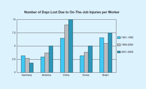
The image is a bar graph representing the number of days lost due to on-the-job injuries per worker across five countries over three-time periods. In Germany, 1991-1995 shows 2.5 days, 1996-2000 shows 5 days, and 2001-2005 shows 3.75 days. In America, 1991-1995 shows 5 days, 1996-2000 shows 7.5 days, and 2001-2005 shows 5.75 days. In China, 1991-1995 shows 7.5 days, 1996-2000 shows 10 days, and 2001-2005 shows 6.25 days. In Korea, 1991-1995 shows 10 days, 1996-2000 shows 2.5 days, and 2001-2005 shows 5 days. In Brazil, 1991-1995 shows 5 days, 1996-2000 shows 3.75 days, and 2001-2005 shows 2.5 days. The x-axis lists the countries Germany, America, China, Korea, and Brazil, and the y-axis measures the number of days from 0 to 10 in increments of 2.5. There are three sets of bars for each country, each representing a different time period with the key indicating light blue for 1991-1995, dark blue for 1996-2000, and medium blue for 2001-2005.
Given the complexity of the image, the above description may not be entirely accurate.
Note: Both the topic and the answer were created by one of our users.

The bar chart illustrates the working days missed because of job injuries per employee in four different European countries from 1991 to 2005 divided into three time periods. Overall, the figures for China were dominant compared to the countries.The opposite is true for Germany. In addition, the number of days lost in America, China, Brazil and Korea increased, whereas Germany saw a decrease over the period of time.

Looking at the categories which increased in all three time periods, in 1991, the number of non-working days in China started at 6 days per worker, while the numbers were around 3 days in America and Korea. From 1996 to 2000, they rose to 8.5, 3.5, and 3.5 days, respectively. Over the next five years, the working days missed because of job injuries in China rose to the peak of about 10 days, while both figures for days lost in America and Korea grew to 5.

Turning to the decreasing category, in 1991, the number of non-working days in Germany was 3 days, then it decreased to 2.5 in the next five years, before dropping to the lowest point at 2 days from 2001 to 2005. Regarding the other category, the figures for days lost in Brazil started at 7 days, then it fell to 6 days before bouncing back to 7.5 days in the last five years mentioned.

Word Count: 227

Answers On The Same Topic:

This bar graph shows the number of days lost due to injury per worker for three countries. There are three time periods shown beginning with the year 1991 and ending in 2005. Write a report for a university lecturer describing the information. You should write at least 150 words.

The bar graph illustrates the three times periods shown beginning with the year 1991 and ending in 2005. China show the most amount of days since year 2001 till 2005. Germany show the lowest level among all of the countries. We can see the drop, unstabillity, grow. also, it is noticeable that before workers were […]

This bar graph shows the number of days lost due to injury per worker for three countries. There are three time periods shown beginning with the year 1991 and ending in 2005. Write a report for a university lecturer describing the information. You should write at least 150 words.

The bar chart illustrates the lost days causes by worker’s injuries in five particular countries. Along with the numbers of days lost are three periods of year starting from 1991 to 2005. From a quick glance at the chart, the numbers of days lost in the given countries increased in each five-year period, except for […]

This bar graph shows the number of days lost due to injury per worker for three countries. There are three time periods shown beginning with the year 1991 and ending in 2005. Write a report for a university lecturer describing the information. You should write at least 150 words.

The bar chart illustrates the working days missed because of job injuries per employee in four different European countries from 1991 to 2005 divided into three time periods. Overall, the figures for China were dominant compared to the countries.The opposite is true for Germany. In addition, the number of days lost in America, China, Brazil […]

This bar graph shows the number of days lost due to injury per worker for three countries. There are three time periods shown beginning with the year 1991 and ending in 2005. Write a report for a university lecturer describing the information. You should write at least 150 words.

The chart illustrates the number of day-offs due to injury per worker in Germany, America, China, Korea, and Brazil. The data is divided to three periods of time, from 1991 to 1995, continued with 1996 to 2000, and followed by 2001 to 2005. Overall, China had the highest number of days lost, while Germany had […]

See All

Other Topics:

Bar chart illustrating different professions between male and female executives

The bar graph demonstrates the percentage of male and female executives in six different types of profession across the UK in year 2007. Overall, it can be seen that both professor male and female executives in different professions, but we can seen female executives more in teaching, advertising and therapists. In the beginning of the […]

The bar chart below shows numbers of seals, whales and dolphins recorded in the Gormez Straits from 2006 to 2018. Summarise the information by selecting and reporting the main features, and make comparisons where relevant. Write at least 150 words.

The bar chart illustrates the numbers of three marine species – seals,whales and dolphins – recorded in the Gormez Straits between 2006 and 2018 Overall,the number of dolphins increased over the time whereas the number of seals and whales varied over time. Looking for an overall perspective it is evident that, number dolphins increased steadily […]

The bar chart below shows numbers of seals, whales and dolphins recorded in the Gormez Straits from 2006 to 2018. Summarise the information by selecting and reporting the main features, and make comparisons where relevant. Write at least 150 words.

The bar chart illustrates the numbers of three marine species – seals, whales and dolphins – recorded in the Gormez Straits between 2006 and 2018 Overall, the no. Of dolphins increased over the time whereas the number of seals and whales varied over time. Looking for an overall perspective it is evident that, number dolphins […]

The bar chart gives information about the percentage of car trips made by male and female drivers

The bar chart compare the proportion of car travels made by male and female drivers for different purposes in 2005. Overall, it is clear that men have made more car trips for work and recreation, while women drove more often for shopping and visiting friends. On the one hand, the highest percentage of travels for […]

it is a bar chart, garang! I sent it here . look at below

The bar chart illustrates the total distance travelled by passengers across five different types of transports from 1990 to 2000 in the UK. In general, it is noticeable that the highest number of passengers, travelled by bus and rail almost the same figure of passangers kilometers among all the given categories in the year 2000, […]

The bar graph shows different types of fruits and the number of people who use them. Describe the data and make a comparison where necessary.

The bar chart illustartes the number of people consume in six different types of fruits. In general, it is noticeable that different trends were observed in all the given trends. While blueberry recorded the highest figure of eaten by the mojority of people, the opposite was true for grapes. Delving into the details, blueberry reached […]

See All
We have detected unusual activity on your device.
Please verify your identity to continue.
Note: This verification step won't sign you in. If you have a premium account, please log in to access the service as usual.
Google/Gmail Verification
Or verify using Email/Code
We've sent a verification code to:
youremail@gmail.com (Not your email?)
Enter it below to complete the verification process.
Ensure your email address is correct, your inbox is not full, and you check your spam folder. If no email arrives, consider using an alternative email.
You will need a Premium plan to perform your action!
Note: If you already have a premium account, please log in to access our services as usual.

Plans & Pricing

Our mission is to make quality education accessible for everyone.
However, to keep our hardworking team running and this service alive, we genuinely need your support!
By opting for a premium plan, not only do you sustain us in achieving the mission, but you also unlock advanced features to enrich your learning experience.

Free

For learners who aren't pressed for time

What's included on Free
100+ Cambridge IELTS Tests
Instant IELTS Writing Task 1 & 2 Evaluation (2 times/month)
Instant IELTS Speaking Part 1, 2, & 3 Evaluation (5 times/month)
Instant IELTS Writing Task 1 & 2 Essay Generator (2 times/month)
500+ Dictation & Shadowing Exercises
100+ Pronunciation Exercises
Flashcards
Other Advanced Tools

Premium

For those serious about advancing their English proficiency, and for IELTS candidates aspiring to boost their band score by 1-2 points (especially in writing & speaking) in just 30 days or less

What's included on Premium
Save Your IELTS Test Progress
Unlock All Courses & IELTS Tests
Unlimited AI Conversations
Unlimited AI Writing Enhancement Exercises
Unlimited IELTS Writing Task 1 & 2 Evaluation
Unlimited IELTS Speaking Part 1, 2, & 3 Evaluation
Checked Answers Will Not Be Published
Unlimited IELTS Writing Task 1 & 2 Essay Generator
Unlimited IELTS Speaking Part 1, 2, & 3 Sample Generator
Unlimited Usage Of Advanced Tools
Priority Support within 24h (12-month plan only)

Due to the nature of our service and the provided free trials, payments are non-refundable.
Nếu bạn là người Việt Nam và không có hoặc không muốn trả bằng credit/debit cards, bạn có thể thanh toán bằng phương thức chuyển khoản:


Chọn gói:
419,000₫ 277,000 ₫ cho gói 1 tháng (chỉ 9,233₫/ngày)
1,239,000₫ 597,000 ₫ cho gói 3 tháng (chỉ 6,633₫/ngày)
2,469,000₫ 1,027,000 ₫ cho gói 6 tháng (chỉ 5,706₫/ngày)
4,929,000₫ 1,417,000 ₫ cho gói 12 tháng (chỉ 3,936₫/ngày)


Sau khi chuyển khoản, vui lòng đợi trình duyệt tự động điều hướng bạn trở lại Engnovate và bạn sẽ ngay lập tức nhận được mã kích hoạt tài khoản premium.
Nếu có lỗi xảy ra, bạn có thể liên hệ với team thông qua một trong các phương thức: email đến helloengnovate@gmail.com hoặc nhắn tin qua facebook.com/engnovate.
Vì toàn bộ công cụ trên website đều có thể sử dụng thử miễn phí, Engnovate không hỗ trợ hoàn tiền.