Our system will evaluate the answer based on this AI-generated description.
The image displays two bar graphs. The first bar graph, titled "Deaths in Someland 1990 (millions)," details deaths from various diseases: AIDS (approximately 0.5 million), Leprosy (approximately 0.1 million), Tropical Diseases (approximatey 0.3 million), Diarrhoea (approximatey 1.7 million), Malaria (approximatey 1.5 million), and TB (approximately 0.8 million). The second bar graph, titled "Medical research funding in Someland (millions)," shows the funding allocations for the same diseases: AIDS (approximatey 180 million), Leprosy (approximatey 20 million), Tropical Diseases (approximatey 120 million), Diarrhoea (approximatey 140 million), Malaria (approximatey 160 million), and TB (approximatey 100 million). Both graphs have a vertical measurement scale, and the diseases are listed vertically on the y-axis with corresponding horizontal bars extending to the right indicating quantitative values.
Given the complexity of the image, the above description may not be entirely accurate.
Skyrocket your IELTS band score by 1-2 points in under a month with our premium plan!
Note: Both the topic and the answer were created by one of our users.
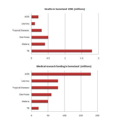
The graphs illustrate the number of deaths in Someland in 1990 due to six different diseases and the amount of funding allocated for research into each of those of diseases.
Overall, the quantity of money provided for the study did not correspond with the disease’s severity as measured by the number of fatalities. While TB was the disease that caused the greatest number of deaths, the largest amount of funding was given to research into AIDS.
In 1990, approximately 0.1 million individuals died from leprosy, 0.2 million from AIDS, and 0.3 million from tropical disease. This year, there were 0.5 million deaths because of diarrhea, 0.4 million decease from malaria, and 1.8 million deaths from TB.
The amount of funding provided for each disease is so different. TB has the highest quantity of deaths but it is only receives about 25 million dollars, the lowest of any disease. Research on leprosy and tropical diseases received 75 million dollars that year. Diarrhoea was spent 60 million and 50 million dollars on malaria research. Approximately 175 million dollars was prioritized for AIDS, the highest among any disease
Word Count: 185