🔥 Today Only: Save 30% on Premium — Offer Ends Soon! - Upgrade Now!
Multiple Graphs

Band 5+: WRITING TASK 1 You should spend about 20 minutes on this task. The line graphs below show the subscriptions to mobile and fixed phone lines in four different countries between 2005 and 2015. Summarise the information by selecting and reporting the main features and make comparisons where relevant. Write at least 150 words.

Image for topic: WRITING TASK 1 You should spend about 20 minutes on this task. The line graphs below show the subscriptions to mobile and fixed phone lines in four different countries between 2005 and 2015. Summarise the information by selecting and reporting the main features and make comparisons where relevant. Write at least 150 words.
Our system will evaluate the answer based on this AI-generated description.
The image displays two line graphs: first graph (Mobile phone subscriptions per hundred people) by years: Eritrea (2005: <20, 2006: 20, 2007: 20, 2008: 30, 2009: 30, 2010: 40, 2011: 50, 2012: 50, 2013: 50, 2014: 50, 2015: 50), India (2005: 0, 2006: 10, 2007: 20, 2008: 40, 2009: 60, 2010: 80, 2011: 80, 2012: 90, 2013: 90, 2014: 100, 2015: 100), UK (2005: 80, 2006: 85, 2007: 90, 2008: 100, 2009: 110, 2010: 120, 2011: 120, 2012: 120, 2013: 125, 2014: 130, 2015: 130), Uruguay (2005: 75, 2006: 80, 2007: 85, 2008: 85, 2009: 95, 2010: 100, 2011: 100, 2012: 110, 2013: 120, 2014: 135, 2015: 140); second graph (Fixed telephone subscriptions per hundred people) by years: Eritrea (2005: <10, 2006: <10, 2007: <10, 2008: <10, 2009: <10, 2010: <10, 2011: <10, 2012: <10, 2013: <10, 2014: <10, 2015: <10), India (2005: 5, 2006: 5, 2007: 10, 2008: 20, 2009: 30, 2010: 35, 2011: 35, 2012: 30, 2013: 30, 2014: 25, 2015: 20), UK (2005: 50, 2006: 55, 2007: 60, 2008: 60, 2009: 60, 2010: 60, 2011: 55, 2012: 55, 2013: 50, 2014: 50, 2015: 50), Uruguay (2005: 90, 2006: 85, 2007: 85, 2008: 80, 2009: 75, 2010: 75, 2011: 70, 2012: 70, 2013: 65, 2014: 60, 2015: 60).
Given the complexity of the image, the above description may not be entirely accurate.
Note: Both the topic and the answer were created by one of our users.

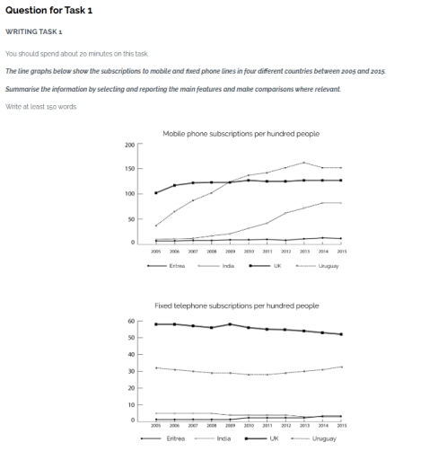
The line graph displays the amount of people subscribed to the telephone service and the number of telephone lines fixed in four different nations Eritrea, India, UK and Uruguay from 2005 to 2015.

Overall, There was a significant growth seen in the number of people subscribed to the mobile plan with countries like India and Uruguay.Conversly There was no big change with UK and Eritea. In terms of number of mobile lines fixed per hundred people there was only very minute growth or decline with all four Nations.

In 2005, The number of mobile phone subscriptions in Uruguay were around 30 for every 100 people. From there on they ascended significantly with a little decline in 2015 and finished with nearly 150 subsciptions per 100 people. Similarly India commenced with very less subscriptions(10-15) in 2005 and with substantial growth it gained nearly 65 subscriptions in that recorded time. In contrast UK and Eritrea barely showed any changes in terms of subscribers gained with UK finishing around 100 subsriptions and Eritea around 10 subsciptions

In terms of fixed mobile lanes all 4 nations showed minimal growth or decline. UK and India showed a decending chart with UK starting from around 60 lined fixed in 2005 dropping to only 50 in 2015. Same for India with around 10 lines in 2004 to barely any in 2015 Whereas Eritea and Uruguay showing a minimal growth.

Word Count: 232

Answers On The Same Topic:

WRITING TASK 1 You should spend about 20 minutes on this task. The line graphs below show the subscriptions to mobile and fixed phone lines in four different countries between 2005 and 2015. Summarise the information by selecting and reporting the main features and make comparisons where relevant. Write at least 150 words.

The line graphs provide a comparative analysis of mobile and fixed telephone subscriptions across Eritrea, India, the UK, and Uruguay over a decade from 2005 to 2015. It is evident that mobile phone subscriptions experienced significant growth in India and Uruguay, while remaining stagnant in the UK and Eritrea. Conversely, fixed telephone subscriptions showed minimal […]

WRITING TASK 1 You should spend about 20 minutes on this task. The line graphs below show the subscriptions to mobile and fixed phone lines in four different countries between 2005 and 2015. Summarise the information by selecting and reporting the main features and make comparisons where relevant. Write at least 150 words.

The line graphs illustrate how many people subscribed to cellular phone lines and landlines in Eritrea, India, the UK, and Uruguay in the period from 2005 to 2015. Figures are expressed in hundreds of people. Overall, during the given period, the number of people subscribed to mobile phone lines rose in India and Uruguay, while […]

WRITING TASK 1 You should spend about 20 minutes on this task. The line graphs below show the subscriptions to mobile and fixed phone lines in four different countries between 2005 and 2015. Summarise the information by selecting and reporting the main features and make comparisons where relevant. Write at least 150 words.

The line graphs provide data about the number of subscribers in per hundred people of two type of phone lines in four different countries over a 10 years period of time, between 2005 and 2015. In terms of mobile phone subscriptions numbers, Uruguay has the most significant increase that more than 3 times. Also india […]

See All

Other Topics:

The bar charts below give information about the railway system in six cities in Europe. Summarise the information by selecting and reporting the main features, and make comparisons where relevant. Write at least 150 words.

The charts above show information about the railway routes and the number of its passengers in six cities in Europe. Overall, Baris had the longest railway routes, while Lisbon recorded the highest number of railway users during the year. The first chart illustrated Baris city had the biggest railway net, which covered nearly 400 kilometers, […]

The table and bar chart compares the household chores and leisure time activities spend by men and women

The table and bar chart illustrates the average minutes of spending for leisure activities and household activities by two genders. Overall, it is clear that men spend their most of time on leisure time activities while women devote their most of time on household activities. To begin with, leisure activities such as TV, video, radio […]

The pie charts illustrate the proportion of graduates with different levels of qualifications in science and art working in a specific engineering company between 1980 and 2008.

The two pie charts demonstrate the percentage of degree holders along with six different levels of credentials in science and art performing a job in a particular engineering company between 1980 and 2008. Overall, graduates in master-science remained the highest proportion in engineering company, while Ph.D science overtook in figure with the passage of time. […]

the charts illlustrates the UK's steel industry from 1970 to 2000.

The two line graphs illustrate changes in the steel industry in the UK, along with the number of steel industry employees in a 30-year period, from 1970 to 2000. Overall, total demand and UK production decreased steadily, as did the number of staff; however, the import experienced an growth. In 1970,it is obvious that the […]

Task 1: The bar chart below shows the number of tourists who traveled to Australia in 1995 and 2005. The line graph shows the number of tourists who did this type of holiday. Summarize the information by selecting and reporting the main features and make comparisons where relevant.

The bar graph compares how many tourists who visited from the US, The UK and Japan to Australia from 1995 to 2005, however, the line graph depicts the number of visitor who traveled two types of holiday their destination between 1995 and 2005. Overall, the number of UK and US visitors who traveled increase over […]

The chart and table below show the results of a survey of library users at a university. Summarise the information by selecting and reporting the main features, and make comparisons where relevant.

The provided pie chart illustrates data about outcome of a survey of people categories who visit university’s library, and the table gives information about visitors’s satisfaction. Overall, it is clearly seen that the majority of library users are full-time undergraduate students, while the minority consists of academic staff. In addition, the percentage of satisfaction is […]

See All
We have detected unusual activity on your device.
Please verify your identity to continue.
Note: This verification step won't sign you in. If you have a premium account, please log in to access the service as usual.
Google/Gmail Verification
Or verify using Email/Code
We've sent a verification code to:
youremail@gmail.com (Not your email?)
Enter it below to complete the verification process.
Ensure your email address is correct, your inbox is not full, and you check your spam folder. If no email arrives, consider using an alternative email.
You will need a Premium plan to perform your action!
Note: If you already have a premium account, please log in to access our services as usual.

Plans & Pricing

Our mission is to make quality education accessible for everyone.
However, to keep our hardworking team running and this service alive, we genuinely need your support!
By opting for a premium plan, not only do you sustain us in achieving the mission, but you also unlock advanced features to enrich your learning experience.

Free

For learners who aren't pressed for time

What's included on Free
100+ Cambridge IELTS Tests
Instant IELTS Writing Task 1 & 2 Evaluation (2 times/month)
Instant IELTS Speaking Part 1, 2, & 3 Evaluation (5 times/month)
Instant IELTS Writing Task 1 & 2 Essay Generator (2 times/month)
500+ Dictation & Shadowing Exercises
100+ Pronunciation Exercises
Flashcards
Other Advanced Tools

Premium

For those serious about advancing their English proficiency, and for IELTS candidates aspiring to boost their band score by 1-2 points (especially in writing & speaking) in just 30 days or less

What's included on Premium
Save Your IELTS Test Progress
Unlock All Courses & IELTS Tests
Unlimited AI Conversations
Unlimited AI Writing Enhancement Exercises
Unlimited IELTS Writing Task 1 & 2 Evaluation
Unlimited IELTS Speaking Part 1, 2, & 3 Evaluation
Checked Answers Will Not Be Published
Unlimited IELTS Writing Task 1 & 2 Essay Generator
Unlimited IELTS Speaking Part 1, 2, & 3 Sample Generator
Unlimited Usage Of Advanced Tools
Priority Support within 24h (12-month plan only)

Due to the nature of our service and the provided free trials, payments are non-refundable.
Nếu bạn là người Việt Nam và không có hoặc không muốn trả bằng credit/debit cards, bạn có thể thanh toán bằng phương thức chuyển khoản:


Chọn gói:
419,000₫ 277,000 ₫ cho gói 1 tháng (chỉ 9,233₫/ngày)
1,239,000₫ 597,000 ₫ cho gói 3 tháng (chỉ 6,633₫/ngày)
2,469,000₫ 1,027,000 ₫ cho gói 6 tháng (chỉ 5,706₫/ngày)
4,929,000₫ 1,417,000 ₫ cho gói 12 tháng (chỉ 3,936₫/ngày)


Sau khi chuyển khoản, vui lòng đợi trình duyệt tự động điều hướng bạn trở lại Engnovate và bạn sẽ ngay lập tức nhận được mã kích hoạt tài khoản premium.
Nếu có lỗi xảy ra, bạn có thể liên hệ với team thông qua một trong các phương thức: email đến helloengnovate@gmail.com hoặc nhắn tin qua facebook.com/engnovate.
Vì toàn bộ công cụ trên website đều có thể sử dụng thử miễn phí, Engnovate không hỗ trợ hoàn tiền.