24 Hours Only: Get 39% OFF on Our Premium Plan - Check Out Now!
Bar Chart

Band 7+: You should spend about 20 minutes on this task. The bar chart below shows the number of houses built per year in two cities, Derby and Nottingham, Between 2000 and 2009. Write a report for a university lecturer describing the information shown below. You should write at least 150 words.

Image for topic: You should spend about 20 minutes on this task. The bar chart below shows the number of houses built per year in two cities, Derby and Nottingham, Between 2000 and 2009. Write a report for a university lecturer describing the information shown below. You should write at least 150 words.
Our system will evaluate the answer based on this AI-generated description.
The image depicts a bar chart showing the number of houses built per year in the cities of Derby and Nottingham from the year 2000 to 2009; Derby houses are represented in blue and Nottingham in yellow. In 2000, 100 houses were built in Derby and 150 in Nottingham. In 2001, Derby had 150 and Nottingham 200. In 2002, numbers in Derby rose to 200, while Nottingham increased slightly to 250. In 2003, the numbers decreased for both cities, with Derby at 90 and Nottingham at 150. For 2004, Derby built 200 houses, and Nottingham constructed 300. The year 2005 had a steep decline for both, with Derby at 90 and Nottingham at 100. In 2006, Derby's constructions slightly grew to 140, and Nottingham's to 80. By 2007, Derby numbers remain unchanged, but Nottingham's decreased to 50. The numbers rose in 2008 dramatically, with Derby constructing 350 houses while Nottingham built 320. The chart concludes with 2009 data showing Derby at 90 houses and Nottingham at 350.
Given the complexity of the image, the above description may not be entirely accurate.
Note: Both the topic and the answer were created by one of our users.

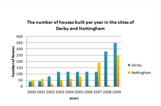
The given bar chart illustrates the number of homes stablished the mentioned two cities throughout a period of nine years.

Overall, it can clearly be seen that Derby has made a significant increase in the construction of houses with a steady rise in some years. However, Nottingham shows substantial ups and downs during the whole period though reaching a new level at the end the period.

In the year 2000, Derby started at around 40 houses and managed to erect 150 after three years. With that being said, it made a stable move until 2007 but in a surprise upward trend, Derby succeeded in building around 270 houses a year later. In the following years, Derby constructed more than 30 buildings.

Nottingham, however, started building 50 houses in 2000 and made considerable fluctuations in the following seven years, reaching approximately 190 houses. Nottingham managed to construct 250 homes in 200 after a trough of nearly building 5 homes.

Word Count: 158

Answers On The Same Topic:

You should spend about 20 minutes on this task. The bar chart below shows the number of houses built per year in two cities, Derby and Nottingham, Between 2000 and 2009. Write a report for a university lecturer describing the information shown below. You should write at least 150 words.

The provided bar graph demonstrates the number of houses constructed in a year in the cities of Derby and Nottingham, between the years 2000 and 2009. Overall, it is obvious that the houses built had small quantity in 2000 compared to the amount in 2009 that significantly surged. Except for this, whilst Derby has gradually […]

You should spend about 20 minutes on this task. The bar chart below shows the number of houses built per year in two cities, Derby and Nottingham, Between 2000 and 2009. Write a report for a university lecturer describing the information shown below. You should write at least 150 words.

The given graph illustrates the quantity of houses built per year in Derby and Nottingham, from 2000 to 2009. Overall, the number of houses built in Derby in the given years increased, while in Nottingham it fluctuated. The maximum point was recorded in Derby, the minimum one in Nottingham. To begin, in Derby in 2000 […]

You should spend about 20 minutes on this task. The bar chart below shows the number of houses built per year in two cities, Derby and Nottingham, Between 2000 and 2009. Write a report for a university lecturer describing the information shown below. You should write at least 150 words.

The bar chart illustrates the number of houses constructed in Derby and Nottingham each year from 2000 to 2009. Overall, both cities witnessed a significant surge in the houses built over the period. Notably, Nottingham initially showed a higher number compared to Derby in the year 2000. However, by the end of the period, Derby […]

You should spend about 20 minutes on this task. The bar chart below shows the number of houses built per year in two cities, Derby and Nottingham, Between 2000 and 2009. Write a report for a university lecturer describing the information shown below. You should write at least 150 words.

The bar chart demonstrates the amount of constructed houses in two particular touns Derby and Nottingham from 2000 to 2009. Overall, the number of houses built per year in Derby shows upward trend, while in Nottingham can be observed notable divergence trom Derby. Throughout the decade Nottingham town demonstrates significant fluctuations. From 2000 to 2003 […]

You should spend about 20 minutes on this task. The bar chart below shows the number of houses built per year in two cities, Derby and Nottingham, Between 2000 and 2009. Write a report for a university lecturer describing the information shown below. You should write at least 150 words.

THE DIAGRAM COMPARES THE NUMBER OF ACCOMMODATIONS CONSTRUCTED IN DERBY AND NOTTINGHAM, FROM 2000 TO 2009. OVERALL, THE LOWEST PROPORTION OF HOUSING WAS DERBY AT THE BEGINNING OF THE PERIOD, WHILE THE OPPOSITE TREND WAS TRUE FOR HOUSING IN NOTTINGHAM. THE NUMBER OF HOUSES EXPERIENCED AN INCREASE OVER THE GIVEN PERIOD. WHAT STANDS OUT FROM […]

See All

Other Topics:

The charts compare the percentage of households by size in the UK in 1981 and 2001

The bar chart compares the proportion of households by size in the UK in two different years: 1981 and 2001. Overall, the percentage of households with more than 3 people was lower in 2001 that 1981 (4, 5 and 6-person). The figure for 2-person households remained dominant in both years, followed closely by 1-person in […]

the chart below show the percentage of people in a city in the UK using the internet for different activities in 2007 and 2009.

The chart illustrates how people in a UK city used the Internet for different activities between 2007 and 2009. Overall, there were increased figures for shopping, job seeking and TV, while the percentages of using the Internet for banking, music and leaming recorded a downward trend. In addition, shopping became the most popular research among […]

The chart gives information on the percentage of women going into higher education in five countries for the years 1970and2005

The bar chart depicts the proportion of females pursuing tertiary learning in five different countries over a period of time from 1970 to 2005. The countries include UK, USA, Canada, Japan and Germany. Overall, percentage of women going into higher education were consistently higher in the year 2005. Alongside being the country with the highest […]

The graph below shows the percentage of self employed workers of the total workforce in five countries in 1998 and 2008.

The bar chart demonstrates the share of self employed employees of the total work power in five countries from 1998 to 2008. Generally speaking, only two country witnessed decrease, while reverse was trues for remain three. From the beginning and until the end the highest percentage of self employed workers was held by Turkey. To […]

The chart below shows the number of men and women in further education in Britain in three periods and whether they were studying full-time or part-time. Summarise the information by selecting and reporting the main features and make comparisons where relevant.

The bar chart depicts the numbers of females and males who chose full-time education or part-time education in Britain from 1970 to 1990. Overall, a proportion of part-time education is higher compared to that of full-time, regardless of their gender. Females constituted the largest proportion in both categories at the end of the period. At […]

yield od different crops ( in metric tons per hectare)

The given bar chart illustrates the amount of yield used in 4 different types of crops between 2012 and 2014. Measured in tons per hectare. It is evident from the graph that in 2012, the highest yield used in mustard around 250 tons per hectare, while least yield used in maize approximately 50 tons per […]

See All
We have detected unusual activity on your device.
Please verify your identity to continue.
Note: This verification step won't sign you in. If you have a premium account, please log in to access the service as usual.
Google/Gmail Verification
Or verify using Email/Code
We've sent a verification code to:
youremail@gmail.com (Not your email?)
Enter it below to complete the verification process.
Ensure your email address is correct, your inbox is not full, and you check your spam folder. If no email arrives, consider using an alternative email.
You will need a Premium plan to perform your action!
Note: If you already have a premium account, please log in to access our services as usual.

Plans & Pricing

Our mission is to make quality education accessible and free for everyone.
However, to keep our hardworking team running and this service alive, we genuinely need your support!
By opting for a premium plan, not only do you sustain us in achieving the mission, but you also unlock advanced features to enrich your learning experience.

Free

For learners who aren't pressed for time

What's included on Free
1000+ IELTS Tests & Samples
Instant IELTS Writing Task 1 & 2 Evaluation (2 times/month)
Instant IELTS Speaking Part 1, 2, & 3 Evaluation (5 times/month)
Instant IELTS Writing Task 1 & 2 Essay Generator (2 times/month)
500+ Dictation & Shadowing Exercises
100+ Pronunciation Exercises
Flashcards
Other Advanced Tools

Premium

For those serious about advancing their English proficiency, and for IELTS candidates aspiring to boost their band score by 1-2 points (especially in writing & speaking) in just 30 days or less

What's included on Premium
Save Your IELTS Test Progress
Unlock All Courses & Content
Unlimited AI Conversations
Unlimited AI Writing Enhancement Exercises
Unlimited IELTS Writing Task 1 & 2 Evaluation
Unlimited IELTS Speaking Part 1, 2, & 3 Evaluation
Checked Answers Will Not Be Published
Unlimited IELTS Writing Task 1 & 2 Essay Generator
Unlimited IELTS Speaking Part 1, 2, & 3 Sample Generator
Unlimited Usage Of Advanced Tools

Due to the nature of our service and the provided free trials, payments are non-refundable.
Nếu bạn là người Việt Nam và không có hoặc không muốn trả bằng credit/debit cards, bạn có thể thanh toán bằng phương thức chuyển khoản:


Chọn gói:
279,000₫ 157,000 ₫ cho gói 1 tháng (chỉ 5,233₫/ngày)
819,000₫ 397,000 ₫ cho gói 3 tháng (chỉ 4,411₫/ngày)
1,649,000₫ 667,000 ₫ cho gói 6 tháng (chỉ 3,706₫/ngày)
3,299,000₫ 857,000 ₫ cho gói 12 tháng (chỉ 2,381₫/ngày)


Sau khi chuyển khoản, vui lòng đợi trình duyệt tự động điều hướng bạn trở lại Engnovate và bạn sẽ ngay lập tức nhận được mã kích hoạt tài khoản premium.
Nếu có lỗi xảy ra, bạn có thể liên hệ với team thông qua một trong các phương thức: email đến helloengnovate@gmail.com hoặc nhắn tin qua facebook.com/engnovate.
Vì toàn bộ công cụ trên website đều có thể sử dụng thử miễn phí, Engnovate không hỗ trợ hoàn tiền.