🔥 Today Only: Save 30% on Premium — Offer Ends Soon! - Upgrade Now!
Multiple Graphs

Band 6+: You should spend about 20 minutes on this task. The following table and graph give information about the Gross Domestic Product (GDP) and employment sectors of a developing country. Summarise the information by selecting and reporting the main features, and make comparisons where relevant. You should write at least 150 words

Image for topic: You should spend about 20 minutes on this task. The following table and graph give information about the Gross Domestic Product (GDP) and employment sectors of a developing country. Summarise the information by selecting and reporting the main features, and make comparisons where relevant. You should write at least 150 words
Our system will evaluate the answer based on this AI-generated description.
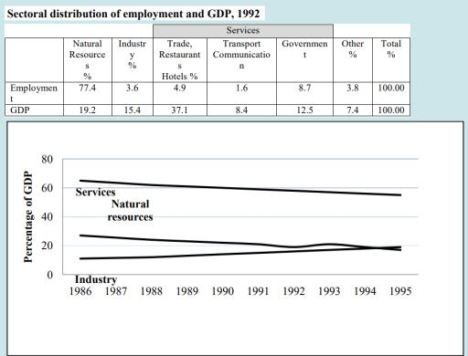
The image displays two pieces of statistical information. The first is a table titled "Sectoral distribution of employment and GDP, 1992", subdivided into sectors: Natural Resources, Industry, Trade, Restaurants, Hotels, Transport Services, Communication, Government, Other, and a Total column. Employment percentages are as follows: Natural Resources 77.4%, Industry 3.6%, Trade Restaurants Hotels 4.9%, Transport Services Communication 1.6%, Government 8.7%, Other 3.8%, Total 100.0%. GDP percentages are given: Natural Resources 19.2%, Industry 15.4%, Trade, Restaurants, Hotels 37.1%, Transport Services Communication 8.4%, Government 12.5%, Other 7.4%, Total 100.0%. The second part of the image is a line graph with the x-axis showing years from 1986 to 1995 and the y-axis indicating percentage of GDP, depicting three lines labeled Services, Natural resources, and Industry. The Services line is consistently above approximately 55%, the Natural Resources line shows a slight decline starting just below 25% and finishing around 22%, and the Industry line begins just above 20% and ends slightly above 15%.
Given the complexity of the image, the above description may not be entirely accurate.
Note: Both the topic and the answer were created by one of our users.

The given table provides data about the percentage of Gross Domestic Product (GDP) and employment sectors in 1992 and the line graph illustrates the proportion of GDP in three distinct sectors- services, natural resources and industry- of a developing country between 1986 and 1995.

Overall, natural resources was the most popular sectors, while the services ( trade restaurants and hotels) contributed most significantly in GDP. Although, the GDP of industry sector showed upward trend, services and natural resources experienced a significant decline.

In 1992, there was a greatest number of employee in natural resources about 77.4%, while it contributed 19.2% of total GDP. In contrast, 3.6% employment was in industry sector but they contributed 15.4% of GDP. Though, services sector accounted less employment about 4.9%, 1.6% and 8.7% in trade, transport and governemnt sector respectively, they contributed a greater number of GDP of 37.1%, 8.4% and 12.5% respectively.

In addition, the percentage of GDP from services and natural resources showed downward trend, started at around 65% and 28% in 1986 and ended with nearly 54% and 18% in 1995 respectively. Conversely, the industry sector experienced a significant rise from about 10% in 1986 to almost 20% in 1995.

Word Count: 198

Answers On The Same Topic:

You should spend about 20 minutes on this task. The following table and graph give information about the Gross Domestic Product (GDP) and employment sectors of a developing country. Summarise the information by selecting and reporting the main features, and make comparisons where relevant. You should write at least 150 words

The graphs illustrate the distribution of employment in six different sectors and its correlates with the ratio of Gross Domestic Product ( GDP) generated by each one in a developing country in 1992, and how the percentage of GDP in three different sectors changed over the years 1986-1995. Overall, the vast majority of workers, about […]

You should spend about 20 minutes on this task. The following table and graph give information about the Gross Domestic Product (GDP) and employment sectors of a developing country. Summarise the information by selecting and reporting the main features, and make comparisons where relevant. You should write at least 150 words

The figures illustrate the detailed description about the employeement sectors and its contribution in Gross Domestic Product (GDP) of any developing country in the year of 1992. Furthermore, it also provides trend of GDP in the nation from 1986 to 1995. Overall, most of the citizens are employed in natural resources sector and fewest in […]

You should spend about 20 minutes on this task. The following table and graph give information about the Gross Domestic Product (GDP) and employment sectors of a developing country. Summarise the information by selecting and reporting the main features, and make comparisons where relevant. You should write at least 150 words

The table and linegraph depicts thepercentage of Gross Domestic Product and employment in different sources. Overall, it is apparent that natural resources contrubuted tohighest portion while industry showed thelowest percentage.Additionally,it can be seen from thegraphisthat services amd natural resources decreased slightly over the period,althoug,there was negligible rise in industry. Initially,natural resources covered the major fraction […]

See All

Other Topics:

The chart below shows the electricity consumption in different sectors of Eastern Europe in 2007 and 2010. Summarize the information by selecting and reporting the main features and make comparisons where relevant.

The chart compares the electricity consumption across different sectors in Eastern Europe in 2007 and 2010. Overall, there were several notable changes. The electricity consumption in four sectors namely, transport, residential, commercial and agriculture, remained unchanged throughout the period. While the figures for mining and other metals increased, the manufacturing and aluminium categories witnessed noticeable […]

The bar chart below gives information about the average number of years at school of adult males and females in Singapore, and the pie charts show the level of the highest educational achievement. Summarise the information by selecting and reporting the main features, and make comparisons where relevant.

The bar chart shows the average number of years at school of adult males and females in Singapore, while the pie charts compare the level of highest educational achievement. Overall, the average years of schooling increased for adult males and females throughout the period, with males consistently recording higher figures than females. Meanwhile, the proportions […]

The chart below shows the electricity consumption in different sectors of Eastern Europe in 2007 and 2010. Summarize the information by selecting and reporting the main features and make comparisons where relevant.

The chart illustrates the consumption of electricity accounted for in different sectors of Eastern Europe in 2007 and 2010. Overall, there were several notable changes. While most of the shares of chart namely, transport, agriculture, residential and commercial fields remained unchanged throughout the period, the figures for mining and other metals rose relatively. In addition, […]

The six pie charts illustrate the proportion of water used for three different purposes—agricultural, industrial, and domestic

The given pie chart illustrates the proportion of water utilized for distinct aim agriculture, domestic, and industrial use in six areas of the world. Overall, the water consumption dominates the agriculture use in north America and Europe, whereas, industrial water usage is higher in other countries like south America, Africa, central Asia and south east […]

the chart and table below give information about online shopping by Australia and New Zealand customers in 2012

the chart and table illustrate data based on online shopping among two difference countries Australian and New Zealand consumers in 2012 overall, the charts compared 3 functions in other respects overseas websites only accounted for the highest while Both overseas and local websites in the bottom. Simultaneously, the table gives some data about these reasons […]

The charts below show the population size and life expectancy for five European countries in 1914 and 2014. Summarise the information by selecting and reporting the main features, and make comparisons where relevant.

The bar chart illustrates the population size and life expectancy figures in five different European countries, namely Spain, UK, Italy, France and Germany in the years 1914 and 2014. Overall, it is notable that population size in all countries experienced an increase, with Germany having the most and Spain the least. It also can be […]

See All
We have detected unusual activity on your device.
Please verify your identity to continue.
Note: This verification step won't sign you in. If you have a premium account, please log in to access the service as usual.
Google/Gmail Verification
Or verify using Email/Code
We've sent a verification code to:
youremail@gmail.com (Not your email?)
Enter it below to complete the verification process.
Ensure your email address is correct, your inbox is not full, and you check your spam folder. If no email arrives, consider using an alternative email.
You will need a Premium plan to perform your action!
Note: If you already have a premium account, please log in to access our services as usual.

Plans & Pricing

Our mission is to make quality education accessible for everyone.
However, to keep our hardworking team running and this service alive, we genuinely need your support!
By opting for a premium plan, not only do you sustain us in achieving the mission, but you also unlock advanced features to enrich your learning experience.

Free

For learners who aren't pressed for time

What's included on Free
100+ Cambridge IELTS Tests
Instant IELTS Writing Task 1 & 2 Evaluation (2 times/month)
Instant IELTS Speaking Part 1, 2, & 3 Evaluation (2 times/month)
Instant IELTS Writing Task 1 & 2 Essay Generator (2 times/month)
500+ Dictation & Shadowing Exercises
100+ Pronunciation Exercises
Flashcards
Other Advanced Tools

Premium

For those serious about advancing their English proficiency, and for IELTS candidates aspiring to boost their band score by 1-2 points (especially in writing & speaking) in just 30 days or less

What's included on Premium
Save Your IELTS Test Progress & Analyze Mistakes By Question Type
Save Your Own Flashcard Sets & Use Them On Any Device
Unlock All Courses, IELTS Tests, Section & Part Practice
Unlimited AI Conversations
Unlimited AI Writing Enhancement Exercises
Unlimited IELTS Writing Task 1 & 2 Evaluation
Unlimited IELTS Speaking Part 1, 2, & 3 Evaluation
Checked Answers Will Not Be Published
Unlimited IELTS Writing Task 1 & 2 Essay Generator
Unlimited IELTS Speaking Part 1, 2, & 3 Sample Generator
Unlimited Usage Of Advanced Tools & AI Features
Priority Support within 24h (12-month plan only)

Due to the nature of our service and the provided free trials, payments are non-refundable.