🔥 Today Only: Save 30% on Premium — Offer Ends Soon! - Upgrade Now!
Line Graph

Band 8+: The graph below shows the number of international tourists visiting three different countries between 2000 and 2020. Summarize the information by selecting and reporting the main features, and make comparisons where relevant.

Image for topic: The graph below shows the number of international tourists visiting three different countries between 2000 and 2020. Summarize the information by selecting and reporting the main features, and make comparisons where relevant.
Our system will evaluate the answer based on this AI-generated description.
The image displays a line graph illustrating international tourists in millions visiting France, USA, and Japan from 2000 to 2020. France's data: 2000 (77), 2001 (79), 2002 (81), 2003 (83), 2004 (82), 2005 (83), 2006 (84), 2007 (86), 2008 (88), 2009 (87), 2010 (85), 2011 (86), 2012 (86), 2013 (84), 2014 (85), 2015 (87), 2016 (86), 2017 (88), 2018 (89), 2019 (90), 2020 (91). USA's data: 2000 (51), 2001 (52), 2002 (53), 2003 (54), 2004 (55), 2005 (56), 2006 (57), 2007 (57), 2008 (56), 2009 (55), 2010 (54), 2011 (53), 2012 (52), 2013 (51), 2014 (50), 2015 (49), 2016 (47), 2017 (45), 2018 (44), 2019 (42), 2020 (42). Japan's data: 2000 (15), 2001 (15), 2002 (16), 2003 (17), 2004 (17), 2005 (19), 2006 (20), 2007 (21), 2008 (23), 2009 (24), 2010 (25), 2011 (27), 2012 (28), 2013 (30), 2014 (33), 2015 (36), 2016 (41), 2017 (47), 2018 (52), 2019 (54), 2020 (50).
Given the complexity of the image, the above description may not be entirely accurate.
Note: Both the topic and the answer were created by one of our users.

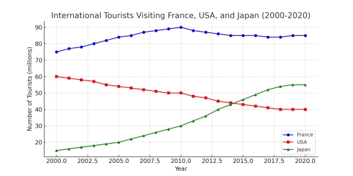
The line graph illustrates the number of international tourists (in millions) who visited France, the USA, and Japan between 2000 and 2020.

Overall, France remained the most popular destination throughout the period. While the USA experienced a gradual decline in tourist numbers, Japan saw a remarkable increase and overtook the USA by the end of the timeframe.

In 2000, France attracted approximately 75 million foreign visitors, the highest among the three countries. This figure rose steadily over the next decade, peaking at around 90 million in 2010. However, it experienced a slight decline thereafter, falling to 85 million by 2020, but still maintaining the top position.

Japan, in contrast, started with a relatively low number of tourists, at about 10 million in 2000. Over the 20-year period, the figure grew dramatically, especially after 2010, surpassing the USA in 2014 and reaching 55 million visitors by 2020.

Meanwhile, the USA saw a gradual decrease in tourist numbers, from 60 million in 2000 to around 40 million in 2010. Although there was a slight recovery afterward, it ended the period with the lowest figure among the three countries.

Word Count: 186

Answers On The Same Topic:

The graph below shows the number of international tourists visiting three different countries between 2000 and 2020. Summarize the information by selecting and reporting the main features, and make comparisons where relevant.

The line graph illustrates the number of international tourists visiting France, the USA, and Japan between 2000 and 2020. Overall, France consistently attracted the highest number of tourists throughout the period, despite a slight decline after 2010. In contrast, the USA experienced a gradual decrease in visitor numbers, while Japan saw a significant and steady […]

The graph below shows the number of international tourists visiting three different countries between 2000 and 2020. Summarize the information by selecting and reporting the main features, and make comparisons where relevant.

The line graph illustrate the number of foreign tourists visited in France, America and Japan from 2000 to 2020. Overall, france remains the most visited country of tourist. Whereas , japan shows increase in tourism wich surpasses America at the end of the survey. At the start of the survey, france remains the most visited […]

The graph below shows the number of international tourists visiting three different countries between 2000 and 2020. Summarize the information by selecting and reporting the main features, and make comparisons where relevant.

The graph illustrates the number of tourists visiting various countries including France, USA, and Japan. Overall, the three lines indicates a massive number of tourists estimated to be (20-90) million individual. France shows a constant number of visitors from 2000 to 2020. At 2010, the numbers of visitiors to France reached to the peack having […]

The graph below shows the number of international tourists visiting three different countries between 2000 and 2020. Summarize the information by selecting and reporting the main features, and make comparisons where relevant.

– The line graph illustrates the number of international tourists visiting France, the United States, and Japan between 2000 and 2020. Overall, France consistently recorded the highest numbers of visitors throughout the period, despite the fluctuations, while the United States experienced a decline in tourist numbers. In contrast, Japan saw a steady increase surpassing the […]

The graph below shows the number of international tourists visiting three different countries between 2000 and 2020. Summarize the information by selecting and reporting the main features, and make comparisons where relevant.

The line graph illustrates the number of international tourists visiting France, the United States, and Japan between 2000 and 2020. Overall, France consistently recorded the highest numbers of visitors throughout the period, despite the fluctuations, while the United States experienced a decline in tourist numbers. In contrast, Japan saw a steady increase surpassing the United […]

See All

Other Topics:

The graph below shows the per capita consumption of whole milk and low-fat milk in the United States between 1970 and 2015. Summarize the information by selecting and reporting the main

The line graph presented to us the per capita consumption of both whole milk and low-fat milk in US between 1970 and 2015. Overall, the whole milk have a dwindling tendency. In the beginning, 1970 year, low fat milk was unpopular and it was almost 6 per capita consumption, while whole milk was on its […]

The graph below gives information about the number of jobs in four sectors of the economy in the US between 1960 and 2020.

The line graph illustrates the number of jobs in 4 economical parts in the US in 1960, 1980, 2000 and 2020. Overall, there are manufacturing, retail, agriculture and healthcare sectors. Figures in retail industry slightly grew thoughout the years. Healthcare line increased extremely, and by 2020, the manufacturing and healthcare values were absolutely similar. Retail […]

The graph shows the Japanese average monthly salary (Yen) from 1953 to 1983, and the prices of black and white television and color television during the same period

The line chart shows the Price of color TV, Price of black and white TV and Japanese average monthly salary (Yen) from 1953 to 1983, and the prices of black-and-white televisions and color television from 1953 to 1983 in Japan. Overall, while Price of color TV and Prince of black and white TV significantly decreased, […]

the chart below shows the percentage of water in UK rivers that was classified as having good chemical quality between 1990 and 2002. Summurise the information by selecting and reporting the main features, and make comparisons where relevant.

The line graph illustrate the proportion of water in UK rivers which was classified as having good chemical quality from 1990 to 2002. Overall, what stands out is that northern Ireland, England, and Scotland followed an upward trend, while Wales showed the opposite pattern. It is also evident that England an Scotland fluctuated over the […]

The graph below shows how serious people in four countries considered some environmental problems between 2000 and 2010.

The line graph given provides information about seriousness of four various environmental issues in average in countries such as China, India, Germany and USA, with figures measured in percentages over a 10-year period. Overall, throughout the whole period such problems as lack of fresh water and air pollution were considered as the most severe ones, […]

The given line graph demonstrates information about the number of employee worked as labour in the United States in a over eighty-year period between 1930 and 2010.

Overall, people worked as farmers, fisher, and work in forest decreased rapidly, while other sectors had a slight fall or climb. Focus on primary industry sector, it started as the majority type of job people chose in 1930 with 75 labours. However, it dropped minorly from 1930 to 1970 and recorded a slump in the […]

See All
We have detected unusual activity on your device.
Please verify your identity to continue.
Note: This verification step won't sign you in. If you have a premium account, please log in to access the service as usual.
Google/Gmail Verification
Or verify using Email/Code
We've sent a verification code to:
youremail@gmail.com (Not your email?)
Enter it below to complete the verification process.
Ensure your email address is correct, your inbox is not full, and you check your spam folder. If no email arrives, consider using an alternative email.
You will need a Premium plan to perform your action!
Note: If you already have a premium account, please log in to access our services as usual.

Plans & Pricing

Our mission is to make quality education accessible for everyone.
However, to keep our hardworking team running and this service alive, we genuinely need your support!
By opting for a premium plan, not only do you sustain us in achieving the mission, but you also unlock advanced features to enrich your learning experience.

Free

For learners who aren't pressed for time

What's included on Free
100+ Cambridge IELTS Tests
Instant IELTS Writing Task 1 & 2 Evaluation (2 times/month)
Instant IELTS Speaking Part 1, 2, & 3 Evaluation (5 times/month)
Instant IELTS Writing Task 1 & 2 Essay Generator (2 times/month)
500+ Dictation & Shadowing Exercises
100+ Pronunciation Exercises
Flashcards
Other Advanced Tools

Premium

For those serious about advancing their English proficiency, and for IELTS candidates aspiring to boost their band score by 1-2 points (especially in writing & speaking) in just 30 days or less

What's included on Premium
Save Your IELTS Test Progress
Unlock All Courses & IELTS Tests
Unlimited AI Conversations
Unlimited AI Writing Enhancement Exercises
Unlimited IELTS Writing Task 1 & 2 Evaluation
Unlimited IELTS Speaking Part 1, 2, & 3 Evaluation
Checked Answers Will Not Be Published
Unlimited IELTS Writing Task 1 & 2 Essay Generator
Unlimited IELTS Speaking Part 1, 2, & 3 Sample Generator
Unlimited Usage Of Advanced Tools
Priority Support within 24h (12-month plan only)

Due to the nature of our service and the provided free trials, payments are non-refundable.
Nếu bạn là người Việt Nam và không có hoặc không muốn trả bằng credit/debit cards, bạn có thể thanh toán bằng phương thức chuyển khoản:


Chọn gói:
419,000₫ 277,000 ₫ cho gói 1 tháng (chỉ 9,233₫/ngày)
1,239,000₫ 597,000 ₫ cho gói 3 tháng (chỉ 6,633₫/ngày)
2,469,000₫ 1,027,000 ₫ cho gói 6 tháng (chỉ 5,706₫/ngày)
4,929,000₫ 1,417,000 ₫ cho gói 12 tháng (chỉ 3,936₫/ngày)


Sau khi chuyển khoản, vui lòng đợi trình duyệt tự động điều hướng bạn trở lại Engnovate và bạn sẽ ngay lập tức nhận được mã kích hoạt tài khoản premium.
Nếu có lỗi xảy ra, bạn có thể liên hệ với team thông qua một trong các phương thức: email đến helloengnovate@gmail.com hoặc nhắn tin qua facebook.com/engnovate.
Vì toàn bộ công cụ trên website đều có thể sử dụng thử miễn phí, Engnovate không hỗ trợ hoàn tiền.