🔥 Today Only: Save 30% on Premium — Offer Ends Soon! - Upgrade Now!
Multiple Graphs

Band 8+: The graph and table below show the average monthly temperatures and the average number of hours of sunshine per year in three major cities Summarise the information by selecting and reporting the main features and make comparisons where relevant.

Image for topic: The graph and table below show the average monthly temperatures and the average number of hours of sunshine per year in three major cities Summarise the information by selecting and reporting the main features and make comparisons where relevant.
Our system will evaluate the answer based on this AI-generated description.
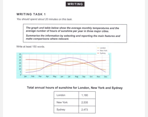
The image depicts a graph and a table; the graph illustrates average monthly temperatures over a year across three cities: London, New York, and Sydney, with temperatures in Celsius on the y-axis ranging from 0 to 30, matching months January to December on the x-axis; a line represents each city. Specific approximate monthly temperatures for London are: January 5°C, February 5°C, March 8°C, April 11°C, May 15°C, June 18°C, July 20°C, August 20°C, September 17°C, October 13°C, November 10°C, December 7°C. For New York: January 3°C, February 4°C, March 8°C, April 14°C, May 19°C, June 24°C, July 27°C, August 26°C, September 22°C, October 16°C, November 10°C, December 5°C. For Sydney: January 25°C, February 25°C, March 23°C, April 20°C, May 17°C, June 14°C, July 13°C, August 15°C, September 17°C, October 19°C, November 22°C, December 24°C. The table presents total annual hours of sunshine, with London at 1,180 hours, New York at 2,535 hours, and Sydney at 2,473 hours.
Given the complexity of the image, the above description may not be entirely accurate.
Note: Both the topic and the answer were created by one of our users.

The diagram illustrates the average monthly temperatures across three major cities – Sydney, London, and New York – whereas the second graph demonstrates the mean sunshine hours in the same cities.

Overall, Sydney is recorded with the highest monthly temperatures, while London and New York’s temperatures have shown a steady decline over the following months.New York reportedly has the highest amount of sun exposure, while London receives the least amount of sun throughout the year.

Sydney’s temperature steadily declined from 25 degrees Celsius to approximately 20 degrees Celsius in May, before a marked increase in June. On the other hand, Sydney’s monthly temperatures have drastically risen over the following months, reaching a peak of 25 degrees Celsius in December. In contrast, both New York’s and London’s temperatures have plummeted over the following months. New York’s temperature peaks in June at over 25 degrees Celsius before reaching a trough of less than 5 degrees Celsius in December.

Regarding the average sun exposure, New York receives the maximum hours of sun exposure at 2535 hours, followed by Sydney at 2473 hours. However, this isn’t the case for London, which receives the minimum amount of sunlight at 1180 hours.

Word Count: 196

Answers On The Same Topic:

The graph and table below show the average monthly temperatures and the average number of hours of sunshine per year in three major cities Summarise the information by selecting and reporting the main features and make comparisons where relevant.

The given datas give information about average monthly temperatures and average number of hours of sunshine per year in London, New York, and Sydney. Overall, it is very clear that New York has the highest degress of temperature and total annual hours of sunshine. In addition, London has no significant changes of temperature and has […]

The graph and table below show the average monthly temperatures and the average number of hours of sunshine per year in three major cities Summarise the information by selecting and reporting the main features and make comparisons where relevant.

The diagram illustrates the average monthly temperatures across three major cities – Sydney, London, and New York – whereas the second graph demonstrates the mean sunshine hours in the same cities. Overall, Sydney is recorded with the highest monthly temperatures, while London and New York’s temperatures have experienced major fluctuations throughout the period. New York […]

The graph and table below show the average monthly temperatures and the average number of hours of sunshine per year in three major cities Summarise the information by selecting and reporting the main features and make comparisons where relevant.

The line graph illustrates the average monthly temperatures, while the table graph compares the popularity of different tupes of annual hours among sunshine in London, New- York, and Sydney. Overall, New York and London have similar temperature patterns, with hottest summer and coldest winter. The number of annual hours is highest in New York, followed […]

The graph and table below show the average monthly temperatures and the average number of hours of sunshine per year in three major cities Summarise the information by selecting and reporting the main features and make comparisons where relevant.

The schemes demonstrate the average monthly degrees and entire sunny periods per year in the three megapolises. Overall, the New York and London cities witness identic trends of temperature rise in the warm periods, meanwhile Sydney’s climate follows the opposite weather alterations, getting cooled from spring to autumn. According to the table, sun shined the […]

See All

Other Topics:

NUMBER OF TOURISTS VISITING FIVE COUNTRIES AND REASONS FOR TRAVEL IN 2023

This is a bar chart showing the number of tourists traveling to five countries in 2023 and a pie chart showing the different purposes of travel in the same year. In general, France had the highest number of tourists and Italy is the lowest. The dominant reason for travel was leisure, with education and other […]

The charts below show the percentage of people using public transport and that of people using private cars in five Australian cities between 2000 and 2010. Summarise the information by selecting and reporting the main features, and make comparisons where relevant.

The charts illustrate the proportions of residents who use public transport and private automobiles in five Australian cities: Sydney, Perth, Adelaide, Canberra and Melbourne between 2000 and 2010. Overall, it is immediately apparent that the percentage of individuals travelling via public transportation shows varied changes, while that of private vehicles witnessed an increase in all […]

The charts below show the percentage of people using public transport and that of people using private cars in five Australian cities between 2000 and 2010. Summarise the information by selecting and reporting the main features, and make comparisons where relevant.

The two given charts illustrate the proportions of residents who use public transport and personal cars in five cities of Australia involving Sydney, Perth, Adelaide, Canberra and Melbourne between 2000 and 2010. Overall, it is immediately apparent that the percentage of travelling via public transportation shows varied changes, while that of private vehicles witnessed an […]

Writing task 1 The graph below shows the viewership of different TV programs among three different age groups. Summarise the information by selecting and reporting the main features, and make comparisons where relevant.

The pie chart illustrates the information in terms of 5 different TV programmes which are watched by three distinct age groups. It is evident that a striking contrast between the younger generation and adults is precise. Teenagers mostly prefer to watch dramas, whereas the preference for news experiences substantial growth among older cohorts. The proportion […]

amounts of added sugar, saturated fat and sodium if 4 different meals

The given pie charts illustrate the average proportion of three different nutrients in a usual everyday meal; all of these could be unhealthy if consumed in excessive amounts. Overall, it is evident that most of these nutrients, namely sodium, saturated fats, and added sugars, are consumed during dinner by Americans, whereas the least amount of […]

The charts below show the average percentages in typical meals of three types of nutrients, all of which may be unhealthy if eaten too much. Summarize the information by selecting and reporting the main features, and make comparisons where relevant.

The three bar charts display how much three varies nutrients, such as added sugar, sodium, and saturated fat, are consumed in typical meals in the USA. Overall, sodium and saturated fat account for the highest percentage in dinner, while snacks are considered to be the one, which have the majority of added sugar. All nutrients […]

See All
We have detected unusual activity on your device.
Please verify your identity to continue.
Note: This verification step won't sign you in. If you have a premium account, please log in to access the service as usual.
Google/Gmail Verification
Or verify using Email/Code
We've sent a verification code to:
youremail@gmail.com (Not your email?)
Enter it below to complete the verification process.
Ensure your email address is correct, your inbox is not full, and you check your spam folder. If no email arrives, consider using an alternative email.
You will need a Premium plan to perform your action!
Note: If you already have a premium account, please log in to access our services as usual.

Plans & Pricing

Our mission is to make quality education accessible for everyone.
However, to keep our hardworking team running and this service alive, we genuinely need your support!
By opting for a premium plan, not only do you sustain us in achieving the mission, but you also unlock advanced features to enrich your learning experience.

Free

For learners who aren't pressed for time

What's included on Free
100+ Cambridge IELTS Tests
Instant IELTS Writing Task 1 & 2 Evaluation (2 times/month)
Instant IELTS Speaking Part 1, 2, & 3 Evaluation (5 times/month)
Instant IELTS Writing Task 1 & 2 Essay Generator (2 times/month)
500+ Dictation & Shadowing Exercises
100+ Pronunciation Exercises
Flashcards
Other Advanced Tools

Premium

For those serious about advancing their English proficiency, and for IELTS candidates aspiring to boost their band score by 1-2 points (especially in writing & speaking) in just 30 days or less

What's included on Premium
Save Your IELTS Test Progress
Unlock All Courses & IELTS Tests
Unlimited AI Conversations
Unlimited AI Writing Enhancement Exercises
Unlimited IELTS Writing Task 1 & 2 Evaluation
Unlimited IELTS Speaking Part 1, 2, & 3 Evaluation
Checked Answers Will Not Be Published
Unlimited IELTS Writing Task 1 & 2 Essay Generator
Unlimited IELTS Speaking Part 1, 2, & 3 Sample Generator
Unlimited Usage Of Advanced Tools
Priority Support within 24h (12-month plan only)

Due to the nature of our service and the provided free trials, payments are non-refundable.
Nếu bạn là người Việt Nam và không có hoặc không muốn trả bằng credit/debit cards, bạn có thể thanh toán bằng phương thức chuyển khoản:


Chọn gói:
419,000₫ 277,000 ₫ cho gói 1 tháng (chỉ 9,233₫/ngày)
1,239,000₫ 597,000 ₫ cho gói 3 tháng (chỉ 6,633₫/ngày)
2,469,000₫ 1,027,000 ₫ cho gói 6 tháng (chỉ 5,706₫/ngày)
4,929,000₫ 1,417,000 ₫ cho gói 12 tháng (chỉ 3,936₫/ngày)


Sau khi chuyển khoản, vui lòng đợi trình duyệt tự động điều hướng bạn trở lại Engnovate và bạn sẽ ngay lập tức nhận được mã kích hoạt tài khoản premium.
Nếu có lỗi xảy ra, bạn có thể liên hệ với team thông qua một trong các phương thức: email đến helloengnovate@gmail.com hoặc nhắn tin qua facebook.com/engnovate.
Vì toàn bộ công cụ trên website đều có thể sử dụng thử miễn phí, Engnovate không hỗ trợ hoàn tiền.