🔥 Today Only: Save 30% on Premium — Offer Ends Soon! - Upgrade Now!
Multiple Graphs

Band 4+: proportional government spending on the arts number of people participating in arts events

Image for topic: proportional government spending on the arts number of people participating in arts events
Our system will evaluate the answer based on this AI-generated description.
The image contains two separate data visualizations. The first visualization is a pair of pie charts labeled "1995" and "2005", representing "Proportional Government Spending on the Arts" divided into four categories: Visual arts, Theatre, Music, and Literature; no specific percentage values are provided. The second visualization is a bar graph labeled "Number of People Participating in Arts Events" with the vertical axis ranging from 0 to 160,000 in increments of 20,000 and the horizontal axis listing four categories: Visual arts, Theatre, Music, and Literature. Two sets of bars represent the years 1995 and 2005. The numerical values for each category in 1995 are Visual arts approximately 42,000, Theatre approximately 75,000, Music approximately 92,000, Literature approximately 45,000. The numerical values for each category in 2005 are Visual arts approximately 98,000, Theatre approximately 150,000, Music approximately 140,000, Literature approximately 60,000.
Given the complexity of the image, the above description may not be entirely accurate.
Note: Both the topic and the answer were created by one of our users.

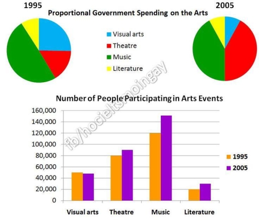
The pie charts illustrate proportional spending on the arts variation of people participating in arts events.

Overall, the music events were signficant in both years, also it dominance while other art events lost percentage of people. Despite the music, the theatre also make visual rose in the 2005, making the same size as in the music events in 2015.

The two declained arts events the literature and visual arts which were also dominance in 1995 but, in the 2005 a double declained for almost 1,000 people. However the 3 events significantly grown adding at least 1,000 people in each art.

But, there were the literature which was not rose in the end 2005 and, on the contrast they stay the same level between 1995 and 2005, while in that time the music achieved a peak in the data, having above 150,000 individuals.

Word Count: 142

Answers On The Same Topic:

proportional government spending on the arts number of people participating in arts events

The charts above illustrate information about percentage of art forms and number of participants in various arts events in two different years; 1995 and 2005. Overall, music was the most popular event type among all of them, in contrast events about literature was the least preferred one. The amount of money which was spent to […]

proportional government spending on the arts number of people participating in arts events

The pie charts compare the proportional government spending on the arts, while the bar chart illustretes the number of people participating in arts events during a decade (1995; 2005). Overall, the rate of theater increased significantly, while the percentages of visual arts and music decreased and literature stayed unchanged. In contrast, the number of theatre, […]

proportional government spending on the arts number of people participating in arts events

The pei charts give information about proportional government spending on the arts in different sectors: visual arts, theatre, music and literature from 1995 to 2005, while the bart chart comparies the figure of people participating arts events between 1995 and 2005. Ovarall, the share of spending money for theartre inclined significantly, although the quantity of […]

See All

Other Topics:

The Number of Foreign Tourists Visiting Country in 2007 and 2008

The bar chart compares the number of foreign tourists visiting XCountry in 2007 and 2008, while the table presents the annual income earned by different tourism businesses during those years. Overall, Australia remained the most popular destination in both years. Although the number of tourists decreased in some regions in 2008, several tourism businesses still […]

The charts show (illustrate, depict, delineate, indicate, present, represent) the time spent on two devices according to various categories.

The two pie charts depict the percentage of time spent on smartphones and tablets as per six different categories of software, ranging from games to social networking, utilities and several others. Overall, while both platforms are heavily used for entertainment via gaming, tablets are preferred for media consumption, whereas smartphones are favoured for social networking […]

Select and report main features of the pei charts .

The pie chart illustrates average percentages in normal meal c three types of nutrients namely sodium, saturated fats and added sugars in the USA, overeating of thes three nutrients may have severe health consequences. Overall, average percentages of both sodium and saturated fa intake are quite high in dinner while added sugar intake is high […]

The graph and pie chart below give information on in-house training courses in a large financial company. Summarise the information by selecting and reporting the main features, and make comparisons where relevant.

The bar graph provides details of office workers attitude to in-house training courses, while the pie chart shows the number of training hours per year in a large financial organisation. Overall, technical courses accounts for 30% of the time spent on training while health and safety represents the least time. Managers had a positive attitude […]

The charts below show the average percentages in typical meals of three types of nutrients all of which may be unhealthy if eaten too much

The pie graphs illustrate the mean proportions of three nutrients in common food intake, each of which can be harmful to health if consumed in excess. Overall, dinner is the primary source of both sodium and saturated fat intake for people, while snacks contribute the highest percentage of added sugar. In contrast, breakfast consistently accounts […]

The table and graph below show the number of international tourists and the income of tourism in four countries in East Asia from 2000 to 2014.

The table and graph illustrate the figure for incoming tourists visiting four different countries, namely Thailand, South Korea, Japan, and Singapore, and the revenue generated from tourism from 2000 to 2014. Overall, there was a dramatic shift in terms of the turnover from 2000 to 2014. In addition, Thailand emerged as the most dominate category […]

See All
We have detected unusual activity on your device.
Please verify your identity to continue.
Note: This verification step won't sign you in. If you have a premium account, please log in to access the service as usual.
Google/Gmail Verification
Or verify using Email/Code
We've sent a verification code to:
youremail@gmail.com (Not your email?)
Enter it below to complete the verification process.
Ensure your email address is correct, your inbox is not full, and you check your spam folder. If no email arrives, consider using an alternative email.
You will need a Premium plan to perform your action!
Note: If you already have a premium account, please log in to access our services as usual.

Plans & Pricing

Our mission is to make quality education accessible for everyone.
However, to keep our hardworking team running and this service alive, we genuinely need your support!
By opting for a premium plan, not only do you sustain us in achieving the mission, but you also unlock advanced features to enrich your learning experience.

Free

For learners who aren't pressed for time

What's included on Free
100+ Cambridge IELTS Tests
Instant IELTS Writing Task 1 & 2 Evaluation (2 times/month)
Instant IELTS Speaking Part 1, 2, & 3 Evaluation (5 times/month)
Instant IELTS Writing Task 1 & 2 Essay Generator (2 times/month)
500+ Dictation & Shadowing Exercises
100+ Pronunciation Exercises
Flashcards
Other Advanced Tools

Premium

For those serious about advancing their English proficiency, and for IELTS candidates aspiring to boost their band score by 1-2 points (especially in writing & speaking) in just 30 days or less

What's included on Premium
Save Your IELTS Test Progress
Unlock All Courses & IELTS Tests
Unlimited AI Conversations
Unlimited AI Writing Enhancement Exercises
Unlimited IELTS Writing Task 1 & 2 Evaluation
Unlimited IELTS Speaking Part 1, 2, & 3 Evaluation
Checked Answers Will Not Be Published
Unlimited IELTS Writing Task 1 & 2 Essay Generator
Unlimited IELTS Speaking Part 1, 2, & 3 Sample Generator
Unlimited Usage Of Advanced Tools
Priority Support within 24h (12-month plan only)

Due to the nature of our service and the provided free trials, payments are non-refundable.
Nếu bạn là người Việt Nam và không có hoặc không muốn trả bằng credit/debit cards, bạn có thể thanh toán bằng phương thức chuyển khoản:


Chọn gói:
419,000₫ 277,000 ₫ cho gói 1 tháng (chỉ 9,233₫/ngày)
1,239,000₫ 597,000 ₫ cho gói 3 tháng (chỉ 6,633₫/ngày)
2,469,000₫ 1,027,000 ₫ cho gói 6 tháng (chỉ 5,706₫/ngày)
4,929,000₫ 1,417,000 ₫ cho gói 12 tháng (chỉ 3,936₫/ngày)


Sau khi chuyển khoản, vui lòng đợi trình duyệt tự động điều hướng bạn trở lại Engnovate và bạn sẽ ngay lập tức nhận được mã kích hoạt tài khoản premium.
Nếu có lỗi xảy ra, bạn có thể liên hệ với team thông qua một trong các phương thức: email đến helloengnovate@gmail.com hoặc nhắn tin qua facebook.com/engnovate.
Vì toàn bộ công cụ trên website đều có thể sử dụng thử miễn phí, Engnovate không hỗ trợ hoàn tiền.