🔥 Today Only: Save 30% on Premium — Offer Ends Soon! - Upgrade Now!
Multiple Graphs

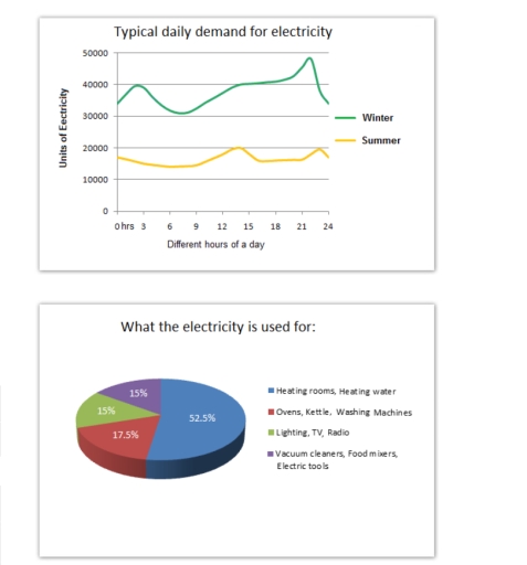
Band 5+: The graph below shows the demand for electricity in England during typical days in winter and summer. The pie chart shows how electricity is used in an average English home.

Image for topic: The graph below shows the demand for electricity in England during typical days in winter and summer. The pie chart shows how electricity is used in an average English home.
Our system will evaluate the answer based on this AI-generated description.
The image contains two separate data visualizations. The first is a graph titled "Typical daily demand for electricity" displaying units of electricity on the y-axis, from 0 to 50000 in increments of 10000, and different hours of a day on the x-axis from 0 to 24. It depicts two lines representing winter and summer electricity demand, with winter starting at about 40000 units at 0 hrs, dropping to just above 20000 units at 3 hrs, rising to approximately 45000 units at 9 hrs and slowly declining to 30000 units by 24 hrs; meanwhile, summer starts at just above 20000 units at 0 hrs, dips slightly below until 6 hrs, gradually increases to nearly 30000 units at 15 hrs and drops back to around 20000 units by 24 hrs. The second visualization is a pie chart titled "What the electricity is used for" indicating percentages for different uses: Heating rooms, Heating water 52.5%, Ovens, Kettle, Washing Machines 17.5%, Lighting, TV, Radio 15%, and Vacuum cleaners, food mixers, Electric tools 15%.
Given the complexity of the image, the above description may not be entirely accurate.
Note: Both the topic and the answer were created by one of our users.

The line chart demonstrates the electricity consumption in England regarding two seasons winter and summer. Meanwhile the pie graph illustrates what household activities using electricity in England.

Overall, there are an overwhelmed trend in the electricity usages of England citizen in winter season, whereas electricity is mostly used for heating room and heating water purposes.

It is obviously to witnesses that electricity usages in England during winter season generally as more as twice in comparison with the summer. In addition, there is a highest volume of demand for electricity in the evening (from 9:00 PM to 12:00 AM) in both winter and summer seasons, which the figure for those of reach a peak at nearly 50,000 units and 20,000 units respectively. In contrast, the demand for electricity in the morning is less than other period time of a day.

In terms of activities using electricity in an average household, heating is the majority purpose, which account for more than a half of total consumption. The percentage of using electricity for electronic devices for cooking make up for 17.5% while the proportion of consuming electricity for the two remaining categories experience the same amount of 15%.

Word Count: 195

Answers On The Same Topic:

The graph below shows the demand for electricity in England during typical days in winter and summer. The pie chart shows how electricity is used in an average English home.

The graph illustrates the variation in electricity demand between winter and summer in England at different times of the day, while the pie chart depicts how electricity is used in a typical English household. Overall, electricity demand is far higher in winter than in summer throughout the day, with the highest figure recorded late in […]

The graph below shows the demand for electricity in England during typical days in winter and summer. The pie chart shows how electricity is used in an average English home.

The line graph illustrates demand for electricity in England during usual days in winter and summer. On the other hand, the pie chart represents the proportion of electricity usage in an average English household. Overall, it is clear that there is a significant difference in electricity usage in winter and summer. It is also noticeable […]

The graph below shows the demand for electricity in England during typical days in winter and summer. The pie chart shows how electricity is used in an average English home.

The graph illustrates the demand for electricity in England on average winter and summer days. Meanwhile, the pie chart represents the purpose for which electricity is commonly used. Overall, it can be seen in the graph that the demand for electricity is high during the winters as compared to summers. Whereas, the pie chart shows […]

The graph below shows the demand for electricity in England during typical days in winter and summer. The pie chart shows how electricity is used in an average English home.

The trend of the demand for the electricity in England during a day in both summer and winter is compared in line graph whereas the proportion of electricity consumption is shown in the pie chart. Overall, it can be seen that people consumed electricity in winter more than in summer, in every single hour. Also, […]

The graph below shows the demand for electricity in England during typical days in winter and summer. The pie chart shows how electricity is used in an average English home.

The graph illustrates the demand for electricity in England during typical days in winter and summer. Also, a pie chart depicts the distribution of electricity in an average home in England. Overall, in graph, we can see the highest and lowest consumption of electricity from morning to evening during winter and summer. The pie chart […]

See All

Other Topics:

the graphs show information about visitors from France and North America for holiday and business purposes. Provide an overview of the information by indentifying and describing the key detail,a nd include comparisons where appropriate.

The given line graphs compare the number of French visitors and the North American visitors, travelling to the UK for business and holiday purposes. Overall, the number of people visiting the UK increased throughout the year, and most of them were North American. Additionally, travelling for holidays was more common. In terms of holiday purposes, […]

GDP from IT and service industry of the uk from year1992 to 2000

The bar chart illustrates the percentage contribution of the IT industry and the service industry to the Gross Domestic Product (GDP) of the United Kingdom between 1992 and 2000. Overall, both industries showed growth during the period, but the IT industry increased more rapidly and eventually overtook the service industry by the year 2000. In […]

The charts below show that UK graduate and postgraduate students who did not go into full-time work after leaving college in 2008. Summarize the information by selecting and reporting and the main features, and make comparisons where relevant

The bar charts illustrate the destination UK graduate and postgraduate students who did go into full-time work after graduating college in 2008. In general, further study was the dominant category in both UK graduates and postgraduates, while the reverse was true for voluntary work. Notably, they showed a similar patterns with the exception of part-time […]

GDP from IT and service industry of the uk from year1992 to 2000

The diagram illustrates the process of producing sugar from sugar cane. Overall, it is a linear, seven-stage process that begins with the cultivation of sugar cane and ends with the production of refined sugar crystals. The initial stages are agricultural, while the later stages involve industrial processing. The process starts with the growth of sugar […]

The table shows the average annual income of people working in different sectors in 2004 , and the change from 2003. The pie chart shows the distribution of graduates in the different sectors.

The given table compares the average salary in six different sectors ,in 2004, and the changes after a year. The pie chart shows the ratio of graduates who work at different proffesion sectors. Overall, people who worked at the public services had the highest income, while agriculture workers got the lowest salary. In addition, wholesale […]

Mixed graphs. Summarize the information by selecting key information and make comparison where relevant.

The provided visual data encompasses a pie chart and a table illustrating the demographic composition of Australia by nationality and the distribution of these nationalities between urban and rural locales. It is evident that Australians constitute the predominant nationality, while Dutch individuals represent the minimal segment. Additionally, a significant disparity exists in the residency of […]

See All
We have detected unusual activity on your device.
Please verify your identity to continue.
Note: This verification step won't sign you in. If you have a premium account, please log in to access the service as usual.
Google/Gmail Verification
Or verify using Email/Code
We've sent a verification code to:
youremail@gmail.com (Not your email?)
Enter it below to complete the verification process.
Ensure your email address is correct, your inbox is not full, and you check your spam folder. If no email arrives, consider using an alternative email.
You will need a Premium plan to perform your action!
Note: If you already have a premium account, please log in to access our services as usual.

Plans & Pricing

Our mission is to make quality education accessible for everyone.
However, to keep our hardworking team running and this service alive, we genuinely need your support!
By opting for a premium plan, not only do you sustain us in achieving the mission, but you also unlock advanced features to enrich your learning experience.

Free

For learners who aren't pressed for time

What's included on Free
100+ Cambridge IELTS Tests
Instant IELTS Writing Task 1 & 2 Evaluation (2 times/month)
Instant IELTS Speaking Part 1, 2, & 3 Evaluation (5 times/month)
Instant IELTS Writing Task 1 & 2 Essay Generator (2 times/month)
500+ Dictation & Shadowing Exercises
100+ Pronunciation Exercises
Flashcards
Other Advanced Tools

Premium

For those serious about advancing their English proficiency, and for IELTS candidates aspiring to boost their band score by 1-2 points (especially in writing & speaking) in just 30 days or less

What's included on Premium
Save Your IELTS Test Progress
Unlock All Courses & IELTS Tests
Unlimited AI Conversations
Unlimited AI Writing Enhancement Exercises
Unlimited IELTS Writing Task 1 & 2 Evaluation
Unlimited IELTS Speaking Part 1, 2, & 3 Evaluation
Checked Answers Will Not Be Published
Unlimited IELTS Writing Task 1 & 2 Essay Generator
Unlimited IELTS Speaking Part 1, 2, & 3 Sample Generator
Unlimited Usage Of Advanced Tools
Priority Support within 24h (12-month plan only)

Due to the nature of our service and the provided free trials, payments are non-refundable.
Nếu bạn là người Việt Nam và không có hoặc không muốn trả bằng credit/debit cards, bạn có thể thanh toán bằng phương thức chuyển khoản:


Chọn gói:
419,000₫ 277,000 ₫ cho gói 1 tháng (chỉ 9,233₫/ngày)
1,239,000₫ 597,000 ₫ cho gói 3 tháng (chỉ 6,633₫/ngày)
2,469,000₫ 1,027,000 ₫ cho gói 6 tháng (chỉ 5,706₫/ngày)
4,929,000₫ 1,417,000 ₫ cho gói 12 tháng (chỉ 3,936₫/ngày)


Sau khi chuyển khoản, vui lòng đợi trình duyệt tự động điều hướng bạn trở lại Engnovate và bạn sẽ ngay lập tức nhận được mã kích hoạt tài khoản premium.
Nếu có lỗi xảy ra, bạn có thể liên hệ với team thông qua một trong các phương thức: email đến helloengnovate@gmail.com hoặc nhắn tin qua facebook.com/engnovate.
Vì toàn bộ công cụ trên website đều có thể sử dụng thử miễn phí, Engnovate không hỗ trợ hoàn tiền.