Our system will evaluate the answer based on this AI-generated description.
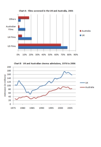
The image consists of two charts labeled Chart A and Chart B. Chart A, titled "Films screened in the UK and Australia, 2001," is a bar chart with percentage on the X-axis ranging from 0% to 90% and categories on the Y-axis labeled "US Films," "UK Films," "Australian Films," and "Others." Data points for Australia: US Films slightly above 80%, UK Films approximately 10%, Australian Films just below 10%, Others nearly 0%. Data points for the UK: US Films slightly under 70%, UK Films just above 20%, Australian Films around 5%, Others close to 5%. Chart B, titled "UK and Australian cinema admissions, 1976 to 2006," is a line graph with years on the X-axis ranging from 1975 to 2005 and "Admissions in millions" on the Y-axis from 0 to 200 in increments of 20. The UK line starts around 100 in 1975, dips to below 60 in the early '80s, rises to 120 in the early '90s, drops to 100 in the mid-90s, and then climbs steadily to just below 180 in 2006. The Australia line starts just above 20 in 1975, climbs to above 40 in the early '80s, hovers around 40 until the early '90s, then rises steadily to just above 80 in 2006.
Given the complexity of the image, the above description may not be entirely accurate.
Skyrocket your IELTS band score by 1-2 points in under a month with our premium plan!
Note: Both the topic and the answer were created by one of our users.
The bar chart illustrates the proportion of four kinds of films realeasd in UK and Australia in 2001, while the line charts shows the Audiences in millions in the same countries who took admission from 1976 to 2006.
To begin, overall UK dominates Australia in screening all types of films except other films. US films are released with a high proportion in the UK and Australia accordingly around 78 % and 68%. In the UK, less number of other films are screened with just 5% while Australia has Australian film with around 3 %.
The line chart gives information about the number of admissions to films in the UK and Australia. Overall, the UK has the highest numbers of adimissions compared to Australia in a given time period. The figure starts with around 100 millions admission in the UK at the start of the period. At that time Australia has approximately 30 millions admission. From 2000 to 2005, both countries reach their peak levels of intakes, Australia and UK reached accordingly 70 % and 170 % of addmissions respectively.
Word Count: 179