🔥 Today Only: Save 30% on Premium — Offer Ends Soon! - Upgrade Now!
Multiple Graphs

Band 5+: Choose one of the charts below and write a sample answer. Consider the following: How you can group the information What paragraphs you will use How you can describe the trends How you can outline the statistical details The accuracy of your sentenceselowa and write your answer.

Image for topic: Choose one of the charts below and write a sample answer. Consider the following: How you can group the information What paragraphs you will use How you can describe the trends How you can outline the statistical details The accuracy of your sentenceselowa and write your answer.
Our system will evaluate the answer based on this AI-generated description.
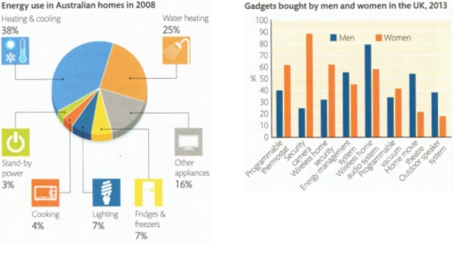
The image shows energy use in Australian homes in 2008 with heating & cooling at 38%, water heating at 25%, other appliances at 16%, lighting at 7%, fridges & freezers at 7%, cooking at 4%, and stand-by power at 3%; and gadgets bought by men and women in the UK in 2013 with programmable thermostats by men at approximately 38% and women at 15%, internet TV by men at about 50% and women at 17%, central heating controls by men at roughly 30% and women at 10%, online security cameras by men at about 62% and women at 18%, energy monitors by men at around 78% and women at 58%, wireless speakers by men at about 55% and women at 50%, people counters by men at roughly 20% and women at 10%, home cinema by men at 50% and women at around 16%, home movie projectors by men at approximately 62% and women at 21%, outdoor movie systems by men at about 85% and women at 65%, and streaming systems by men at about 58% and women at 57%.
Given the complexity of the image, the above description may not be entirely accurate.
Note: Both the topic and the answer were created by one of our users.

This pie chart illustrate the percentage of the energy which was spent on each purpose in Australian homes in 2008. There are seven categories of expences.

The largest spending of energy corresponds the heating and cooling which consisted over the 30 percent. Exactly quarter of power was spent on water heating, this fact made that category the second by consumptions of energy. Purposes required the least amount of energy were cooking and appliances standby mode. Three percent went on the first one and four on second.

It is interesting that compearing fridges and freezers and lighting shows that energy used on these purposes is the same and consists 7 percent which is even more than needed for cooking. Expences on other appliances consist over the 15 persent, which is less than power was consumed for water heating on almost 10 percent, moreover it is more than fridges and lighting were spending together.

Word Count: 152

Answers On The Same Topic:

Choose one of the charts below and write a sample answer. Consider the following: How you can group the information What paragraphs you will use How you can describe the trends How you can outline the statistical details The accuracy of your sentenceselowa and write your answer.

The pie chart shows the different sources for energy consumed by Australian citizens in 2008. Overall, what stands out is that heating and cooling is the biggest segment of utilized energy-based products, followed by water heating. As for the less energy-consuming parts of the house that year, one can see that there was lighting, fridges […]

Choose one of the charts below and write a sample answer. Consider the following: How you can group the information What paragraphs you will use How you can describe the trends How you can outline the statistical details The accuracy of your sentenceselowa and write your answer.

I have chosen a chart that provides information about energy use in Australia in 2008. The diagram shows that appliances designed for heating and cooling require more electricity than others, accounting for 38% of total energy usage. This higher demand is due to the complexity of these processes. Additionally, 25% of energy is used for […]

See All

Other Topics:

You should spend about 20 minutes on this task. The graph shows the amount earned by graduates of different age groups in 2002. It includes those with a degree, those with a higher degree (postgraduate) and those with other qualifications. Summarize the information by selecting and reporting the main features, and make comparisons where relevant. Wo le at least 150 words

The illustrated pie charts and table depict the diet and basic health state of two groups of students. Overall, while cereals and fish are equally included in the diet of both groups, the amount of food with a high fat content is differs from each other, as well as the proportion of vegetables. As for […]

The charts compare the daily time, in minutes, spent by uk men and women on household and leisure activities in 2008.

The diagrams compare how much time both gender spend on household and leisure activities in 2008. Overall, men spent more time on leisure activities, whereas women involved more time to household chores. Cooking and washing have the largest proportion of women’s household activities while repair were only task that men spent more in. In household […]

Graph charts show various activities in a US office in 1980 , 2000

The bar chart illustrate that the amount of time spent on different types of task in the US office between 1980 and 2000. Overall, it is evident that, the maximum time spent on phone. There was least time spent on meeting over the periods. The amount of time was 30% phone in 1980, which decreased […]

The table and chart give information about the number of patients

The table and charts show information about the doctors between 1986 and 2006 in Australia. Overall, number of doctors in Australia showed upward trend, starting from 1986 to 2006.Although male doctors remained the dominant majority group, female doctors’ proportion increased steadily. Additionally, in 1986 and 1996 Australian-born trend was preeminent. However, in the final year […]

The charts below show Australian dollars in Australia's trade in 3 nations from 2004 to 2009

The charts illustrate the information about Australian dollars in Australian trade in three countries (China, India, and the USA). The statistics are given in billion dollars and cover the periods between 2004 and 2009. Overall, throughout the span, the import rates of Australia’s dollar trade in three nations rose. However, when it comes to export […]

The given charts give information about the number of students at university in the UK from 1991 to 2001, government spending and the types of family economic background they came from in 1991.

The given pie chart shows the percentage of students who came from 3 types of family economic background in 1991, while the bar chart illustrates the sum of students at university in the UK between 1991 and 2001. The last chart show the goverment spending on each student from 1991 to 2001. Overall, it can […]

See All
We have detected unusual activity on your device.
Please verify your identity to continue.
Note: This verification step won't sign you in. If you have a premium account, please log in to access the service as usual.
Google/Gmail Verification
Or verify using Email/Code
We've sent a verification code to:
youremail@gmail.com (Not your email?)
Enter it below to complete the verification process.
Ensure your email address is correct, your inbox is not full, and you check your spam folder. If no email arrives, consider using an alternative email.
You will need a Premium plan to perform your action!
Note: If you already have a premium account, please log in to access our services as usual.

Plans & Pricing

Our mission is to make quality education accessible for everyone.
However, to keep our hardworking team running and this service alive, we genuinely need your support!
By opting for a premium plan, not only do you sustain us in achieving the mission, but you also unlock advanced features to enrich your learning experience.

Free

For learners who aren't pressed for time

What's included on Free
100+ Cambridge IELTS Tests
Instant IELTS Writing Task 1 & 2 Evaluation (2 times/month)
Instant IELTS Speaking Part 1, 2, & 3 Evaluation (5 times/month)
Instant IELTS Writing Task 1 & 2 Essay Generator (2 times/month)
500+ Dictation & Shadowing Exercises
100+ Pronunciation Exercises
Flashcards
Other Advanced Tools

Premium

For those serious about advancing their English proficiency, and for IELTS candidates aspiring to boost their band score by 1-2 points (especially in writing & speaking) in just 30 days or less

What's included on Premium
Save Your IELTS Test Progress
Unlock All Courses & IELTS Tests
Unlimited AI Conversations
Unlimited AI Writing Enhancement Exercises
Unlimited IELTS Writing Task 1 & 2 Evaluation
Unlimited IELTS Speaking Part 1, 2, & 3 Evaluation
Checked Answers Will Not Be Published
Unlimited IELTS Writing Task 1 & 2 Essay Generator
Unlimited IELTS Speaking Part 1, 2, & 3 Sample Generator
Unlimited Usage Of Advanced Tools
Priority Support within 24h (12-month plan only)

Due to the nature of our service and the provided free trials, payments are non-refundable.
Nếu bạn là người Việt Nam và không có hoặc không muốn trả bằng credit/debit cards, bạn có thể thanh toán bằng phương thức chuyển khoản:


Chọn gói:
419,000₫ 277,000 ₫ cho gói 1 tháng (chỉ 9,233₫/ngày)
1,239,000₫ 597,000 ₫ cho gói 3 tháng (chỉ 6,633₫/ngày)
2,469,000₫ 1,027,000 ₫ cho gói 6 tháng (chỉ 5,706₫/ngày)
4,929,000₫ 1,417,000 ₫ cho gói 12 tháng (chỉ 3,936₫/ngày)


Sau khi chuyển khoản, vui lòng đợi trình duyệt tự động điều hướng bạn trở lại Engnovate và bạn sẽ ngay lập tức nhận được mã kích hoạt tài khoản premium.
Nếu có lỗi xảy ra, bạn có thể liên hệ với team thông qua một trong các phương thức: email đến helloengnovate@gmail.com hoặc nhắn tin qua facebook.com/engnovate.
Vì toàn bộ công cụ trên website đều có thể sử dụng thử miễn phí, Engnovate không hỗ trợ hoàn tiền.