🔥 Today Only: Save 30% on Premium — Offer Ends Soon! - Upgrade Now!
Multiple Graphs

Band 8+: Choose one of the charts below and write a sample answer. Consider the following: How you can group the information What paragraphs you will use How you can describe the trends How you can outline the statistical details The accuracy of your sentenceselowa and write your answer.

Image for topic: Choose one of the charts below and write a sample answer. Consider the following: How you can group the information What paragraphs you will use How you can describe the trends How you can outline the statistical details The accuracy of your sentenceselowa and write your answer.
Our system will evaluate the answer based on this AI-generated description.
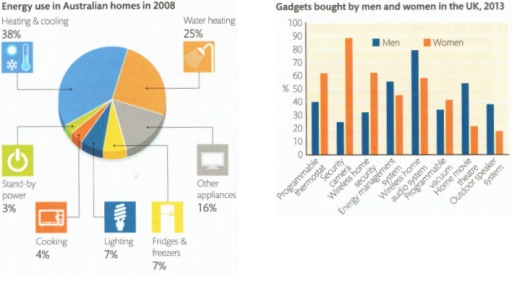
The image shows energy use in Australian homes in 2008 with heating & cooling at 38%, water heating at 25%, other appliances at 16%, lighting at 7%, fridges & freezers at 7%, cooking at 4%, and stand-by power at 3%; and gadgets bought by men and women in the UK in 2013 with programmable thermostats by men at approximately 38% and women at 15%, internet TV by men at about 50% and women at 17%, central heating controls by men at roughly 30% and women at 10%, online security cameras by men at about 62% and women at 18%, energy monitors by men at around 78% and women at 58%, wireless speakers by men at about 55% and women at 50%, people counters by men at roughly 20% and women at 10%, home cinema by men at 50% and women at around 16%, home movie projectors by men at approximately 62% and women at 21%, outdoor movie systems by men at about 85% and women at 65%, and streaming systems by men at about 58% and women at 57%.
Given the complexity of the image, the above description may not be entirely accurate.
Note: Both the topic and the answer were created by one of our users.

I have chosen a chart that provides information about energy use in Australia in 2008. The diagram shows that appliances designed for heating and cooling require more electricity than others, accounting for 38% of total energy usage. This higher demand is due to the complexity of these processes.

Additionally, 25% of energy is used for water heating. This significant percentage is also attributed to the complexities associated with the heating process, as well as the large volume of water that needs to be heated.

Other gadgets, such as PCs and TVs, consume 16% of energy, reflecting their widespread use among Australians. Refrigerators and lighting each account for 7% of energy consumption, indicating that Australia utilizes optimized technologies that help to reduce energy waste.

Lastly, cooking appliances and standby power account for 4% and 3% of electricity usage, respectively.

Word Count: 138

Answers On The Same Topic:

Choose one of the charts below and write a sample answer. Consider the following: How you can group the information What paragraphs you will use How you can describe the trends How you can outline the statistical details The accuracy of your sentenceselowa and write your answer.

The pie chart shows the different sources for energy consumed by Australian citizens in 2008. Overall, what stands out is that heating and cooling is the biggest segment of utilized energy-based products, followed by water heating. As for the less energy-consuming parts of the house that year, one can see that there was lighting, fridges […]

Choose one of the charts below and write a sample answer. Consider the following: How you can group the information What paragraphs you will use How you can describe the trends How you can outline the statistical details The accuracy of your sentenceselowa and write your answer.

This pie chart illustrate the percentage of the energy which was spent on each purpose in Australian homes in 2008. There are seven categories of expences. The largest spending of energy corresponds the heating and cooling which consisted over the 30 percent. Exactly quarter of power was spent on water heating, this fact made that […]

See All

Other Topics:

The two graphs show the main sources of energy in the USA in the 1980s and the 1990s. Write a report for a university lecturer describing the changes which occurred. Write at least 150 words.

The two pie charts illustrate the proportion of energy produced by five main sources in the years 1980 and 1990. Overall, in the given time frame, oil accounted for the lion’s share of energy production even though it experienced a decrease. Coal as well as nuclear power showed growth in energy production and its reverse […]

These pie charts describe the percentage of polluted ocean area in 1997 and 2007. The parts are measured in percents.

Both pie charts demonstrate the amount of wasted in several parts of sea by 1997 and 2007. Overall, pollutants from air is the highest while litter has declined to o%. By 1997, the most significantly polluted were from air which is shows by 30%, and continued to the second highest is marine that is 22%, […]

The table gives information on the location and types of dance young people in a town in Australia are currently attending. Summarise the information by selecting and reporting the main features, and make comparisons where relevant.

The given pie chart represent information about location of dance classes in one area of Austrialia and bar graph shows interest of dance classes by young generation. Overall, it can be depicts that privates studios have more attendance in dance class and ballet dance is popular among children (Under 11 )whereas modern dance have more […]

percentage of full workers holding a university degree and average salary of graduates

The line graph compares the percentage of all university students and Math majors who secured full-time employment after graduation in Australia over an eight-year period from 2004 to 2012. The table, meanwhile, shows the annual incomes of these two groups during the same period. Overall, it is clear that the proportion of both Math graduates […]

The chart and table below show the average number of children born to one woman and the average age of women when they had their first child in two countries between 1920 and 2019

The line graph and table provide information about the average number of children born to a woman and the age of women who had their first child in UK and Kazakhstan from 1920 to 2019. Overall, there was a significant number of births to a woman in Kazakhstan initially and it declined at the end […]

The charts below show the average temperatures in 12months in three cities and how many hours of sunshinethese cities have in a year.Summarise the information byselecting and reporting the main features, and makecomparisons where relevant.

The charts give information about typical temperatures in a year in three big cities: London, New York and Sydney, while the table shows the total hours of sunshine per year in the same cities given. Overall, the average temperatures in London and New York increased substantially starting from January to Jun, it continued to rise […]

See All
We have detected unusual activity on your device.
Please verify your identity to continue.
Note: This verification step won't sign you in. If you have a premium account, please log in to access the service as usual.
Google/Gmail Verification
Or verify using Email/Code
We've sent a verification code to:
youremail@gmail.com (Not your email?)
Enter it below to complete the verification process.
Ensure your email address is correct, your inbox is not full, and you check your spam folder. If no email arrives, consider using an alternative email.
You will need a Premium plan to perform your action!
Note: If you already have a premium account, please log in to access our services as usual.

Plans & Pricing

Our mission is to make quality education accessible for everyone.
However, to keep our hardworking team running and this service alive, we genuinely need your support!
By opting for a premium plan, not only do you sustain us in achieving the mission, but you also unlock advanced features to enrich your learning experience.

Free

For learners who aren't pressed for time

What's included on Free
100+ Cambridge IELTS Tests
Instant IELTS Writing Task 1 & 2 Evaluation (2 times/month)
Instant IELTS Speaking Part 1, 2, & 3 Evaluation (2 times/month)
Instant IELTS Writing Task 1 & 2 Essay Generator (2 times/month)
500+ Dictation & Shadowing Exercises
100+ Pronunciation Exercises
Flashcards
Other Advanced Tools

Premium

For those serious about advancing their English proficiency, and for IELTS candidates aspiring to boost their band score by 1-2 points (especially in writing & speaking) in just 30 days or less

What's included on Premium
Save Your IELTS Test Progress & Analyze Mistakes By Question Type
Save Your Own Flashcard Sets & Use Them On Any Device
Unlock All Courses, IELTS Tests, Section & Part Practice
Unlimited AI Conversations
Unlimited AI Writing Enhancement Exercises
Unlimited IELTS Writing Task 1 & 2 Evaluation
Unlimited IELTS Speaking Part 1, 2, & 3 Evaluation
Checked Answers Will Not Be Published
Unlimited IELTS Writing Task 1 & 2 Essay Generator
Unlimited IELTS Speaking Part 1, 2, & 3 Sample Generator
Unlimited Usage Of Advanced Tools & AI Features
Priority Support within 24h (12-month plan only)

Due to the nature of our service and the provided free trials, payments are non-refundable.