24 Hours Only: Get 39% OFF on Our Premium Plan - Check Out Now!
Bar Chart

Band 5+: The Bar Chart below gives information about the percentage of the population living in urban areas in the whole world and in different parts of the world.

Image for topic: The Bar Chart below gives information about the percentage of the population living in urban areas in the whole world and in different parts of the world.
Our system will evaluate the answer based on this AI-generated description.
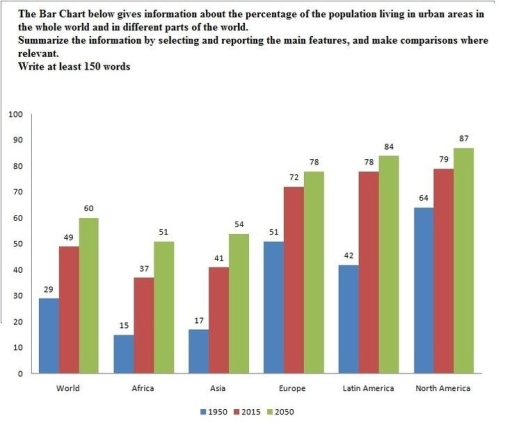
The image presents a bar chart showing the percentages of populations living in urban areas across different world regions and global averages in the years 1950, 2015, and projected for 2050. The percentages for each respective year and region are as follows: World (1950 - 29%, 2015 - 49%, 2050 - 60%), Africa (1950 - 15%, 2015 - 37%, 2050 - 51%), Asia (1950 - 17%, 2015 - 41%, 2050 - 54%), Europe (1950 - 51%, 2015 - 72%, 2050 - 78%), Latin America (1950 - 42%, 2015 - 64%, 2050 - 79%), and North America (1950 - 64%, 2015 - 79%, 2050 - 87%). The chart displays substantial growth in all regions, with Europe and North America starting at higher urbanization levels in 1950 and still showing significant projected increases by 2050. Meanwhile, regions with initially lower percentages like Africa and Asia display dramatic rises over the century, reflecting accelerated urbanization trends.
Given the complexity of the image, the above description may not be entirely accurate.
Note: Both the topic and the answer were created by one of our users.

The bar chart below depicts trends in urbanization composition worldwide and in some regions across the globe in the year of 1950,2015 and 2050.Overall, the mankind’s rate of living in urban cities was the highest in the last provided year for all 5 continents ,which are North and South America , Europe, Asia and Africa.

Firstly, The most gigantic proportion of urbanized areas were in North and Latin America as well as I. Europe, accounting for 64%,42% and 51% in 1950. Following by Asia and Africa, making up 17% and 15% as the deepest points of all the time ,while in the whole world,the average amount of people living in urban regions was 29% in 1950.

Secondly, All 5 mainlands oscillated from around 40% for Africa as well as Asia to more than 70% for three dominating continents in the year of 2015.Nonetheless , just under a half was composed globally in that same year

Finally, Europe , Northern and Southern part of America reached its peak of 78%, 84% and 87% ,while two last continents made up just over a half in 2050. After all, the expenditure of urban cities to 60% was represented in the whole world in 2050.

Word Count: 201

Answers On The Same Topic:

The Bar Chart below gives information about the percentage of the population living in urban areas in the whole world and in different parts of the world.

The bar chart illustrates information about the percentages of the population living in the urban areas in the whole world and in diverse parts of the planet in different years. Overall, it can be seen that in the past it was included little population living in the whole world, while in the future this trend […]

The Bar Chart below gives information about the percentage of the population living in urban areas in the whole world and in different parts of the world.

The bar chart presents the percentage of the population living in cities worldwide and in different countries of the world in three different years: 1950, 2025, and 2025. Overall, while the urban population has risen across all regions and is projected to increase further, particularly in North America, Latin America, and Europe, which represent the […]

The Bar Chart below gives information about the percentage of the population living in urban areas in the whole world and in different parts of the world.

The bar chart compares the proportion of people who lived in cities worldwide and in five different continents (Africa, Asia, Europe, Latin America, and North America) in 1950, 2015, and with a projection for 2050. Overall, most individuals lived in urban areas in North America. However, the urban population of Africa was the lowest, and […]

The Bar Chart below gives information about the percentage of the population living in urban areas in the whole world and in different parts of the world.

The presented bar chart provides the data about the number of the urban population in different parts of the world. The comparisons are made in percentages and reveal the information about 1950 and 2015 years. Moreover, there is an assumption about the approximate number of city residents in 2050. It can be observed that only […]

The Bar Chart below gives information about the percentage of the population living in urban areas in the whole world and in different parts of the world.

The bar chart compares the proportions of people who live in urban areas in the whole world and different parts of it. Overall, it is evident that the number of people preferring to live in urban areas showed an upward trend in the all areas of the world. In-depth analysis reveals that 64% of population […]

See All

Other Topics:

The chart below shows the spending by 18-20 year olds in one year country on five different products in 2010 and 2014.

The bar chart illustrates the amount of expenses on five different items by 18-20 year old in year 2010 and 2014. the unit is measured in millions dollar. Overall, spending on food was highest in both year, while books were lowest during that time. People aged 18-20 allocated most money on food, at 3600 millions […]

The chart below gives information about the ratio of income to spending (in dollars) I by Americans by age range in 2013

The chart illustrates the amount of money American people earned and spent in 2013 by age range. Overall, the information corresponds that Americans over 25 and under 75 tend to earn more than spend. While the chart shows that the expenses of the youth of the USA are slightly higher than their incomes. There is […]

The graph shows the percentage of people who recycle their rubbish, in five countries, over 12 years. Summarise the information by selecting and reporting the main features, and make comparisons where relevant. Write at least 150 words.

The line graph illustrates the proportion of people who recycle their rubbish, in five countries, in 1992 and 2004. Overall, it the graph the highest percentage shows UK, while the lowest percentage demonstrates the Germany over the period. To begin with, in 1992 the UK on compares with 2004, shows the less percent, which stood […]

The chart shows number of UK tourist visiting two countries from 2010 and 2013

The supplied bar graph exhibits the figures of UK travellers visiting Thailand and Greece from the period 2010 to 2013. Overall, it is clear that Thailand recorded the highest number of UK tourists throughout the year exccept 2011 where people visited Greece more than Thailand. While Greece observed the lowest figure of UK travellers throughout […]

Task 1: The chart below shows the number of households in the US by their annual income in 2007, 2011 and 2015. Summarize the information by selecting and reporting the main features and make comparisons where relevant. Write at least 150 words.

The bar chart represents the annual income of families in the US in 2007,2011 and 2015.Overall two main tendencies can be observed. Firstly, low-income and wealthy families were predominant with mixed success during the period, and secondly, middle-income residential units were notably smaller than those above. In 2007 rich families were dominant with 30 million […]

The chart below shows information about the favourite subjects of 60 students from two schools, School A and School B. Summarise the information by selecting and reporting the main features, and make comparisons where relevant.

The line graph illustrates the data including subjects that are adorable and interested in such as social science,science, language, craft or drawing and sport among 60 students between school A and school B. Overall,according to survey sport section grew dramatically in school A,while drawing experinced the average level in school B.However school B showed the […]

See All
We have detected unusual activity on your device.
Please verify your identity to continue.
Note: This verification step won't sign you in. If you have a premium account, please log in to access the service as usual.
Google/Gmail Verification
Or verify using Email/Code
We've sent a verification code to:
youremail@gmail.com (Not your email?)
Enter it below to complete the verification process.
Ensure your email address is correct, your inbox is not full, and you check your spam folder. If no email arrives, consider using an alternative email.
You will need a Premium plan to perform your action!
Note: If you already have a premium account, please log in to access our services as usual.

Plans & Pricing

Our mission is to make quality education accessible and free for everyone.
However, to keep our hardworking team running and this service alive, we genuinely need your support!
By opting for a premium plan, not only do you sustain us in achieving the mission, but you also unlock advanced features to enrich your learning experience.

Free

For learners who aren't pressed for time

What's included on Free
1000+ IELTS Tests & Samples
Instant IELTS Writing Task 1 & 2 Evaluation (2 times/month)
Instant IELTS Speaking Part 1, 2, & 3 Evaluation (5 times/month)
Instant IELTS Writing Task 1 & 2 Essay Generator (2 times/month)
500+ Dictation & Shadowing Exercises
100+ Pronunciation Exercises
Flashcards
Other Advanced Tools

Premium

For those serious about advancing their English proficiency, and for IELTS candidates aspiring to boost their band score by 1-2 points (especially in writing & speaking) in just 30 days or less

What's included on Premium
Save Your IELTS Test Progress
Unlock All Courses & Content
Unlimited AI Conversations
Unlimited AI Writing Enhancement Exercises
Unlimited IELTS Writing Task 1 & 2 Evaluation
Unlimited IELTS Speaking Part 1, 2, & 3 Evaluation
Checked Answers Will Not Be Published
Unlimited IELTS Writing Task 1 & 2 Essay Generator
Unlimited IELTS Speaking Part 1, 2, & 3 Sample Generator
Unlimited Usage Of Advanced Tools

Due to the nature of our service and the provided free trials, payments are non-refundable.
Nếu bạn là người Việt Nam và không có hoặc không muốn trả bằng credit/debit cards, bạn có thể thanh toán bằng phương thức chuyển khoản:


Chọn gói:
279,000₫ 157,000 ₫ cho gói 1 tháng (chỉ 5,233₫/ngày)
819,000₫ 397,000 ₫ cho gói 3 tháng (chỉ 4,411₫/ngày)
1,649,000₫ 667,000 ₫ cho gói 6 tháng (chỉ 3,706₫/ngày)
3,299,000₫ 857,000 ₫ cho gói 12 tháng (chỉ 2,381₫/ngày)


Sau khi chuyển khoản, vui lòng đợi trình duyệt tự động điều hướng bạn trở lại Engnovate và bạn sẽ ngay lập tức nhận được mã kích hoạt tài khoản premium.
Nếu có lỗi xảy ra, bạn có thể liên hệ với team thông qua một trong các phương thức: email đến helloengnovate@gmail.com hoặc nhắn tin qua facebook.com/engnovate.
Vì toàn bộ công cụ trên website đều có thể sử dụng thử miễn phí, Engnovate không hỗ trợ hoàn tiền.