🔥 Today Only: Save 30% on Premium — Offer Ends Soon! - Upgrade Now!
Bar Chart

Band 5+: The chart below gives information about how families in one country spent their weekly income in 1968 and 2018. Summarize the information by selecting and reporting the main features, and make comparisons wherever relevant. 1968 and 2018: average weekly spending by families

Image for topic: The chart below gives information about how families in one country spent their weekly income in 1968 and 2018. Summarize the information by selecting and reporting the main features, and make comparisons wherever relevant. 1968 and 2018: average weekly spending by families
Our system will evaluate the answer based on this AI-generated description.
The image presents a bar chart comparing average weekly spending by families in percentages of weekly income on different categories for the years 1968 and 2018. In 1968, the expenditure percentages for various categories are as follows: Food (approximately 23%), Housing (roughly 7%), Fuel and power (close to 5%), Clothing and footwear (about 8%), Household goods (nearly 4%), Personal goods (around 2%), Transport (just over 5%), and Leisure (slightly more than 2%). For the year 2018, the spending percentages for the same categories are: Food (approximately 8%), Housing (about 30%), Fuel and power (close to 2%), Clothing and footwear (around 3%), Household goods (nearly 3%), Personal goods (approximately 3%), Transport (about 15%), and Leisure (roughly 10%). The chart illustrates a significant decrease in the percentage of income spent on food, fuel, and power from 1968 to 2018, with an increase in spending on housing, transport, and leisure in the same period.
Given the complexity of the image, the above description may not be entirely accurate.
Note: Both the topic and the answer were created by one of our users.

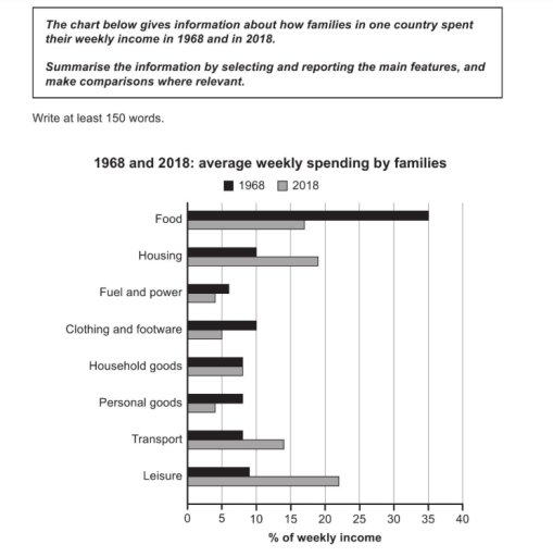
The given chart illustrates details related to the typical weekly spendings of families in particular territory between 1968 and 2018. Unit meassurements in weekly spendings by famiies.

Overall, the first thing that notable is that the large proportion of the expense came from nutrients, it had been roughly 35 % in 1968. However, the food spendings in 2018 was being approximately 16 %. Accomodation and holidays have been spending significantly around 20 % in 2018, while in 1968 it had lowest spent on it about 10 %. Transportation had slighest differences in two years just under 6 % in 1968. Moreover, just over 14 % in 2018.

Technics and energy with individual property share the same amount of outgoings in each periods. Although, stuffs that uses in houses didn’t make major changes on it, still being nearly 6 % in each year. Cloths and shoemakings had 5 % gap between it, just 10 % in 1968 and about 5 % in 2018.

Word Count: 162

Answers On The Same Topic:

The chart below gives information about how families in one country spent their weekly income in 1968 and 2018. Summarize the information by selecting and reporting the main features, and make comparisons wherever relevant. 1968 and 2018: average weekly spending by families

The bar chart illustrate how families in one nation spent their weekly income in the years 1968 and 2018. The units are measured in percentages. Overall, in 1968 the highest expenditure of families was on Food accounted for 35 percent and in 2018 families spent around 6 per cent on Fuel and Power. However, in […]

The chart below gives information about how families in one country spent their weekly income in 1968 and 2018. Summarize the information by selecting and reporting the main features, and make comparisons wherever relevant. 1968 and 2018: average weekly spending by families

The bar chart ilustrates the information about how families in one country spent their weekly income between 1968 and 2018. Overall, in 1968, food was the type that accounted for the most percentage average weekly spending by families at all, while in 2018, leisure had the largest percen. Moreover, whereas food, fuel and power, clothing […]

The chart below gives information about how families in one country spent their weekly income in 1968 and 2018. Summarize the information by selecting and reporting the main features, and make comparisons wherever relevant. 1968 and 2018: average weekly spending by families

The given bar graph indicates the average weekly spending of families in one country, in percentages of weekly income, on different categories for the years 1968 and 2018. Overall, it is evident that while food consumption dominated in the earlier year, later periods witnessed an increased focus on leisure activities and housing. In 1968, families […]

The chart below gives information about how families in one country spent their weekly income in 1968 and 2018. Summarize the information by selecting and reporting the main features, and make comparisons wherever relevant. 1968 and 2018: average weekly spending by families

The bar chart compares the percentage of weekly income that families spent on various categories in 1968 and 2018. Overall, families spent a higher proportion of their income on housing, transport, and leisure in 2018 than in 1968, while spending on food, clothing, fuel and power, and personal goods declined. The proportion spent on household […]

The chart below gives information about how families in one country spent their weekly income in 1968 and 2018. Summarize the information by selecting and reporting the main features, and make comparisons wherever relevant. 1968 and 2018: average weekly spending by families

The given bar chart compares how the average household in one particular nation spent their weekly income in 1968 and 2018. Overall, it can be seen that the families used more their income on food in 1968 while housing and leisure had overtaken food as the largest areas of expenditure in 2018. Although, all sources […]

See All

Other Topics:

the chart below shows the aid from six developed countries to developing countries from 2008 - 2010.

The bar chart compares the differences foreign aid from six developed countries from 2008 to 2010. The chart shows how much money this developed countries donated to foreign aid. At all, all countries developed their aid slightly throughout the year, although some fluctuations can be seen. USA giving the highest amount of funding. While Sweden […]

the bar chart shows the number of cars per 1000 people in 5 European countries in 3 years and compares with the European average.

The chart illustrates the number of car owners per 1,000 people in five European countries in 2005, 2009 and 2015, compared with the European average. Overall, Countries 1 and 2 had lower levels of car ownership than the European average throughout the period, whereas the remaining countries recorded higher figures. In addition, Country 5 consistently […]

the bar chart shows the number of cars per 1000 people in 5 European countries in 3 years and compares with the European average.

The data gives information about the figure of car owners per 1000 people in European nations in 3 several years: 2005,2009 and 2015 and compares with European avarage. Overall, while the number of cars per 1000 people showed smaller numbers in Country 1 and Country 2 where are compared with avarage, the reverse was true […]

The charts below show the percentages of male and female students getting top grades in 1960 and 2000. Summarise the information by selecting and reporting the main features and make comparisons where relevant.

The below chart presents information about the proportion of famele and male students getting top grades of various subjects over the period from 1960 and 2000. Overall, humanities showed the largest percentage for male while, art peresent the lowest proportion. Moreover, languages illustrated the higher proportion for famele. However, science had the lowest proportion. First […]

The chart below shows the percentage of different types of household waste that were recycled in one city between 1992 and 2002

The line chart provides information regarding the proportions of four distinct types of recycled household waste in a particular city from 1992 to 2002. Overall, it is evident that with the exception of plastic, the other three types: paper, glass, and cans were recorded at nearly similar figures initially. However, glass was the most prevalent […]

The chart below shows the percentages of different types of household waste that were recycled in one city between 1992 and 2002. Summarise the information by selecting and reporting the main features, and make comparisons where relevant.

The line chart provides information regarding the proportions of four distinct recycled household waste in a particular city from 1992 to 2002. Overall, it is evident that with the exception of plastic, the other three types: paper, glass, and cans, were recorded at nearly similar figures initially. However, glass was the most prevalent type of […]

See All
We have detected unusual activity on your device.
Please verify your identity to continue.
Note: This verification step won't sign you in. If you have a premium account, please log in to access the service as usual.
Google/Gmail Verification
Or verify using Email/Code
We've sent a verification code to:
youremail@gmail.com (Not your email?)
Enter it below to complete the verification process.
Ensure your email address is correct, your inbox is not full, and you check your spam folder. If no email arrives, consider using an alternative email.
You will need a Premium plan to perform your action!
Note: If you already have a premium account, please log in to access our services as usual.

Plans & Pricing

Our mission is to make quality education accessible for everyone.
However, to keep our hardworking team running and this service alive, we genuinely need your support!
By opting for a premium plan, not only do you sustain us in achieving the mission, but you also unlock advanced features to enrich your learning experience.

Free

For learners who aren't pressed for time

What's included on Free
100+ Cambridge IELTS Tests
Instant IELTS Writing Task 1 & 2 Evaluation (2 times/month)
Instant IELTS Speaking Part 1, 2, & 3 Evaluation (5 times/month)
Instant IELTS Writing Task 1 & 2 Essay Generator (2 times/month)
500+ Dictation & Shadowing Exercises
100+ Pronunciation Exercises
Flashcards
Other Advanced Tools

Premium

For those serious about advancing their English proficiency, and for IELTS candidates aspiring to boost their band score by 1-2 points (especially in writing & speaking) in just 30 days or less

What's included on Premium
Save Your IELTS Test Progress
Unlock All Courses & IELTS Tests
Unlimited AI Conversations
Unlimited AI Writing Enhancement Exercises
Unlimited IELTS Writing Task 1 & 2 Evaluation
Unlimited IELTS Speaking Part 1, 2, & 3 Evaluation
Checked Answers Will Not Be Published
Unlimited IELTS Writing Task 1 & 2 Essay Generator
Unlimited IELTS Speaking Part 1, 2, & 3 Sample Generator
Unlimited Usage Of Advanced Tools
Priority Support within 24h (12-month plan only)

Due to the nature of our service and the provided free trials, payments are non-refundable.
Nếu bạn là người Việt Nam và không có hoặc không muốn trả bằng credit/debit cards, bạn có thể thanh toán bằng phương thức chuyển khoản:


Chọn gói:
419,000₫ 277,000 ₫ cho gói 1 tháng (chỉ 9,233₫/ngày)
1,239,000₫ 597,000 ₫ cho gói 3 tháng (chỉ 6,633₫/ngày)
2,469,000₫ 1,027,000 ₫ cho gói 6 tháng (chỉ 5,706₫/ngày)
4,929,000₫ 1,417,000 ₫ cho gói 12 tháng (chỉ 3,936₫/ngày)


Sau khi chuyển khoản, vui lòng đợi trình duyệt tự động điều hướng bạn trở lại Engnovate và bạn sẽ ngay lập tức nhận được mã kích hoạt tài khoản premium.
Nếu có lỗi xảy ra, bạn có thể liên hệ với team thông qua một trong các phương thức: email đến helloengnovate@gmail.com hoặc nhắn tin qua facebook.com/engnovate.
Vì toàn bộ công cụ trên website đều có thể sử dụng thử miễn phí, Engnovate không hỗ trợ hoàn tiền.