🔥 Today Only: Save 30% on Premium — Offer Ends Soon! - Upgrade Now!
Bar Chart

Band 6+: The chart below shows the amount of money in billions of dollars spent on international tourism by people from seven different countries in 2011 and 2012.

Image for topic: The chart below shows the amount of money in billions of dollars spent on international tourism by people from seven different countries in 2011 and 2012.
Our system will evaluate the answer based on this AI-generated description.
The image presents a bar graph showing spending on international tourism in billion dollars for seven countries in 2011 and 2012. The vertical axis, labeled as spending in billion dollars, has increments of 20 from 0 to 120, while the horizontal axis lists the countries. For China, the spending depicted for 2011 is about 73 billion dollars, while for 2012 it is around 100 billion dollars. Germany's spending for 2011 is approximately 84 billion dollars and for 2012 about 83 billion dollars. The United States' spending in 2011 is roughly 79 billion dollars, and in 2012 it is close to 83 billion dollars. The United Kingdom's spending in 2011 is around 51 billion dollars and in 2012 approximately 52 billion dollars. The Russian Federation shows a spending of about 43 billion dollars in 2011 and nearly 50 billion dollars in 2012. France's spending in 2011 is close to 38 billion dollars while in 2012 it is approximately 37 billion dollars. Finally, Canada's spending is depicted at around 24 billion dollars for both 2011 and 2012.
Given the complexity of the image, the above description may not be entirely accurate.
Note: Both the topic and the answer were created by one of our users.

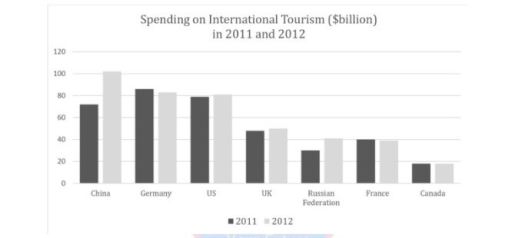
The given bar chart illustrates spending on international tourism in billions of dollars for seven different countries between 2011 and 2012

Overall, it can be seen that China, Germany, and the US were the top spenders on tourism compared to the four other nations in the chart. In addition, while China, the US, and Russian Federation experienced an upward trend, the rest of countries declined or remained unchanged.

In 2011, Germany was the country that was the highest spending on international travel, which was above $80 billion. This was followed by the US and Chine, with respective figures being $79 billion and approximately $70 billion. Moreover, in 2012, both China and the US increased to around $100 billion (a change considerately) and $75 billion respectively. However, the money that Germany spent slightly fell which by $1 billion.

The money spent by Canada on travel was the lowest compared to other countries, and the figure remained stable during the period, which nearly $20 billion from 2011 to 2012. Starting with nearly $50 billion and $30 billion, the UK and Russian Federation witnessed a growth to $1 billion and $8 billion respectively. In contrast, France recorded a drop, which was from $40 billion to $39 billion during 1 years later.

Word Count: 208

Answers On The Same Topic:

The chart below shows the amount of money in billions of dollars spent on international tourism by people from seven different countries in 2011 and 2012.

The bar chart represents information about spending time on international tourism in different nations between 2011 and 2012. Overall, China, Germany and Us had the largest promotion of international tourism in 2011,while other countries like UK, Russian Federation, France and Canada had quite lower number of tourism. However, in 2012 all counties start increasing steadily […]

The chart below shows the amount of money in billions of dollars spent on international tourism by people from seven different countries in 2011 and 2012.

The bar chart illustrates how much money was spent on international tourism by travellers from seven different nations, namely China, Germany, the US, the UK, Russia, France and Canada in 2011 and 2012. Overall, while there was an increase in the amount of money spent on international tourism in most countries, the opposite was true […]

The chart below shows the amount of money in billions of dollars spent on international tourism by people from seven different countries in 2011 and 2012.

The bar chart compares the quantity of money in billions of dollars spent on international tourism by people from China,Germany,US and UK ,Russian federation ,France and Canada in 2011 and 2012.Overall,it illustrates spending international tourism among the groups. Overall,it is evident that the Canada has no additional actions took place.Moreover,biggest difference is clear in China.Also […]

The chart below shows the amount of money in billions of dollars spent on international tourism by people from seven different countries in 2011 and 2012.

The bar chart provides information about how much money, in billions spend on global tourism by individuals from seven countries in the years 2011 and 2012. Overall, the most significant spending is in China, whereas Canada has the least consumption for tourism in both years. Some countries show an upward trend, while others display a […]

See All

Other Topics:

The bar chart shows the percentage of school children learning to play four different musical instruments. Summarise the information by selecting and reporting the main features, and make comparisons where relevant.

The illustrated bar chart shows the percentage of school children learning to play four various instruments in three separate years 2005, 2010, and 2015. Overall, aside from the violin, majority of the instruments were being learned by a noticeably larger group of children in 2015 compared to other years. Additionally, throughout the three years, guitar […]

The bar chart shows components of GDP in the aUK from 1992 to 2000

The bar chart depicts the elements of GDP sources in the United Kingdom between 1992 and 2000. Overall, It is evident that the gross domestic product from IT sector provides highest source of GDP throughout the year. On the other hand, the service industry fortunately rose over the period but the proportion was least comparing […]

• Task 1: The chart below compares the percentage of time Australian mothers and fathers spent helping their children with four activities in 2013.

The bar chart depicts the proportion of time that Australian mothers and fathers allocated to assist their children with four activities in 2013 Overview: mẹ cao nhất.., ba cao nhất.., both thấp nhất.. From an overall perspective, it is evident that mothers dedicated significant time to dressing and homework for the children while fathers spent […]

The vertical bar graph gives information about the number of deaths due to car crashes in the USA in the year 2010 and 2012. Summarize the information by selecting and reporting the main features and make comparisons where relevant.

The vertical bar graph illustrates of Deaths due to Road Accidents by Car in USA from 2010 to 2012. The vertical bar graph gives five graphic about months in the year. Overall, it can be seen that, USA deaths in the period given. The highest number of death was july and august in 2010 and […]

The graph below shows female unemployment rates in each country of the United Kings in 2013 and 2014. Summarise the information by selecting and reporting the main features, and make comparisc where relevant. Write at least 150 words.

The given bar chart illustrates the women jobless rates in four different countries of the UK over a period of a year. Overall, Scotland compare the highest number of female unemployment, while Northen Ireland oppositely the lowest. All units are measured in percentage. At the beginning, in 2013, England showed the highest pace in female […]

The table Below gives information about the percentage of workforce employed in six industries in Australia between 1989 and 2009.

It is delineated from the given table that the comparison among the proportional allocation of employees in six distinct industtries over a span of two decades, from 1989 to 2009. Looking from an overall perspectibe, the data exhibits a marked transformation in six types of employment sector which are Manufacturing, Retail, Health care, Construction, Education, […]

See All
We have detected unusual activity on your device.
Please verify your identity to continue.
Note: This verification step won't sign you in. If you have a premium account, please log in to access the service as usual.
Google/Gmail Verification
Or verify using Email/Code
We've sent a verification code to:
youremail@gmail.com (Not your email?)
Enter it below to complete the verification process.
Ensure your email address is correct, your inbox is not full, and you check your spam folder. If no email arrives, consider using an alternative email.
You will need a Premium plan to perform your action!
Note: If you already have a premium account, please log in to access our services as usual.

Plans & Pricing

Our mission is to make quality education accessible for everyone.
However, to keep our hardworking team running and this service alive, we genuinely need your support!
By opting for a premium plan, not only do you sustain us in achieving the mission, but you also unlock advanced features to enrich your learning experience.

Free

For learners who aren't pressed for time

What's included on Free
100+ Cambridge IELTS Tests
Instant IELTS Writing Task 1 & 2 Evaluation (2 times/month)
Instant IELTS Speaking Part 1, 2, & 3 Evaluation (5 times/month)
Instant IELTS Writing Task 1 & 2 Essay Generator (2 times/month)
500+ Dictation & Shadowing Exercises
100+ Pronunciation Exercises
Flashcards
Other Advanced Tools

Premium

For those serious about advancing their English proficiency, and for IELTS candidates aspiring to boost their band score by 1-2 points (especially in writing & speaking) in just 30 days or less

What's included on Premium
Save Your IELTS Test Progress
Unlock All Courses & IELTS Tests
Unlimited AI Conversations
Unlimited AI Writing Enhancement Exercises
Unlimited IELTS Writing Task 1 & 2 Evaluation
Unlimited IELTS Speaking Part 1, 2, & 3 Evaluation
Checked Answers Will Not Be Published
Unlimited IELTS Writing Task 1 & 2 Essay Generator
Unlimited IELTS Speaking Part 1, 2, & 3 Sample Generator
Unlimited Usage Of Advanced Tools
Priority Support within 24h (12-month plan only)

Due to the nature of our service and the provided free trials, payments are non-refundable.
Nếu bạn là người Việt Nam và không có hoặc không muốn trả bằng credit/debit cards, bạn có thể thanh toán bằng phương thức chuyển khoản:


Chọn gói:
419,000₫ 277,000 ₫ cho gói 1 tháng (chỉ 9,233₫/ngày)
1,239,000₫ 597,000 ₫ cho gói 3 tháng (chỉ 6,633₫/ngày)
2,469,000₫ 1,027,000 ₫ cho gói 6 tháng (chỉ 5,706₫/ngày)
4,929,000₫ 1,417,000 ₫ cho gói 12 tháng (chỉ 3,936₫/ngày)


Sau khi chuyển khoản, vui lòng đợi trình duyệt tự động điều hướng bạn trở lại Engnovate và bạn sẽ ngay lập tức nhận được mã kích hoạt tài khoản premium.
Nếu có lỗi xảy ra, bạn có thể liên hệ với team thông qua một trong các phương thức: email đến helloengnovate@gmail.com hoặc nhắn tin qua facebook.com/engnovate.
Vì toàn bộ công cụ trên website đều có thể sử dụng thử miễn phí, Engnovate không hỗ trợ hoàn tiền.