🔥 Today Only: Save 30% on Premium — Offer Ends Soon! - Upgrade Now!
Line Graph

Band 5+: The chart below shows the changes in wage levels of full-time U.S. male workers by education for 1964-2012. Summarise the information by selecting and reporting the main features, and make comparisons where relevant.

Image for topic: The chart below shows the changes in wage levels of full-time U.S. male workers by education for 1964-2012. Summarise the information by selecting and reporting the main features, and make comparisons where relevant.
Our system will evaluate the answer based on this AI-generated description.
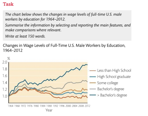
The image shows a line chart of wage levels for full-time U.S. male workers by education from 1964 to 2012. In 1964, less than high school was at 1.0, high school graduate at 1.0, some college at 1.0, bachelor's degree at approximately 1.54, and >bachelor's degree at approximately 1.68. By 1972, less than high school rose slightly above 1.0, high school graduate was at 1.2, some college at 1.25, bachelor's degree just under 1.8, and >bachelor's degree at approximately 1.9. In 1984, levels were as follows: less than high school at 1.1, high school graduate below 1.3, some college at approximately 1.4, bachelor's degree at 1.6, and >bachelor's degree peaking at 1.9. By 1996, less than high school dropped below 1.0, high school graduate near 1.1, some college about 1.2, bachelor's degree above 1.5, and >bachelor's degree at 1.8. In 2004, less than high school remained at 0.9, high school graduate just above 1.0, some college near 1.2, bachelor's degree around 1.6, >bachelor's degree at 1.9. Finally, in 2012, less than high school stayed at 0.8, high school graduate at 1.0, some college at 1.2, bachelor's at 1.6, with >bachelor's degree reaching 1.9.
Given the complexity of the image, the above description may not be entirely accurate.
Note: Both the topic and the answer were created by one of our users.

The chart below describes changes in wage levels in percentage of full-time U.S. male workers by education from 1964 till 2012.

Overall, this graph shows clear growth of wages of all men, who had accomplished their education, however, wages of those, who haven’t finished even school, had declined.

In this graph in 1964 wages of all types of male workers have starting point of one percent. It is clear that by 1972 those, who got education higher than bachelor degree, have raised their wages over one point four percent, while others only got higher than one point two percent. Despite relative downfall of wages in period of 1976 till 1984, wages of master degree graduates have risen up over one point eight percent in 2012.

In sharp contrast to this, wages of those, who haven’t finished high school, despite growth in 1972, have decreased less than it used to be in 1964.

Word Count: 152

Answers On The Same Topic:

The chart below shows the changes in wage levels of full-time U.S. male workers by education for 1964-2012. Summarise the information by selecting and reporting the main features, and make comparisons where relevant.

The chart represents the changes in salary levels of full-time U.S. men employees by education between 1964 and 2012 Overall, all lines start from one point, however the last year shows that males with higher than bacheler’s degree has the biggest wage and males who weren’t graduated from High School earn minimum. The trend begins […]

The chart below shows the changes in wage levels of full-time U.S. male workers by education for 1964-2012. Summarise the information by selecting and reporting the main features, and make comparisons where relevant.

The chart below illustrates how wage levels for full-time U.S. male workers has changedby level of education. The data is based on men’s education levels and ismeasured in 0.2 percentage at four-year intervals between 1964 and 2012. In general,it is clear that while people who did not attend university have mostly similar salaries, those with […]

The chart below shows the changes in wage levels of full-time U.S. male workers by education for 1964-2012. Summarise the information by selecting and reporting the main features, and make comparisons where relevant.

The line chart illustrates the disparities in income levels, categorized by educational attainment, among male employees in the United States from 1964 to 2012. In general, individuals possessing a bachelor’s degree or higher consistently earn higher wages than workers with a college degree or lower. Over the years, a consistent pattern has been observed regarding […]

The chart below shows the changes in wage levels of full-time U.S. male workers by education for 1964-2012. Summarise the information by selecting and reporting the main features, and make comparisons where relevant.

The information provided by the Line chart illustrates that percent of changes in wage levels of U.S Male workers as compared by their education who are working full-time within the 48 years time period of 1964-2012. The data is demonstrated in comparison by the education that the U.S male workers persists. Their educational specifics consists […]

The chart below shows the changes in wage levels of full-time U.S. male workers by education for 1964-2012. Summarise the information by selecting and reporting the main features, and make comparisons where relevant.

The line chart illustrates differences in the wage levels of U.S. male employees working full-time between 1964 and 2012, according to the type of their education. Overall, it is clear from the chart that higher education provided workers with a good salary throughout the period. In contrast, men without a degree earned considerably less. It […]

See All

Other Topics:

The line graph below shows how much money was spent on cars in four different countries in Asia. Summarise the information by selecting and reporting the main features, and make comparisons where relevant

The line graph depicts the quantity of money spent on cars between 1995 and 2005. The information is given for four countries: China, Vietnam, Thailand, and Indonesia. Firstly, China’s spending on cars went up from nearly 80 million US dollars in 1995 to 90 million US dollars in 1999, and after a slight decline in […]

The line graph illustrates the percentage of employed Australian men and women aged between 18 and 34 in 1971 and 2011.

The line graph presented illustrates the percentage of men and women (aged 18-34) employed in Australia in 1976 and 2011. Overall, it is clear from the graph that the number of males represented the largest proportion of employment in each of the two years. As they got older, the percentage of women employed became considerably […]

The line graph shows the percentage of travel by four different transport types in one country between 1985 and 2015. Summarise the information by selecting and reporting the main features, and make comparisons where relevant.

The line graph compares the proportion of travel by four distinct transport types in one country from 1985 to 2015. Overall, it is that the proportion of journay by car experienced the most dramatic increase, whereas the percentage of journay by bus saw a noticeable decline over the given period. Meanhile, the figures for the […]

The line graph shows the percentage of travel by four different transport types in one country between 1985 and 2015. Summarise the information by selecting and reporting the main features, and make comparisons where relevant.

The line graph compares the proportion of journeys by four distinct vehicle types in one country over a 30-year period. Overall, it is clear that the proportion of cars experienced a significant increase, whereas the percentage of buses saw a noticeable decline over the given period. Despite slight changes, rail and other transport modes showed […]

The graph below shows the percentage of the Australian workforce in five industries between 1962 and 2012. Summarise the information by selecting and reporting the main features, and make comparisons where relevant.

The graph depicts data about the percentages of workforce by five different industries including services, manufacturing, agriculture, constructions and mining in Australia over a 50-year period, starting from 1962. Overall, it is clear that the percentages of Australian workspace in services exhibited a significant increase, from 50% to 80%, while Australian people working on manufacturing […]

See All
We have detected unusual activity on your device.
Please verify your identity to continue.
Note: This verification step won't sign you in. If you have a premium account, please log in to access the service as usual.
Google/Gmail Verification
Or verify using Email/Code
We've sent a verification code to:
youremail@gmail.com (Not your email?)
Enter it below to complete the verification process.
Ensure your email address is correct, your inbox is not full, and you check your spam folder. If no email arrives, consider using an alternative email.
You will need a Premium plan to perform your action!
Note: If you already have a premium account, please log in to access our services as usual.

Plans & Pricing

Our mission is to make quality education accessible for everyone.
However, to keep our hardworking team running and this service alive, we genuinely need your support!
By opting for a premium plan, not only do you sustain us in achieving the mission, but you also unlock advanced features to enrich your learning experience.

Free

For learners who aren't pressed for time

What's included on Free
100+ Cambridge IELTS Tests
Instant IELTS Writing Task 1 & 2 Evaluation (2 times/month)
Instant IELTS Speaking Part 1, 2, & 3 Evaluation (2 times/month)
Instant IELTS Writing Task 1 & 2 Essay Generator (2 times/month)
500+ Dictation & Shadowing Exercises
100+ Pronunciation Exercises
Flashcards
Other Advanced Tools

Premium

For those serious about advancing their English proficiency, and for IELTS candidates aspiring to boost their band score by 1-2 points (especially in writing & speaking) in just 30 days or less

What's included on Premium
Save Your IELTS Test Progress & Analyze Mistakes By Question Type
Save Your Own Flashcard Sets & Use Them On Any Device
Unlock All Courses, IELTS Tests, Section & Part Practice
Unlimited AI Conversations
Unlimited AI Writing Enhancement Exercises
Unlimited IELTS Writing Task 1 & 2 Evaluation
Unlimited IELTS Speaking Part 1, 2, & 3 Evaluation
Checked Answers Will Not Be Published
Unlimited IELTS Writing Task 1 & 2 Essay Generator
Unlimited IELTS Speaking Part 1, 2, & 3 Sample Generator
Unlimited Usage Of Advanced Tools & AI Features
Priority Support within 24h (12-month plan only)

Due to the nature of our service and the provided free trials, payments are non-refundable.