🔥 Today Only: Save 30% on Premium — Offer Ends Soon! - Upgrade Now!
Bar Chart

Band 6+: The chart below shows the percentage of the total us population aged 65 and over between 1900 and 2000.

Image for topic: The chart below shows the percentage of the total us population aged 65 and over between 1900 and 2000.
Our system will evaluate the answer based on this AI-generated description.
The image is a bar chart with eight bars, representing the percentage of the total US population aged 65 and over between 1900 and 2000, at ten-year intervals. Among all bars, three age groups are represented by segmented colors in each bar: 65-74, 75-84, and 85+. In 1900, 65-74 was 3.1%, 75-84 was 0.2%, and 85+ was 0.01%. In 1910, 65-74 was 3.2%, 75-84 was 0.3%, and 85+ was 0.02%. In 1920, 65-74 was 3.5%, 75-84 was 0.4%, and 85+ was 0.02%. In 1930, 65-74 was 4.1%, 75-84 was 0.6%, and 85+ was 0.03%. In 1940, 65-74 was 4.5%, 75-84 was 0.7%, and 85+ was 0.04%. In 1950, 65-74 was 5.0%, 75-84 was 1.0%, and 85+ was 0.07%. In 1960, 65-74 was 6.0%, 75-84 was 1.4%, and 85+ was 0.1%. In 1970, 65-74 was 7.1%, 75-84 was 2.0%, and 85+ was 0.2%. In 1980, 65-74 was 8.3%, 75-84 was 2.7%, and 85+ was 0.4%. In 1990, 65-74 was 9.6%, 75-84 was 3.4%, and 85+ was 0.7%. In 2000, 65-74 was 10.1%, 75-84 was 3.5%, and 85+ was 1.2%. Overall, the trend shows an increase in the percentage of the population aged 65 and over, with significant growth in the older age groups, especially 85+.
Given the complexity of the image, the above description may not be entirely accurate.
Note: Both the topic and the answer were created by one of our users.

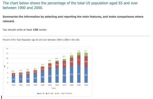
The provided bar chart depicts the changes in the percentage of the elderly population aged 65 and above in the United States over the span of a century from 1900 to 2000.

Overall, there was a consistent upward trajectory in the proportion of older individuals in the US over the specified period. The 65-74 age category consistently represented the majority, with the 75-84 age group following, and the 85 and above age category consistently showing the lowest percentage.

Initially in 1900, the elderly population made up 4% of the total US population, with 2.9% being aged 65-74, 1% aged 75-84, and merely 0.2% aged 85 and above. By 1940, this percentage had more than doubled to over 8%, with significant increases in all three age groups, notably 5.6% for 65-74 years old. The trend continued with a steady increase, reaching its peak at around 12.5% in 1990.

Between 1960 and 2000, the proportion of seniors showed sustained growth, culminating in over 12% by the end of the period. By 2000, the percentage dropped slightly but remained considerable. While the percentage of the 65-74 age group declined to 6.5% by 2000, both the 75-84 and 85 and above age groups exhibited an upward trend, reaching 4.4% and 1.5% respectively.

Word Count: 208

Answers On The Same Topic:

The chart below shows the percentage of the total us population aged 65 and over between 1900 and 2000.

The chart illustrates changes in the total number of people from 65 years for one century./over the period from Overall, it is clear that the highest percent of population was in 1990 and the lowest in 1900. Additionally, it can be seen that the biggest percent of people was by group aged 65-74 in every […]

The chart below shows the percentage of the total us population aged 65 and over between 1900 and 2000.

The bar chart illustrates the percentage of the US population aged 65 and over for each decade spanning from 1900 to 2000. Overall, there was a substantial increase in all three age groups within the US population over the century. Notably, the percentage of individuals aged 65 to 74 was consistently the highest among the […]

The chart below shows the percentage of the total us population aged 65 and over between 1900 and 2000.

The bar chart illustrates the percentage of the entire US population from 65 years old to 85 over between 1900 and 2000, The figure calculated in percentage. Overall, both 75 to 84 years old and over 85 years old age group shown a simmilar condition with gradual increased while in 65 to 74 years old […]

The chart below shows the percentage of the total us population aged 65 and over between 1900 and 2000.

The given chart illustrates information about the total percentage of the USA population aged 65 and over between the two time period, fron 1990 to 2000. Overall, there are three age groups that’s number had been increasing over the decades. Excluding the one group that’s age is from 65 to 74. The percentage of people […]

The chart below shows the percentage of the total us population aged 65 and over between 1900 and 2000.

The bar chart provided illustrates changes in the percentage of the US population aged 65 and over from 1900 to 2000. Overall, there was a significant increase in the proportion of individuals aged 65 and above in the US population. The percentage of those aged 65-74 was consistently the highest compared to the other age […]

See All

Other Topics:

The charts below show the percentage of workers in three sectors across four countries in 1980 and 2010.Summaries the information by selecting and reporting the main features, and make comparisons where relevant.

The bar charts illustrate the propation of workers in agricultural, industrial and services fields across selected countries between 1980 and 2010. Overall, the people worked in industries domain in Germany, USA and Japan in both years. While many chainnes worked in agricultral field in 1980, it was significant fell in 2010. The perecentage of individuals […]

The bar chart below gives information on the number of workers on different occupatios who migrated to Australia between 2009 and 2012

The given bar chart illustrates data about number of workers in different fields, who migrated to Australia from 2009 to 2012. Overall, it is clear that the number of accountants who moved to Australia was the highest in all years. Likewise, computer programmers recorded lowest figures. Chefs and software engineers experienced fluctuation. In 2009, 20,000 […]

The bar graph below represents the data about the clubs joined by the people of two different age groups at a leisure centre in a small city. Summarise the information by selecting and reporting the main features, and make comparisons where relevant. You should write at least 150 words.

The bar chart illustrates the statistics of members of two age bracket who joined six clubs at a leisure centre in a small city. Overall, in most of the clubs, adults aged 25-35 years were more than their counterparts. Photography club had equal number of membership for both age groups. Cycling had the highest number […]

The bar chart below gives information on the number of workers on different occupatios who migrated to Australia between 2009 and 2012

The bar chart shows how many skilled workers from four occupations migrated to Australia from 2009 to 2012. Overall, the number of accountants migrating to Australia was the highest in all years, while computer programmers recorded the lowest figures. It is also noticeable that all four categories experienced fluctuations and showed different patterns of change. […]

The graph below shows the percentage of adults according to age and gender who do not do any physical activity in Australia. Summarise the information by selecting and reporting the main features and make comparisons where relevant.

The bar chart compares the percentages of Australian men and women in different age groups who did not participate in any form of physical activity. Overall, inactivity rates generally increased with age for both genders. Females recorded higher proportions than males in most age groups, although men were more inactive among those aged 45-64. The […]

the graph below gives the result of a survey showing what 1.000 young people did after leaving school between 2008 and 2012 summarise the information by selecting and reporting the main features, and make comparasions where relevant

The bar chart illustrates the options of 1,000 young people after completing their schooling over a five-year period from 2008 to 2012. Overall, it is clear that while searching for employment was the most popular option for school leavers, going to university became the dominant choice by the end of the period. On the other […]

See All
We have detected unusual activity on your device.
Please verify your identity to continue.
Note: This verification step won't sign you in. If you have a premium account, please log in to access the service as usual.
Google/Gmail Verification
Or verify using Email/Code
We've sent a verification code to:
youremail@gmail.com (Not your email?)
Enter it below to complete the verification process.
Ensure your email address is correct, your inbox is not full, and you check your spam folder. If no email arrives, consider using an alternative email.
You will need a Premium plan to perform your action!
Note: If you already have a premium account, please log in to access our services as usual.

Plans & Pricing

Our mission is to make quality education accessible for everyone.
However, to keep our hardworking team running and this service alive, we genuinely need your support!
By opting for a premium plan, not only do you sustain us in achieving the mission, but you also unlock advanced features to enrich your learning experience.

Free

For learners who aren't pressed for time

What's included on Free
100+ Cambridge IELTS Tests
Instant IELTS Writing Task 1 & 2 Evaluation (2 times/month)
Instant IELTS Speaking Part 1, 2, & 3 Evaluation (5 times/month)
Instant IELTS Writing Task 1 & 2 Essay Generator (2 times/month)
500+ Dictation & Shadowing Exercises
100+ Pronunciation Exercises
Flashcards
Other Advanced Tools

Premium

For those serious about advancing their English proficiency, and for IELTS candidates aspiring to boost their band score by 1-2 points (especially in writing & speaking) in just 30 days or less

What's included on Premium
Save Your IELTS Test Progress
Unlock All Courses & IELTS Tests
Unlimited AI Conversations
Unlimited AI Writing Enhancement Exercises
Unlimited IELTS Writing Task 1 & 2 Evaluation
Unlimited IELTS Speaking Part 1, 2, & 3 Evaluation
Checked Answers Will Not Be Published
Unlimited IELTS Writing Task 1 & 2 Essay Generator
Unlimited IELTS Speaking Part 1, 2, & 3 Sample Generator
Unlimited Usage Of Advanced Tools
Priority Support within 24h (12-month plan only)

Due to the nature of our service and the provided free trials, payments are non-refundable.
Nếu bạn là người Việt Nam và không có hoặc không muốn trả bằng credit/debit cards, bạn có thể thanh toán bằng phương thức chuyển khoản:


Chọn gói:
419,000₫ 277,000 ₫ cho gói 1 tháng (chỉ 9,233₫/ngày)
1,239,000₫ 597,000 ₫ cho gói 3 tháng (chỉ 6,633₫/ngày)
2,469,000₫ 1,027,000 ₫ cho gói 6 tháng (chỉ 5,706₫/ngày)
4,929,000₫ 1,417,000 ₫ cho gói 12 tháng (chỉ 3,936₫/ngày)


Sau khi chuyển khoản, vui lòng đợi trình duyệt tự động điều hướng bạn trở lại Engnovate và bạn sẽ ngay lập tức nhận được mã kích hoạt tài khoản premium.
Nếu có lỗi xảy ra, bạn có thể liên hệ với team thông qua một trong các phương thức: email đến helloengnovate@gmail.com hoặc nhắn tin qua facebook.com/engnovate.
Vì toàn bộ công cụ trên website đều có thể sử dụng thử miễn phí, Engnovate không hỗ trợ hoàn tiền.