🔥 Today Only: Save 30% on Premium — Offer Ends Soon! - Upgrade Now!
Bar Chart

Band 5+: The chart below shows the total number of Olympic medals won by twelve different countries. Write a report for a university, lecturer describing the information shown below. Summarise the information by selecting and reporting the main features and make comparisons where relevant.

Image for topic: The chart below shows the total number of Olympic medals won by twelve different countries. Write a report for a university, lecturer describing the information shown below. Summarise the information by selecting and reporting the main features and make comparisons where relevant.
Our system will evaluate the answer based on this AI-generated description.
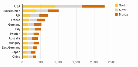
The image is a horizontal bar graph depicting the total number of Gold, Silver, and Bronze medals won by different countries, arranged in descending order of total medals won. The USA has the highest number of Gold medals (approximately 1,000) and total medals (close to 2,500), followed by the Soviet Union with Gold medals (around 500) and total medals (slightly over 1,000). The UK, France, Germany, Italy, Sweden, Australia, Hungary, East Germany, Japan, and China follow, respectively, with decreasing numbers of Gold and total medals. The UK has Gold medals (about 250) and total medals (around 750), France has Gold medals (just over 200) and total medals (nearly 700), Germany has Gold medals (approximately 175) and total medals (about 600), Italy has Gold medals (just under 175) and total medals (slightly over 500), Sweden has Gold medals (around 150) and total medals (close to 500), Australia has Gold medals (about 125) and total medals (nearly 500), Hungary has Gold medals (over 150) and total medals (just under 500), East Germany has Gold medals (around 150) and total medals (over 400), Japan has Gold medals (just under 100) and total medals (about 350), and China has the least with Gold medals (about 75) and total medals (approximately 300). Each country also has varying amounts of Silver and Bronze medals, with the Silver medals always being less than or equal to the Gold and Bronze medals often being the highest or equal to the Gold medals for each country.
Given the complexity of the image, the above description may not be entirely accurate.
Note: Both the topic and the answer were created by one of our users.

This bar graph demonstrates the number of three type medals in Olympic by twelve different countries. According to this figure, we can analysis the difference in both number and types among this countries.

In terms of medal’s number, USA dominate the Olympic Olympic game. Specifically, USA have near by 2,500 medals in the history, which is the most number among this countries. In comparison, the second is Soviet Union with 1,000 medals while no more than half of USA. Moreover, all of other countries’ total medals less than 1,000 and even have six countries not reach 5,00.

From the medal’s types perspective, the three different medals always have the positive relationship in Olympic. If a country have more gold medals, it will get more silver and bronze medals too, such as USA that earned first in all of medals. However, there have some except like Germany that the total number of medals exceed Italy but the number of gold medals behind Italy.

Word Count: 162

Answers On The Same Topic:

The chart below shows the total number of Olympic medals won by twelve different countries. Write a report for a university, lecturer describing the information shown below. Summarise the information by selecting and reporting the main features and make comparisons where relevant.

The chart illustrates the total number of Olympic medals like ; Gold medals, Silver medals and Bronze medals won by twelve different countries such as : USA, Soviet Union, UK, France, Germany, Italy,Sweden, Australia, Hungary, East Germany, Japan and China. Overall, USA has the highest numbers of Olympic medals then all the other countries.Conversly, Japan […]

The chart below shows the total number of Olympic medals won by twelve different countries. Write a report for a university, lecturer describing the information shown below. Summarise the information by selecting and reporting the main features and make comparisons where relevant.

The bar chart illustrates the total number of gold, silver, and bronze medals earned by twelve nations. Overall, the United States achieves the highest number of medals, both in total and per medal. In contrast, Japan, China, East Germany win medals less than any other country. The United States collects approximately 2,3000 medals, including around […]

The chart below shows the total number of Olympic medals won by twelve different countries. Write a report for a university, lecturer describing the information shown below. Summarise the information by selecting and reporting the main features and make comparisons where relevant.

The provided bar chart depicts the total number of Olympic medals achieved by athletes from twelve different countries. Generally, the American athletes dominated the medal count (gold, silver, and bronze), while Japanese athletes had the lowest number. The rest of the countries (the Soviet Union, the UK, France, Germany, Italy, Sweden, Hungary, Australia, East Germany, […]

The chart below shows the total number of Olympic medals won by twelve different countries. Write a report for a university, lecturer describing the information shown below. Summarise the information by selecting and reporting the main features and make comparisons where relevant.

The chart illustrates the total quantity of Olympic medals won by twelve different nations. Overall, the U.S.A. has the highest number of medals compared to other countries. Additionally, the U.S.A. has the most medals in the three categories (gold, silver, and bronze). On the other hand, Japan has the fewest medals among the nations. First […]

The chart below shows the total number of Olympic medals won by twelve different countries. Write a report for a university, lecturer describing the information shown below. Summarise the information by selecting and reporting the main features and make comparisons where relevant.

The chart illustrates the total quantity of olympic medals won by twelve different nations. Overall, the U.S.A has the highest number of medals compared to other countries. Additionally, the U.S.A has the most medals in the three categories (gold, silver, and bronze). On the other hand, Japan has the fewest medals among the nations. First […]

See All

Other Topics:

The bar charts below show the prevalence of obesity among boys and girls aged 12 to 19 years by ethnicity, in the United States for the years 2004 and 2014.

The two bar charts give information about prevalence of obesity among boys and girls between 12 and 19 years-olds by ethnicity, in the US for the years 2004 and 2014. Generally, boys gained more obesity compared to girls in two groups. Ethnicity is divided into three groups Non-Hispanic White, Non-Hispanic Black and Hispanic. To begin […]

The chart shows the percentage of household expenditure on goods and services in a country from 1995 to 2005. Summarise the information by selecting and reporting the main features and make comparisons where relevant.

The given bar chart illustrates the amount spent on different categories of household in a specific nation, recorded over ten-year period starting from 1995. Overall, it is clear to evident that the proportion of other goods and services witnessed an upward trend as similar as the figures for food and drink climbing up significantly, by […]

The bar chart shows the average amount of water used for six different household activities in a country in 2000 and 2020. Summarise the information by selecting and reporting the main features, and make comparisons where relevant.

The bar chart illustrates the distribution of water consumption in six daily chores in 2000 and 2020 in a country . The water measured in Litres . Generally speaking , the mount of water used in all the household activities are close with notabe exception of bathing , wich was more high in 2000 than […]

The bar chart below shows the percentage of food bought by people in a town in different ways during the week in 2009, 2011 and 2013.

The bar chart illustrates information about the percentages of products that was bought in differents days of week in 2009, 2011 and 2013. Overall, the biggest share of food was bought on Friday, Saturday and Sunday in all years. The lowest figure for wednesday. On Thursday the hiegst percentage was in 2011. On Monday, the […]

The bar chart shows the number of boys and girls who played four different sports: football, tennis, basketball and cricket.

The bar chart shows the number of boys and girls who played four different sports: football, tennis, basketball and cricket. Overall, boys were more interested in football and cricket than girls. On the other hand, girls had a higher number in basketball. Tennis was the only sport where the numbers of boys and girls were […]

The bar chart shows the number of boys and girls who played four different sports: football, tennis, basketball and cricket.

The bar chart shows the number of boys and girls who played four different sports: football, tennis, basketball and cricket. Overall, boys were more interested in football and cricket than girls. On the other hand, girls had a higher number in basketball. Tennis was the only sport where the numbers of boys and girls were […]

See All
We have detected unusual activity on your device.
Please verify your identity to continue.
Note: This verification step won't sign you in. If you have a premium account, please log in to access the service as usual.
Google/Gmail Verification
Or verify using Email/Code
We've sent a verification code to:
youremail@gmail.com (Not your email?)
Enter it below to complete the verification process.
Ensure your email address is correct, your inbox is not full, and you check your spam folder. If no email arrives, consider using an alternative email.
You will need a Premium plan to perform your action!
Note: If you already have a premium account, please log in to access our services as usual.

Plans & Pricing

Our mission is to make quality education accessible for everyone.
However, to keep our hardworking team running and this service alive, we genuinely need your support!
By opting for a premium plan, not only do you sustain us in achieving the mission, but you also unlock advanced features to enrich your learning experience.

Free

For learners who aren't pressed for time

What's included on Free
100+ Cambridge IELTS Tests
Instant IELTS Writing Task 1 & 2 Evaluation (2 times/month)
Instant IELTS Speaking Part 1, 2, & 3 Evaluation (2 times/month)
Instant IELTS Writing Task 1 & 2 Essay Generator (2 times/month)
500+ Dictation & Shadowing Exercises
100+ Pronunciation Exercises
Flashcards
Other Advanced Tools

Premium

For those serious about advancing their English proficiency, and for IELTS candidates aspiring to boost their band score by 1-2 points (especially in writing & speaking) in just 30 days or less

What's included on Premium
Save Your IELTS Test Progress & Analyze Mistakes By Question Type
Save Your Own Flashcard Sets & Use Them On Any Device
Unlock All Courses, IELTS Tests, Section & Part Practice
Unlimited AI Conversations
Unlimited AI Writing Enhancement Exercises
Unlimited IELTS Writing Task 1 & 2 Evaluation
Unlimited IELTS Speaking Part 1, 2, & 3 Evaluation
Checked Answers Will Not Be Published
Unlimited IELTS Writing Task 1 & 2 Essay Generator
Unlimited IELTS Speaking Part 1, 2, & 3 Sample Generator
Unlimited Usage Of Advanced Tools & AI Features
Priority Support within 24h (12-month plan only)

Due to the nature of our service and the provided free trials, payments are non-refundable.