🔥 Today Only: Save 30% on Premium — Offer Ends Soon! - Upgrade Now!
Line Graph

Band 7+: The chart graph shows the percentage of tourists to Scotland who visited four different types of attractions from 1980 to 2010.

Image for topic: The chart graph shows the percentage of tourists to Scotland who visited four different types of attractions from 1980 to 2010.
Our system will evaluate the answer based on this AI-generated description.
The image shows a line graph illustrating the percentage of tourists to Scotland who visited different attractions from 1980 to 2010. The graph has four lines representing the Aquarium (blue), Castle (red), Zoo (yellow), and Festival (purple) attractions. In 1980, the castle had the highest percentage of visitors at approximately 30%, followed by the festival at around 25%, the aquarium at 20%, and the zoo at 15%. By 1985, the castle and festival were both around 35%, the aquarium at 25% and the zoo at 20%. In 1990 the trend remained similar to 1985. By 1995, the castle reached its peak at 45%, while the festival saw a slight decrease to 30%, the aquarium remained steady at 25%, and the zoo dropped to 15%. In 2000, the castle had a slight dip to just below 45%, the festival increased to nearly 35%, the aquarium rose to 30%, and the zoo remained at 15%. In 2005, the castle decreased to around 40%, the festival went up to 40%, the aquarium stayed at 30%, and the zoo had a slight increase to just over 15%. By 2010, the castle was at 40%, the festival decreased to 35%, the aquarium slightly increased to just above 30%, and the zoo went up to just below 20%.
Given the complexity of the image, the above description may not be entirely accurate.
Note: Both the topic and the answer were created by one of our users.

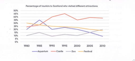
The given line chart illustrates the variations in the percentage of tourists visiting four different types of attractions in Scotland over a 30-year period, from 1980 to 2010.

Overall, the castle and zoo experienced an increasing trend in the number of visitors, while the aquarium and festival attractions witnessed a decrease in the percentage of tourists over the three decades.

In 1980, the castle received approximately 30% of the total visitors, making it the most visited attraction, while the zoo had the lowest percentage at around 15%. By 1995, the castle peaked at 45%, becoming the most visited attraction, whereas the zoo remained stable at 15%. Over the next 15 years, the castle saw a slight decrease to just under 45%, while the zoo doubled its percentage to nearly 30%.

In contrast, the festival attracted around 25% of the tourists in 1980, making it the second most popular attraction, while the aquarium had the lowest percentage at 20%. However, by 2010, the festival decreased to around 35%, and the aquarium remained the least visited attraction at just over 30%.

Word Count: 179

Answers On The Same Topic:

The chart graph shows the percentage of tourists to Scotland who visited four different types of attractions from 1980 to 2010.

The line graph illustrates how many travellers visited four different types of attractions, namely Aquarium, Castle, Zoo and Festival in Scotland between 1980 and 2010. Overall, there was an increase in the number of tourists visiting Castle and Zoo, while the opposite was true for Festival and Aquarium attractions. It was also notable that Castle […]

The chart graph shows the percentage of tourists to Scotland who visited four different types of attractions from 1980 to 2010.

The line graph shows how many people visit four different destinations aquarium, castle, zoo, and festival in Scotland from 1980 to 2010 Overall, despite some fluctuations, there was an increase in the number of visitors who went to the castle and zoo in Scotland. In contrast, the people went to the aquarium, and the festival […]

The chart graph shows the percentage of tourists to Scotland who visited four different types of attractions from 1980 to 2010.

The line graph shows how many people visited four different destinations – aquarium, castle, zoo, and festival – in Scotland from 1980 to 2010. Overall, despite some fluctuations, there was an increase in the number of visitors who went to the castle and zoo in Scotland. In contrast, the number of people who went to […]

The chart graph shows the percentage of tourists to Scotland who visited four different types of attractions from 1980 to 2010.

The line graph shows how much people visits to four different destination about aquarium, castle, zoo and festival in Scotland from 1980 to 2010 Overall, despite some fluctuations, there was an increase in the mount of visitors who went to castle and zoo in Scotland. In contrast, the people went to the aquarium and the […]

The chart graph shows the percentage of tourists to Scotland who visited four different types of attractions from 1980 to 2010.

The line graph depicts the proportions of travelers in Scotland visiting four distinct destinations in Edinburgh—Aquarium, Castle, Zoo, and Festival—between 1980 and 2010. Overall, it is clear from the graph that while the festival followed a steady downward trajectory, the aquarium experienced a significant drop in the number of visitors. The castle witnessed the most […]

See All

Other Topics:

The line shows the number of inquiries received by the Tourist Information Office in one day over six months in 2011 (telephone, letter/email, and in person).

The line graph compares three methods of collecting daily inquiries by the Tourist Information Office during a six-month period in 2011. Overall, most categories observed strong upswings, except for gathering inquiries by letter/email, which showed a reverse pattern. Additionally, the most considerable escalation was witnessed in the in-person criterion. Regarding the two groups with the […]

The graph below shows the investment trends of men and women in the UK since 1950. Summarise the information by selecting and reporting the main features, and make comparisons where relevant.

The chart illustrates information on how men and women made investments in the UK from 1950 to 1980. Overall, the amount of money invested by both men and women rose significantly over the time period. However, while men’s investments fluctuated, the numbers for women grew more consistently. At the start of the time period, the […]

The line graph illustrate thefts per 1000 vehicles in the four different countries over the 9 years.

The line graph provided illustrates the thefts per thousand vehicles between Great Britain, Sweden, France and Canada in 10 years. Overall, Great Britain consistently recorded the highest number of vehicle thefts throughout the period, although there were some fluctuations. In contrast, Sweden experienced a steady increase, while France and Canada remained lower and relatively stable. […]

The chart shows the acid level in mouth from consumption of sweets. Write a report with making comparisons where relevant and reporting the main features.

The line graph provides information about acid level in mouth from consumption of sweets in three category: fruit sugar, cane sugar, and honey, by the minutes between 0 and 40. Overall, lower PH means higher acid level, and PH level 7 means neutral. In the graph, cane sugar is the most acidic one, compared to […]

The graph shows the percentage of travel by four different type of transport in one country between 1985 and 2015.

The graph illustrates the proportion travel by car, bus, rail and others kind of transport in one country from 1985 to 2010. Overview, Overall, car travel increased significantly and became the most popular type of transport, while bus usage declined considerably. Rail travel fluctuated slightly but ended higher, whereas other transport remained the least common […]

The graph below shows the number of enquiries received by the Tourist Information Office in one city over a six-month period in 2011. Summarise the information by selecting and reporting the main features, and make comparisons where relevant.

The line graph illustrates the number of inquiries received by the Tourist Information Office in a single city over six months in 2011. Overall, the number of inquiries received by two methods (‘in person’ and ‘by telephone’) generally increased throughout the period. However, the number of inquiries via letter and email declined. In-person inquiries surpassed […]

See All
We have detected unusual activity on your device.
Please verify your identity to continue.
Note: This verification step won't sign you in. If you have a premium account, please log in to access the service as usual.
Google/Gmail Verification
Or verify using Email/Code
We've sent a verification code to:
youremail@gmail.com (Not your email?)
Enter it below to complete the verification process.
Ensure your email address is correct, your inbox is not full, and you check your spam folder. If no email arrives, consider using an alternative email.
You will need a Premium plan to perform your action!
Note: If you already have a premium account, please log in to access our services as usual.

Plans & Pricing

Our mission is to make quality education accessible for everyone.
However, to keep our hardworking team running and this service alive, we genuinely need your support!
By opting for a premium plan, not only do you sustain us in achieving the mission, but you also unlock advanced features to enrich your learning experience.

Free

For learners who aren't pressed for time

What's included on Free
100+ Cambridge IELTS Tests
Instant IELTS Writing Task 1 & 2 Evaluation (2 times/month)
Instant IELTS Speaking Part 1, 2, & 3 Evaluation (5 times/month)
Instant IELTS Writing Task 1 & 2 Essay Generator (2 times/month)
500+ Dictation & Shadowing Exercises
100+ Pronunciation Exercises
Flashcards
Other Advanced Tools

Premium

For those serious about advancing their English proficiency, and for IELTS candidates aspiring to boost their band score by 1-2 points (especially in writing & speaking) in just 30 days or less

What's included on Premium
Save Your IELTS Test Progress
Unlock All Courses & IELTS Tests
Unlimited AI Conversations
Unlimited AI Writing Enhancement Exercises
Unlimited IELTS Writing Task 1 & 2 Evaluation
Unlimited IELTS Speaking Part 1, 2, & 3 Evaluation
Checked Answers Will Not Be Published
Unlimited IELTS Writing Task 1 & 2 Essay Generator
Unlimited IELTS Speaking Part 1, 2, & 3 Sample Generator
Unlimited Usage Of Advanced Tools
Priority Support within 24h (12-month plan only)

Due to the nature of our service and the provided free trials, payments are non-refundable.
Nếu bạn là người Việt Nam và không có hoặc không muốn trả bằng credit/debit cards, bạn có thể thanh toán bằng phương thức chuyển khoản:


Chọn gói:
419,000₫ 277,000 ₫ cho gói 1 tháng (chỉ 9,233₫/ngày)
1,239,000₫ 597,000 ₫ cho gói 3 tháng (chỉ 6,633₫/ngày)
2,469,000₫ 1,027,000 ₫ cho gói 6 tháng (chỉ 5,706₫/ngày)
4,929,000₫ 1,417,000 ₫ cho gói 12 tháng (chỉ 3,936₫/ngày)


Sau khi chuyển khoản, vui lòng đợi trình duyệt tự động điều hướng bạn trở lại Engnovate và bạn sẽ ngay lập tức nhận được mã kích hoạt tài khoản premium.
Nếu có lỗi xảy ra, bạn có thể liên hệ với team thông qua một trong các phương thức: email đến helloengnovate@gmail.com hoặc nhắn tin qua facebook.com/engnovate.
Vì toàn bộ công cụ trên website đều có thể sử dụng thử miễn phí, Engnovate không hỗ trợ hoàn tiền.