Our system will evaluate the answer based on this AI-generated description.
The image depicts a bar graph illustrating British emigration to selected destinations between 2004-2007, with thousands on the y-axis and destination countries on the x-axis. Each country has four bars representing the years, with blue for 2004, red for 2005, green for 2006, and yellow for 2007. Australia had the highest emigration numbers, starting around 50,000 in 2004, decreasing steadily each year to just over 30,000 in 2007. Spain's numbers ranged from just over 40,000 in 2004 to around 35,000 in 2007. New Zealand saw a consistent decrease from just over 20,000 in 2004 to around 10,000 in 2007. The USA had an increase from 20,000 in 2004 to nearly 30,000 in 2006 before dropping to around 20,000 in 2007. France's numbers remained relatively stable, starting at just over 10,000 in 2004, peaking at around 15,000 in 2005, and settling at just under 10,000 in 2007. The data source is the International Passenger Survey/ONS.
Given the complexity of the image, the above description may not be entirely accurate.
Skyrocket your IELTS band score by 1-2 points in under a month with our premium plan!
Note: Both the topic and the answer were created by one of our users.
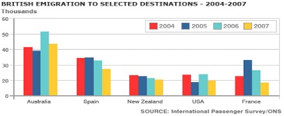
The bar chart shows the number of British people who emigrated to five destinations over the period 2004 to 2007. It is evident from the chart that throughout the period, the most popular place to move to was Australia.
Emigration to Australia stood at just over 40,000 people in 2004, which was approximately 6,000 higher than for Spain, and twice as high as the other three countries. Apart from a jump to around 52,000 in 2006, it remained around this level throughout the period.
The next most popular country for Britons to move to was Spain, though its popularity declined over the time frame to finish at below 30,000 in 2007. Despite this, the figure was still higher than for the remaining three countries. Approximately 20,000 people emigrated to New Zealand each year, while the USA fluctuated between 20-25,000 people over the period.
Although the number of visitors to France spiked to nearly 35,000 in 2005, it was the country that was the least popular to emigrate to at the end of the period, at just under 20,000 people.
Word Count: 179