🔥 Today Only: Save 30% on Premium — Offer Ends Soon! - Upgrade Now!
Bar Chart

Band 7+: • The charts summarize the weight measurements of people living in Charlestown in 1955 and 2015.

Image for topic: • The charts summarize the weight measurements of people living in Charlestown in 1955 and 2015.
Our system will evaluate the answer based on this AI-generated description.
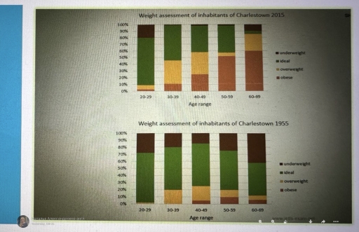
The image has two stacked bar graphs labeled "Weight assessment of inhabitants of Charlestown 2015" and "Weight assessment of inhabitants of Charlestown 1955"; both have the same five categories for age range '20-29', '30-39', '40-49', '50-59', '60-69' on the x-axis and a vertical percentage scale from 0% to 100% on the y-axis, divided into four weight categories 'underweight', 'ideal', 'overweight', 'obese'. The 2015 graph data: '20-29' age range 15% underweight, 20% ideal, 45% overweight, 20% obese; '30-39' age range 10% underweight, 25% ideal, 40% overweight, 25% obese; '40-49' age range 5% underweight, 20% ideal, 50% overweight, 25% obese; '50-59' age range 5% underweight, 25% ideal, 45% overweight, 25% obese; '60-69' age range no underweight, 30% ideal, 40% overweight, 30% obese. The 1955 graph data: '20-29' age range 40% underweight, 40% ideal, 15% overweight, 5% obese; '30-39' age range 30% underweight, 45% ideal, 20% overweight, 5% obese; '40-49' age range 20% underweight, 50% ideal, 25% overweight, 5% obese; '50-59' age range 10% underweight, 55% ideal, 25% overweight, 10% obese; '60-69' age range 5% underweight, 50% ideal, 35% overweight, 10% obese.
Given the complexity of the image, the above description may not be entirely accurate.
Note: Both the topic and the answer were created by one of our users.

The two bar charts illustrate the percentage of three different weight measurements (underweight, ideal, overweight, and obese) from five age groups in Charlestown in 1995 and 2015.

Overall, the proportion of overweight and obese people generally increased. Whereas, the majority of ideal and underweight people decreased over the period given.

In 1995, the ideal weight was the highest at seven in ten for ages 20-29, while for ages 30-69 slightly lower, at between 45% and 60%. Underweight was the second highest for the youngest and oldest, at around 28% and 42% respectively. Moreover, a very small number of people at age 20-29 were overweight. The number for obese people was only high for older age (40-69) at range 5% to 10%.

In contrast by 2015, the proportion of obese people increased sharply, especially for the age 60-69. This number reached nearly 60%, becoming the dominant category. Furthermore, the ideal weight people declined in most age groups, but the number for people at age 20-29 remained unchanged. The number of overweight people increased, especially for the oldest group. For the underweight category, the number declined to under 2% for people at ages 30-59.

Word Count: 192

Answers On The Same Topic:

• The charts summarize the weight measurements of people living in Charlestown in 1955 and 2015.

The two bar charts give information about the weight measurements of Charlestown residents in 1955 and 2015. Overall, in 1955, most people in all age groups were in the ideal weight category. However, in 2015, most people in the older age group were in the obese and overweight category. Furthermore, there were fewer underweight citizens […]

• The charts summarize the weight measurements of people living in Charlestown in 1955 and 2015.

The bar chart illustrates the weight assessment of people in different age groups living in Charlestown in 1995 and 2015. Overall, in 1995, most people in all age groups were in the ideal weight category, while in 2015, there was a noticeable increase in overweight and obese individuals, especially in older age groups. The percentage […]

• The charts summarize the weight measurements of people living in Charlestown in 1955 and 2015.

The charts compare the weight assessments of people living in Charlestown in 1955 and 2015. The data are presented in percentages and divided into five age groups. Overall, it is evident that the number of inhabitants suffering from obesity increased, while the problem of underweight demonstrated a downward trend. In 1955, 70% of individuals between […]

• The charts summarize the weight measurements of people living in Charlestown in 1955 and 2015.

The bar charts compare the different body indexes of citizens in Charlestown between 1955 and 2015. Overall, in 1955, most of Charlestown residents had ideal weight in all age categories. Subsequently, in 2015, people gained more weight and became obese. It can be seen from the graph, the percentage of people with the ideal weight […]

See All

Other Topics:

The graph gives information about coffee production in 4 different countries from 1990 to 2010.

Coffee is one of the most popular product in the world.By analyzing this bar chart, trend in coffee production could be predicted. In 1990, The amount of coffee producted by Brazil and Bolombia is almost the same with 0.7 and 0.6 million tonnes respectively. However ,according to the chart,it is much higher than Indonesia and […]

the percentage contribution of the IT and service industries to the GDP

The bar chart illustrates elements of GDP in the UK from 1992 to 2000. Overall,it can be seen that It industry had the biggest percentage of Gross Domestic Product overtime.The most percentage of Gross Domestic Product from IT industry was in 2000 year around 15 percent.The second most perecentage of GDP was in 1998 with […]

the percentage contribution of the IT and service industries to the GDP

The bar graph depicts elements of GDP in the UK between 1992 and 2000. Overall, it can be seen that both the IT and service industries experienced a rise in their proportion of GDP. The IT industry’s share of GDP was always greater than that of the service industry throughout the given period. Having an […]

The chart below shows the different levels of post-school qualifications in Australia and the proportion of men and women who held them in 1999. Summarise the information by selecting and reporting the main features, and make comparisons where relevant.

The bar chart illustrates, the different levels of post-school certifications in Australia back in 1999 based on gender. Overall, the number of men and women in skilled vocatinal diploma is respectively the highest and lowest through all the different levels. However, in other fields the amount of them is diffrentiating based on the degree. According […]

Writing task 1 The chart below shows the percentages of time Australian mothers and fathers spent helping their children with four activities at home in 2013. Summarise the information by selecting and reporting the main features, and make comparisons where relevant.

The bar chart demonstrates the quantity of Australian parents spent assisting their children with four different activities at home in 2013. Overall, when it came to helping with dressing and homework, mothers played the most dominant role. Nevertheless, fathers had significant demand in aid with playing games and preparing for bedtime. It is interesting that […]

Bar charts show the proportion of money spent on food and other goods in 1998 and 2008

The two bar charts depict the percentage of money personals that in France, Germany and England spent on food and other products between 1998 and 2008. Overview, the amount of money spent for food increased in every country over the period. Also, there was more significantly grow spent money for other goods. First, France sharply […]

See All
We have detected unusual activity on your device.
Please verify your identity to continue.
Note: This verification step won't sign you in. If you have a premium account, please log in to access the service as usual.
Google/Gmail Verification
Or verify using Email/Code
We've sent a verification code to:
youremail@gmail.com (Not your email?)
Enter it below to complete the verification process.
Ensure your email address is correct, your inbox is not full, and you check your spam folder. If no email arrives, consider using an alternative email.
You will need a Premium plan to perform your action!
Note: If you already have a premium account, please log in to access our services as usual.

Plans & Pricing

Our mission is to make quality education accessible for everyone.
However, to keep our hardworking team running and this service alive, we genuinely need your support!
By opting for a premium plan, not only do you sustain us in achieving the mission, but you also unlock advanced features to enrich your learning experience.

Free

For learners who aren't pressed for time

What's included on Free
100+ Cambridge IELTS Tests
Instant IELTS Writing Task 1 & 2 Evaluation (2 times/month)
Instant IELTS Speaking Part 1, 2, & 3 Evaluation (2 times/month)
Instant IELTS Writing Task 1 & 2 Essay Generator (2 times/month)
500+ Dictation & Shadowing Exercises
100+ Pronunciation Exercises
Flashcards
Other Advanced Tools

Premium

For those serious about advancing their English proficiency, and for IELTS candidates aspiring to boost their band score by 1-2 points (especially in writing & speaking) in just 30 days or less

What's included on Premium
Save Your IELTS Test Progress & Analyze Mistakes By Question Type
Save Your Own Flashcard Sets & Use Them On Any Device
Unlock All Courses, IELTS Tests, Section & Part Practice
Unlimited AI Conversations
Unlimited AI Writing Enhancement Exercises
Unlimited IELTS Writing Task 1 & 2 Evaluation
Unlimited IELTS Speaking Part 1, 2, & 3 Evaluation
Checked Answers Will Not Be Published
Unlimited IELTS Writing Task 1 & 2 Essay Generator
Unlimited IELTS Speaking Part 1, 2, & 3 Sample Generator
Unlimited Usage Of Advanced Tools & AI Features
Priority Support within 24h (12-month plan only)

Due to the nature of our service and the provided free trials, payments are non-refundable.