🔥 Today Only: Save 30% on Premium — Offer Ends Soon! - Upgrade Now!
Line Graph

Band 5+: The figure shows demographic trends in an industrialized country. Summarize the information by selecting and reporting the main features.

Image for topic: The figure shows demographic trends in an industrialized country. Summarize the information by selecting and reporting the main features.
Our system will evaluate the answer based on this AI-generated description.
The image illustrates demographic trends in Scotland from 1940 to 2050, showing three key rates: birth, population growth, and death. In 1940, birth rate stands at 2.5%, population growth rate at 0.7%, and death rate at 1.5%. By 1950, birth rate remains around 2.6%, population growth reaches 1.0%, death rate is about 1.4%. From 1960 to 1970, birth rate peaks at 2.9% in 1960 and drops to 2.1% by 1970; population growth rate peaks at 1.1% in 1960, reduces to 1.0% by 1970; death rate remains steady around 1.3%. A continued decline in birth rate and population growth rate is observed from 1980, with birth rate at 1.7% in 1980, 1.2% in 1990, and further dropping to 1.0% by 2000; population growth rate remains at 0.7% in 1980, decreases to 0.4% in 1990, and to 0.0% in 2000. Death rate remains near 1.2% in 1980 and decreases to 1.1% by 2000. From 2010 to 2050, the birth rate declines from 1.2% in 2010 to 0.8% forecasted in 2050; the population growth rate reduces from 0.2% in 2010 to negative values around -0.1% by 2050; the death rate drops from 1.3% in 2010 to about 0.4% by 2050.
Given the complexity of the image, the above description may not be entirely accurate.
Note: Both the topic and the answer were created by one of our users.

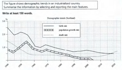
The line graph compares demographic data in Scotland which is industrial country, over the period of 80 years.

It is clear that the birth and death rate have significant difference. Population growth rate trend shows the result of difference between death and birth rate in Scotland.

In 1940 birth rate was about two percent of population and on the other side death rate was approximately 1.5 percent. By 1945, both experienced a decline of about half a percent .After a small increase in the birth rate, by 1960 the birth and death rates had fallen to about 1 percent and 1.5 percent respectively. After that not only birth rate decrease steadily but also death rate experienced a slight growth up to 2018 than death rate cross the birth rate to more than a half percent.

Population growth rate was around a percent. Between 1940 and 1955, there was a fast increase from a low of 0.5 percent to high of one and half percent. Furthermore, growth rate experienced gradual decline, on top of that, it became zero percent in 2005 in Scotland.

Word Count: 182

Answers On The Same Topic:

The figure shows demographic trends in an industrialized country. Summarize the information by selecting and reporting the main features.

The figure shows the amount of industrialized country. Summarize the displays by selecting and reporting the main features. The figure shows displays in Schotland country that demographic trends between 1940 and 2020. There are birth rate, population growth rate, death rate. For intance birth rate to be every year change it percentage. At the beginning […]

The figure shows demographic trends in an industrialized country. Summarize the information by selecting and reporting the main features.

The graphic above illustrates trend of demographic in Scotland between 1940 to 2020 in percent. The trend has three factors which are birth rate, population growth rate and death rate. From overall percpective , the population growth rate and birth rate slowly dropped over the following years. On the other hand, the death rate of […]

The figure shows demographic trends in an industrialized country. Summarize the information by selecting and reporting the main features.

The present line graph depicts the changes of three core variables in demographic data of an industrialized country in a time span of 60 years. At first glance, it is evident that a general decreasing trend was dominated on all studied categories from 1940 to 2020. A closer examination of figures reveals that the fluctuations […]

See All

Other Topics:

The line graph shows the average annual spending on cell phone, national, and internatonal fixed-line services in the US between 2001 and 2010.

The picture demonstrates expenses on cell phones per year. It includes: national, and international fixed line services in the US. The period: from 2001 to 2010. Units are measured in dollars. Groups such as Cell phone services and International fixed-line services experienced a stable state. Cell phone services rocketed from 200 dollars in 2001 to […]

The line graph shows the percentage of different age groups of cinema visitors ina a particular country from 1978 to 2008.

The 14-24 age group consistently has the highest percentage of cinema visitors, starting at around 90% in 1978, dipping slightly in 1988, peaking again around 1998-2003, and then declining a bit by 2008. The 25-34 group shows a moderate level, beginning at about 80%, dropping in 1988, then gradually increasing and stabilizing around the mid-to-high […]

The graph below shows the consumption of fish and some different kinds of meat in a European country between 1979 and 2004.

The line chart illustrates the consumption of chicken, beef, lamb, and fish in a country in Europe from 1979 to 2004. Overall, it is clear that the amount of chicken consumed rose significantly and overtook beef, while lamb and beef had a downward trend. Having stood at about 145 grams initially (the third highest figure […]

The graph below shows the use of solar energy in four different countries .

THE LINE CHART ILLUSTRATES THE CONSUMPTION OF GENERATED POWER FROM THE SUN IN USA, CHINA, JAPAN, AND GERMANY. OVERALL, SOLAR USAGE INCREASED SIGINIFICANTLY IN THE USA AND CHINA, WHILE THAT OF JAPAN GRAFUALLY DECREASED, AND GERMANY REMINED RELATIVELY STABLE. THE UNITED STATES HAD THE BIGGEST SOLAR ENERGY CONSUMERS IN 1995 WITH JUST BELOW 8000 AND […]

the graph below shows the hospital admissions for five hospitals in a European nation from 2004 to 2018

The line graph presents the weekly admissions across five hospitals – Fortsmith, AdLin, Stanton, Bardley, and Oxley – over a span from 2004 to 2018. Overall, the graph reveals distinct trends and variations in hospital admissions, with notable fluctuations in the numbers for each hospital throughout the 14-year period. Commencing with Fortsmith, the hospital exhibited […]

The line graph shows the number of enquires to tourist information office made by telephone, letter/ email, and in person from January 2001 to June 2001.

The given line graph illustrate the number of enquries received by tourist information through these three diffrent methode, namely in a person or by telephone and by email/letter. Overall its evident the enqurie in person increced dramatically over the period, while those send by email/letter decliend steadily, telephone enquries showed a moderate upward trend. in […]

See All
We have detected unusual activity on your device.
Please verify your identity to continue.
Note: This verification step won't sign you in. If you have a premium account, please log in to access the service as usual.
Google/Gmail Verification
Or verify using Email/Code
We've sent a verification code to:
youremail@gmail.com (Not your email?)
Enter it below to complete the verification process.
Ensure your email address is correct, your inbox is not full, and you check your spam folder. If no email arrives, consider using an alternative email.
You will need a Premium plan to perform your action!
Note: If you already have a premium account, please log in to access our services as usual.

Plans & Pricing

Our mission is to make quality education accessible for everyone.
However, to keep our hardworking team running and this service alive, we genuinely need your support!
By opting for a premium plan, not only do you sustain us in achieving the mission, but you also unlock advanced features to enrich your learning experience.

Free

For learners who aren't pressed for time

What's included on Free
100+ Cambridge IELTS Tests
Instant IELTS Writing Task 1 & 2 Evaluation (2 times/month)
Instant IELTS Speaking Part 1, 2, & 3 Evaluation (5 times/month)
Instant IELTS Writing Task 1 & 2 Essay Generator (2 times/month)
500+ Dictation & Shadowing Exercises
100+ Pronunciation Exercises
Flashcards
Other Advanced Tools

Premium

For those serious about advancing their English proficiency, and for IELTS candidates aspiring to boost their band score by 1-2 points (especially in writing & speaking) in just 30 days or less

What's included on Premium
Save Your IELTS Test Progress
Unlock All Courses & IELTS Tests
Unlimited AI Conversations
Unlimited AI Writing Enhancement Exercises
Unlimited IELTS Writing Task 1 & 2 Evaluation
Unlimited IELTS Speaking Part 1, 2, & 3 Evaluation
Checked Answers Will Not Be Published
Unlimited IELTS Writing Task 1 & 2 Essay Generator
Unlimited IELTS Speaking Part 1, 2, & 3 Sample Generator
Unlimited Usage Of Advanced Tools
Priority Support within 24h (12-month plan only)

Due to the nature of our service and the provided free trials, payments are non-refundable.
Nếu bạn là người Việt Nam và không có hoặc không muốn trả bằng credit/debit cards, bạn có thể thanh toán bằng phương thức chuyển khoản:


Chọn gói:
419,000₫ 277,000 ₫ cho gói 1 tháng (chỉ 9,233₫/ngày)
1,239,000₫ 597,000 ₫ cho gói 3 tháng (chỉ 6,633₫/ngày)
2,469,000₫ 1,027,000 ₫ cho gói 6 tháng (chỉ 5,706₫/ngày)
4,929,000₫ 1,417,000 ₫ cho gói 12 tháng (chỉ 3,936₫/ngày)


Sau khi chuyển khoản, vui lòng đợi trình duyệt tự động điều hướng bạn trở lại Engnovate và bạn sẽ ngay lập tức nhận được mã kích hoạt tài khoản premium.
Nếu có lỗi xảy ra, bạn có thể liên hệ với team thông qua một trong các phương thức: email đến helloengnovate@gmail.com hoặc nhắn tin qua facebook.com/engnovate.
Vì toàn bộ công cụ trên website đều có thể sử dụng thử miễn phí, Engnovate không hỗ trợ hoàn tiền.