🔥 Today Only: Save 30% on Premium — Offer Ends Soon! - Upgrade Now!
Line Graph

Band 7+: The graph above shows the stock price of four technology companies between 2011 and 2016. Summarise the information by selecting and reporting the main features, and make comparisons where relevant.

Image for topic: The graph above shows the stock price of four technology companies between 2011 and 2016. Summarise the information by selecting and reporting the main features, and make comparisons where relevant.
Our system will evaluate the answer based on this AI-generated description.
The image presents a line graph depicting stock price movements for Facebook, Google, Apple, and Yahoo from 2011 to 2016. In 2011, the stock prices start with Facebook approximately at 0, Google around 5,000, Apple close to 5,000, and Yahoo near 15,000. By 2012, Facebook's price rises slightly over 10,000, Google ascends to near 10,000, Apple climbs significantly above 15,000, and Yahoo remains around 15,000. In 2013, Facebook's price increases above 10,000, Google jumps to nearly 15,000, Apple fluctuates around 15,000, and Yahoo falls below 10,000. In 2014, Facebook climbs over 10,000, Google reaches about 20,000, Apple approaches 30,000, and Yahoo drops slightly under 10,000. By 2015, Facebook surges to close to 25,000, Google maintains around 20,000, Apple exceeds 30,000, and Yahoo stabilizes under 5,000. In 2016, stock prices show Facebook around 10,000, Google close to 25,000, Apple approximately at 35,000, while Yahoo drops further below 5,000.
Given the complexity of the image, the above description may not be entirely accurate.
Note: Both the topic and the answer were created by one of our users.

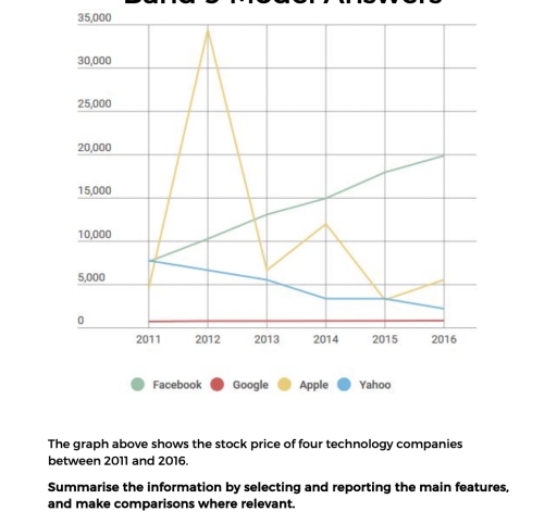
The line chart compares the share prices of four technology companies – Facebook, Google, Apple and Yahoo – between 2011 and 2016.

Overall, Apple experienced the most dramatic fluctuations and recorded the highest figure during the period, while Facebook showed a steady upward trend. In contrast, Yahoo’s share price declined considerably, whereas Google remained relatively stable at a very low level.

In 2011, Apple’s share price stood at approximately 5,000. It then rose sharply and reached a peak of around 35,000 in 2012. However, this figure dropped significantly to about 6,000 in 2013. Although it recovered slightly to around 11,000 in 2014, it fell again to roughly 3,000 in 2015 before increasing modestly to about 5,000 in 2016.

Meanwhile, Facebook and Yahoo both started at roughly 7,000 in 2011. Facebook’s share price increased steadily throughout the period, reaching nearly 20,000 by 2016. By contrast, Yahoo’s figure declined gradually, falling to around 2,000 at the end of the period. Google, on the other hand, remained close to zero and showed almost no change over the six years.

Word Count: 176

Answers On The Same Topic:

The graph above shows the stock price of four technology companies between 2011 and 2016. Summarise the information by selecting and reporting the main features, and make comparisons where relevant.

The data displays the stock price of technology companies, Facebook, appel, google and yahoo from 2011 to 2016. Overall, Google had stability on the stock price during that period, in addtion appel had instability on the stock price compared to yahoo had decrease gradualy, in contrast facebook had increase gradualy during that period comparing to […]

The graph above shows the stock price of four technology companies between 2011 and 2016. Summarise the information by selecting and reporting the main features, and make comparisons where relevant.

The line graph illustrates changes in the stock prices of four major technology companies – Facebook, Google, Apple and Yahoo – between 2011 and 2016. Overall, Apple displayed the most volatile trend, surging to a dramatic peak before falling sharply afterwards. Facebook, in contrast, experienced consistent growth and finished the period with the highest share […]

The graph above shows the stock price of four technology companies between 2011 and 2016. Summarise the information by selecting and reporting the main features, and make comparisons where relevant.

The line chart illustrates the four type of technology companies share price.Which happens in 2011 to 2016, including Facebook, Google, Apple, Yahoo. Overall, it can be seen that Apple was owns the most high figure, whereas Google was remained relatively stable in every year, even though it was the lowest throughout the period. In 2011, […]

The graph above shows the stock price of four technology companies between 2011 and 2016. Summarise the information by selecting and reporting the main features, and make comparisons where relevant.

The line graph displays the data about stock value of four technology companies peroid Between 2011 to 2016. Overall, it is clear that Google price remained constant and Facebook increase slowly whereas a apple stock was dramatically increase and slowly drop down whereas yahoo fall downward. In 2011 most companies started at around 5000 to […]

See All

Other Topics:

The graph below shows the amount of goods transported in the United Kingdom by four different types of transport between 1980 and 2008. Summarise the information by selecting and reporting the main features, and make comparisons

The line graph illustrates the quantity of goods transported in the UK by four different modes of transport: road, water, rail and pipeline from 1980 to 2008. Overall, all types of transport experienced upward trends with fluctuations, though to varying degrees. Additionally, road remained the dominant mode throughout the period, while pipeline consistently recorded the […]

the line graph illustrates the proportion of total expenditure in a certain European country between 1960 and 2000.

The line graph shows the consuming of total expenditure in a certain Europian country in percentage from 1960 to 2000. Overall it can be clearly seen that there is a 5 things for humanization facilities namely: food, leisure, clothing, transport, energy. According to the data food and clothing has the most changes during this 4 […]

The graph below shows UK air pollutants in millions of tonnes, from three different sources, between 1990 and 2005.

The presented line chart compares and contrasts the amount of air pollutants, measured in millions of tonnes, originating from 3 different sources, including industry, transport and households over the course of 15 years. Overall, it is obvious that there was a decline in almost all categories, while the opposite is true for transport. Additionally, the […]

The chart below shows the market size of mobile and QR sales in the USA in billions of US dollars.

The chart presents the mobile and QR sales of the market size in the USA in billions of US dollars. Overall, the market size of mobile and QR sales increased from steadily 2017 to 2023. Between 2017 and 2019, the market size considerably raised from approximately 1 billion to 2 billion dollars. From 2019 to […]

Write the description according to the instructions. The line graph shows the number of visitors to four tourist destinations on an island between 1980 and 2015.

The data displays the amount of guests on 4 different tourist attractions on an island from 1980 to 2015. Overall, parks experienced the greatest rise in visitor count, aquariums experienced less, museums was the only attraction to drop in guest count, and zoos went through almost no variation. However, aquariums remain the most popular among […]

The graph below shows the number of shops that closed and the number of the new shops that opened in one country between 2011 and 2018.

The line graph illustrates how many stores were closed down and launched in a particular country from 2011 to 2018. Overall, both categories experienced downward trends with fluctuations, though to varying degrees. Additionally, while the new shops outnumbered the closed ones initially, the former were eventually surpassed by the former. Focusing on the first half […]

See All
We have detected unusual activity on your device.
Please verify your identity to continue.
Note: This verification step won't sign you in. If you have a premium account, please log in to access the service as usual.
Google/Gmail Verification
Or verify using Email/Code
We've sent a verification code to:
youremail@gmail.com (Not your email?)
Enter it below to complete the verification process.
Ensure your email address is correct, your inbox is not full, and you check your spam folder. If no email arrives, consider using an alternative email.
You will need a Premium plan to perform your action!
Note: If you already have a premium account, please log in to access our services as usual.

Plans & Pricing

Our mission is to make quality education accessible for everyone.
However, to keep our hardworking team running and this service alive, we genuinely need your support!
By opting for a premium plan, not only do you sustain us in achieving the mission, but you also unlock advanced features to enrich your learning experience.

Free

For learners who aren't pressed for time

What's included on Free
100+ Cambridge IELTS Tests
Instant IELTS Writing Task 1 & 2 Evaluation (2 times/month)
Instant IELTS Speaking Part 1, 2, & 3 Evaluation (5 times/month)
Instant IELTS Writing Task 1 & 2 Essay Generator (2 times/month)
500+ Dictation & Shadowing Exercises
100+ Pronunciation Exercises
Flashcards
Other Advanced Tools

Premium

For those serious about advancing their English proficiency, and for IELTS candidates aspiring to boost their band score by 1-2 points (especially in writing & speaking) in just 30 days or less

What's included on Premium
Save Your IELTS Test Progress
Unlock All Courses & IELTS Tests
Unlimited AI Conversations
Unlimited AI Writing Enhancement Exercises
Unlimited IELTS Writing Task 1 & 2 Evaluation
Unlimited IELTS Speaking Part 1, 2, & 3 Evaluation
Checked Answers Will Not Be Published
Unlimited IELTS Writing Task 1 & 2 Essay Generator
Unlimited IELTS Speaking Part 1, 2, & 3 Sample Generator
Unlimited Usage Of Advanced Tools
Priority Support within 24h (12-month plan only)

Due to the nature of our service and the provided free trials, payments are non-refundable.
Nếu bạn là người Việt Nam và không có hoặc không muốn trả bằng credit/debit cards, bạn có thể thanh toán bằng phương thức chuyển khoản:


Chọn gói:
419,000₫ 277,000 ₫ cho gói 1 tháng (chỉ 9,233₫/ngày)
1,239,000₫ 597,000 ₫ cho gói 3 tháng (chỉ 6,633₫/ngày)
2,469,000₫ 1,027,000 ₫ cho gói 6 tháng (chỉ 5,706₫/ngày)
4,929,000₫ 1,417,000 ₫ cho gói 12 tháng (chỉ 3,936₫/ngày)


Sau khi chuyển khoản, vui lòng đợi trình duyệt tự động điều hướng bạn trở lại Engnovate và bạn sẽ ngay lập tức nhận được mã kích hoạt tài khoản premium.
Nếu có lỗi xảy ra, bạn có thể liên hệ với team thông qua một trong các phương thức: email đến helloengnovate@gmail.com hoặc nhắn tin qua facebook.com/engnovate.
Vì toàn bộ công cụ trên website đều có thể sử dụng thử miễn phí, Engnovate không hỗ trợ hoàn tiền.