🔥 Today Only: Save 30% on Premium — Offer Ends Soon! - Upgrade Now!
Line Graph

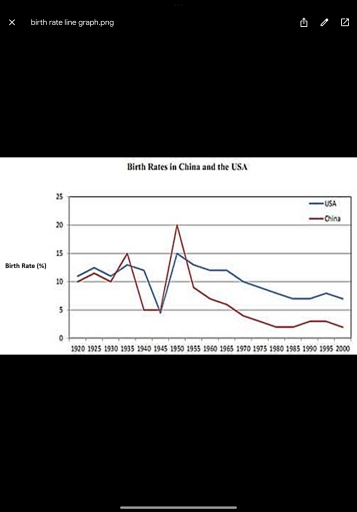
Band 8+: The graph below compares the changes in the birth rates of China and the USA between 1920 and 2000. Summarise the information by selecting and reporting the main features and make comparisons where relevant.

Image for topic: The graph below compares the changes in the birth rates of China and the USA between 1920 and 2000. Summarise the information by selecting and reporting the main features and make comparisons where relevant.
Our system will evaluate the answer based on this AI-generated description.
The image presents a line graph comparing birth rates in China and the USA from 1920 to 2000. In 1920, China’s birth rate is 9 while the USA's is slightly higher at 11.5, with 1925 showing China at 14 and USA at 14.5. The 1930 data indicates China at 13 and USA at 15, then 1935 records China at 12 and USA at 13. A mark of 15 for China and 12 for USA in 1940 precedes an increase to 20 in 1945 for China and 17 for USA. Both rates peak in 1950, at 22 for China and 20 for USA, before declining, hitting 17 for China and 19 for USA in 1955. China then descends sharply to 7 in 1960, and 6 in 1965, whereas the USA's gradual decrease sets it at 18 in 1960 and 14 in 1965. By 1970, China is at 5, with USA at 15; in 1975, China remains at 5, and USA is at 14. In 1980, both countries stand at 10, China remains at 4 in 1985 and USA adjusts to 13. By 1990, China reaches 4, and USA is at 12; by 1995, China’s birth rate is at 5 contrasted by USA’s 13. The final year, 2000, marks stable rates with China at 7 and USA at 12.
Given the complexity of the image, the above description may not be entirely accurate.
Note: Both the topic and the answer were created by one of our users.

The line graph illustrates the contrasting birth rate patterns in China and the United States over an eighty-year period, revealing significant differences in their demographic transitions.

In the USA, birth rates fluctuates moderately, peaking at 15% around 1930 before beginning a gradual decline. A temporary increase interrupted this downward trend, but rates continued falling steadily to approximately 7% by 2000.

China’s demographic pattern differed significantly. After maintaining stability until 1940, birth rates climbed sharply to reach 20% in 1955. This was followed by a dramatic decline of 8 percentage points within 15 years, eventually slowing to match America’s rate at century’s end.

While the USA experienced consistent gradual reduction, China underwent rapid expansion followed by an equally swift contraction. They eventually became similar, showing that even though they developed in different ways, both countries ended up with similar population patterns.

Word Count: 140

Answers On The Same Topic:

The graph below compares the changes in the birth rates of China and the USA between 1920 and 2000. Summarise the information by selecting and reporting the main features and make comparisons where relevant.

The graph below compares the changes in the birth rates of China and the USA between 1920 and 2000. Overall, the data reveals a similar trajectory in birth rate both in China and the USA, with the USA commences a higher level than China, yet maintained its higher position in the final examined year. The […]

The graph below compares the changes in the birth rates of China and the USA between 1920 and 2000. Summarise the information by selecting and reporting the main features and make comparisons where relevant.

A glance at the graph provided reveals how the fertility rates in America and China altered over an 80-year period from 1920 to 2000. Overall, both countries witnessed a dramatic fall during 1940-1945, with a notable increase between around 1945-1955 before leveling off. Increasing from approximately 10% to 15% in 1935, the birth rate in […]

The graph below compares the changes in the birth rates of China and the USA between 1920 and 2000. Summarise the information by selecting and reporting the main features and make comparisons where relevant.

A glance at the graph provided reveals how the fertility rates in America and China altered over a 80-year period from 1920 to 2000. Overall, both countries witnessed dramatical fall during 1940-1945, with notable increase between around 1945-1955 before leveling off. Increasing from approximately 10 % to 15 % in 1935, the birth rate in […]

The graph below compares the changes in the birth rates of China and the USA between 1920 and 2000. Summarise the information by selecting and reporting the main features and make comparisons where relevant.

A glance at the graph provided reveals how the fertility rates in America and China altered over a 80-year period from 1920 to 2000. Overall, both nations witnessed marked fluctuation, with notable troughs in the 1940s and peaks in the 1950s. Birth rates in USA and China was broadly comparble up to mid century prior […]

The graph below compares the changes in the birth rates of China and the USA between 1920 and 2000. Summarise the information by selecting and reporting the main features and make comparisons where relevant.

The line graph compares the birth rate proportions in China and the USA over eighty years, from 1920 to 2000. Overall, despite a sharp increase in the 1950s, the proportions of birth rates both in China and the USA decreased significantly over the examined period. Notably, while the birth rate difference between the two nations […]

See All

Other Topics:

the line graph below shows the household recycling rates in three different countries between 2005 and 2015. Summarize the information by selecting and reporting the main feature and make comparison where relevant .

The rate of household recycling in the UK, Germany and France from 2005 to 2015 has been illustrated in the line graph. Overall, the graph demonstrates that during this period the percentage of recycling in the UK and Germany has grown, however the percentage of recycling in France has dropped. In 2013 the number of […]

The chart below shows the changes that took place in three different areas of crime in New Port city center from 2003-2012. Summarise the information by selecting and reporting the main features, and make comparisons where relevant.

The line graph represents the frequency of three different types of cripes used to happen in New Port city center from 2003 to 2021. As we can see from the graph, three crime types included are bulglary, car theft and robbery. The lines for car theft and robbery had some fluctuations over the period while […]

The graph below shows average carbon dioxide emissions per person in the United Kingdom, Sweden, Italy and Portugal between 1967 and 2007.

The line graph illustrates the average amount of carbon dioxide emission per capita in the UK and three other European countries over a 40-year period from 1967 to 2007. It is clear that the average emission per person experienced a significant decrease over the period in the UK and Sweden. While the remaining two European […]

The graph below shows average carbon dioxide emissions per person in the United Kingdom, Sweden, Italy and Portugal between 1967 and 2007.

The diagram depicts the average amount of carbon dioxide emissions per capita in four European countries from 1967 to 2007. Overall, the United Kingdom and Sweden experienced significant reductions in the average amount of carbon emissions. Meanwhile, the amount in Italy and Portugal increased significantly over the period. The United Kingdom had the highest CO2 […]

The line graph shows the percentage of people using four different forms of transport in a city between 2000 and 2020.

The given line graph illustrates the proportion of people using four different forms of transport, namely Car, Bicycle, Bus, and walking in a city between 2000 and 2020. Overall, it can be seen that car accounted for the highest proportion of transport usage throughout the period. By contrast, walking remained the least popular form of […]

The graph shows average annual expenditures on cell phone and residential phone services between 2001 and 2010. Summarize the information by selecting and reporting the main features, and make comparisons where relevant.

The given line graph illustrates the US consumers’ average annual expenditures on cell phone and residential phone services during the period 2001 to 2010. Overall, it is obvious that cell phone services saw a sharp rise throughout the period, while residental phone services witnessed a rapid decline over the period. With regard to cell phone […]

See All
We have detected unusual activity on your device.
Please verify your identity to continue.
Note: This verification step won't sign you in. If you have a premium account, please log in to access the service as usual.
Google/Gmail Verification
Or verify using Email/Code
We've sent a verification code to:
youremail@gmail.com (Not your email?)
Enter it below to complete the verification process.
Ensure your email address is correct, your inbox is not full, and you check your spam folder. If no email arrives, consider using an alternative email.
You will need a Premium plan to perform your action!
Note: If you already have a premium account, please log in to access our services as usual.

Plans & Pricing

Our mission is to make quality education accessible for everyone.
However, to keep our hardworking team running and this service alive, we genuinely need your support!
By opting for a premium plan, not only do you sustain us in achieving the mission, but you also unlock advanced features to enrich your learning experience.

Free

For learners who aren't pressed for time

What's included on Free
100+ Cambridge IELTS Tests
Instant IELTS Writing Task 1 & 2 Evaluation (2 times/month)
Instant IELTS Speaking Part 1, 2, & 3 Evaluation (5 times/month)
Instant IELTS Writing Task 1 & 2 Essay Generator (2 times/month)
500+ Dictation & Shadowing Exercises
100+ Pronunciation Exercises
Flashcards
Other Advanced Tools

Premium

For those serious about advancing their English proficiency, and for IELTS candidates aspiring to boost their band score by 1-2 points (especially in writing & speaking) in just 30 days or less

What's included on Premium
Save Your IELTS Test Progress
Unlock All Courses & IELTS Tests
Unlimited AI Conversations
Unlimited AI Writing Enhancement Exercises
Unlimited IELTS Writing Task 1 & 2 Evaluation
Unlimited IELTS Speaking Part 1, 2, & 3 Evaluation
Checked Answers Will Not Be Published
Unlimited IELTS Writing Task 1 & 2 Essay Generator
Unlimited IELTS Speaking Part 1, 2, & 3 Sample Generator
Unlimited Usage Of Advanced Tools
Priority Support within 24h (12-month plan only)

Due to the nature of our service and the provided free trials, payments are non-refundable.
Nếu bạn là người Việt Nam và không có hoặc không muốn trả bằng credit/debit cards, bạn có thể thanh toán bằng phương thức chuyển khoản:


Chọn gói:
419,000₫ 277,000 ₫ cho gói 1 tháng (chỉ 9,233₫/ngày)
1,239,000₫ 597,000 ₫ cho gói 3 tháng (chỉ 6,633₫/ngày)
2,469,000₫ 1,027,000 ₫ cho gói 6 tháng (chỉ 5,706₫/ngày)
4,929,000₫ 1,417,000 ₫ cho gói 12 tháng (chỉ 3,936₫/ngày)


Sau khi chuyển khoản, vui lòng đợi trình duyệt tự động điều hướng bạn trở lại Engnovate và bạn sẽ ngay lập tức nhận được mã kích hoạt tài khoản premium.
Nếu có lỗi xảy ra, bạn có thể liên hệ với team thông qua một trong các phương thức: email đến helloengnovate@gmail.com hoặc nhắn tin qua facebook.com/engnovate.
Vì toàn bộ công cụ trên website đều có thể sử dụng thử miễn phí, Engnovate không hỗ trợ hoàn tiền.