🔥 Today Only: Save 30% on Premium — Offer Ends Soon! - Upgrade Now!
Line Graph

Band 5+: The graph below compares the number of visits to two new music sites on the web. Write a report for a university lecturer describing the information shown below.

Image for topic: The graph below compares the number of visits to two new music sites on the web. Write a report for a university lecturer describing the information shown below.
Our system will evaluate the answer based on this AI-generated description.
The image contains a line graph comparing visits to 'Music Choice' and 'Pop Parade' over 15 days; day 1, 'Music Choice' had 40 visits and 'Pop Parade' had 120 visits; day 2, 'Music Choice' rose to 100 visits, 'Pop Parade' dropped to 80 visits; day 3, 'Music Choice' dropped to 20 visits, 'Pop Parade' rose to 140 visits; day 4, 'Music Choice' rose to 120 visits, 'Pop Parade' dropped to 100 visits; day 5, 'Music Choice' dropped to 60 visits, 'Pop Parade' rose to 160 visits; day 6, 'Music Choice' rose to 140 visits, 'Pop Parade' dropped to 120 visits; day 7, 'Music Choice' dropped to 20 visits, 'Pop Parade' rose to 180 visits; day 8, 'Music Choice' rose to 100 visits, 'Pop Parade' dropped to 20 visits; day 9, 'Music Choice' dropped to 60 visits, 'Pop Parade' rose to 160 visits; day 10, 'Music Choice' rose to 160 visits, 'Pop Parade' dropped to 60 visits; day 11, 'Music Choice' dropped to 20 visits, 'Pop Parade' rose to 180 visits; day 12, 'Music Choice' rose to 100 visits, 'Pop Parade' dropped to 60 visits; day 13, 'Music Choice' dropped to 60 visits, 'Pop Parade' rose to 140 visits; day 14, 'Music Choice' rose to 140 visits, 'Pop Parade' dropped to 100 visits; day 15, 'Music Choice' dropped to 40 visits, 'Pop Parade' rose to 160 visits; y-axis scale is in increments of 20 from 0 to 180, labeled '000s'; x-axis labeled 'Days' from 1 to 15; 'Music Choice' represented by dashed line, 'Pop Parade' represented by dotted line.
Given the complexity of the image, the above description may not be entirely accurate.
Note: Both the topic and the answer were created by one of our users.

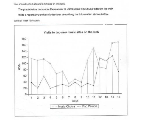
The graph below reports the amount of visits to two new music sites on the web. The data reported is during a period of two weeks. The two sites are Musich Choice and Pop Parade. According to the graph the first is more famous than the second one.

At the beginning the number of hits to Music Choice half on the second day, dropping to 20.000. The next day instead the hits rocket to 60.000. For the first eight days the visits for Pop Parade drop over the period. After that instead rose dramatically. While Music Choice had some fluctuations until the eleventh day. The next day Music Choice hit 120.000 visits.

The graph shows that this day and the next one are the only two in which Music Choice has more hits than Pop Parade. In fact on day 14 hits for Pop Parade had a drastic increase reaching 160.000 visits. Additionally on day 15 the number of visitors for Musich choice plunge to 80.000.

Word Count: 166

Answers On The Same Topic:

The graph below compares the number of visits to two new music sites on the web. Write a report for a university lecturer describing the information shown below.

The line chart illustrate the changes in the number of visits to two innovative music sites on the internet for 15 days ,namely Music Choice and Pop Parade. Overall, both sites experienced fluctuataion, where Music Choice took the lead for the first 11 days, thereafter , Pop parade overtook it and got exceeded on the […]

The graph below compares the number of visits to two new music sites on the web. Write a report for a university lecturer describing the information shown below.

The graph features information about visitors to two new music sites on the web for the past 15 days. In general, graph had ups and downs. For instance, at the first day website number 1 had almost 120 visitors, meanwhile the second site only 40. But next days everything changed, first website was dramatically losing […]

The graph below compares the number of visits to two new music sites on the web. Write a report for a university lecturer describing the information shown below.

The line greph Illustrates the number of visits to two new music sites,Music Choice and Pop Parade, over a period of 15 days.The scale is in thousands. Overall, it Can be seen that the Pop Parade initially attracted more visitors. Music Choice experienced significantly higher peaks in popularity towards the ends of the period, with […]

The graph below compares the number of visits to two new music sites on the web. Write a report for a university lecturer describing the information shown below.

This graph illustrates the visits to the two newly launched music sites on the internet during the period of 15 days. The music choices sites stand at the 40 visits on the first day and with a rise on day 3 it was at 60 visits. After the drop on day four and drop at […]

The graph below compares the number of visits to two new music sites on the web. Write a report for a university lecturer describing the information shown below.

The line graph compares the daily number of visits, measured in thousands, to two newly launched music websites, Music Choice and Pop Parade, over a 15-day period. Overall, Pop Parade consistently attracted more visitors than Music Choice, except for a brief period in the middle, and both sites experienced significant fluctuations. Pop Parade ended the […]

See All

Other Topics:

The graph below shows the number of shops that closed and the number of new shops that opened in one country between 2011 and 2018. Summarise the information by selecting and reporting the main features, and make comparisons where relevant. Write at least 150 words.

The line graph illustrates the amount of stores that closed and the amount of new stores that opened in a country around 2011 and 2018. Overall, there was a fluctuation for the opening stores with a decreased trend. On the other hand, there was a remain steady trend with one rocket drop on one year […]

The graph below shows the population of particular coutry by age group starting in 1960 and including a forecast to 2040

The graph depicts the population of a nation in three age groups from 0 up to 65 years old between 1960 and including a forecast to 2040. Overall, the young from 0 to 14 years old a decline among 80 years, while the older groups who are over 65 years old experiencing a significant increased. […]

The graph below shows the results of a survey among online adults on their use of various social media in the USA between 2012 and 201 5.

In today’s fast – paced world, there are many various social medias. This allows them to choose that they really need. This essay is about line graph, that shows us the usage websites in the USA between 2012 and 2015. Overall, the data reveals that users in all social networks generally increased. The Facebook consistently […]

The line graph shows the percentage of spending in a European country from 1960 to 2000. Summarise the information by selecting and reporting the main features, and make comparisons where relevant.

The graph illustrates the proportion of household expenditure on food, leisure, clothing, transport, and energy in a distinct European country from 1960 to 2000. Overall, the figure for energy, clothing, leisure, and food decreased gradually, while that for transport increased consistently. Notably, the gap between several expenditure categories became much smaller by the end of […]

the graph below shows the weekdays volume of passenger activity on the toronto metro system for july 2007.

The line graph illustrates the volume of acitivity of passengers on weekdays on the Toronto Metro system for July 2007. Overall, the graph shows an unstable trend with significant fluctuation. Although the figures reached its two highest points at 8 am and 6 pm, there are considerable decreases in the number right after the rush […]

The graph below illustrates global energy demand, measured in millions of tonnes of oil equivalent, over a six-decade period.

The line graph depicts international energy consumption, expressed in millions of tonnes on an oil-equivalent basis, over 60 years, from 1970 to 2030. Over the period 1970 to 2030, oil consumption has risen considerably across all fuel types, but hydro needs are still levelling off by 2030. The most significant point is that at the […]

See All
We have detected unusual activity on your device.
Please verify your identity to continue.
Note: This verification step won't sign you in. If you have a premium account, please log in to access the service as usual.
Google/Gmail Verification
Or verify using Email/Code
We've sent a verification code to:
youremail@gmail.com (Not your email?)
Enter it below to complete the verification process.
Ensure your email address is correct, your inbox is not full, and you check your spam folder. If no email arrives, consider using an alternative email.
You will need a Premium plan to perform your action!
Note: If you already have a premium account, please log in to access our services as usual.

Plans & Pricing

Our mission is to make quality education accessible for everyone.
However, to keep our hardworking team running and this service alive, we genuinely need your support!
By opting for a premium plan, not only do you sustain us in achieving the mission, but you also unlock advanced features to enrich your learning experience.

Free

For learners who aren't pressed for time

What's included on Free
100+ Cambridge IELTS Tests
Instant IELTS Writing Task 1 & 2 Evaluation (2 times/month)
Instant IELTS Speaking Part 1, 2, & 3 Evaluation (5 times/month)
Instant IELTS Writing Task 1 & 2 Essay Generator (2 times/month)
500+ Dictation & Shadowing Exercises
100+ Pronunciation Exercises
Flashcards
Other Advanced Tools

Premium

For those serious about advancing their English proficiency, and for IELTS candidates aspiring to boost their band score by 1-2 points (especially in writing & speaking) in just 30 days or less

What's included on Premium
Save Your IELTS Test Progress
Unlock All Courses & IELTS Tests
Unlimited AI Conversations
Unlimited AI Writing Enhancement Exercises
Unlimited IELTS Writing Task 1 & 2 Evaluation
Unlimited IELTS Speaking Part 1, 2, & 3 Evaluation
Checked Answers Will Not Be Published
Unlimited IELTS Writing Task 1 & 2 Essay Generator
Unlimited IELTS Speaking Part 1, 2, & 3 Sample Generator
Unlimited Usage Of Advanced Tools
Priority Support within 24h (12-month plan only)

Due to the nature of our service and the provided free trials, payments are non-refundable.
Nếu bạn là người Việt Nam và không có hoặc không muốn trả bằng credit/debit cards, bạn có thể thanh toán bằng phương thức chuyển khoản:


Chọn gói:
419,000₫ 277,000 ₫ cho gói 1 tháng (chỉ 9,233₫/ngày)
1,239,000₫ 597,000 ₫ cho gói 3 tháng (chỉ 6,633₫/ngày)
2,469,000₫ 1,027,000 ₫ cho gói 6 tháng (chỉ 5,706₫/ngày)
4,929,000₫ 1,417,000 ₫ cho gói 12 tháng (chỉ 3,936₫/ngày)


Sau khi chuyển khoản, vui lòng đợi trình duyệt tự động điều hướng bạn trở lại Engnovate và bạn sẽ ngay lập tức nhận được mã kích hoạt tài khoản premium.
Nếu có lỗi xảy ra, bạn có thể liên hệ với team thông qua một trong các phương thức: email đến helloengnovate@gmail.com hoặc nhắn tin qua facebook.com/engnovate.
Vì toàn bộ công cụ trên website đều có thể sử dụng thử miễn phí, Engnovate không hỗ trợ hoàn tiền.