🔥 Today Only: Save 30% on Premium — Offer Ends Soon! - Upgrade Now!
Line Graph

Band 7+: The graph below gives information on cinema attendance in the UK from 1984 to 2003.

Image for topic: The graph below gives information on cinema attendance in the UK from 1984 to 2003.
Our system will evaluate the answer based on this AI-generated description.
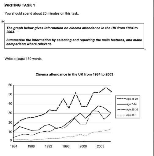
The image displays a line graph, 'Cinema attendance in the UK from 1984 to 2003', showing data for four age groups across a vertical axis from 0 to 60. For the Age 15-24 group, the approximate yearly values are: 16 (1984), 22 (1985), 24 (1986), 25 (1987), 26 (1988), 28 (1989), 29 (1990), 32 (1991), 33 (1992), 32 (1993), 40 (1994), 45 (1995), 35 (1996), 46 (1997), 52 (1998), 40 (1999), 38 (2000), 45 (2001), 52 (2002), and 57 (2003). For the Age 7-14 group, the approximate values are: 10 (1984), 16 (1985), 15 (1986), 12 (1987), 12 (1988), 11 (1989), 17 (1990), 18 (1991), 12 (1992), 12 (1993), 15 (1994), 15 (1995), 20 (1996), 25 (1997), 27 (1998), 30 (1999), 25 (2000), 32 (2001), 38 (2002), and 30 (2003). For the Age 25-35 group, the values are approximately: 7 (1984), 5 (1985), 6 (1986), 8 (1987), 7 (1988), 7 (1989), 9 (1990), 11 (1991), 18 (1992), 12 (1993), 13 (1994), 13 (1995), 15 (1996), 22 (1997), 26 (1998), 18 (1999), 19 (2000), 30 (2001), 32 (2002), and 22 (2003). For the Age 35+ group, the approximate values are: 3 (1984), 1 (1985), 1 (1986), 2 (1987), 0 (1988), 1 (1989), 2 (1990), 2 (1991), 3 (1992), 2 (1993), 3 (1994), 4 (1995), 4 (1996), 5 (1997), 4 (1998), 8 (1999), 6 (2000), 8 (2001), 10 (2002), and 13 (2003).
Given the complexity of the image, the above description may not be entirely accurate.
Note: Both the topic and the answer were created by one of our users.

The graph provided, represents cinema attendance in the UK, spanning almost two decades, from 1984 to 2003.

People aged from 15-24 remained the highest attendees throughout the years, compared to the other age groups. Their attendance grew steadily, with a sudden drop around the late 90s, which was then followed by an immediate rebounce, and yet another decline in the early 2000s, which reached a plateau for a couple of years before it started increasing again.

The age group that directly followed were kids and preteens, with their attendance showing an overall increase over the years, with less dramatic flunctuations.

Young adults ranged from 25 to 35 years old, demonstrated a steady increase for over a decade, before a gradual decline in the late 90s that plateaued until the early 2000s, when it gradually skyrocketed.

Overall, adults over the age of 35 consistently held the lowest attendance rate out of all the age groups. Up until the year 2000 attendance remained constant, with only a more noticeable increase happening near the year 2003.

Word Count: 173

Answers On The Same Topic:

The graph below gives information on cinema attendance in the UK from 1984 to 2003.

The line graph shows information about four age collective who attended to the cinema in 1984 and 2003. Overall, it is clear that all four age categories saw an significant increase to going cinema over the period, mostly, middle age group always had highest attendance among others. In 1984, people who aged 15-24 recorded the […]

The graph below gives information on cinema attendance in the UK from 1984 to 2003.

The chart shows the figures for British people attending cinema’s movies between 1984 and 2003. Overall, citizens aged between 15 and 24 years old represent the foremost age-based category who went to the cinema, followed by children between 7 and 14 years old, then older citizens. While the trend regarding people over 35 slightly increased […]

The graph below gives information on cinema attendance in the UK from 1984 to 2003.

The line graph illustrates changes in cinema attendance among four age groups in the UK between 1984 and 2003. Overall, cinema attendance increased across all age categories over the period. People aged 15-24 consistently recorded the highest participation and experienced the most substantial growth, whereas those aged 35 and over remained the least frequent cinema-goers […]

The graph below gives information on cinema attendance in the UK from 1984 to 2003.

The line chart compares trends in cinema attendance among four different age groups across the UK between 1984 and 2003. Overall, it is immediately noticeable that all age groups experienced increases, albeit to varying degrees. Age group of 15-24 was the most pronounced category, by contrast, the 35+ group remained significantly stable despite a marked […]

See All

Other Topics:

The graph below gives information about the price of bananas in four countries between 1984 and 2004. Summarize the information by selecting and reporting the main features, and make comparisons where relevant.

The graph illustrates the banana prices in Japan, France, Germany, and the USA from 1994 to 2004, units measured in dollars per kilogram. Overall, it can be seen that Japan had the highest banana prices consistently througout the period despite some fluctuations. On the other hand, the price of the same fruit in Germany and […]

The graph below gives information about one company's unit sales of 5 different types of jam from 2009 to 2014. Summarise the information by selecting and reporting the main features, and make comparisons where relevant.

The line graph illustrates a company’s unit sales of 5 different types of jam in the span of 5 year We can see that strawberry jam was the most prominent type of jam in the 2009,and grape was the lest popular option then.but In 2014.While strawberry jam still kept it value with the most sale,grape […]

The graph below shows the percentage of total spending in five different categories from 1970 to 2010 in one city in Australia.

The line graph demonstrates the percentage of total spending in five different categories from 1970 to 2010 in one city in Australia. Overall, it is noticeable that the proportion of spending on food declined significantly over the 40-year period, falling from around 33% in 1970 to just 12% in 2010, making it the most dramatic […]

The graph below shows the percentage of total spending in five different categories from 1970 to 2010 in one city in Australia.

The line graph demonstrate the percentage of total spending in five different categories from 1970 to 2010 in one city in Australia. Overall, it is noticeable that the proportion of spending on food declined significantly over the 40-year period, falling from around 33% in 1970 to just 12% in 2010, making it the most dramatic […]

The chart below shows the percentage of difference in income between men and women from 1978 to 2008 Summarise the information by selecting and reporting the main features, and make comparisons

The line graph illustrates the percentage of variation in income between men and women from 1978 to 2008 in five countries named Japan,US,France,UK and Australia. Overall it can cristal clearly be seen that ,all countries except Australia showed decline in the percentage difference from 1978 to2008. Australia has presented steady decline up to 1998 and […]

See All
We have detected unusual activity on your device.
Please verify your identity to continue.
Note: This verification step won't sign you in. If you have a premium account, please log in to access the service as usual.
Google/Gmail Verification
Or verify using Email/Code
We've sent a verification code to:
youremail@gmail.com (Not your email?)
Enter it below to complete the verification process.
Ensure your email address is correct, your inbox is not full, and you check your spam folder. If no email arrives, consider using an alternative email.
You will need a Premium plan to perform your action!
Note: If you already have a premium account, please log in to access our services as usual.

Plans & Pricing

Our mission is to make quality education accessible for everyone.
However, to keep our hardworking team running and this service alive, we genuinely need your support!
By opting for a premium plan, not only do you sustain us in achieving the mission, but you also unlock advanced features to enrich your learning experience.

Free

For learners who aren't pressed for time

What's included on Free
100+ Cambridge IELTS Tests
Instant IELTS Writing Task 1 & 2 Evaluation (2 times/month)
Instant IELTS Speaking Part 1, 2, & 3 Evaluation (5 times/month)
Instant IELTS Writing Task 1 & 2 Essay Generator (2 times/month)
500+ Dictation & Shadowing Exercises
100+ Pronunciation Exercises
Flashcards
Other Advanced Tools

Premium

For those serious about advancing their English proficiency, and for IELTS candidates aspiring to boost their band score by 1-2 points (especially in writing & speaking) in just 30 days or less

What's included on Premium
Save Your IELTS Test Progress
Unlock All Courses & IELTS Tests
Unlimited AI Conversations
Unlimited AI Writing Enhancement Exercises
Unlimited IELTS Writing Task 1 & 2 Evaluation
Unlimited IELTS Speaking Part 1, 2, & 3 Evaluation
Checked Answers Will Not Be Published
Unlimited IELTS Writing Task 1 & 2 Essay Generator
Unlimited IELTS Speaking Part 1, 2, & 3 Sample Generator
Unlimited Usage Of Advanced Tools
Priority Support within 24h (12-month plan only)

Due to the nature of our service and the provided free trials, payments are non-refundable.
Nếu bạn là người Việt Nam và không có hoặc không muốn trả bằng credit/debit cards, bạn có thể thanh toán bằng phương thức chuyển khoản:


Chọn gói:
419,000₫ 277,000 ₫ cho gói 1 tháng (chỉ 9,233₫/ngày)
1,239,000₫ 597,000 ₫ cho gói 3 tháng (chỉ 6,633₫/ngày)
2,469,000₫ 1,027,000 ₫ cho gói 6 tháng (chỉ 5,706₫/ngày)
4,929,000₫ 1,417,000 ₫ cho gói 12 tháng (chỉ 3,936₫/ngày)


Sau khi chuyển khoản, vui lòng đợi trình duyệt tự động điều hướng bạn trở lại Engnovate và bạn sẽ ngay lập tức nhận được mã kích hoạt tài khoản premium.
Nếu có lỗi xảy ra, bạn có thể liên hệ với team thông qua một trong các phương thức: email đến helloengnovate@gmail.com hoặc nhắn tin qua facebook.com/engnovate.
Vì toàn bộ công cụ trên website đều có thể sử dụng thử miễn phí, Engnovate không hỗ trợ hoàn tiền.