🔥 Today Only: Save 30% on Premium — Offer Ends Soon! - Upgrade Now!
Line Graph

Band 4+: The graph below represents the employment patterns in the USA between 1930 and 2010.

Image for topic: The graph below represents the employment patterns in the USA between 1930 and 2010.
Our system will evaluate the answer based on this AI-generated description.
The image displays a line graph charting employment patterns in the USA by sector from 1930 to 2010. The X-axis ranges from 1930 to 2010 in ten-year increments, and the Y-axis displays percentages from 0 to 75 in increments of 25. The 'Industrial' sector shows a steep decline from approximately 55% in 1930 to about 10% in 2010. 'Technical' jobs exhibit a gradual rise from near 5% to just over 25%. The 'Sales and Office' sector starts around 10%, peaks near the 50% mark around 2000, then slightly declines to just below 50% in 2010. 'Other Services' sector remains below 25%, rising long-term from about 5% to 15%. 'Farming, fishing and Forestry' sector displays a gradual decline, starting above 15% and stateside falling near 5%. The intersect points include 'Technical' crossing 'Farming, Fishing and Forestry' near 1960 at around 15%, 'Sales and Office' surpassing 'Industrial' near 1940 just under 25%, and 'Technical' intersecting 'Other Services' near 2000 at about 15%.
Given the complexity of the image, the above description may not be entirely accurate.
Note: Both the topic and the answer were created by one of our users.

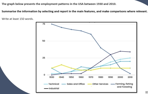
The chart display the types of employments demands in the USA in the period from 1930 to 2010.

Overall, Farming, fishing and foresting decreased significantly, While Industrial services increased dramatically, But technical, Sales and ofiice services increased gradually, And finally other services fluctuated through that period.

Farming, fishing and foresting services demands were the highest with 75 in 1930 then they decreased slightly during the first thirty years and falls signigicantly to around 10 by year 2010, While industrial services were rarly demand in the first three decates but they dramatically increased after 1960 and reach about 30 in 2010.

Technical , sales and offices services remains stable in the first decades with about 10 till 1960, Then increased gradually till they reach about 25 in 2010, otherwise on the other hand the other services clearly fluctuated in the period between 1930 and 1980, Then after that they reletevily remain stable from 1980 to 2010.

Word Count: 155

Answers On The Same Topic:

The graph below represents the employment patterns in the USA between 1930 and 2010.

The graph illustrates the employment patterns in the United States of America throughout the 1930’s to the 2010’s in different sectors. It is noteworthy that the farming, fishing and foresting sector has had a slow decrease of emplyement over the years, while the industrial sector has noticed an increase. Throughout 1930, the leading service at […]

The graph below represents the employment patterns in the USA between 1930 and 2010.

The line graph illustrates the hiring trends of the United States from 1930 to 2010. Overall, The Farming, fishing, and foresting employment rate is at its peaked at the start but it had decline greatly at the end. It is seen to be the opposite results in the industrial area. In 1930, the agricultural sector […]

The graph below represents the employment patterns in the USA between 1930 and 2010.

The chart delineates the information about the employment patterns in the USA from 1930 to 2010. Overall, there an increase in workforce in almost all the sectors except farming,fishing and foresting which recorded a decline over the entire period. In 1930 farming, fishing and foresting was the leading employer with three-quatres of the workers engaging […]

See All

Other Topics:

the graph below shows the consumption of fish and some different kinds of meat in a european country between 1979 and 2004summarise the information by selectinf and reporting the main features, and make comparisons where relevant

The provided line graph illustrates the amount of fish and three different kinds of meat consumed per week by a person in a European country from 1979 to 2004. Overall, the quantity of chicken eaten weekly recorded an upward trend, while the opposite was true for beef, lamb and fish. Additionally, the consumption of chicken […]

The graph below shows the unemployment rate in the USA and the UK between 2000 and 2020. Summarise the information by selecting and reporting the main features, and make comparisons where relevant.

The provided graph chart demonstrates the proportion of the unemployment in two different nations: USA and UK between double decades. Overall, it is clear that the ratio of unemployment in USA and UK witnesed a fuctuation from 2000 to 2020. In the USA, the percentage for unemployment was about 4% that steadily increased until 2003 […]

The graph below shows the Satisfaction rating of the staff in four colleges from 1991 to 2002

The provided line graph illustrates the levels of job satisfaction among staff members in four colleges( A,B,C and D) from 1991 to 2002. Overall, it is clear that collage C exprienced a dramatic surge to become the most satisfied group by the end of the period, College A saw a significant decline.College B and College […]

The chart below shows the percentage of Australian people who were born in different places of the world.

The graph depict the trend of population of Australia who were born in various places of the world since 1976 until 2011. Overall, the stands out from the graph is there was gradual upward trend in the number of Australian citizens who were born in Asia, which became the highest percentage with 15% in 2011. […]

the graph below shows the percentage of household with different kinds of technology in the USA from 1995 to 1999

THe provided illustration of the graph delineates the percentage of households with various types of technology in the US between 1995 and 1999. Overall, it is evident that the washing machine took the lead from the start and continued to be the top household activity, while the internet use, which was the smallest among others, […]

: The graph below gives information about one company's unit sales of 5 different types of jam from 2009 to 2014

The line graph compares the unit sales of 5 different jams in a specific company between 2009 and 2014. Overall, interest in all types of jams witnessed an upward trend, except for plum jam. While the trade of strawberry jam increased gradually, that of plum decreased dramatically. As for the grape jam, it increased steadily. […]

See All
We have detected unusual activity on your device.
Please verify your identity to continue.
Note: This verification step won't sign you in. If you have a premium account, please log in to access the service as usual.
Google/Gmail Verification
Or verify using Email/Code
We've sent a verification code to:
youremail@gmail.com (Not your email?)
Enter it below to complete the verification process.
Ensure your email address is correct, your inbox is not full, and you check your spam folder. If no email arrives, consider using an alternative email.
You will need a Premium plan to perform your action!
Note: If you already have a premium account, please log in to access our services as usual.

Plans & Pricing

Our mission is to make quality education accessible for everyone.
However, to keep our hardworking team running and this service alive, we genuinely need your support!
By opting for a premium plan, not only do you sustain us in achieving the mission, but you also unlock advanced features to enrich your learning experience.

Free

For learners who aren't pressed for time

What's included on Free
100+ Cambridge IELTS Tests
Instant IELTS Writing Task 1 & 2 Evaluation (2 times/month)
Instant IELTS Speaking Part 1, 2, & 3 Evaluation (5 times/month)
Instant IELTS Writing Task 1 & 2 Essay Generator (2 times/month)
500+ Dictation & Shadowing Exercises
100+ Pronunciation Exercises
Flashcards
Other Advanced Tools

Premium

For those serious about advancing their English proficiency, and for IELTS candidates aspiring to boost their band score by 1-2 points (especially in writing & speaking) in just 30 days or less

What's included on Premium
Save Your IELTS Test Progress
Unlock All Courses & IELTS Tests
Unlimited AI Conversations
Unlimited AI Writing Enhancement Exercises
Unlimited IELTS Writing Task 1 & 2 Evaluation
Unlimited IELTS Speaking Part 1, 2, & 3 Evaluation
Checked Answers Will Not Be Published
Unlimited IELTS Writing Task 1 & 2 Essay Generator
Unlimited IELTS Speaking Part 1, 2, & 3 Sample Generator
Unlimited Usage Of Advanced Tools
Priority Support within 24h (12-month plan only)

Due to the nature of our service and the provided free trials, payments are non-refundable.
Nếu bạn là người Việt Nam và không có hoặc không muốn trả bằng credit/debit cards, bạn có thể thanh toán bằng phương thức chuyển khoản:


Chọn gói:
419,000₫ 277,000 ₫ cho gói 1 tháng (chỉ 9,233₫/ngày)
1,239,000₫ 597,000 ₫ cho gói 3 tháng (chỉ 6,633₫/ngày)
2,469,000₫ 1,027,000 ₫ cho gói 6 tháng (chỉ 5,706₫/ngày)
4,929,000₫ 1,417,000 ₫ cho gói 12 tháng (chỉ 3,936₫/ngày)


Sau khi chuyển khoản, vui lòng đợi trình duyệt tự động điều hướng bạn trở lại Engnovate và bạn sẽ ngay lập tức nhận được mã kích hoạt tài khoản premium.
Nếu có lỗi xảy ra, bạn có thể liên hệ với team thông qua một trong các phương thức: email đến helloengnovate@gmail.com hoặc nhắn tin qua facebook.com/engnovate.
Vì toàn bộ công cụ trên website đều có thể sử dụng thử miễn phí, Engnovate không hỗ trợ hoàn tiền.