24 Hours Only: Get 39% OFF on Our Premium Plan - Check Out Now!
Bar Chart

Band 5+: The graph below shows average time spent on social media from 2016 to 2020

Image for topic: The graph below shows average time spent on social media from 2016 to 2020
Our system will evaluate the answer based on this AI-generated description.
The image depicts a vertical bar graph titled "The Average Time Spent on Social Media from 2000 to 2020," with the x-axis representing years from 2016 to 2020 and the y-axis representing average time spent in minutes, ranging from 0 to 60 in increments of 10. Four social media platforms are shown: Facebook, Twitter, Instagram, and Snapchat. For 2016, Facebook usage is around 35, Twitter 30, Instagram 20, and Snapchat 10 minutes. In 2017, Facebook increases slightly above 35, Twitter dips below 30, Instagram jumps to just over 30, and Snapchat rises to around 15 minutes. The year 2018 shows Facebook at approximately 40, Twitter back to 30, Instagram close to around 45, and Snapchat at 20 minutes. The 2019 data shows a significant increase, with Facebook around 45, Twitter just above 30, Instagram at 50, and Snapchat nearing 30 minutes. Finally, in 2020, Facebook minutes are over 50, Twitter remains consistent at just above 30, Instagram reaches slightly below 60, and Snapchat rises above 30 minutes.
Given the complexity of the image, the above description may not be entirely accurate.
Note: Both the topic and the answer were created by one of our users.

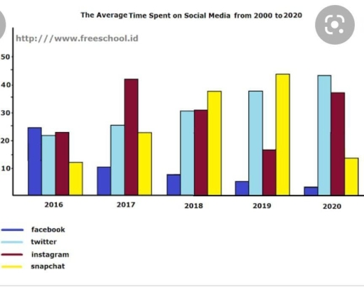
The given bar chart provides information on how much time was spent by people using various social networking sites over a four-year period between 2016 and 2020.

Overall what stand out from the graph is that Facebook, which was the most popular platform in 2016, gradually lost its popularity making way for Twitter and Instagram, while Snapchat having flactuated over time ended the period at the same figure it had had at the beginning of the period in question.

Looking into details, Facebook started the period with approximately 25% of users. Having halved in 2017 it then continued to decrese gradually and ended the period at about 2%. As regards Snapchat, which was the least popular social media in 2016, it had been increasing remarkably until 2019 reaching its peak of about 45% of users. The figure then dropped dramatically and made up about 15%.

Twitter, being one of the two leaders in 2020, started the period with nearly 22% of users underwent a gradual increase over the period in question and constitued about 40% in 2020. Instagram on the other hand flactuated cinsiderably but the general trend was upward, making it the second leader with about 35% in 2020

Word Count: 200

Answers On The Same Topic:

The graph below shows average time spent on social media from 2016 to 2020

The bar chart illustrates the average time spent on social media from 2000 to 2020. Overall, the data shows significant fluctuations throughout this period. In 2016, Facebook, Twitter, and Instagram were closely aligned, with average usage between 20 and 25 minutes per day. In contrast, Snapchat recorded the lowest average usage at just below 10 […]

The graph below shows average time spent on social media from 2016 to 2020

The bar chart shows the average time spent on social media between 2000 and 2020. Overall, the bar charts were unstable all over the peiod. In 2016 facebook, twitter and instagram were almost in the same place between 20 and 25, when the snapchat was lowest from these bar charts just below 10. In 2017 […]

The graph below shows average time spent on social media from 2016 to 2020

The bar chart illustrates information about the average length of time users spent on social media between 2016 and 2020. Overall, the data of time that users spent on Twitter witnessed an upward trend while Facebook showed a downward trend, the figure for people opting for using Instagram and Snapchat either dropped or increased. Obviously, […]

The graph below shows average time spent on social media from 2016 to 2020

The proportion of average duration on various social platforms (Facebook, Twitter, Instagram, and Snapchat) over a period of two decades is examined in the illustrated bar graph. Units are measured in minutes. Overall, it is clear that Snapchat’s figure was the highest within the period. In contrast, the pattern of Facebook was the lowest. Instagram […]

See All

Other Topics:

Gadgets bought by men and women in the UK in 2013

In this chart illustrates the gadgets which bought by men and women in the UK in2013. Overall, the most bought products by men is wireless home audio system, while women’s purchased more security cameras. Firstly, women bought security cameras close to 90%. Women often buy programmable thermostat and wireless home security. Noticably, they in the […]

The bar short shows the percentages of the UK workforce in five major industries in 1841 and 2011.

The bar chart illustrates the proportion of workers laboring in five industries in the UK in two years: 1841 and 2011. Overall, a downward trend was shown in three out of five categories with the exception of “services”, this field saw the greatest growth, and “construction”, experiencing a slow increase. There were remarkable changes in […]

The bar chart gives data about the percentage of individuals who ate specific portion of herbals on a single day in the UK between 2001 and 2008.

The bar chart illustrates the proportion of people in the UK who consumed specific portions of fruit and vegetables per day between 2001 and 2008. Overall, it is clear that despite some fluctuations, the proportions of all groups increased significantly throughout the period. Women recorded the highest percentages among the groups, while the figures for […]

The chart below gives information on the numbers of workers in different occupations who migrated to Australia between 2009 and 2012.

The graph illustrates the number of foreign emplooyes in various professions who migrated between Australia in 2009 and 2012. Overall, One of the most popular occupation between 2009 and 2012 was accountant afterwards, cook and software engineer were showing similar growth rate during same period yet computer programmers can be considered as less populated in […]

The chart shows the initial estimate of costs and the actual costs for the Summer Olympics from 1976 to 2012.

The graph provide information about the initial estimate of costs compared to the actual costs across the years from 1976 to 2012 for the Summer Olympics. Overall, it can be seen that the most relevant difference by estimation from actual costs is higher in the last two events: Beijing 2008 and London 2012. In the […]

the chart below show the percentage of people in a city in the UK using the internet for different activities in 2007 and 2009.

The chart provides the proportion of people in a city in the UK who used the internet for various activities in 2007 and 2009. Overall, shopping was the most widely used in both years while watching TV and learning were among the least common. Most activities experienced slight changes over the period. In 2007, there […]

See All
We have detected unusual activity on your device.
Please verify your identity to continue.
Note: This verification step won't sign you in. If you have a premium account, please log in to access the service as usual.
Google/Gmail Verification
Or verify using Email/Code
We've sent a verification code to:
youremail@gmail.com (Not your email?)
Enter it below to complete the verification process.
Ensure your email address is correct, your inbox is not full, and you check your spam folder. If no email arrives, consider using an alternative email.
You will need a Premium plan to perform your action!
Note: If you already have a premium account, please log in to access our services as usual.

Plans & Pricing

Our mission is to make quality education accessible and free for everyone.
However, to keep our hardworking team running and this service alive, we genuinely need your support!
By opting for a premium plan, not only do you sustain us in achieving the mission, but you also unlock advanced features to enrich your learning experience.

Free

For learners who aren't pressed for time

What's included on Free
1000+ IELTS Tests & Samples
Instant IELTS Writing Task 1 & 2 Evaluation (2 times/month)
Instant IELTS Speaking Part 1, 2, & 3 Evaluation (5 times/month)
Instant IELTS Writing Task 1 & 2 Essay Generator (2 times/month)
500+ Dictation & Shadowing Exercises
100+ Pronunciation Exercises
Flashcards
Other Advanced Tools

Premium

For those serious about advancing their English proficiency, and for IELTS candidates aspiring to boost their band score by 1-2 points (especially in writing & speaking) in just 30 days or less

What's included on Premium
Save Your IELTS Test Progress
Unlock All Courses & Content
Unlimited AI Conversations
Unlimited AI Writing Enhancement Exercises
Unlimited IELTS Writing Task 1 & 2 Evaluation
Unlimited IELTS Speaking Part 1, 2, & 3 Evaluation
Checked Answers Will Not Be Published
Unlimited IELTS Writing Task 1 & 2 Essay Generator
Unlimited IELTS Speaking Part 1, 2, & 3 Sample Generator
Unlimited Usage Of Advanced Tools

Due to the nature of our service and the provided free trials, payments are non-refundable.
Nếu bạn là người Việt Nam và không có hoặc không muốn trả bằng credit/debit cards, bạn có thể thanh toán bằng phương thức chuyển khoản:


Chọn gói:
279,000₫ 157,000 ₫ cho gói 1 tháng (chỉ 5,233₫/ngày)
819,000₫ 397,000 ₫ cho gói 3 tháng (chỉ 4,411₫/ngày)
1,649,000₫ 667,000 ₫ cho gói 6 tháng (chỉ 3,706₫/ngày)
3,299,000₫ 857,000 ₫ cho gói 12 tháng (chỉ 2,381₫/ngày)


Sau khi chuyển khoản, vui lòng đợi trình duyệt tự động điều hướng bạn trở lại Engnovate và bạn sẽ ngay lập tức nhận được mã kích hoạt tài khoản premium.
Nếu có lỗi xảy ra, bạn có thể liên hệ với team thông qua một trong các phương thức: email đến helloengnovate@gmail.com hoặc nhắn tin qua facebook.com/engnovate.
Vì toàn bộ công cụ trên website đều có thể sử dụng thử miễn phí, Engnovate không hỗ trợ hoàn tiền.