🔥 Today Only: Save 30% on Premium — Offer Ends Soon! - Upgrade Now!
Line Graph

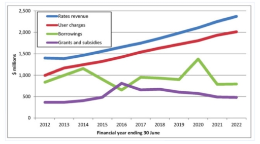
Band 6+: The graph below shows financial sources for IT companies in South America in 2012-2022. Summarise the information by selecting and reporting the main features, and make comparisons where relevant. Write at least 150 words.

Image for topic: The graph below shows financial sources for IT companies in South America in 2012-2022. Summarise the information by selecting and reporting the main features, and make comparisons where relevant. Write at least 150 words.
Our system will evaluate the answer based on this AI-generated description.
The image depicts a line graph showing financial data over a period from the financial year ending June 30, 2012, to 2022. It presents four categories: Rates revenue, User charges, Borrowings, and Grants and subsidies. Rates revenue starts around $500 million in 2012 and appears to steadily increase annually to slightly below $2,500 million in 2022. User charges initially are approx. $650 million in 2012, growing relatively steadily to reach about $1,800 million in 2022. Borrowings begin about $750 million in 2012, fluctuate around this figure until about 2019, then appear to rise sharply, peaking near $1,500 million around 2020 before declining slightly to about $1,300 million by 2022. Grants and subsidies start at about $200 million in 2012, peak at around $800 million in 2018 and 2019, then fall to approximately $500 million by 2022. Each line in the graph shifts distinctly, reflecting different trajectories and peaks over these ten years.
Given the complexity of the image, the above description may not be entirely accurate.
Note: Both the topic and the answer were created by one of our users.

The line graph provides information about four financial sources (rates revenue, user charges, borrowings, and grants and subsidies) for IT professions in South America between 2012 and 2022. The features are given in dollars.

Overall, the measures for rates revenue and user charges recorded stable and actual results, while the figures for borrowings and grants and subsidies showed fluctuating indicators. All lines remained in their initial order without changing.

The amount of property tax revenue started the period at $1,500 million in 2012, while the indicator for user fees began at a 1,000 million dollars in the same year above-mentioned. Then, they reached steady growth and reported around 2,400 million dollars in 2022 for rates revenue, while user charges illustrated two thousand dollars at the end.

If we look at the other graphs, the figures for borrowed funds began the line at $500 million, while the amount for grants and subsidies was the lowest measure at first. They crossed their levels around 600 and 700 million dollars in 2016; however, they returned to those levels later that year. Finally, these lines finished the period at about $800 million for borrowings and a clear $500 million for grants and subsidies in 2022.

Word Count: 201

Answers On The Same Topic:

The graph below shows financial sources for IT companies in South America in 2012-2022. Summarise the information by selecting and reporting the main features, and make comparisons where relevant. Write at least 150 words.

The line graph provides information abnout four financial sources (rates revenue,user charges, borrowings, grants and subsidies ) on IT professions in South Africa between 2012 and 2022. The features are given with dollars. Overall,the measures of rates avenue and user charges recorded steable and actual results while features of borrowings and grants-subsidies showed a fluctuating […]

The graph below shows financial sources for IT companies in South America in 2012-2022. Summarise the information by selecting and reporting the main features, and make comparisons where relevant. Write at least 150 words.

The line graph provides information about financial sources for IT companies in South America from 2012 to 2022. Units are measured in millions of dollars. Overall, it is clear that the data demonstrates varying trends across the four financial sources, with rates revenue, and user charges experiencing notable increases, while borrowings, grants and subsidies encountered […]

The graph below shows financial sources for IT companies in South America in 2012-2022. Summarise the information by selecting and reporting the main features, and make comparisons where relevant. Write at least 150 words.

The chart illustrates the different financial sources used by IT firms in South America over the period from 2012 to 2022. Overall, it can be seen that some funding types increased significantly, while others became less common throughout the decade. The most striking trend is that there is a dramatic increase in the rates revenue […]

The graph below shows financial sources for IT companies in South America in 2012-2022. Summarise the information by selecting and reporting the main features, and make comparisons where relevant. Write at least 150 words.

The line graph illustrates four financial sources for information technology companies in South America from 2012 to 2022. Overall, at the beginning of the period, the rates revenue took the leading position, although at the end of the period, it was still at the highest point. From 2012 to 2022, user charges showed a considerable […]

See All

Other Topics:

The graph below shows the percentage of national arts funding allocated to five different sectors in the UK from 2000 to 2020. Summarise the information by selecting and reporting the main features, and make comparisons where relevant.

The line chart illustrates the percentage of national arts funding distributed among the five sectors in the UK, for the period of 2000 to 2020. It can be seen clearly that all the categories had downnward trend except for theatre and Visual arts. By 2020 theatre and dance had the biggest proportion, while literature was […]

The graph below gives information about international tourist arrivals in five countries. Summarise the information by selecting and reporting the main features and make comparisions where relevant.

The line graph illustrates data about worldwide traveller arrivals in the USA, France, Malaysia, Brazil and Egypt from 1995 to 2010. Overall, according to the given chart, it is evidient that, the USA record the highest number of arrivals , while, Brazil experience the lowest by 2010. The USA holding the top positions from starting […]

Writing In Focus The graph below gives information about internet users in three countries between 1999 and 2009. Write a report for a university lecturer describing the information shown below. Make comparisons where relevant. You should write at least 150 words.

The given graph chart demonstrates the percentage of population on the internet from USA, Canada and Mexico over a ten-year period. Overall, it is evident from the graph that both Canada and USA showed a significant rise over a given period, while Mexico steadily growed. In 1999, a marginal percentage of people from Canada were […]

this line graph is typical of ielts writting task 1.it shows three lines and one of the lines doesnot have any data for the first few years.see the model answer below tolearn how tacklethis task.

The line graph compares the consumption of three types of spreads in grams between 1981 and 2007. It is clear that butter was the most popular spread at the beginning, but its consumption decreased over the period. Low-fat and reduced spreads became more popular, while margarine changed only slightly at first and then fell. In […]

The chart below shows the percentage of households with different kinds of technology in the UK from 1997 to 2001. Summarise the information by selecting and reporting the main features, and make comparisons where relevant.

The image compares the share of households bearing different types of technology in the UK in a time period of 1997 to 2001. Overall, the biggest percentage throughout the years is accounted for by homes with a CD player , with the lowest being ones that had a DVD player. Over the years, the percent […]

The line graph shows the number of participants by activities between 2000 and 2020.

The line graph compares the number of participants in five different activities from 2000 to 2020. Overall, the participation in film club and table tennis generally rose, whereas musical performances and amateur dramatics declined. Meanwhile, martial arts saw a modest increase before a slight decrease. In 2000, film club had the highest participation, with 65 […]

See All
We have detected unusual activity on your device.
Please verify your identity to continue.
Note: This verification step won't sign you in. If you have a premium account, please log in to access the service as usual.
Google/Gmail Verification
Or verify using Email/Code
We've sent a verification code to:
youremail@gmail.com (Not your email?)
Enter it below to complete the verification process.
Ensure your email address is correct, your inbox is not full, and you check your spam folder. If no email arrives, consider using an alternative email.
You will need a Premium plan to perform your action!
Note: If you already have a premium account, please log in to access our services as usual.

Plans & Pricing

Our mission is to make quality education accessible for everyone.
However, to keep our hardworking team running and this service alive, we genuinely need your support!
By opting for a premium plan, not only do you sustain us in achieving the mission, but you also unlock advanced features to enrich your learning experience.

Free

For learners who aren't pressed for time

What's included on Free
100+ Cambridge IELTS Tests
Instant IELTS Writing Task 1 & 2 Evaluation (2 times/month)
Instant IELTS Speaking Part 1, 2, & 3 Evaluation (2 times/month)
Instant IELTS Writing Task 1 & 2 Essay Generator (2 times/month)
500+ Dictation & Shadowing Exercises
100+ Pronunciation Exercises
Flashcards
Other Advanced Tools

Premium

For those serious about advancing their English proficiency, and for IELTS candidates aspiring to boost their band score by 1-2 points (especially in writing & speaking) in just 30 days or less

What's included on Premium
Save Your IELTS Test Progress & Analyze Mistakes By Question Type
Save Your Own Flashcard Sets & Use Them On Any Device
Unlock All Courses, IELTS Tests, Section & Part Practice
Unlimited AI Conversations
Unlimited AI Writing Enhancement Exercises
Unlimited IELTS Writing Task 1 & 2 Evaluation
Unlimited IELTS Speaking Part 1, 2, & 3 Evaluation
Checked Answers Will Not Be Published
Unlimited IELTS Writing Task 1 & 2 Essay Generator
Unlimited IELTS Speaking Part 1, 2, & 3 Sample Generator
Unlimited Usage Of Advanced Tools & AI Features
Priority Support within 24h (12-month plan only)

Due to the nature of our service and the provided free trials, payments are non-refundable.