24 Hours Only: Get 20% OFF on Our Premium Plan - Upgrade Now!
Line Graph

Band 5+: The graph below shows the average consumption of cheese per person in England, Scotland, Wales, and Northern Ireland between 1980 and 2020

Image for topic: The graph below shows the average consumption of cheese per person in England, Scotland, Wales, and Northern Ireland between 1980 and 2020
Our system will evaluate the answer based on this AI-generated description.
The image is a line graph titled Annual Cheese Consumption, it depicts the average cheese consumption in England, Scotland, Wales, and Northern Ireland between 1980 and 2020. Four lines represent each area, with data points at 1980, 1990, 2000, 2010, and 2020. England starts at 110 in 1980, increases to 125 in 1990, decreases to 100 in 2000, and remains at 100 in 2010 and 2020. Scotland begins at 50 in 1980, increases to 75 in 1990, drops to below 75 in 2000, rises to 75 in 2010, and decreases to just above 50 in 2020. Wales starts at 75 in 1980, decreases to 50 in 1990, increases to almost 100 in 2000, decreases to below 75 in 2010, and drops to 25 in 2020. Northern Ireland begins at 50 in 1980, increases to above 75 in 1990, decreases to 75 in 2000, remains at 75 in 2010, and slightly increases to above 75 in 2020. The vertical axis represents average cheese consumption in milligrams, ranging from 0 to 125, and the horizontal axis represents years from 1980 to 2020.
Given the complexity of the image, the above description may not be entirely accurate.
Note: Both the topic and the answer were created by one of our users.

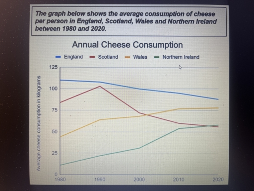
The line graph illustrates the average amount of cheese consumed citizens of England, Scotland, Wales, and Northern Ireland from 1980 to 2020. Units are measured in kilograms.

Overall, there were noticeable changes in the consumption patterns of cheese among these regions. While England and Scotland exhibited a marked decrease in the consumption of cheese, Wales and Northern Ireland’s rates increased remarkably over the period shown. In addition, it is worth noting that, despite falling gradually, England remained the country that consumed the most cheese.

Turning to the details, in England, the average cheese consumption for each person was about 110kg in 1980, which declined steadily to approximately 80kg by the end of the period. Beginning at around 80kg, the figure for Scotland increased markedly to a little over 100kg in 1990, before falling continually, becoming the country consuming the least amount of cheese in 2020.

As regards Wales and Northern Ireland, the former stayed at about 45kg while the latter was around 10kg in 1980. Following 3 decades, the amount of cheese consumption in both nations rose constantly to just over 75kg and 50kg respectively. The last 10 years saw minimal growth of approximately 5kg for both figures.

Word Count: 198

Answers On The Same Topic:

The graph below shows the average consumption of cheese per person in England, Scotland, Wales, and Northern Ireland between 1980 and 2020

The line graph illustrates how much cheese was consumed in four countries – England, Scotland, Wales, and Northern Ireland – between 1980 and 2020. Overall, what stands out from the graph is that there were considerable upward trends in cheese consumption in both Wales and Northern Ireland, whereas the figures for England and Scotland showed […]

The graph below shows the average consumption of cheese per person in England, Scotland, Wales, and Northern Ireland between 1980 and 2020

The line graph gives the information about how much cheese per person consumed on average in kilograms (kg) in four different countries England, Scotland, Wales, and Northern Ireland from 1980 to 2020. Overall, the average cheese consumption in Wales and Northern Ireland experienced an upward trend, showing consistently growth over the period. Additionally, England and […]

The graph below shows the average consumption of cheese per person in England, Scotland, Wales, and Northern Ireland between 1980 and 2020

Given line graph presents the statistics of consumed cheese in four countries: England, Scotland, Wales and Northern Ireland between 1980 and 2020 years. Overall, Northern Ireland and Wales showed a steady rise throughout the whole time, conversely, England displayed opposite trend. Scotland managed to show sharp rise in the amount of eaten cheese, however experienced […]

The graph below shows the average consumption of cheese per person in England, Scotland, Wales, and Northern Ireland between 1980 and 2020

The given line graph illustrates the average consumption of cheese per person in four European countries from 1980 to 2012. Overall, it is clear that a rapid growth in the number of the cheese consumption was observed in Wales and Ireland. While, the number of it in England and Scotland decreased significantly. Focusing on ascending […]

The graph below shows the average consumption of cheese per person in England, Scotland, Wales, and Northern Ireland between 1980 and 2020

The graph illustrates the average amount of cheese consumed per person over a 40 year period in the UK. Overall, it is clear that cheese consumption varies across England, Scotland, Wales and Northern Ireland. As for England and Scotland the general trend was declining, albeit the substantial surge in consumption of cheese in Scotland in […]

See All

Other Topics:

The graph below shows the number of international tourists visiting three different regions (Asia, Europe, and America) between 2000 and 2020. Summarize the information by selecting and reporting the main features, and make comparisons where relevant.

The number of international visitors to Asia, Europe, and America between 2000 and 2020 is depicted in the line graph. Overall, although Asia and Europe witnessed fluctuations, there was an upward trend in the amount of tourists visiting three countries, and American saw the most significant growth. Additionally, Asia lead the chart while Europe was […]

the graph below shows how much money was spent on tourist infrastructure in four different european countries from 1980 to 1992 summarise the information by selecting and reporting the main features and make comparisons where relevant.

The chart illustrates informaton regarding the amount of money spent on tourist developments in Britain, France, Spain, and Germany over a 12-year period from 1980 to 1992. Overall, what stands out from the chart is that Britain and France experienced the raising invesment during the period. Spain witnessed a fall invesment until 1990 before recovering […]

The graph below shows the percentage of tourists visiting four different attractions in a European city between 1980 and 2010.

The line graph provides an information about travelers visit to four different attractions in European city with 30 year duration from 1980 to 2010. Overall, percentage of tourists in Theme Park increased considerably, becoming the leader in visits among all other attractions while visits of historic building decreased giving way to another type of attraction. […]

The line graph shows the number of people visiting a cinema in three different countries in a month between 2000 and 2020.

The line graph provides data on the monthly cinema attendance in the USA, China, and the UK from 2000 to 2020 Overall, every single country witnessed a consistent upward trajectory over a 20-year period. The UK which registered a considerably lower share initially surpassed the remaining countries by the end of the timeframe. Notably, during […]

The provided line chart compares the changing trends in the value of various entertainment media downloads and sales, measured in millions of dollars, over a ten-year period starting from 1999.

The line graph illustrates the market value of four distinct media sectors – Games, Music, DVD sales, and DVD rentals – in the United Kingdom over a ten-year period from 1999 to 2008.Overall, the decade was defined by a dramatic shift in consumer preferences, as the value of the games industry experienced exponential growth to […]

The line graph illustrates the proportion of total expenditure in a certain European country between 1960 and 2000.

The graph demonstrates the percentage of expenditures to food, leisure, clothing, transport, fuel or energy in European countries from 1960 to 2000. Overall, the using money for food declined dramatically over the periods, clothing increased a bit. In contrast, the percentage of leisure, transport and energy slightly decreased. The expenditure to food was just below […]

See All
We have detected unusual activity on your device.
Please verify your identity to continue.
Note: This verification step won't sign you in. If you have a premium account, please log in to access the service as usual.
Google/Gmail Verification
Or verify using Email/Code
We've sent a verification code to:
youremail@gmail.com (Not your email?)
Enter it below to complete the verification process.
Ensure your email address is correct, your inbox is not full, and you check your spam folder. If no email arrives, consider using an alternative email.
You will need a Premium plan to perform your action!
Note: If you already have a premium account, please log in to access our services as usual.

Plans & Pricing

Our mission is to make quality education accessible for everyone.
However, to keep our hardworking team running and this service alive, we genuinely need your support!
By opting for a premium plan, not only do you sustain us in achieving the mission, but you also unlock advanced features to enrich your learning experience.

Free

For learners who aren't pressed for time

What's included on Free
100+ Cambridge IELTS Tests
Instant IELTS Writing Task 1 & 2 Evaluation (2 times/month)
Instant IELTS Speaking Part 1, 2, & 3 Evaluation (5 times/month)
Instant IELTS Writing Task 1 & 2 Essay Generator (2 times/month)
500+ Dictation & Shadowing Exercises
100+ Pronunciation Exercises
Flashcards
Other Advanced Tools

Premium

For those serious about advancing their English proficiency, and for IELTS candidates aspiring to boost their band score by 1-2 points (especially in writing & speaking) in just 30 days or less

What's included on Premium
Save Your IELTS Test Progress
Unlock All Courses & IELTS Tests
Unlimited AI Conversations
Unlimited AI Writing Enhancement Exercises
Unlimited IELTS Writing Task 1 & 2 Evaluation
Unlimited IELTS Speaking Part 1, 2, & 3 Evaluation
Checked Answers Will Not Be Published
Unlimited IELTS Writing Task 1 & 2 Essay Generator
Unlimited IELTS Speaking Part 1, 2, & 3 Sample Generator
Unlimited Usage Of Advanced Tools
Priority Support within 24h (12-month plan only)

Due to the nature of our service and the provided free trials, payments are non-refundable.
Nếu bạn là người Việt Nam và không có hoặc không muốn trả bằng credit/debit cards, bạn có thể thanh toán bằng phương thức chuyển khoản:


Chọn gói:
459,000₫ 347,000 ₫ cho gói 1 tháng (chỉ 11,567₫/ngày)
1,359,000₫ 797,000 ₫ cho gói 3 tháng (chỉ 8,856₫/ngày)
2,699,000₫ 1,367,000 ₫ cho gói 6 tháng (chỉ 7,594₫/ngày)
5,399,000₫ 1,997,000 ₫ cho gói 12 tháng (chỉ 5,547₫/ngày)


Sau khi chuyển khoản, vui lòng đợi trình duyệt tự động điều hướng bạn trở lại Engnovate và bạn sẽ ngay lập tức nhận được mã kích hoạt tài khoản premium.
Nếu có lỗi xảy ra, bạn có thể liên hệ với team thông qua một trong các phương thức: email đến helloengnovate@gmail.com hoặc nhắn tin qua facebook.com/engnovate.
Vì toàn bộ công cụ trên website đều có thể sử dụng thử miễn phí, Engnovate không hỗ trợ hoàn tiền.