🔥 Today Only: Save 30% on Premium — Offer Ends Soon! - Upgrade Now!
Line Graph

Band 4+: The graph below shows the average consumption of cheese per person in England, Scotland, Wales, and Northern Ireland between 1980 and 2020

Image for topic: The graph below shows the average consumption of cheese per person in England, Scotland, Wales, and Northern Ireland between 1980 and 2020
Our system will evaluate the answer based on this AI-generated description.
The image is a line graph titled Annual Cheese Consumption, it depicts the average cheese consumption in England, Scotland, Wales, and Northern Ireland between 1980 and 2020. Four lines represent each area, with data points at 1980, 1990, 2000, 2010, and 2020. England starts at 110 in 1980, increases to 125 in 1990, decreases to 100 in 2000, and remains at 100 in 2010 and 2020. Scotland begins at 50 in 1980, increases to 75 in 1990, drops to below 75 in 2000, rises to 75 in 2010, and decreases to just above 50 in 2020. Wales starts at 75 in 1980, decreases to 50 in 1990, increases to almost 100 in 2000, decreases to below 75 in 2010, and drops to 25 in 2020. Northern Ireland begins at 50 in 1980, increases to above 75 in 1990, decreases to 75 in 2000, remains at 75 in 2010, and slightly increases to above 75 in 2020. The vertical axis represents average cheese consumption in milligrams, ranging from 0 to 125, and the horizontal axis represents years from 1980 to 2020.
Given the complexity of the image, the above description may not be entirely accurate.
Note: Both the topic and the answer were created by one of our users.

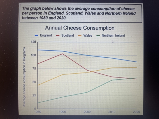
The given line graph compares an average intake of cheese by each person in different provise of United Kingdom namely England, Wales, Northern Ireland and Scotland.

Overview, from the graph it is apparent that despite there were upward trends of consuming cheese among Scotland, Wales and Northern Irelnd, people in England ate more cheese than people in any other states.

In 1980,cheese consumed by northern Ireland people and wales people were 10 kilogram and 40 kg respectively.By 1990,their cheese intake gradually rose to nearly 22kg and 65kg followed by 30kg and 70kg in 2000. The amount of cheese intake grew slowely but steadlily upward to more or less 52kg and 70kg in 2010 and reached their peak consumption to somewhat 60kg by Northern Ireland people and 77 kg by Wales people by 2020.

In 1980, the English and the Scotish included aproximately 110kg and 80 kg cheese in their diet. However, the folllowing decade, cheese consumption by Scotish people sored up to 105kg aproximately and then plunged rapidly throughout the years and by 2020, their cheese intake remained as the lowest among all the other states.Inspite of continuous sluggishnes, English citizen consumed the highest amount of cheese throughout the given period that is 110kg in 1990,100kg in 2000 85kg in 2020.

Word Count: 211

Answers On The Same Topic:

The graph below shows the average consumption of cheese per person in England, Scotland, Wales, and Northern Ireland between 1980 and 2020

The line graph illustrates the average per capita cheese consumption across four regions of the United Kingdom – England, Scotland, Wales, and Northern Ireland – over a four-decade period from 1980 to 2020. Overall, England witnessed a gradual decline in cheese consumption, whereas Scotland experienced considerable fluctuations. In contrast, Wales and Northern Ireland exhibited a […]

The graph below shows the average consumption of cheese per person in England, Scotland, Wales, and Northern Ireland between 1980 and 2020

The line graph illustrates how much cheese was consumed in four countries – England, Scotland, Wales, and Northern Ireland – between 1980 and 2020. Overall, what stands out from the graph is that there were considerable upward trends in cheese consumption in both Wales and Northern Ireland, whereas the figures for England and Scotland showed […]

The graph below shows the average consumption of cheese per person in England, Scotland, Wales, and Northern Ireland between 1980 and 2020

The line graph gives the information about how much cheese per person consumed on average in kilograms (kg) in four different countries England, Scotland, Wales, and Northern Ireland from 1980 to 2020. Overall, the average cheese consumption in Wales and Northern Ireland experienced an upward trend, showing consistently growth over the period. Additionally, England and […]

The graph below shows the average consumption of cheese per person in England, Scotland, Wales, and Northern Ireland between 1980 and 2020

Given line graph presents the statistics of consumed cheese in four countries: England, Scotland, Wales and Northern Ireland between 1980 and 2020 years. Overall, Northern Ireland and Wales showed a steady rise throughout the whole time, conversely, England displayed opposite trend. Scotland managed to show sharp rise in the amount of eaten cheese, however experienced […]

The graph below shows the average consumption of cheese per person in England, Scotland, Wales, and Northern Ireland between 1980 and 2020

The given line graph illustrates the average consumption of cheese per person in four European countries from 1980 to 2012. Overall, it is clear that a rapid growth in the number of the cheese consumption was observed in Wales and Ireland. While, the number of it in England and Scotland decreased significantly. Focusing on ascending […]

See All

Other Topics:

The multiple line graph shows cell phone usage among males and females in Anytowne during the period from 1996 to 2002. Summarize the information by selecting and reporting the main features and make comparisons where relevant

The line graph shows cell phone use among men, women and both sexes in Brazil from 1996 to 2002. Overall, cell phone use increased among both men and women over the period. The total number of users was always much higher than the number of male or female users separately, and it reached its highest […]

The multiple line graph shows cell phone usage among males and females in Anytowne during the period from 1996 to 2002. Summarize the information by selecting and reporting the main features and make comparisons where relevant

First of all, the organization of the research decided to do the investigation over the basic categories without any interchanged sexes, for instance gay or lesbian etc. Therefore, the data on the graph can be evaluated from the observer for the graph is that there is a women and men genders who are users. As […]

The graph shows children by age group as a percentage of the young population in the United Kingdom between 1990 and 2001.

The line graph illustrates children by age team as a percentage of the young population in UK between 1990 and 2001. Generally, we see some eye-catching movements especially between age 15 to 19 as is shown the line is fluctuating by the time . More than that the group age between 10 and 14 is […]

The line graph shows the percentages of travels by 4 transportsin one country between 1985 and 2015

The line graph illustrates the percentages of travels by 4 transportsin one country such as Bus, Car, Rail and Others over a period from 1985 to 2015. Overall, it is clear that the ‘Car’ category was the highest in the chart over a period, while the ‘Others’ was the lowest figure in comparison with ‘Bus’ […]

The graph below shows the average number of American commuters travelling each day by car, bus or train between 1980 and 2040

The figure represents transportation by Americans communters each day throughout 1980 to 2040. And it also illustrates the average number of transport by car, bus and train. Overall, bus transportation has declined steadily whereas car and train travel have dropped, peaked and increased over the years. In the year 1980, four million Amercians depended on […]

The line graph shows the number of first marriages, remarriages, and all marriages in thousands from 1951 to 2001.

The line graph illustrates the number of first marriages, remarriages and total marriages, measured in thousands, between 1951 and 2001. Overall, all three figures increased steadily until 1981 before declining afterwards. First marriages consistently made up the largest proportion, whereas remarriages remained the least common throughout the period. In 1951, there were about 450 thousand […]

See All
We have detected unusual activity on your device.
Please verify your identity to continue.
Note: This verification step won't sign you in. If you have a premium account, please log in to access the service as usual.
Google/Gmail Verification
Or verify using Email/Code
We've sent a verification code to:
youremail@gmail.com (Not your email?)
Enter it below to complete the verification process.
Ensure your email address is correct, your inbox is not full, and you check your spam folder. If no email arrives, consider using an alternative email.
You will need a Premium plan to perform your action!
Note: If you already have a premium account, please log in to access our services as usual.

Plans & Pricing

Our mission is to make quality education accessible for everyone.
However, to keep our hardworking team running and this service alive, we genuinely need your support!
By opting for a premium plan, not only do you sustain us in achieving the mission, but you also unlock advanced features to enrich your learning experience.

Free

For learners who aren't pressed for time

What's included on Free
100+ Cambridge IELTS Tests
Instant IELTS Writing Task 1 & 2 Evaluation (2 times/month)
Instant IELTS Speaking Part 1, 2, & 3 Evaluation (5 times/month)
Instant IELTS Writing Task 1 & 2 Essay Generator (2 times/month)
500+ Dictation & Shadowing Exercises
100+ Pronunciation Exercises
Flashcards
Other Advanced Tools

Premium

For those serious about advancing their English proficiency, and for IELTS candidates aspiring to boost their band score by 1-2 points (especially in writing & speaking) in just 30 days or less

What's included on Premium
Save Your IELTS Test Progress
Unlock All Courses & IELTS Tests
Unlimited AI Conversations
Unlimited AI Writing Enhancement Exercises
Unlimited IELTS Writing Task 1 & 2 Evaluation
Unlimited IELTS Speaking Part 1, 2, & 3 Evaluation
Checked Answers Will Not Be Published
Unlimited IELTS Writing Task 1 & 2 Essay Generator
Unlimited IELTS Speaking Part 1, 2, & 3 Sample Generator
Unlimited Usage Of Advanced Tools
Priority Support within 24h (12-month plan only)

Due to the nature of our service and the provided free trials, payments are non-refundable.
Nếu bạn là người Việt Nam và không có hoặc không muốn trả bằng credit/debit cards, bạn có thể thanh toán bằng phương thức chuyển khoản:


Chọn gói:
419,000₫ 277,000 ₫ cho gói 1 tháng (chỉ 9,233₫/ngày)
1,239,000₫ 597,000 ₫ cho gói 3 tháng (chỉ 6,633₫/ngày)
2,469,000₫ 1,027,000 ₫ cho gói 6 tháng (chỉ 5,706₫/ngày)
4,929,000₫ 1,417,000 ₫ cho gói 12 tháng (chỉ 3,936₫/ngày)


Sau khi chuyển khoản, vui lòng đợi trình duyệt tự động điều hướng bạn trở lại Engnovate và bạn sẽ ngay lập tức nhận được mã kích hoạt tài khoản premium.
Nếu có lỗi xảy ra, bạn có thể liên hệ với team thông qua một trong các phương thức: email đến helloengnovate@gmail.com hoặc nhắn tin qua facebook.com/engnovate.
Vì toàn bộ công cụ trên website đều có thể sử dụng thử miễn phí, Engnovate không hỗ trợ hoàn tiền.