🔥 Today Only: Save 30% on Premium — Offer Ends Soon! - Upgrade Now!
Multiple Graphs

Band 5+: The graph below shows the changes in ownership of electrical appliances and amount of time spent on doing housework in households in one country between 1920 and 2019.

Image for topic: The graph below shows the changes in ownership of electrical appliances and amount of time spent on doing housework in households in one country between 1920 and 2019.
Our system will evaluate the answer based on this AI-generated description.
The image contains two line graphs relating to household electrical appliances and time spent doing housework between 1920-2019. The top graph shows the percentage of households with electrical appliances, with data for washing machines increasing from nearly 0% in 1920 to almost 100% by 2019, refrigerators starting at 0% in 1920 to also nearly 100% by 2019, and vacuum cleaners beginning around 0% in 1920 and reaching over 90% by 2019. The bottom graph depicts the number of hours of housework per week, per household, with two lines representing "total hours per week" and "hours per week", both decreasing over time. The "total hours per week" drops from approximately 50 hours in 1920 to around 15 hours by 2019, while the "hours per week" shows a similar decline, starting at around 50 hours in 1920 and falling to about 10 hours by 2019. Notably, there is a slight increase in hours around 1960 for both lines, followed by a steady decline.
Given the complexity of the image, the above description may not be entirely accurate.
Note: Both the topic and the answer were created by one of our users.

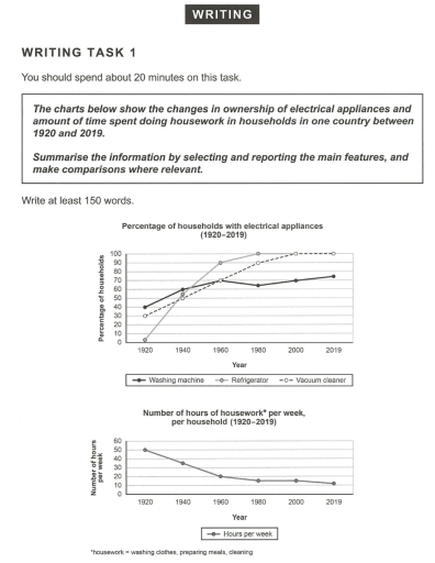
The data displays the changes in ownership of electrical appliances and how much time is spent while doing chores in households in one state from 1920 to 2019. Overall, the amount of fridges and vacuum cleaners that are used reached its peak in 2019. However, the same cannot be said about the number of housework each week as it reached a decreasing amount in 2019.

Initially, refrigerators are quite a popular use amongst housings as it gradually increases each year between 1920 and 2019, which begins with 0 to 100%. Not quite far from that, the use of vacuum cleaners starts with only 30% of use as each year goes by, it had a rise to 100% of appliance in 2019. Nevertheless, washing machines did not manage to reach 100% of use as the chart presents in 1920 with 40% to about 70% above in year 2019.

Moreover, the number of hours that is spent during weekly chores was large in 1920, showing 50 hours of work. Following with the next year, 1940, it decreased a little to approximately 35 hours. In fact, this downward trend continued to the end of the year that the data displayed, 2019, with 10 hours of time that is spent doing housework.

Word Count: 208

Answers On The Same Topic:

The graph below shows the changes in ownership of electrical appliances and amount of time spent on doing housework in households in one country between 1920 and 2019.

The charts compare the proportion changes between electrical devices and spending time that allocated for housework in one country between 1920 and 2019. Overall, the proportion of households owning three different electrical appliances consistently rose over the five periods. Meanwhile, the number of housework showed a steadily decrease strating from 1920 until 2019. Refrigerator started […]

The graph below shows the changes in ownership of electrical appliances and amount of time spent on doing housework in households in one country between 1920 and 2019.

The charts given below illustrate the percentage of households’s electrical appliances and the number of hours of doing chores in one country between 1920 and 2019. Overall, the ownership of all three electrical appliances mentioned was on an upward trend with that of refrigerators having the greatest growth. In contrast, at the same time, the […]

The graph below shows the changes in ownership of electrical appliances and amount of time spent on doing housework in households in one country between 1920 and 2019.

The line graphs illustrate the changes in ownership of electrical appliances and the amount of time which the households spent for their housework in a specific country during the years 1920 to 2019. Overall, meanwhile owning the home appliances grew constantly, the time that individuals spent for house tasks declined. The first diagram demonstrates that […]

The graph below shows the changes in ownership of electrical appliances and amount of time spent on doing housework in households in one country between 1920 and 2019.

The line graph illustrates the shifts in possession of electrical appliances and the number of hours spent per week on household works with in a particular country between 1920 to 2019. Overall, The use of household appliances like Refrigerator and vacuum cleaner has increased significantly and impacted the reduction of time spent on household works. […]

See All

Other Topics:

a pie chart showing the percentage contribution of different sectors to the economy, and a bar chart illustrating export earnings (in US $ billions) over a period of time.

The visuals illustrate the contribution of different sectors to an economy in percentage terms, alongside a bar chart shows the changes in revenue measured in US dollars (billion) over the period from 1982 to 2003. As an overview, the tourism and industry account for the largest share of the economy structure and export earnings. Where […]

Distribution of visitors to different types of tourist attractions in Britain,1999

The pie chart illustrates the proportion of popular distinct areas that visitors are likely to visit in Britain in 1999, while the table providies profound details on theme parks. Overall, one noticeable key feature is that a majority of people tend to stop by theme parks, which made a pool that located in the parks, […]

total percentge of films and ticket sales in different periods of time

The two bra graphs compare the percentage of four genres of films released with their respective sales in 1996 and 2006. Overall, it is interesting to note that even though more drama than comedy films were released, the sales of comedy films was the maximum, and Romantic films was always consist of tiny figure among […]

The four bar charts compare the percentage of male and female students who achieved high grades (A and B) in five subjects at Parston School and the national average. Summarize the information by selecting and reporting the main features and make comparisons where relevant.

The bar charts compare the proportion of students receiving high grades (A and B) in five different subjects, including Math, Science, Humanities Subjects, Arts and Languages, in terms of gender at Parston School and the national average. Overall, it is immediately obvious that Math is prominent in the number of students obtaining high scores. Furthermore, […]

The given charts give information about the number of students at university in the UK from 1991 to 2001, government spending and the types of family economic background they came from in 1991. Summarize the information by selecting and reporting the main features and make comparisons where relevant.

The charts provide information on the total number of students at a particular university in the UK from 1991 to 2001 and the percentage of students from three different family economic backgrounds (high-income, middle-income, and low-income families) in 1991. Overall, the total number of students increased significantly. Students from middle-income families made up the largest […]

The diagrams below show changes of a cinema from 1980 until now. Summarize the information by selecting and reporting the main features, and make comparisons where relevant.

The maps depict how a cinema changed between 1980 and the present day. Overall, the cinema has undergone a significant transformation, with the addition of three extra cinemas, a DVD shop, and a relaxation room. In 1980, there was a ticket office and a shop for drinks on the right side of the entrance and […]

See All
We have detected unusual activity on your device.
Please verify your identity to continue.
Note: This verification step won't sign you in. If you have a premium account, please log in to access the service as usual.
Google/Gmail Verification
Or verify using Email/Code
We've sent a verification code to:
youremail@gmail.com (Not your email?)
Enter it below to complete the verification process.
Ensure your email address is correct, your inbox is not full, and you check your spam folder. If no email arrives, consider using an alternative email.
You will need a Premium plan to perform your action!
Note: If you already have a premium account, please log in to access our services as usual.

Plans & Pricing

Our mission is to make quality education accessible for everyone.
However, to keep our hardworking team running and this service alive, we genuinely need your support!
By opting for a premium plan, not only do you sustain us in achieving the mission, but you also unlock advanced features to enrich your learning experience.

Free

For learners who aren't pressed for time

What's included on Free
100+ Cambridge IELTS Tests
Instant IELTS Writing Task 1 & 2 Evaluation (2 times/month)
Instant IELTS Speaking Part 1, 2, & 3 Evaluation (5 times/month)
Instant IELTS Writing Task 1 & 2 Essay Generator (2 times/month)
500+ Dictation & Shadowing Exercises
100+ Pronunciation Exercises
Flashcards
Other Advanced Tools

Premium

For those serious about advancing their English proficiency, and for IELTS candidates aspiring to boost their band score by 1-2 points (especially in writing & speaking) in just 30 days or less

What's included on Premium
Save Your IELTS Test Progress
Unlock All Courses & IELTS Tests
Unlimited AI Conversations
Unlimited AI Writing Enhancement Exercises
Unlimited IELTS Writing Task 1 & 2 Evaluation
Unlimited IELTS Speaking Part 1, 2, & 3 Evaluation
Checked Answers Will Not Be Published
Unlimited IELTS Writing Task 1 & 2 Essay Generator
Unlimited IELTS Speaking Part 1, 2, & 3 Sample Generator
Unlimited Usage Of Advanced Tools
Priority Support within 24h (12-month plan only)

Due to the nature of our service and the provided free trials, payments are non-refundable.
Nếu bạn là người Việt Nam và không có hoặc không muốn trả bằng credit/debit cards, bạn có thể thanh toán bằng phương thức chuyển khoản:


Chọn gói:
419,000₫ 277,000 ₫ cho gói 1 tháng (chỉ 9,233₫/ngày)
1,239,000₫ 597,000 ₫ cho gói 3 tháng (chỉ 6,633₫/ngày)
2,469,000₫ 1,027,000 ₫ cho gói 6 tháng (chỉ 5,706₫/ngày)
4,929,000₫ 1,417,000 ₫ cho gói 12 tháng (chỉ 3,936₫/ngày)


Sau khi chuyển khoản, vui lòng đợi trình duyệt tự động điều hướng bạn trở lại Engnovate và bạn sẽ ngay lập tức nhận được mã kích hoạt tài khoản premium.
Nếu có lỗi xảy ra, bạn có thể liên hệ với team thông qua một trong các phương thức: email đến helloengnovate@gmail.com hoặc nhắn tin qua facebook.com/engnovate.
Vì toàn bộ công cụ trên website đều có thể sử dụng thử miễn phí, Engnovate không hỗ trợ hoàn tiền.