🔥 Today Only: Save 30% on Premium — Offer Ends Soon! - Upgrade Now!
Line Graph

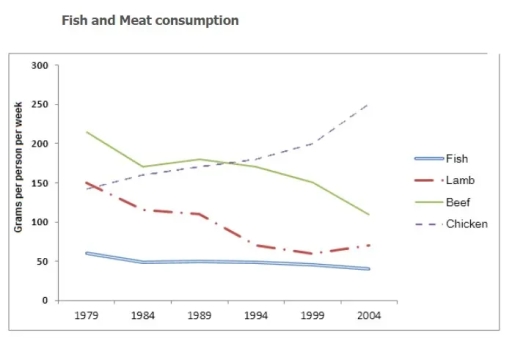
Band 5+: the graph below shows the consumption of fish and some different kinds of meat in a european country between 1979 and 2004. summarise the infomrations by selecting and reporting the main features and make comparison where relevant

Image for topic: the graph below shows the consumption of fish and some different kinds of meat in a european country between 1979 and 2004. summarise the infomrations by selecting and reporting the main features and make comparison where relevant
Our system will evaluate the answer based on this AI-generated description.
The image shows a line graph titled 'Fish and Meat consumption' with the x-axis labeled with years from 1979 to 2004 in 5-year intervals and the y-axis labeled with 'Grams per person per week' starting from 0 to 300 in 50-gram increments. Four lines represent different types of meat: Fish (solid line), Lamb (dashed line), Beef (solid line), and Chicken (dashed line). Fish consumption starts at around 60 grams and shows a slight increase over the years, reaching just above 100 grams in 2004. Lamb consumption starts at approximately 150 grams, decreases steeply to around 75 grams by 1989, then levels off and fluctuates slightly. Beef consumption begins at 250 grams, declines steadily to almost 150 grams by 2004. Chicken consumption starts at nearly 150 grams, remains stable until 1989, then rises sharply, surpassing beef by 1999 and reaching just below 250 grams in 2004.
Given the complexity of the image, the above description may not be entirely accurate.
Note: Both the topic and the answer were created by one of our users.

The presented line graph illustrates the divergent sorts of meat and also fish that were consumed over a European nation from 1979 to 2004.

At the onset, it is evident from the graph that chicken had experienced a significant rise throughout the period; simultaneously, the rest of them witnessed a decline.

As can be seen that chicken was the highest compared to others in these following years, increasing from beneath 150 to nearly 250 and it was reverse to the tendency of lamb which faced with downward trend at this point. Initially, it was just ahead of chicken, with under and above 150, respectively, however later on it fell down to around 100 in 2004.

We can notice that beef accounted for decrease. At the beginning period, it commenced with just over 200 although it declined by 180 in that year and than beef faced 240 alike as well as subsequently it declined stable until 2004 with 80. Turning to fish, there was not increase or anything like that. It almost remained steady with 60 except for some changes.

It is blatantly obvious that the gap between beef lamb in addition to fish had narrowed considerably over the second half of the period in question.

Word Count: 205

Answers On The Same Topic:

the graph below shows the consumption of fish and some different kinds of meat in a european country between 1979 and 2004. summarise the infomrations by selecting and reporting the main features and make comparison where relevant

The line chart illustrates weekly per-capita consumption of fish, lamb, beef, and chicken in a European country from 1979 until 2004. Overall, poultry consumption climbed steadily, whereas fish, lamb, and beef declined. In 1979, beef was the most commonly eaten protein by the population. Each individual consumed about 200 grams of beef weekly, four times […]

the graph below shows the consumption of fish and some different kinds of meat in a european country between 1979 and 2004. summarise the infomrations by selecting and reporting the main features and make comparison where relevant

The graph given the information about consumption three meat and fish in a week at 1976 until 2004. At 1980’s the most popular was beef and the unpopular consumption was fish. From the graph the consumption beef slightly decrease, but the consumption of chicken increase. In the last 25 years consumption lamb slightly decrease. The […]

the graph below shows the consumption of fish and some different kinds of meat in a european country between 1979 and 2004. summarise the infomrations by selecting and reporting the main features and make comparison where relevant

The line graph illustrates the consumption of fish and three different kinds of meat – beef, lamb, and chicken in a European country between 1978 and 2003. Overall, at the beginning of the period, beef was the most consumed, while lamb had the lowest level of consumption.By the end of the period, chicken had become […]

the graph below shows the consumption of fish and some different kinds of meat in a european country between 1979 and 2004. summarise the infomrations by selecting and reporting the main features and make comparison where relevant

The given line graph demonstrates how much fish and three different kinds of meat were consumed in a European country during the years 1979-2004. Overall, it can be seen that chicken consumption increased rapidly over the period, while beef and lamb had a gradual downward trend. Meanwhile, fish remained relatively stable at the lowest point, […]

the graph below shows the consumption of fish and some different kinds of meat in a european country between 1979 and 2004. summarise the infomrations by selecting and reporting the main features and make comparison where relevant

The graph demonstrate in European country consumption of fish and variety sort of meat from 1979 to 2004. Overall, what stand out of the graph is that one of the popularity meat was beef for 10 years, after chicken was increase while other meats was stable and decreasing. With regards to beef and chicken, starts […]

See All

Other Topics:

The line graph illustrates the percentage of employed Australian men and women aged between 18 and 34 in 1971 and 2011.

The line graph below demonstrates the employment of males and females aged 18 to 34 in Australia from 1976 to 2011. Overall, the percentage of men hired increased significantly across the age range. While women’s figures followed different patterns, one group showed a steady decline while others steadily before also decline. In 1976 had the […]

The graph below shows the number of undergraduate students enrolled in five different humanities and social science disciplines in UK universities from 1985 to 2015. Summarise the information by selecting and reporting the main features and make comparisons where relevant.

The line graph represents the amount of undergraduates registered in five various humanities and social sciences disciplines in UK universities between 1985 and 2015. Overall, the number of students enrolled in law showed the most significant growth throughout the period. Political Science marginally increased and fell over the period, while ethics had constant upward trend. […]

The line graph below shows the percentage of people using the Internet in five different countries from 2000 to 2020

The line graph illustrates the proportion of people using Internet in five different countries between 2000 to 2020. Overall, the use of Internet has increased in every country in twenty years. The most dramatical change in the percentage of people was in India followed up by Germany. In 2000, India had almost no usage of […]

The graph shows how much money was spent on foreign investment in real estate for four Asian countries from 2014 to 2024.

The line graph illustrates the amount of earnings being spent on foreign investment in housing for four various Asian nations between 2014 and 2024. A glance at the graph reveals that Japanese’s investment upsurged whereas Chinese’s investment plumped throughout the provided timeframe. As regards the Singaporians, their investment decreased gradually while Korean’s fluctuated over the […]

The line graph shows the number of overseas visitors to three different areas in a European country between 1987 and 2007. Summarise the information by selecting and reporting the main features, and make comparisons where relevant.

The data illustrates overseas visitors to three several areas in a European country from 1987 to 2007. Overall, proportion of people who visited to the coasts and lakes increased substantially, but with some flactuations, over the period, . The mountains visitors also rose, although the increase was considerably less pronounced. At the first half of […]

The line graph shows the number of overseas visitors to three different areas in a European country between 1987 and 2007. Summarise the information by selecting and reporting the main features, and make comparisons where relevant.

The given line graph compares the changes in the number of tourists visiting European country areas in a 20-year period starting from 1987. Overall, all three visiting lands gained popularity over the time, ending with the coast dominance, followed by the lakes and the mountains. While the figure for the coast and the lakes had […]

See All
We have detected unusual activity on your device.
Please verify your identity to continue.
Note: This verification step won't sign you in. If you have a premium account, please log in to access the service as usual.
Google/Gmail Verification
Or verify using Email/Code
We've sent a verification code to:
youremail@gmail.com (Not your email?)
Enter it below to complete the verification process.
Ensure your email address is correct, your inbox is not full, and you check your spam folder. If no email arrives, consider using an alternative email.
You will need a Premium plan to perform your action!
Note: If you already have a premium account, please log in to access our services as usual.

Plans & Pricing

Our mission is to make quality education accessible for everyone.
However, to keep our hardworking team running and this service alive, we genuinely need your support!
By opting for a premium plan, not only do you sustain us in achieving the mission, but you also unlock advanced features to enrich your learning experience.

Free

For learners who aren't pressed for time

What's included on Free
100+ Cambridge IELTS Tests
Instant IELTS Writing Task 1 & 2 Evaluation (2 times/month)
Instant IELTS Speaking Part 1, 2, & 3 Evaluation (2 times/month)
Instant IELTS Writing Task 1 & 2 Essay Generator (2 times/month)
500+ Dictation & Shadowing Exercises
100+ Pronunciation Exercises
Flashcards
Other Advanced Tools

Premium

For those serious about advancing their English proficiency, and for IELTS candidates aspiring to boost their band score by 1-2 points (especially in writing & speaking) in just 30 days or less

What's included on Premium
Save Your IELTS Test Progress & Analyze Mistakes By Question Type
Save Your Own Flashcard Sets & Use Them On Any Device
Unlock All Courses, IELTS Tests, Section & Part Practice
Unlimited AI Conversations
Unlimited AI Writing Enhancement Exercises
Unlimited IELTS Writing Task 1 & 2 Evaluation
Unlimited IELTS Speaking Part 1, 2, & 3 Evaluation
Checked Answers Will Not Be Published
Unlimited IELTS Writing Task 1 & 2 Essay Generator
Unlimited IELTS Speaking Part 1, 2, & 3 Sample Generator
Unlimited Usage Of Advanced Tools & AI Features
Priority Support within 24h (12-month plan only)

Due to the nature of our service and the provided free trials, payments are non-refundable.