Our system will evaluate the answer based on this AI-generated description.
The image contains a line graph showing Twitter use by age group over 8 time points: 10/11, 11/01, 11/05, 11/08, 12/02, 12/08, 12/12, 13/05. Age groups are represented as 18-29, 30-49, 50-64, 65+. At 10/11, 18-29 usage is around 30%, 30-49 around 15%, 50-64 around 5%, 65+ just under 5%. At 11/01, 18-29 increases to just under 35%, 30-49 to just above 15%, 50-64 and 65+ remain steady. At 11/05, 18-29 drops to just above 30%, 30-49 rises to 20%, 50-64 to almost 10%, 65+ to almost 5%. At 11/08, 18-29 rises to just under 35%, 30-49 to just over 20%, 50-64 to just over 10%, 65+ to just over 5%. At 12/02, 18-29 drops to 30%, 30-49 drops to 15%, 50-64 rises to 12.5%, 65+ drops to 5%. At 12/08, 18-29 rises to almost 35%, 30-49 rises to 20%, 50-64 to almost 15%, 65+ to just over 5%. At 12/12, 18-29 drops to just above 30%, 30-49 drops to just over 15%, 50-64 rises to 15%, 65+ to just under 5%. At 13/05, 18-29 rises to just below 35%, 30-49 to just over 20%, 50-64 to just under 15%, 65+ remains steady.
Given the complexity of the image, the above description may not be entirely accurate.
Skyrocket your IELTS band score by 1-2 points in under a month with our premium plan!
Note: Both the topic and the answer were created by one of our users.
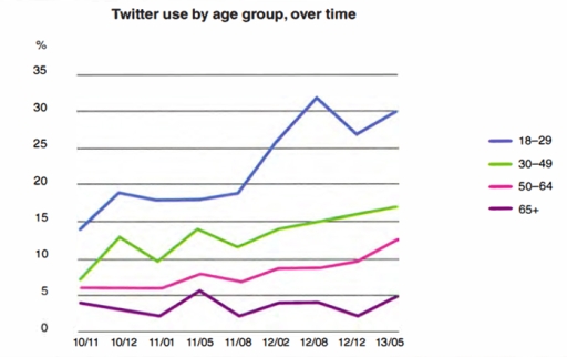
This line graph ilustrates amount in percents of Twitter users in the USA between November 2010 and May 2013.The graph devided by 4 age groups from 18 to 65+ years.
Overall there was a growth of the number of people, who use Twitter, during this period of time. At the start this social network was used the most by 18-29 age group. For 30-65+ aged people it was not so populal as for the first group. The amound of users for rest three groups have been fluctuating by this time period but at the end it rose number 2 some.
Blue line, which is for the youngest age group had the biggest amont at the beginning in 10/11. It rose some in 10/12 and stay the same up to 11/08. Only 1 year ago, unfortunaly it hitted a peak of 32%users. It went down to 27% after 4 mounths and grow up to 30% after 9 months. Compared to others, blue line had the best increase in quantity of users .
The rest – gren, pink, purple charts started almost from one point, they ware approximately 5%. During 1011-11/08 there ware fluctuations Kin gren one, like the purple line, In 13/05 green had 17% of users and purple had 5%. Pink line was the most stable for this period. Only for 1212-135 it increased to 13%. The purple line had the smallest percent of people It left the same as the beginning period percentage
Word Count: 244