🔥 Today Only: Save 30% on Premium — Offer Ends Soon! - Upgrade Now!
Line Graph

Band 6+: The graph shows average house prices in countries from 2007 to 2014.

Image for topic: The graph shows average house prices in countries from 2007 to 2014.
Our system will evaluate the answer based on this AI-generated description.
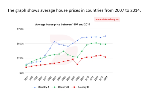
The image presents a line graph depicting average house prices for Country A, Country B, and Country C from 1997 to 2014; in 1997, Country A was at $150k, Country B at $80k, Country C at $130k; by 1998, Country A increased to $180k, Country B to $100k, Country C to $135k; by 1999, Country A rose to $190k, Country B to $120k, Country C decreased to $125k; in 2000, Country A at $220k, Country B at $150k, Country C back at $130k; by 2001, Country A surged to $270k, Country B $170k, Country C at $150k; in 2002, Country A dramatically rose to $350k, Country B to $195k, Country C to $180k; by 2003, Country A reached $450k, Country B $200k, Country C $230k; in 2004, Country A hit $500k, Country B $210k, Country C $250k; by 2005, Country A dipped to $480k, Country B to $205k, Country C $260k; in 2006, Country A at $490k, Country B $180k, Country C $300k; by 2007, Country A rose again to $510k, Country B $170k, Country C $310k; in 2008, Country A grew to $540k, Country B $150k, Country C $320k; by 2009, Country A $550k, Country B $145k, Country C peaked at $400k; in 2010, Country A at $560k, Country B $130k, Country C $390k; by 2011, Country A $590k, Country B $135k, Country C $320k; in 2012, Country A grew to $600k, Country B $140k, Country C $330k; by 2013, Country A rose to $680k, Country B $150k, Country C $350k; in 2014, Country A peaked at $750k, Country B $160k, Country C $420k.
Given the complexity of the image, the above description may not be entirely accurate.
Note: Both the topic and the answer were created by one of our users.

The line graph illustrates the information about the middle changes of apartments costs in 3 different cities ,over the period of 17 years, between 1997 and 2014.

Overall, the price of houses in all metropolis were almost the same at the beginning of the period, however country (a) changed the position and took the leadership at the end of the period,over the given years.

Turning to the details, in 1997 the rate of price were almost $120k in country (a) and also country (b).Until 2000 years there was no huge differences, in the country (b) index of house increased to $250k, while the country (a) achieved to about $200k. After this the demand for apartments in country (a) increased dramatically and reached more than $500k in 2003, however the rate of house in country (b) heated to around $300k.

As for Country C, house prices stayed the lowest during the whole period. In 1997, the average cost was about $100,000, and it increased slowly to around $150,000 by 2003. After that, prices fell a little to nearly $120,000 in 2004. Then, the cost of houses started to rise again and reached about $250,000 in 2009. In the last years, the prices changed slightly and finished at around $230,000 in 2014.

Word Count: 210

Answers On The Same Topic:

The graph shows average house prices in countries from 2007 to 2014.

The graph depicts information about approximate house prices in countries between 2007 and 2014. Overall, between 2007 and 2014, there was a dramatic improvement. In 2007, countries A, B, and C all showed an upward trend: country A at just under $500K, country B at almost $300K, and country C at just under $250K. In […]

The graph shows average house prices in countries from 2007 to 2014.

The line chart illustrates average house prices in three countries from 1997 to 2014, measured in US dollars. Overall, Country A experienced the greatest price volatility among three coutries. In contrast, Country B showed a brief dip and Country C demonstrated a rising steadily. At the early stages, the average house prices in Country A […]

The graph shows average house prices in countries from 2007 to 2014.

The line chart illustrates the average of house prices in certain countries – A, B, C respectively – between 2007 and 2014 Overall, the average house price in all examined countries witnessed an upward trajectory. Additionally, the country C experienced a slight decline before recovering after that. The house price in country B stood at […]

See All

Other Topics:

The line graph below shows the percentage of tourists who visited four attractions in a city between 1990 and 2020.

The line graph represents the proportion of those who visited four different types of entertainment location in a city over a 30-year period, starting from 1990. Overall, It is evident that the figure for Zoo and Bontanical Garden witnessed a remarkable growth over the time frame, while the statistics of Museum underwent an upward trajectory […]

The graph below gives information about telephone subscribers per 1000 inhabitants in Africa between 19994 and 2004.

The line chart depicts the number of African telephone subscribers per 100 people from 1994 to 2004. Overall, over the decade, both fixed-line and mobile subscriptions increased, with mobile users experiencing a notable shift. In the period before 2001, mobile phone subscriptions were lower than fixed-line, starting at 0.06 and 1.7 respectively. Although both types […]

The graph below gives information about the number of jobs in four sectors of the economy in the US between 1960 and 2020. Summarise the information by selecting and reporting the main features, and make comparisons where relevant.

The diagram illustrates the data about the number of jobs in four different sectors of the economy in the US from 1960 to 2020. Overall, it can be seen that the ratio of jobs in manufacturing department were increased throughout the more than half of the given time, but later it fell; however, the number […]

Describe the data shown in the 'World Bank Forecast' graph

The statistics below illustrate the growth forecast by the World Bank for the years 2018 to 2019. Overall, it is evident that the most significant percent growth occurred in 2016, while 2009 recorded the smallest results. Additionally, the years 2011 and 2014 showed approximately equal growth rates. Specifically, the International Monetary Fund had a strong […]

Describe the data shown in the 'World Bank Forecast' graph

The statistics below illustrates information about growth in the World Bank Forecast between years 2019 to 2018. Overall, it is clearly seen that huge amount of percent growth was in 2016, while 2009 had the most smallest results . Furthermore, years 2011 and 2014 were approximately equal. In detail, International Monetary fund started great but […]

See All
We have detected unusual activity on your device.
Please verify your identity to continue.
Note: This verification step won't sign you in. If you have a premium account, please log in to access the service as usual.
Google/Gmail Verification
Or verify using Email/Code
We've sent a verification code to:
youremail@gmail.com (Not your email?)
Enter it below to complete the verification process.
Ensure your email address is correct, your inbox is not full, and you check your spam folder. If no email arrives, consider using an alternative email.
You will need a Premium plan to perform your action!
Note: If you already have a premium account, please log in to access our services as usual.

Plans & Pricing

Our mission is to make quality education accessible for everyone.
However, to keep our hardworking team running and this service alive, we genuinely need your support!
By opting for a premium plan, not only do you sustain us in achieving the mission, but you also unlock advanced features to enrich your learning experience.

Free

For learners who aren't pressed for time

What's included on Free
100+ Cambridge IELTS Tests
Instant IELTS Writing Task 1 & 2 Evaluation (2 times/month)
Instant IELTS Speaking Part 1, 2, & 3 Evaluation (5 times/month)
Instant IELTS Writing Task 1 & 2 Essay Generator (2 times/month)
500+ Dictation & Shadowing Exercises
100+ Pronunciation Exercises
Flashcards
Other Advanced Tools

Premium

For those serious about advancing their English proficiency, and for IELTS candidates aspiring to boost their band score by 1-2 points (especially in writing & speaking) in just 30 days or less

What's included on Premium
Save Your IELTS Test Progress & Analyze Mistakes By Question Type
Unlock All Courses & IELTS Tests
Unlimited AI Conversations
Unlimited AI Writing Enhancement Exercises
Unlimited IELTS Writing Task 1 & 2 Evaluation
Unlimited IELTS Speaking Part 1, 2, & 3 Evaluation
Checked Answers Will Not Be Published
Unlimited IELTS Writing Task 1 & 2 Essay Generator
Unlimited IELTS Speaking Part 1, 2, & 3 Sample Generator
Unlimited Usage Of Advanced Tools
Priority Support within 24h (12-month plan only)

Due to the nature of our service and the provided free trials, payments are non-refundable.
Nếu bạn là người Việt Nam và không có hoặc không muốn trả bằng credit/debit cards, bạn có thể thanh toán bằng phương thức chuyển khoản:


Chọn gói:
419,000₫ 277,000 ₫ cho gói 1 tháng (chỉ 9,233₫/ngày)
1,239,000₫ 597,000 ₫ cho gói 3 tháng (chỉ 6,633₫/ngày)
2,469,000₫ 1,027,000 ₫ cho gói 6 tháng (chỉ 5,706₫/ngày)
4,929,000₫ 1,417,000 ₫ cho gói 12 tháng (chỉ 3,936₫/ngày)


Sau khi chuyển khoản, vui lòng đợi trình duyệt tự động điều hướng bạn trở lại Engnovate và bạn sẽ ngay lập tức nhận được mã kích hoạt tài khoản premium.
Nếu có lỗi xảy ra, bạn có thể liên hệ với team thông qua một trong các phương thức: email đến helloengnovate@gmail.com hoặc nhắn tin qua facebook.com/engnovate.
Vì toàn bộ công cụ trên website đều có thể sử dụng thử miễn phí, Engnovate không hỗ trợ hoàn tiền.