🔥 Today Only: Save 30% on Premium — Offer Ends Soon! - Upgrade Now!
Line Graph

Band 5+: The graph shows the percentage of 15-year-olds with low literacy (reading and writing) levels in four countries. Summarise the information by selecting and reporting the main features making comparisons where relevant.

Image for topic: The graph shows the percentage of 15-year-olds with low literacy (reading and writing) levels in four countries. Summarise the information by selecting and reporting the main features making comparisons where relevant.
Our system will evaluate the answer based on this AI-generated description.
The image shows a line graph of 15 year-olds with low literacy levels from 2000 to 2009 for Austria, Denmark, Ireland, and Sweden. In 2000, Austria started at about 18%, Denmark at 16%, Ireland at 12%, and Sweden at 10%. In 2003, Austria increased to about 19%, Denmark stayed the same, Ireland increased to about 13%, and Sweden increased to about 11%. In 2006, Austria increased dramatically to about 27%, Denmark increased to about 17%, Ireland increased to about 15%, and Sweden increased to about 12%. In 2009, Austria decreased to about 26%, Denmark increased to about 18%, Ireland increased to about 17%, and Sweden increased to about 14%. The y-axis represents the percentage of 15 year-olds with low literacy levels, while the x-axis represents the years. Each country is represented by a different colored line: Austria (blue), Denmark (purple), Ireland (yellow), and Sweden (green).
Given the complexity of the image, the above description may not be entirely accurate.
Note: Both the topic and the answer were created by one of our users.

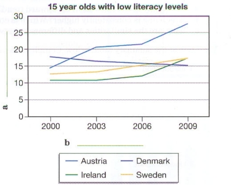
The line graph compares 15 year old teenagers which have bad literacy skills in 4 Europian countries(Austria, Denmark, Sweden and Ireland) by percentages from 2000 to 2009.

Overall, it can be seen that, the situation gotten worse during the given period except Denmark.

Starting with Austria, which stood at just below 15% in 2000, saw a significant growth to just over 20% in 2003. Then, there was still slight increase to 2006, from there to 2009, there was again huge increase, which peaked at approximately 28% which is highest out of all four countries. However, Denmark stood at just below 20% as it was highest in 2000 compared to other countries. But, Denmark experienced a loss from the start, then saw a little decrease change in 2003, and ended with 15%.

Unlike Denmark and Austira, Ireland and Sweden has similar characteristic as they started from the least spots with approximately 11% and 13%, respectively. Thougth, Ireland remain unchanged from 2000 to 2003, while Sweden witnessed a very little growth. From 2003 to 2009, they both experienced an increase, but Ireland with better increase stability. Furthermore, Ireland and Sweden ended with same percentage(approximately 17%).

Word Count: 193

Answers On The Same Topic:

The graph shows the percentage of 15-year-olds with low literacy (reading and writing) levels in four countries. Summarise the information by selecting and reporting the main features making comparisons where relevant.

The line graph compares changes in the proportions of the children aged 15 who were bad at reading and writing in Austria, Denmark, Ireland and Sweden from 2000 to 2009. Overall, with the exception of Denmark, the remaining three countries experienced substantial increases throughout the period. Besides, Austria became the dominant in terms of having […]

The graph shows the percentage of 15-year-olds with low literacy (reading and writing) levels in four countries. Summarise the information by selecting and reporting the main features making comparisons where relevant.

This line graph provides information about the ability of learning how to read and write properly from 15 years old over the year from 2000 to 2009 years. There are two clear trends visible. Only one country,Denmark , has dropping in literacy skills. In 2000 year Denmark got 17 percent and by the end of […]

The graph shows the percentage of 15-year-olds with low literacy (reading and writing) levels in four countries. Summarise the information by selecting and reporting the main features making comparisons where relevant.

The line graph illustrates that the percentage of 15 year old teenagers with low literacy, includes reading and writing levels in four different countries. Firstly, the highest percentage in Austria, it showed the highest numbers in each years(2000, 2003, 2006 and 2009). Denmark is on the second place, it was in the middle of three […]

The graph shows the percentage of 15-year-olds with low literacy (reading and writing) levels in four countries. Summarise the information by selecting and reporting the main features making comparisons where relevant.

The linegraph illustrates the percentage of 15 year-old teenagers with low literacy level in four countries. Overall literacy rate in Austria the highest among four countries. In Denmark the lowest percentage. Ireland in 2000 showed about 10% till 2006 growed gradually but after 2006 it surged. It became higher than 15%. Sweden between 2000 and […]

The graph shows the percentage of 15-year-olds with low literacy (reading and writing) levels in four countries. Summarise the information by selecting and reporting the main features making comparisons where relevant.

The linegraph illustrates the distribution of low literacy skilleds among 15-year-olds in Austria, Denmark, Ireland and Sweden. Overall, percentage of teenagers who can barely read and write in Austria, Ireland and Sweden grew gradually throughout the given period.Meanwhile, Denmark’s distribution declined in 9 years. While low literacy percentage skyrocketed in sweden from around 14 to […]

See All

Other Topics:

The graph below shows the average number of American commuters travelling each day by car, bus or train between 1980 and 2040

The graph below illustrates the usual number of pendular American travellers commuting daily by cars, buses and trains during the period of 60 years. Overall, in the period of 60 years, from 1980 to 2040, the average amount of passengers commuting each day by cars will have risen. In contrast, the buses will have plunged. […]

The graph below gives information about the number of jobs in four sectors economy in the US between 1960 and 2020.

The line graph compares the number of occupations in four sectors of the US industry from 1960 to 2020. Overall, manufacturing dominated in the number of workers, while the opposite was true for healthcare. Additionally, the number staffs who worked in the healthcare and retail increased over the period, whereas manufacturing and agriculture experienced decreases. […]

Band 7+: The chart below gives information about computer ownership in the US from 1997 to 2012.

The graph below illustrates the number of customers in four different restaurants (Burger Bar, Chicken Spot, Pizza Hut, Donut Bro) during a twenty five-year period, from 1990 to 2015. Overall, regarding the line grap, it can be seen that Burger Bar and Donut Bro increased significantly. In contrast, Pizza Hut and Chicken Spot showed a […]

The line graph shows the percentage of people living in cities in four countries (Philippines, Malaysia, Thailand and Indonesia) from 1970 to 2020.

The given graph chart illustrates information on data on the population in four Asian countries living in cities over a period from 1918 to 2020, with predictions for 2030 and 2040. It is evident that there was an upward trend in the percentage of the population in four Asian countries living in cities and this […]

The graph below shows how people in one city in Australia buy music from 2015 to 2020.

The line graph illustrates how individual in one city bought music in Australia from 2015 between 2020 Overall, it is clear percentage of total music sales by method, there are three percentage it is streams, downloads, CDs purchased. Leader was streams it have highly increased line by the follow downloads line was flactuating and CDs […]

The given chart shows the proportion of residents of America (in millions) living in different regions between 2015 and 2020.Summarize the information by selecting and reporting the main features and make comparisons where relevant. Write at least 150 words.

The given chart illustrates the proportion of residents in America, measured in millions, who lived in different regions from 2015 to 2020. Overall, the population of all regions experienced some changes during the period. While certain regions showed a steady increase in the number of residents, others witnessed slight fluctuations. It is clear that one […]

See All
We have detected unusual activity on your device.
Please verify your identity to continue.
Note: This verification step won't sign you in. If you have a premium account, please log in to access the service as usual.
Google/Gmail Verification
Or verify using Email/Code
We've sent a verification code to:
youremail@gmail.com (Not your email?)
Enter it below to complete the verification process.
Ensure your email address is correct, your inbox is not full, and you check your spam folder. If no email arrives, consider using an alternative email.
You will need a Premium plan to perform your action!
Note: If you already have a premium account, please log in to access our services as usual.

Plans & Pricing

Our mission is to make quality education accessible for everyone.
However, to keep our hardworking team running and this service alive, we genuinely need your support!
By opting for a premium plan, not only do you sustain us in achieving the mission, but you also unlock advanced features to enrich your learning experience.

Free

For learners who aren't pressed for time

What's included on Free
100+ Cambridge IELTS Tests
Instant IELTS Writing Task 1 & 2 Evaluation (2 times/month)
Instant IELTS Speaking Part 1, 2, & 3 Evaluation (5 times/month)
Instant IELTS Writing Task 1 & 2 Essay Generator (2 times/month)
500+ Dictation & Shadowing Exercises
100+ Pronunciation Exercises
Flashcards
Other Advanced Tools

Premium

For those serious about advancing their English proficiency, and for IELTS candidates aspiring to boost their band score by 1-2 points (especially in writing & speaking) in just 30 days or less

What's included on Premium
Save Your IELTS Test Progress
Unlock All Courses & IELTS Tests
Unlimited AI Conversations
Unlimited AI Writing Enhancement Exercises
Unlimited IELTS Writing Task 1 & 2 Evaluation
Unlimited IELTS Speaking Part 1, 2, & 3 Evaluation
Checked Answers Will Not Be Published
Unlimited IELTS Writing Task 1 & 2 Essay Generator
Unlimited IELTS Speaking Part 1, 2, & 3 Sample Generator
Unlimited Usage Of Advanced Tools
Priority Support within 24h (12-month plan only)

Due to the nature of our service and the provided free trials, payments are non-refundable.
Nếu bạn là người Việt Nam và không có hoặc không muốn trả bằng credit/debit cards, bạn có thể thanh toán bằng phương thức chuyển khoản:


Chọn gói:
419,000₫ 277,000 ₫ cho gói 1 tháng (chỉ 9,233₫/ngày)
1,239,000₫ 597,000 ₫ cho gói 3 tháng (chỉ 6,633₫/ngày)
2,469,000₫ 1,027,000 ₫ cho gói 6 tháng (chỉ 5,706₫/ngày)
4,929,000₫ 1,417,000 ₫ cho gói 12 tháng (chỉ 3,936₫/ngày)


Sau khi chuyển khoản, vui lòng đợi trình duyệt tự động điều hướng bạn trở lại Engnovate và bạn sẽ ngay lập tức nhận được mã kích hoạt tài khoản premium.
Nếu có lỗi xảy ra, bạn có thể liên hệ với team thông qua một trong các phương thức: email đến helloengnovate@gmail.com hoặc nhắn tin qua facebook.com/engnovate.
Vì toàn bộ công cụ trên website đều có thể sử dụng thử miễn phí, Engnovate không hỗ trợ hoàn tiền.