24 Hours Only: Get 39% OFF on Our Premium Plan - Check Out Now!
Line Graph

Band 5+: The graph shows the percentage of people accessing news from 4 sources: TV, Radio, Newspaper, Internet. Summarise the information by selecting and reporting the main features, and make comparisons where relevant.

Image for topic: The graph shows the percentage of people accessing news from 4 sources: TV, Radio, Newspaper, Internet. Summarise the information by selecting and reporting the main features, and make comparisons where relevant.
Our system will evaluate the answer based on this AI-generated description.
The image depicts a graph from 1995 to 2025 displaying TV (green), newspaper (yellow), radio (red), and internet (gray) usage from 0 to 80; starting in 1995, TV at 20, newspaper at 50, radio at 60, internet at 0; by 2000, TV rises to 30, newspaper drops to 45, radio decreases to 50, internet stands at 10; in 2005, TV reaches 35, newspaper continues to fall to 40, radio slightly drops to 48, internet grows to 20; by 2010, TV ascends to 40, newspaper declines to 35, radio decreases to 45, internet significantly rises to 30; in 2015, TV climbs to 50, newspaper dips to 30, radio falls to 40, internet sharply increases to 40; in 2020, TV peaks at 60, newspaper lowers to 25, radio decreases to 35, internet levels with TV at 60; projected for 2025, TV maintains at 70, newspaper declines to 20, radio reduces to 30, internet surpasses others, reaching 70.
Given the complexity of the image, the above description may not be entirely accurate.
Note: Both the topic and the answer were created by one of our users.

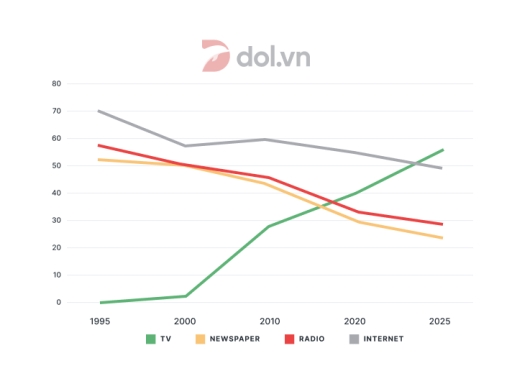
The line chart illustrates how many people in a country chose Tv, newspapers, radio and the Internet to get information from 1995 to 2025.

Overall, there was a gradual decline in the figure for TV, newspaper and radio, whilst it increased sharply in the Internet. In addition, it was noticeable that the Internet users rate generally on the top position throughout the period.

To begin, the share of people using television started at nearly 70%, after which a fluctuation was seen through the given period and it declined gradually from 2010 to 2024, the prediction of this figure will end at 50% in 2025. By contrast, the proportion of the Internet users witnessed a significant growth through 30-year period, from 0% to approximately 55%.

According to newspaper and radio, they followed the same partern. Around 55% of people who selected newspaper and radio to access news in 1995, then the figure saw a dramatic decline over 30 years, from about 55% to nearly 40% and from roughly 55% to just over 30%, respectively.

Word Count: 173

Answers On The Same Topic:

The graph shows the percentage of people accessing news from 4 sources: TV, Radio, Newspaper, Internet. Summarise the information by selecting and reporting the main features, and make comparisons where relevant.

The line graph depicts the percentage of citizen entering news from 4 types; TV , Radio , Social Media , Newspaper from 1995 to 2025. Overall, it can be seen from the graph ,TV shows plummeted than other three sources in 2025. At the start of the period, a peak of figure on the internet […]

The graph shows the percentage of people accessing news from 4 sources: TV, Radio, Newspaper, Internet. Summarise the information by selecting and reporting the main features, and make comparisons where relevant.

The line chart illustrates the proportion of how people access news through four ways TV, Radio, Newspaper and Internet from 1995 to 2025. Overall, there was a decrease in the number of people who read news on Newspaper, Radio and Internet, in spite of greater extents while the TV experienced an upward trend. Additionally, people […]

The graph shows the percentage of people accessing news from 4 sources: TV, Radio, Newspaper, Internet. Summarise the information by selecting and reporting the main features, and make comparisons where relevant.

The supplied line chart demonstrates the proportion of people who received news from four different types of resources (TV, Newspaper, Radio, and Internet) between 1995 and 2025 in a specific area. The figures are given as a percentage. It can be clearly seen that, except for the TV, which experienced an upward trend, other sources […]

The graph shows the percentage of people accessing news from 4 sources: TV, Radio, Newspaper, Internet. Summarise the information by selecting and reporting the main features, and make comparisons where relevant.

The line graph displays how many people have access to news from TV, newspaper, radio and Internet from 1995 to 2025. Overall, it is noticeable that access to TV growth dramatically through years and at the end of period become the most accessible source. While newspaper, radio, internet decline slightly. The percentage of people who […]

The graph shows the percentage of people accessing news from 4 sources: TV, Radio, Newspaper, Internet. Summarise the information by selecting and reporting the main features, and make comparisons where relevant.

The line graph illustrates the number of users accessing news from four sources: TV, radio, newspaper and internet from 1995 to 2025. It is noticeable that the internet has recorded an upward trend throughout the period, by contrast, remainders have seen a downward trend. However, a drastic rise can be witnessed in the consumption of […]

See All

Other Topics:

The chart below shows the Unemployment rate the number of people leaving Ireland from 1998 to 2008

The line graph gives information about unemployment rate change of Irish people between 1998-2008. Overall,the unemployment rates had downward trend.In the end of the line graph unemployment rate decreased respectively.Imigration and unemployment rate were experiencing fluctuations.It is clear that the number of immigrants Irish people and unemployment rate had started from the highest point. In […]

The graph below shows the percentage of 18-25 year olds in universities in four countries.

The line graph presents information about the percentage of students in universities in Singapore, Malaysia, the Philippines and Thailand from 1961 to 2011. Overall, despite some fluctuations, the proportions of students increased in all four countries over a fifty-year period. Thailand and Singapore had the highest proportions by the end of the period, while Malaysia […]

The graph below shows the percentage of 18-25 year olds in universities in four countries.

The graph illustrates the precentage of young adults in universities in Thailand, The Philipppines, Malaysia and Singapore from 1961 to 2011. Overall, the individuals aged 18-25 year olds who attend the higher education showing un upward trends over the fifty-year period. It was clear that Thailand and Singapore showed significant growth, while The Philippines and […]

The graph below shows the number of enquiries received bu the tourist information office in one cityover a six month period in 2011

The line graph illustrates data about the number of enquiries received by the tourist information centre in a particular city over a six month period in the year 2011. Overall, it is evident that there are three ways to submit an enquiry. Receiving enquiries in person made up the largest figure, as opposed to by […]

The graph above shows the stock price of four technology companies between 2011 and 2016. Summarise the information by selecting and reporting the main features, and make comparisons where relevant.

The data displays the stock price of technology companies, Facebook, appel, google and yahoo from 2011 to 2016. Overall, Google had stability on the stock price during that period, in addtion appel had instability on the stock price compared to yahoo had decrease gradualy, in contrast facebook had increase gradualy during that period comparing to […]

the line graph gives data abt the number(million) of users of five different communication services worldwide from 1998 to 2008

The line graph depicts data of internet usage measured in millions of users,in five types of commuication services in a ten-year duration between 1998 and 2008. Generally, there is a rise in internet utilization noticed in all the types of internet services in that period of time with Cellular phone service leading the trend. Being […]

See All
We have detected unusual activity on your device.
Please verify your identity to continue.
Note: This verification step won't sign you in. If you have a premium account, please log in to access the service as usual.
Google/Gmail Verification
Or verify using Email/Code
We've sent a verification code to:
youremail@gmail.com (Not your email?)
Enter it below to complete the verification process.
Ensure your email address is correct, your inbox is not full, and you check your spam folder. If no email arrives, consider using an alternative email.
You will need a Premium plan to perform your action!
Note: If you already have a premium account, please log in to access our services as usual.

Plans & Pricing

Our mission is to make quality education accessible and free for everyone.
However, to keep our hardworking team running and this service alive, we genuinely need your support!
By opting for a premium plan, not only do you sustain us in achieving the mission, but you also unlock advanced features to enrich your learning experience.

Free

For learners who aren't pressed for time

What's included on Free
1000+ IELTS Tests & Samples
Instant IELTS Writing Task 1 & 2 Evaluation (2 times/month)
Instant IELTS Speaking Part 1, 2, & 3 Evaluation (5 times/month)
Instant IELTS Writing Task 1 & 2 Essay Generator (2 times/month)
500+ Dictation & Shadowing Exercises
100+ Pronunciation Exercises
Flashcards
Other Advanced Tools

Premium

For those serious about advancing their English proficiency, and for IELTS candidates aspiring to boost their band score by 1-2 points (especially in writing & speaking) in just 30 days or less

What's included on Premium
Save Your IELTS Test Progress
Unlock All Courses & Content
Unlimited AI Conversations
Unlimited AI Writing Enhancement Exercises
Unlimited IELTS Writing Task 1 & 2 Evaluation
Unlimited IELTS Speaking Part 1, 2, & 3 Evaluation
Checked Answers Will Not Be Published
Unlimited IELTS Writing Task 1 & 2 Essay Generator
Unlimited IELTS Speaking Part 1, 2, & 3 Sample Generator
Unlimited Usage Of Advanced Tools

Due to the nature of our service and the provided free trials, payments are non-refundable.
Nếu bạn là người Việt Nam và không có hoặc không muốn trả bằng credit/debit cards, bạn có thể thanh toán bằng phương thức chuyển khoản:


Chọn gói:
279,000₫ 157,000 ₫ cho gói 1 tháng (chỉ 5,233₫/ngày)
819,000₫ 397,000 ₫ cho gói 3 tháng (chỉ 4,411₫/ngày)
1,649,000₫ 667,000 ₫ cho gói 6 tháng (chỉ 3,706₫/ngày)
3,299,000₫ 857,000 ₫ cho gói 12 tháng (chỉ 2,381₫/ngày)


Sau khi chuyển khoản, vui lòng đợi trình duyệt tự động điều hướng bạn trở lại Engnovate và bạn sẽ ngay lập tức nhận được mã kích hoạt tài khoản premium.
Nếu có lỗi xảy ra, bạn có thể liên hệ với team thông qua một trong các phương thức: email đến helloengnovate@gmail.com hoặc nhắn tin qua facebook.com/engnovate.
Vì toàn bộ công cụ trên website đều có thể sử dụng thử miễn phí, Engnovate không hỗ trợ hoàn tiền.