🔥 Today Only: Save 30% on Premium — Offer Ends Soon! - Upgrade Now!
Bar Chart

Band 6+: The graph shows the result of a survey of 2,000 American adults regarding their interest in taking part in selected extreme sports. Summarize the information by selecting and reporting the main features, and make comparisons where relevant.

Image for topic: The graph shows the result of a survey of 2,000 American adults regarding their interest in taking part in selected extreme sports. Summarize the information by selecting and reporting the main features, and make comparisons where relevant.
Our system will evaluate the answer based on this AI-generated description.
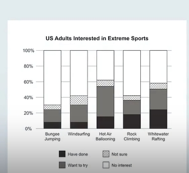
The image presents a segmented bar chart detailing the interest levels in extreme sports among US adults categorized into five activities: Bungee Jumping, Windsurfing, Hot Air Ballooning, Rock Climbing, and Whitewater Rafting. Each category outlines percentages across four segments: "Have done," approximately 10% for Hot Air Ballooning, around 5% for Rock Climbing, roughly 3% for Bungee Jumping and Windsurfing, and slightly above 5% for Whitewater Rafting; "Want to try," about 22% for Bungee Jumping, around 25% for Windsurfing, close to 35% for Hot Air Ballooning, roughly 28% for Rock Climbing, and nearly 30% for Whitewater Rafting; "Not sure," hovering near 10% for Bungee Jumping, just over 10% for Windsurfing, around 7% for Hot Air Ballooning, close to 8% for Rock Climbing, and about 10% for Whitewater Rafting; "No interest," approximately 65% for Bungee Jumping, near 60% for Windsurfing, around 50% for Hot Air Ballooning, nearly 60% for Rock Climbing, and about 55% for Whitewater Rafting.
Given the complexity of the image, the above description may not be entirely accurate.
Note: Both the topic and the answer were created by one of our users.

The bar illustrates the result of a survey of 2000 american adults showing wether they have interest, participating in different extreme sports.

Overall, there is a noticable difference between the adults that have participated and the ones showing no interest. However, A minor portion of them are still confused.

Firstly, there are five extreme sports included in the survey: Bungee Jumping, WindSuffering, Hot Air Balloon, Rock Climbing and Whitewater. Young people who have played these sports are gradually increasing from about 10% to approximately 20% respectively. Likewise, the ones who would love to participate in future are quite stable at 18% except for Hot Air Ballooning which is considerably higher at 40%. In Addditon, a small portion of adults are yet to decide wether they would participate or not. Finally, there is a big chunk of adults who are not interesred in these extreme sports at all, therefore are the remaining ones.

Word Count: 152

Answers On The Same Topic:

The graph shows the result of a survey of 2,000 American adults regarding their interest in taking part in selected extreme sports. Summarize the information by selecting and reporting the main features, and make comparisons where relevant.

This graphic illustrates the result of a survey of an amount of American adults about their interest in extreme sports. Overall, whitewater rafting has the highest amount of adults that have done it, followed by rock climbing. In contrast, bungee jumping is one of the least interesting extreme sport in the survey since most of […]

The graph shows the result of a survey of 2,000 American adults regarding their interest in taking part in selected extreme sports. Summarize the information by selecting and reporting the main features, and make comparisons where relevant.

The bar illustrates the result of a survey of 2000 American adults showing whether they have interest in participating in different extreme sports. Overall, there is a noticeable difference between the adults that have participated and the ones showing no interest. However, a minor portion of them is still confused. Firstly, there are five extreme […]

See All

Other Topics:

'The chart below shows how frequently people in the USA ate in fast food restorants between 2003 and 2013.

The bar chart illustrates the frequency od eating at fast food restaurants among individuals in the USA in 2003, 2006 and 2013. Overall, it can be seen that people tend to consume fast food once a week or once/twice a month in all three years. While individuals usually ate in fast food restaurants once a […]

The chart below shows the amount of energy generated from wind in four countries from 1985 to 2000. Summarise the information by selecting and reporting the main features, and make comparisons where relevant.

The bar chart compares the proportion of energy obtained from wind in four countries between 1985 and 2000. Overall, the production of electricity rose over the years in all the countries, especially in Denmark and India, where it multiplied more than sixfold. Of particular note, United States, the leading country for approximately 10 years, and […]

the graph below shows the amount of energy generated wind in four countries in the period 1980-2000

The diagramm illustrates the total of wind power produced in India, Denmark, Germany and US in 1985, 1990, 1995 and 2000. It is clear that, US was the major producer of wind energy untill 1995, whereas Denmark overcome every country in generating of reliable energy by 2000. Overall, all four countries increased its amount of […]

The following bar chart shows the share in modes of transport in 2014 of three cities: New York, Sydney and Hong Kong. Summarize the information by selecting and reporting the main features and make comparisons where relevant.

The bar chart illustrates the percentage of transportation using in three cities: New York, Sydney and Hong Kong in 2014. Overall, private transport was the vast majority transportation using by populations in Sydney, while people chose to travel by bus more than other ways in Hong Kong. In New York, walking was the most popular […]

The chart below shows the number of immigrants to Germany by region in 2010 and 2020. Summarise the information by selecting and reporting the main features, and make comparisons where relevant

The bar chart compares the number of immigrants to Germany by region in one decade started in 2000. Overall, a glance at the chart reveals that the higher number of germans visited to Europe and America in the first year while the lowest number of Germans went to South Asia in two years. Furthermore, in […]

The bar chart below gives information about the age range of Internet users (expressed in percentages) in Azerbaijan in the years of 2013-2020. Describe the information given in the bar chart in English.

The bar chart illustrates the percentage of internet users in Azerbaijan from 2013 to 2020. Overall, it is clearly seen that users below 25 accounted for the highest rank over the period, while internet users above 64 was the lowest. In 2013, users below 25 stood at 46.1% and then decreased significantly to 40.1% by […]

See All
We have detected unusual activity on your device.
Please verify your identity to continue.
Note: This verification step won't sign you in. If you have a premium account, please log in to access the service as usual.
Google/Gmail Verification
Or verify using Email/Code
We've sent a verification code to:
youremail@gmail.com (Not your email?)
Enter it below to complete the verification process.
Ensure your email address is correct, your inbox is not full, and you check your spam folder. If no email arrives, consider using an alternative email.
You will need a Premium plan to perform your action!
Note: If you already have a premium account, please log in to access our services as usual.

Plans & Pricing

Our mission is to make quality education accessible for everyone.
However, to keep our hardworking team running and this service alive, we genuinely need your support!
By opting for a premium plan, not only do you sustain us in achieving the mission, but you also unlock advanced features to enrich your learning experience.

Free

For learners who aren't pressed for time

What's included on Free
100+ Cambridge IELTS Tests
Instant IELTS Writing Task 1 & 2 Evaluation (2 times/month)
Instant IELTS Speaking Part 1, 2, & 3 Evaluation (5 times/month)
Instant IELTS Writing Task 1 & 2 Essay Generator (2 times/month)
500+ Dictation & Shadowing Exercises
100+ Pronunciation Exercises
Flashcards
Other Advanced Tools

Premium

For those serious about advancing their English proficiency, and for IELTS candidates aspiring to boost their band score by 1-2 points (especially in writing & speaking) in just 30 days or less

What's included on Premium
Save Your IELTS Test Progress
Unlock All Courses & IELTS Tests
Unlimited AI Conversations
Unlimited AI Writing Enhancement Exercises
Unlimited IELTS Writing Task 1 & 2 Evaluation
Unlimited IELTS Speaking Part 1, 2, & 3 Evaluation
Checked Answers Will Not Be Published
Unlimited IELTS Writing Task 1 & 2 Essay Generator
Unlimited IELTS Speaking Part 1, 2, & 3 Sample Generator
Unlimited Usage Of Advanced Tools
Priority Support within 24h (12-month plan only)

Due to the nature of our service and the provided free trials, payments are non-refundable.
Nếu bạn là người Việt Nam và không có hoặc không muốn trả bằng credit/debit cards, bạn có thể thanh toán bằng phương thức chuyển khoản:


Chọn gói:
419,000₫ 277,000 ₫ cho gói 1 tháng (chỉ 9,233₫/ngày)
1,239,000₫ 597,000 ₫ cho gói 3 tháng (chỉ 6,633₫/ngày)
2,469,000₫ 1,027,000 ₫ cho gói 6 tháng (chỉ 5,706₫/ngày)
4,929,000₫ 1,417,000 ₫ cho gói 12 tháng (chỉ 3,936₫/ngày)


Sau khi chuyển khoản, vui lòng đợi trình duyệt tự động điều hướng bạn trở lại Engnovate và bạn sẽ ngay lập tức nhận được mã kích hoạt tài khoản premium.
Nếu có lỗi xảy ra, bạn có thể liên hệ với team thông qua một trong các phương thức: email đến helloengnovate@gmail.com hoặc nhắn tin qua facebook.com/engnovate.
Vì toàn bộ công cụ trên website đều có thể sử dụng thử miễn phí, Engnovate không hỗ trợ hoàn tiền.