🔥 Today Only: Save 30% on Premium — Offer Ends Soon! - Upgrade Now!
Multiple Graphs

Band 8+: The graphs below show the Expenditure on Health & Education, UAE as percentages of GDP and Infant mortality and life expectancy.

Image for topic: The graphs below show the Expenditure on Health & Education, UAE as percentages of GDP and Infant mortality and life expectancy.
Our system will evaluate the answer based on this AI-generated description.
The image contains two graphs; the top graph is a bar chart labeled 'Expenditure on Health & Education, UAE as % of GDP' and has three pairs of bars representing the years 1985, 1990, and 1993. In 1985, health expenditure was around 4.0%, and education was approximately 12.0%. In 1990, health was just under 6.0%, and education was around 8.0%. In 1993, health was about 6.5%, and education was approximately 13.5%. The bottom graph is a line chart labeled 'Infant Mortality and Life Expectancy, 1970 - 1992' with two lines, one for life expectancy (years) and the other for infant mortality (per 1000 births). In 1970, life expectancy was about 65 years, and infant mortality was roughly 80 per 1000 births. By 1992, life expectancy had increased to just under 75 years, whereas infant mortality had decreased significantly to about 20 per 1000 births.
Given the complexity of the image, the above description may not be entirely accurate.
Note: Both the topic and the answer were created by one of our users.

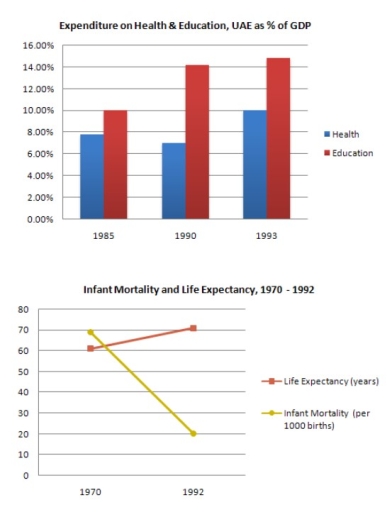
The graphs illustrate the percentage of GDP spent on health and education in the UAE between 1985 and 1993, as well as data on infant mortality (measured per 1,000 births) and duration of human lifespan (measured in years) from 1970 to 1992.

In general, a higher percentage of expenditure is allocated to education than to healthcare. Meanwhile, infant mortality declined significantly, whereas human lifespan showed a steady rise.

Regarding the expenditure, the proportion of education increased significantly and consistently, from 10% in 1985 to roughly 15% in 1993 during the time frame. A similar pattern was also shown in healthcare, in which the figure generally increased. However, there was a fluctuating trend between 1990 and 1993, with the percentage dropping from well below 8% to about 7% before rising back to approximately 10% by the end of the period.

Turning to the second graph, infant mortality declined markedly from 1970 to 1992 (about 70 to around 20 per 1,000 births). By contrast, human lifespan rose steadily, standing at 60 years then increasing to 70 years over the same period.

Word Count: 179

Answers On The Same Topic:

The graphs below show the Expenditure on Health & Education, UAE as percentages of GDP and Infant mortality and life expectancy.

The graphs show the percentage of GDP spent on health and education in the UAE between 1985 and 1993, and data on life expectancy and infant mortality from 1970 to 1992. Overall, spending on both sectors increased over time, and this was followed by a longer life expectancy and lower infant mortality. In 1985, around […]

The graphs below show the Expenditure on Health & Education, UAE as percentages of GDP and Infant mortality and life expectancy.

The bar chart given illustrates the proportions of expenditure on health and education in the UAE over a seven-year period, from 1985 to 1993, while the line graph elucidates the numbers of infant mortality and life expectancy over a twenty-two-year period, ending in 1992 . Viewed together, there appears to be a relationship between the […]

The graphs below show the Expenditure on Health & Education, UAE as percentages of GDP and Infant mortality and life expectancy.

The provided bar chart illustrates how much money UAE’s people spend on health and education over 8 years, from 1985 to 1993, measured in percentage of GDP and the second graph demonstrates the number of infant mortality rates per 1000 births and life expectancy per years from 1970 to 1992. Overall, it is apparent that […]

The graphs below show the Expenditure on Health & Education, UAE as percentages of GDP and Infant mortality and life expectancy.

The bar chart illustrates the percentages of health & education in 1985 to 1993 and the line graph depicts infant mortality and life expectancy between 1970 and 1992. Overall, education was the one that started and ended up with the highest rate compared with health from the bar chart while in the line graph life […]

See All

Other Topics:

the pie charts below show the percentage of time working adults spent on different activities in a particular country in 1958 and 2008. summarize the information by selecting and reporting the main features and make comparisons where relevant.(150 words)

The pie charts illustrate the ratio of how working individuals spent their time in various activities in a specific nation between 1958 and 2008. Overall, time spent by the individuals in working and sleeping has highest percentage in both years, whereas other things like travelling to various hobbies has minor proportion in this regard. Generally, […]

The charts below illustrate the proportions of American students at a university in the United States who were able to speak languages other than English, in 2005 and 2015. Summarise the information by selecting and reporting the main features, and make comparisons where relevant.

The two pie charts compare the percentages of American university students in the United States who were proficient in languages other than English over a 10-year period, specifically in 2005 and 2015. Overall, it is evident that the percentages of students speaking no additional languages decreased significantly, while Spanish witnessed the biggest increase, and French […]

The charts show the employments of graduates from top US universities in 2004 and the differences compared to 2013.

The charts compare the proportions of US universities graduates employment in 2004 and 2013. Overall, it is clear that number of jobs of US graduates decreased in all sectors with exception of industries and transport, and finance and banking experienced a significant declines over the given timeframe. To begin, finance banking, marketing, and consultancy declined. […]

The diagram below give information on transport and car use in edmonton.

The pie chart compares the percentage of 4 modes of transport use in Edmonton. Meanwhile, the bar chart illustrates 5 reasons for using transport in the city. Overall, car is predominant mean of transportation while the reverse is true for taxi and bus. As for reasons, most residents drive to work, whereas shopping and leisure […]

the pie chart shows the percentage of male and female arrested in the UK from 2015-2020 and the bar chart shows the reasons for these people's arrest

The 2 pie charts give information about the proportion of men and women who were arrested in the UK between 2015 and 2020, while the bar chart illustrates 6 reasons for their arrest. Overall, the share of arrested males was bigger than the percentage of arrested females, with public intoxication being the most common reason […]

The two pie charts below show how an average households in Australia used energy for different purposes in 1995 to 2015

The given sets of pie charts delineate usage of energy for an average household in Australia for several purposes over the period of 20 years between 1995 and 2015. To commence with the year 1995, it can be observed that the largest proportion of energy was utilised for heating by Australians which was accounted for […]

See All
We have detected unusual activity on your device.
Please verify your identity to continue.
Note: This verification step won't sign you in. If you have a premium account, please log in to access the service as usual.
Google/Gmail Verification
Or verify using Email/Code
We've sent a verification code to:
youremail@gmail.com (Not your email?)
Enter it below to complete the verification process.
Ensure your email address is correct, your inbox is not full, and you check your spam folder. If no email arrives, consider using an alternative email.
You will need a Premium plan to perform your action!
Note: If you already have a premium account, please log in to access our services as usual.

Plans & Pricing

Our mission is to make quality education accessible for everyone.
However, to keep our hardworking team running and this service alive, we genuinely need your support!
By opting for a premium plan, not only do you sustain us in achieving the mission, but you also unlock advanced features to enrich your learning experience.

Free

For learners who aren't pressed for time

What's included on Free
100+ Cambridge IELTS Tests
Instant IELTS Writing Task 1 & 2 Evaluation (2 times/month)
Instant IELTS Speaking Part 1, 2, & 3 Evaluation (5 times/month)
Instant IELTS Writing Task 1 & 2 Essay Generator (2 times/month)
500+ Dictation & Shadowing Exercises
100+ Pronunciation Exercises
Flashcards
Other Advanced Tools

Premium

For those serious about advancing their English proficiency, and for IELTS candidates aspiring to boost their band score by 1-2 points (especially in writing & speaking) in just 30 days or less

What's included on Premium
Save Your IELTS Test Progress
Unlock All Courses & IELTS Tests
Unlimited AI Conversations
Unlimited AI Writing Enhancement Exercises
Unlimited IELTS Writing Task 1 & 2 Evaluation
Unlimited IELTS Speaking Part 1, 2, & 3 Evaluation
Checked Answers Will Not Be Published
Unlimited IELTS Writing Task 1 & 2 Essay Generator
Unlimited IELTS Speaking Part 1, 2, & 3 Sample Generator
Unlimited Usage Of Advanced Tools
Priority Support within 24h (12-month plan only)

Due to the nature of our service and the provided free trials, payments are non-refundable.
Nếu bạn là người Việt Nam và không có hoặc không muốn trả bằng credit/debit cards, bạn có thể thanh toán bằng phương thức chuyển khoản:


Chọn gói:
419,000₫ 277,000 ₫ cho gói 1 tháng (chỉ 9,233₫/ngày)
1,239,000₫ 597,000 ₫ cho gói 3 tháng (chỉ 6,633₫/ngày)
2,469,000₫ 1,027,000 ₫ cho gói 6 tháng (chỉ 5,706₫/ngày)
4,929,000₫ 1,417,000 ₫ cho gói 12 tháng (chỉ 3,936₫/ngày)


Sau khi chuyển khoản, vui lòng đợi trình duyệt tự động điều hướng bạn trở lại Engnovate và bạn sẽ ngay lập tức nhận được mã kích hoạt tài khoản premium.
Nếu có lỗi xảy ra, bạn có thể liên hệ với team thông qua một trong các phương thức: email đến helloengnovate@gmail.com hoặc nhắn tin qua facebook.com/engnovate.
Vì toàn bộ công cụ trên website đều có thể sử dụng thử miễn phí, Engnovate không hỗ trợ hoàn tiền.