🔥 Today Only: Save 30% on Premium — Offer Ends Soon! - Upgrade Now!
Bar Chart

Band 5+: The graphs below show the percentage of people in Australia of different age groups who owns a home in 1981 to 2011

Image for topic: The graphs below show the percentage of people in Australia of different age groups who owns a home in 1981 to 2011
Our system will evaluate the answer based on this AI-generated description.
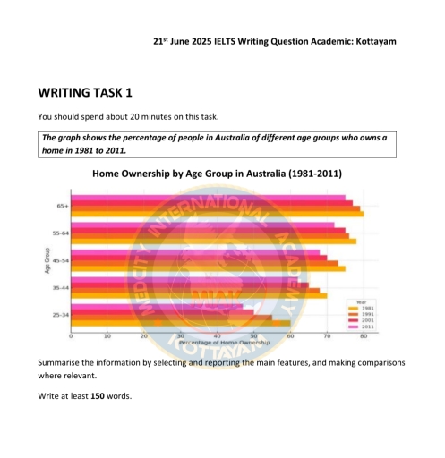
The image presents a bar chart depicting the percentage of home ownership among different age groups in Australia from 1981 to 2011. For the age group 65+, home ownership was approximately 77% in 1981, rising to around 79% in 1991, remaining at about 80% in 2001, and slightly increasing to 82% in 2011. In the 55-64 age group, the figures were about 78% in 1981, growing to approximately 81% in 1991, maintaining around 82% in 2001, and reaching close to 84% in 2011. For those aged 45-54, the percentages were roughly 74% in 1981, escalating to about 78% in 1991, peaking to around 80% in 2001, and reaching 82% in 2011. In the 35-44 age group, home ownership was around 61% in 1981, increasing to about 68% in 1991, rising to approximately 70% in 2001, and reaching 74% in 2011. Lastly, for the 25-34 age group, the ownership started at approximately 39% in 1981, grew to about 48% in 1991, slightly increased to 50% in 2001, and remained stable at 50% in 2011.
Given the complexity of the image, the above description may not be entirely accurate.
Note: Both the topic and the answer were created by one of our users.

The given bar graph describes the proportion of individuals who owned a house in Australia based on five different age categories from 1981 to 2011.

Overall, it is clear that the percentage of people who owned a house decreased over the years. The highest percentage of house ownership was for the 65+ age category, while 25-34 had the lowest.

In 1981, four-fifths of individuals aged above 65 had their own house, whereas it declined gradually over the years and reached almost 75% after 30 years. Similarly, people in the age category 55-64 owned nearly three-quarters of houses in the first year, and then it dropped marginally and reached just above 70% in 2011.

In contrast, the lowest proportion of residences was occupied by 25-34-year-old people over the years, which accounted for 60% and around 48% in 1981 and 2011, respectively. Individuals in the age category of 35 to 44 who hold a property dropped to approximately 60% in 2011, from 70% in the initial year. Likewise, about 75% of individuals who owned a home in 1981 dipped to above 65% in 2011 for the age category 45 to 64.

Word Count: 189

Answers On The Same Topic:

The graphs below show the percentage of people in Australia of different age groups who owns a home in 1981 to 2011

The bar chart illustrates the proportions of home ownership among different age groups in Australia between 1981 and 2011. Overall, the older the age group, the higher home ownship rates throughout the period. Meanwhile, the rate of ownerships for younger age groups (25-34 and 35-44) showed a downward trend, whereas fluctuations were found in older […]

The graphs below show the percentage of people in Australia of different age groups who owns a home in 1981 to 2011

The graph shows the proportion of individuals of diverse age groups in Australia who owns a home in 1981- 2011 Overall, the percentage of individuals amongst all age group who owned a home in Australia followed a similar pattern of growth. With the age group of 65+ being the highest throughout the periods and 25-34 […]

The graphs below show the percentage of people in Australia of different age groups who owns a home in 1981 to 2011

The graph illustrates the percentage of Australian people groups with different ages who possess a home in the years of 1981 and 2011. Overall, It is evident that the oldest generation(65+) had more houses regardless of the decrease in percentages as years passed. Moreover, the older people got, the more houses they owned. Starting with […]

See All

Other Topics:

The diagram below shows the number of landline telephones per 1000 people in different countries over a five-year period

The diagram illustrates the usage of telephones per 1000 people in Asian countries over early 20s In 2000 Brunei Darussallam had over 200 landline telephone, however in 2002 this number reached of it’s peak 250 landline telephones, according to diagram in 2004 thing start to get off trend as the number of users drop slightly […]

You should spend about 20 minutes on this task.Write atleast1o0 words The charts below give information on the location and types of dance classes young people in a town in Australia arecurrently attending. Summarise the information by selecting and reporting the main features, and make comparisons where relevant

The pie chart and the bar chart provide data about the locations and variety of dance classes among adolescents and children in a particular town in Australia are currently attending. 1Overall, observing the pie chart, it is noticeable that private studios include almost half of all attending locations. Looking on the bar chart, the biggest […]

The bar chart below shows the percentage of Australian men and women in different age groups who did regular physical activity in 2010 Summarize the information by selecting and reporting the main features, and make comparisons where relevant.

The bar chart illustrates the percentage of Australian males and females across various age groups in 2010. Overall, the female group had a higher percentage of daily exercisers in many age brackets except 15 to 24, where males group had more participants than females. Looking at the details, the males had around 52.8 percent in […]

The percentage of men and women executives in six different professions across the UK in 2007 is shown in the graph. Summarize the data by choosing and highlighting the key elements, and make comparisons where necessary.

The bar chart provides the number of male and female in executive roles across six professions in the UK in 2007. Overall, men dominated in some jobs like construction and manufacturing more physically demandable job, while women were involved more in education and health jobs. Some professions had almost similar quantity of both genders. In […]

The bar chart shows the number of homes,each worth 5 million US dollars or more,sold in eight cities

The bar chart illustrates the distribution of houses sold across eight cities, each costs 5 million US dollars or more between 2009 and 2014. Overall, there was an increase in the number of homes sold for $5 million in all the cities, with the exception of Singapore. While London experienced a considerable growth in housing, […]

The bar chart below shows the employment of all male and female workers by occupation in the UK in the year 2005. Summarize the information by selecting and reporting the main features, and make comparisons where relevant.

The bar chart illustrates a comparison of the percentages of male and female workers across different occupations in the UK in 2005. Overall, men made up a larger share of the workforce in most sectors. Notably, the percentage of women in administrative and secretarial jobs was the highest, while the proportion of men in personal […]

See All
We have detected unusual activity on your device.
Please verify your identity to continue.
Note: This verification step won't sign you in. If you have a premium account, please log in to access the service as usual.
Google/Gmail Verification
Or verify using Email/Code
We've sent a verification code to:
youremail@gmail.com (Not your email?)
Enter it below to complete the verification process.
Ensure your email address is correct, your inbox is not full, and you check your spam folder. If no email arrives, consider using an alternative email.
You will need a Premium plan to perform your action!
Note: If you already have a premium account, please log in to access our services as usual.

Plans & Pricing

Our mission is to make quality education accessible for everyone.
However, to keep our hardworking team running and this service alive, we genuinely need your support!
By opting for a premium plan, not only do you sustain us in achieving the mission, but you also unlock advanced features to enrich your learning experience.

Free

For learners who aren't pressed for time

What's included on Free
100+ Cambridge IELTS Tests
Instant IELTS Writing Task 1 & 2 Evaluation (2 times/month)
Instant IELTS Speaking Part 1, 2, & 3 Evaluation (5 times/month)
Instant IELTS Writing Task 1 & 2 Essay Generator (2 times/month)
500+ Dictation & Shadowing Exercises
100+ Pronunciation Exercises
Flashcards
Other Advanced Tools

Premium

For those serious about advancing their English proficiency, and for IELTS candidates aspiring to boost their band score by 1-2 points (especially in writing & speaking) in just 30 days or less

What's included on Premium
Save Your IELTS Test Progress
Unlock All Courses & IELTS Tests
Unlimited AI Conversations
Unlimited AI Writing Enhancement Exercises
Unlimited IELTS Writing Task 1 & 2 Evaluation
Unlimited IELTS Speaking Part 1, 2, & 3 Evaluation
Checked Answers Will Not Be Published
Unlimited IELTS Writing Task 1 & 2 Essay Generator
Unlimited IELTS Speaking Part 1, 2, & 3 Sample Generator
Unlimited Usage Of Advanced Tools
Priority Support within 24h (12-month plan only)

Due to the nature of our service and the provided free trials, payments are non-refundable.
Nếu bạn là người Việt Nam và không có hoặc không muốn trả bằng credit/debit cards, bạn có thể thanh toán bằng phương thức chuyển khoản:


Chọn gói:
419,000₫ 277,000 ₫ cho gói 1 tháng (chỉ 9,233₫/ngày)
1,239,000₫ 597,000 ₫ cho gói 3 tháng (chỉ 6,633₫/ngày)
2,469,000₫ 1,027,000 ₫ cho gói 6 tháng (chỉ 5,706₫/ngày)
4,929,000₫ 1,417,000 ₫ cho gói 12 tháng (chỉ 3,936₫/ngày)


Sau khi chuyển khoản, vui lòng đợi trình duyệt tự động điều hướng bạn trở lại Engnovate và bạn sẽ ngay lập tức nhận được mã kích hoạt tài khoản premium.
Nếu có lỗi xảy ra, bạn có thể liên hệ với team thông qua một trong các phương thức: email đến helloengnovate@gmail.com hoặc nhắn tin qua facebook.com/engnovate.
Vì toàn bộ công cụ trên website đều có thể sử dụng thử miễn phí, Engnovate không hỗ trợ hoàn tiền.