🔥 Today Only: Save 30% on Premium — Offer Ends Soon! - Upgrade Now!
Bar Chart

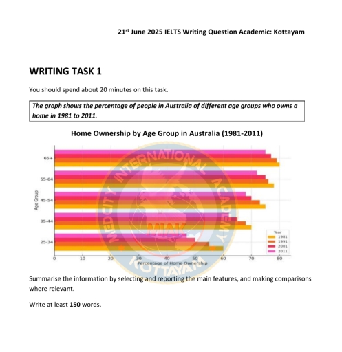
Band 4+: The graphs below show the percentage of people in Australia of different age groups who owns a home in 1981 to 2011

Image for topic: The graphs below show the percentage of people in Australia of different age groups who owns a home in 1981 to 2011
Our system will evaluate the answer based on this AI-generated description.
The image presents a bar chart depicting the percentage of home ownership among different age groups in Australia from 1981 to 2011. For the age group 65+, home ownership was approximately 77% in 1981, rising to around 79% in 1991, remaining at about 80% in 2001, and slightly increasing to 82% in 2011. In the 55-64 age group, the figures were about 78% in 1981, growing to approximately 81% in 1991, maintaining around 82% in 2001, and reaching close to 84% in 2011. For those aged 45-54, the percentages were roughly 74% in 1981, escalating to about 78% in 1991, peaking to around 80% in 2001, and reaching 82% in 2011. In the 35-44 age group, home ownership was around 61% in 1981, increasing to about 68% in 1991, rising to approximately 70% in 2001, and reaching 74% in 2011. Lastly, for the 25-34 age group, the ownership started at approximately 39% in 1981, grew to about 48% in 1991, slightly increased to 50% in 2001, and remained stable at 50% in 2011.
Given the complexity of the image, the above description may not be entirely accurate.
Note: Both the topic and the answer were created by one of our users.

The graph shows the proportion of individuals of diverse age groups in Australia who owns a home in 1981- 2011

Overall, the percentage of individuals amongst all age group who owned a home in Australia followed a similar pattern of growth. With the age group of 65+ being the highest throughout the periods and 25-34 was the lowest of all periods.

In 1981, 60% of people at age group of 25-34 owned houses and at age 35-44 it increased to 70%. While at age 45-54 about 75% had a house, meanwhile age 55-64 and age 65+ had slight increase of about 78% and 80% respectively. Meanwhile, in 1991, it followed similar pattern. As at age 25-34 it was about 55% of persons that owned houses while ag age 65+ in had increased to 79%.

Futhermore, in 2001, 50% of the age group 25-34 owned homes and at 35-44 it had risen to about 65%. The percentage increased amongs all ave group and at 65+ it has rose to approximately 78%. In 2011, age 25-34 had 47% of home owners and at age 65+ about 74% pf individuals owned homes.

Word Count: 189

Answers On The Same Topic:

The graphs below show the percentage of people in Australia of different age groups who owns a home in 1981 to 2011

The bar chart illustrates the proportions of home ownership among different age groups in Australia between 1981 and 2011. Overall, the older the age group, the higher home ownship rates throughout the period. Meanwhile, the rate of ownerships for younger age groups (25-34 and 35-44) showed a downward trend, whereas fluctuations were found in older […]

The graphs below show the percentage of people in Australia of different age groups who owns a home in 1981 to 2011

The graph illustrates the percentage of Australian people groups with different ages who possess a home in the years of 1981 and 2011. Overall, It is evident that the oldest generation(65+) had more houses regardless of the decrease in percentages as years passed. Moreover, the older people got, the more houses they owned. Starting with […]

The graphs below show the percentage of people in Australia of different age groups who owns a home in 1981 to 2011

The given bar graph describes the proportion of individuals who owned a house in Australia based on five different age categories from 1981 to 2011. Overall, it is clear that the percentage of people who owned a house decreased over the years. The highest percentage of house ownership was for the 65+ age category, while […]

See All

Other Topics:

The bar chart below shows the number of international tourists (in millions) visiting five cities in 2010 and 2020. Summarise the information by selecting and reporting the main features, and make comparisons where relevant.

The bar chart illustrates the changes in number of tourists since 2010 to 2020. In this essay will summarise information about this chart. Overall, its clear that the Paris was been absolutely leader among all cities and in 2020 Bankok significant go up. The smallest result shows Tokyo in 2010 to 2020 the number of […]

The chart below shows the main reasons for deforestation in three different regions of the world during two separate decades. Summarise the information by selecting and reporting the main features and make comparisons where relevant.

The chart illustrates the primary causes of deforestation in South America, Southeast Asia, and Central Africa from 1990 to 2000 and from 2010 to 2020. Overall, cattle ranching was the highest percentage cause of deforestation in South America, while commercial agriculture was the reason for deforestation in Southeast Asia. Moreover, subsistence farming was the cause […]

the bar chart below shows the number of students who chose certain subjects in 2005

The bar chart illustrates the amount of male and female pupils who chose eight different types of university subjects in 2005. Overall, more males than females chose Science, Mathematics, Literature and Law, while females were more interested in Social Sciences, Languages and the arts. Humanities was the only subject chosen by an equal number of […]

the bar chart below shows the number of students who chose certain subjects in 2005

The bar chart illustrates the number of male and female students who chose eight different university subjects in 2005. Overall, more males than females chose Science, Mathematics, Literature and Law, while females were more interested in Social Sciences, Languages and the Arts. Humanities was the only subject chosen by an equal number of male and […]

The chart below shows the quantity of candidates from four distinct nations in a UK college from 1999 and 2003. Sum up the data by choosing and detailing the principle capacities, and look at where proper.

The bar chart illustrates the number of visitors traveling to a specific region from four different areas – European Nations, Middle East, Far East, and Africa – between 1999 and 2003. Overall, European Nations initially contributed the highest number of visitors, but this figure experienced the most dramatic decrease over the period. In 1999 and […]

The chart below shows the favourite leisure activities among girls and boys

The bar chart illustrates the percnetage of favourite leisure activities of boys and girls in canada in a particular year. It is clear that, Boys are the highest percntage of leisure activities spend on shopping in a particular year in canada. by the contrast , girls are spend less portion of time on shopping in […]

See All
We have detected unusual activity on your device.
Please verify your identity to continue.
Note: This verification step won't sign you in. If you have a premium account, please log in to access the service as usual.
Google/Gmail Verification
Or verify using Email/Code
We've sent a verification code to:
youremail@gmail.com (Not your email?)
Enter it below to complete the verification process.
Ensure your email address is correct, your inbox is not full, and you check your spam folder. If no email arrives, consider using an alternative email.
You will need a Premium plan to perform your action!
Note: If you already have a premium account, please log in to access our services as usual.

Plans & Pricing

Our mission is to make quality education accessible for everyone.
However, to keep our hardworking team running and this service alive, we genuinely need your support!
By opting for a premium plan, not only do you sustain us in achieving the mission, but you also unlock advanced features to enrich your learning experience.

Free

For learners who aren't pressed for time

What's included on Free
100+ Cambridge IELTS Tests
Instant IELTS Writing Task 1 & 2 Evaluation (2 times/month)
Instant IELTS Speaking Part 1, 2, & 3 Evaluation (2 times/month)
Instant IELTS Writing Task 1 & 2 Essay Generator (2 times/month)
500+ Dictation & Shadowing Exercises
100+ Pronunciation Exercises
Flashcards
Other Advanced Tools

Premium

For those serious about advancing their English proficiency, and for IELTS candidates aspiring to boost their band score by 1-2 points (especially in writing & speaking) in just 30 days or less

What's included on Premium
Save Your IELTS Test Progress & Analyze Mistakes By Question Type
Save Your Own Flashcard Sets & Use Them On Any Device
Unlock All Courses, IELTS Tests, Section & Part Practice
Unlimited AI Conversations
Unlimited AI Writing Enhancement Exercises
Unlimited IELTS Writing Task 1 & 2 Evaluation
Unlimited IELTS Speaking Part 1, 2, & 3 Evaluation
Checked Answers Will Not Be Published
Unlimited IELTS Writing Task 1 & 2 Essay Generator
Unlimited IELTS Speaking Part 1, 2, & 3 Sample Generator
Unlimited Usage Of Advanced Tools & AI Features
Priority Support within 24h (12-month plan only)

Due to the nature of our service and the provided free trials, payments are non-refundable.