🔥 Today Only: Save 30% on Premium — Offer Ends Soon! - Upgrade Now!
Line Graph

Band 7+: The line chart details fuel consumption from 1980 to 2030 in the United States.

Image for topic: The line chart details fuel consumption from 1980 to 2030 in the United States.
Our system will evaluate the answer based on this AI-generated description.
The image depicts a line chart titled "U.S. Energy Consumption by Fuel (1980-2030)" with six labeled lines representing "Petrol and Oil," "Coal," "Natural Gas," "Nuclear," "Solar/Wind," and "Hydropower." The chart's X-axis spans from 1980 to 2030, with the years 1985, 1995, 2005, 2010, 2015, 2020, and 2025 marked. The Y-axis measures quadrillion units from 0 to 50, in increments of 5. "Petrol and Oil" begins at approximately 30 quadrillion units in 1980, peaking near 45 in 2010 and projected to rise slightly above that by 2030. "Coal" starts near 15, peaks at 25 around 2005, and is projected to decline to just above 20. "Natural Gas" begins below 15, surpasses "Coal" near 2010 just under 25, and is expected to reach 30 by 2030. "Nuclear" maintains a steady rise from 5 in 1980 to a projected 10 in 2030. "Solar/Wind" starts at 0, shows a sharp increase after 2010, and is projected to surpass "Nuclear" by 2030, reaching approximately 15. "Hydropower" hovers consistently around 5 quadrillion units throughout the timeline.
Given the complexity of the image, the above description may not be entirely accurate.
Note: Both the topic and the answer were created by one of our users.

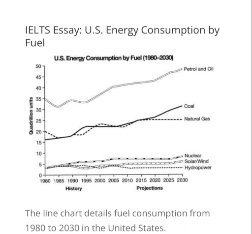
The line chart shows energy usage by fuel type in the USA, measured between 1980 and 2030.

Petrol and oil consumption increased rapidly and is expected to continue rising through 2030. Meanwhile, solar/wind and nuclear energy usage also rose gradually. Coal usage increased steadily as well, but natural gas usage dropped between 1985 and 1995 before resuming an upward trend. Hydropower usage remained stable throughout.

At the beginning of the period, petrol and oil usage was the highest, starting at 35 quadrillion BTUs in 1980 and continuing to increase to over 40 quadrillion BTUs by 2030. Both coal and natural gas rose from 15 to around 30 quadrillion BTUs, though natural gas remained stable at about 25 quadrillion units for a period.

Lastly, nuclear and solar/wind energy usage stayed around 5 quadrillion BTUs over the entire period from 1980 to 2030. Hydropower remained stable at under 5 quadrillion BTUs through 2030.

Word Count: 151

Answers On The Same Topic:

The line chart details fuel consumption from 1980 to 2030 in the United States.

The provided chart gives the detail of US energy utilization by petroleum products from 1980 to 2030. Overall, except hydro power all sectors of petroleum experienced an upward trend, along with coal, natural gas,petrol and oil having significant use as well nuclear and solar/wind have minor rise of consumption. As the Graph shows that the […]

The line chart details fuel consumption from 1980 to 2030 in the United States.

The line graph demonstrates the consumption of fuel between 1980 to 2030 in the United States Overall, it can be observed that the pertrol and oil have the most dominant number of fuel consumption, while the opposite was true for hydropower. In addition To begin with, In 1980, 35 Quadrillion units were generated using Petrol […]

The line chart details fuel consumption from 1980 to 2030 in the United States.

The chart illustrates data about energy use in USA from 1980 to 2030. Overall, the amount of petrol, oil and coal energy used predicted to grow significantly. In contrast, it is predicted that nuclear and hydropower energy consumption will remain relatively stable. To begin, between 1980 and 1995 pertol and oil energy consumption fluctuated between […]

The line chart details fuel consumption from 1980 to 2030 in the United States.

The line graph provides data from a 2008 report about usage of energy in the United States of America from 1980 with predictions up to 2030, measured in quadrillion units. Overall, it is clear that America mostly relied on fossil fuels, which will continue in the future. Petrol and Oil was the highest amount in […]

The line chart details fuel consumption from 1980 to 2030 in the United States.

The graph illustrates the data from an Annual energy outlook regarding the daily consumption of six different energies in the USA for the fifty year period from the year 1980 to 2030. The energy consumption is measured in quadrillion units. Overall, petrol and oil was the most consumed fuel across the time period. The least […]

See All

Other Topics:

The graph below shows UK air pollutants in millions of tonnes, from three different sources, between 1990 and 2005.

The presented line chart compares and contrasts the amount of air pollutants, measured in millions of tonnes, originating from 3 different sources, including industry, transport and households over the course of 15 years. Overall, it is obvious that there was a decline in almost all categories, while the opposite is true for transport. Additionally, the […]

The chart below shows the market size of mobile and QR sales in the USA in billions of US dollars.

The chart presents the mobile and QR sales of the market size in the USA in billions of US dollars. Overall, the market size of mobile and QR sales increased from steadily 2017 to 2023. Between 2017 and 2019, the market size considerably raised from approximately 1 billion to 2 billion dollars. From 2019 to […]

Write the description according to the instructions. The line graph shows the number of visitors to four tourist destinations on an island between 1980 and 2015.

The data displays the amount of guests on 4 different tourist attractions on an island from 1980 to 2015. Overall, parks experienced the greatest rise in visitor count, aquariums experienced less, museums was the only attraction to drop in guest count, and zoos went through almost no variation. However, aquariums remain the most popular among […]

The graph below shows the number of shops that closed and the number of the new shops that opened in one country between 2011 and 2018.

The line graph illustrates how many stores were closed down and launched in a particular country from 2011 to 2018. Overall, both categories experienced downward trends with fluctuations, though to varying degrees. Additionally, while the new shops outnumbered the closed ones initially, the former were eventually surpassed by the former. Focusing on the first half […]

The graph below shows the percentage of people visiting a museum at least once a year between 1980 and 2010. Summarise the information by selecting and reporting the main features and make comparisons where relevant.

The give line graph compares the percentages of different aged museum visitors over three decades from 1980 to 2010. Overall, it is clear that figures for 15-24, 25-34 and 35-49 age group experienced an upward trend, while the reverse was true for people aged 50+. It is also worth mentioning that percentages of people aged […]

The line graph below shows the percentage of people using five communication methods from 2000 to 2020

The line graph illustrates the proportion of individuals using different methods for communication between 2000 and 2020. The usage of some methods such as social media, instant messaging and email increased over the years, while letters and phone calls lost their popularity. Looking first at the figures for social media usage, it is clear that […]

See All
We have detected unusual activity on your device.
Please verify your identity to continue.
Note: This verification step won't sign you in. If you have a premium account, please log in to access the service as usual.
Google/Gmail Verification
Or verify using Email/Code
We've sent a verification code to:
youremail@gmail.com (Not your email?)
Enter it below to complete the verification process.
Ensure your email address is correct, your inbox is not full, and you check your spam folder. If no email arrives, consider using an alternative email.
You will need a Premium plan to perform your action!
Note: If you already have a premium account, please log in to access our services as usual.

Plans & Pricing

Our mission is to make quality education accessible for everyone.
However, to keep our hardworking team running and this service alive, we genuinely need your support!
By opting for a premium plan, not only do you sustain us in achieving the mission, but you also unlock advanced features to enrich your learning experience.

Free

For learners who aren't pressed for time

What's included on Free
100+ Cambridge IELTS Tests
Instant IELTS Writing Task 1 & 2 Evaluation (2 times/month)
Instant IELTS Speaking Part 1, 2, & 3 Evaluation (5 times/month)
Instant IELTS Writing Task 1 & 2 Essay Generator (2 times/month)
500+ Dictation & Shadowing Exercises
100+ Pronunciation Exercises
Flashcards
Other Advanced Tools

Premium

For those serious about advancing their English proficiency, and for IELTS candidates aspiring to boost their band score by 1-2 points (especially in writing & speaking) in just 30 days or less

What's included on Premium
Save Your IELTS Test Progress
Unlock All Courses & IELTS Tests
Unlimited AI Conversations
Unlimited AI Writing Enhancement Exercises
Unlimited IELTS Writing Task 1 & 2 Evaluation
Unlimited IELTS Speaking Part 1, 2, & 3 Evaluation
Checked Answers Will Not Be Published
Unlimited IELTS Writing Task 1 & 2 Essay Generator
Unlimited IELTS Speaking Part 1, 2, & 3 Sample Generator
Unlimited Usage Of Advanced Tools
Priority Support within 24h (12-month plan only)

Due to the nature of our service and the provided free trials, payments are non-refundable.
Nếu bạn là người Việt Nam và không có hoặc không muốn trả bằng credit/debit cards, bạn có thể thanh toán bằng phương thức chuyển khoản:


Chọn gói:
419,000₫ 277,000 ₫ cho gói 1 tháng (chỉ 9,233₫/ngày)
1,239,000₫ 597,000 ₫ cho gói 3 tháng (chỉ 6,633₫/ngày)
2,469,000₫ 1,027,000 ₫ cho gói 6 tháng (chỉ 5,706₫/ngày)
4,929,000₫ 1,417,000 ₫ cho gói 12 tháng (chỉ 3,936₫/ngày)


Sau khi chuyển khoản, vui lòng đợi trình duyệt tự động điều hướng bạn trở lại Engnovate và bạn sẽ ngay lập tức nhận được mã kích hoạt tài khoản premium.
Nếu có lỗi xảy ra, bạn có thể liên hệ với team thông qua một trong các phương thức: email đến helloengnovate@gmail.com hoặc nhắn tin qua facebook.com/engnovate.
Vì toàn bộ công cụ trên website đều có thể sử dụng thử miễn phí, Engnovate không hỗ trợ hoàn tiền.