🔥 Today Only: Save 30% on Premium — Offer Ends Soon! - Upgrade Now!
Line Graph

Band 5+: The line chart gives information about the number of applications received by four universities. Report main features and make comparison

Image for topic: The line chart gives information about the number of applications received by four universities. Report main features and make comparison
Our system will evaluate the answer based on this AI-generated description.
The image presents a line graph titled "Number of applications received by four universities," tracking data from 1980 to 2010 in increments of 5 years on the x-axis and number of students from 0 to 7,000 in increments of 1,000 on the y-axis. Atherton University shows a fluctuating pattern with a peak around 1990 at approximately 4,000 applications, a dip in 1995 to roughly 2,500, before reaching close to 6,000 by 2005 and declining slightly after. The University of Lakewood exhibits steady growth from around 1,000 applications in 1980 to just under 6,000 by 2010. Alstead University initially rises from about 500 in 1980 to nearly 3,000 in 1985, then falls to around 1,500 in 1990, and fluctuates between 2,000 and 3,000 until 2010. Linslade College has more drastic fluctuations, peaking at roughly 5,500 in 1985, dropping to 2,000 in 1990, soaring to nearly 7,000 in 1995, and then declining to around 2,000 by 2010.
Given the complexity of the image, the above description may not be entirely accurate.
Note: Both the topic and the answer were created by one of our users.

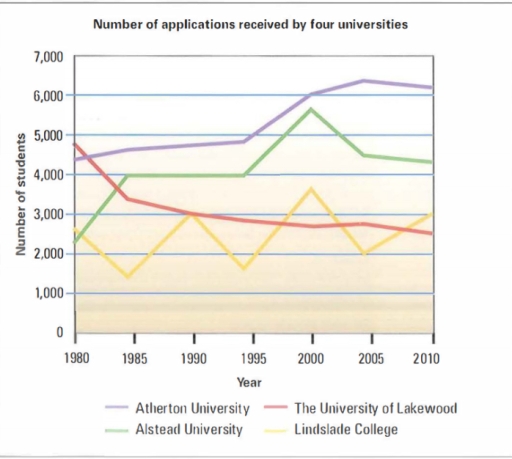
The graph provides information about the number of students in the universities (Atherton,Lakewood,Alstead,Linslade ) from 1980 to 2010 . Overall , a couple of universities (Athrton , Alstead ) sharply increased between 1995 and 2000.

To begin,Altherton started with around 4,300 student applications in 1980, after that it increased gradually until 1995 and the number of applications reached about 5,000. From 1995 until 2005 the number of submissions rose sharply to approximately 6,200, it then finished the period with 6,100.

Also there is another growth in the Alstead University the number of applications was about 2,100 in the first year which is 1980 then it is increased significantly to 4,000 during 1985, after that it is a strong growth into about 5,500 applications in 2000 but there is sudden drop in the same year 2000 until 2010 to 4,200 submissions .

To contrast The University of Lakewood started with 4,800 and in the same year there was a drop into

Word Count: 160

Answers On The Same Topic:

The line chart gives information about the number of applications received by four universities. Report main features and make comparison

The depicted line chart reveals data Concerning the proportion of applications which were received from four universities. Overall,the number of received applications soared in two universities, whereas Lakewood University displayed a downward trend over the period. However, Lindslade College showed a fluctuating trend. in 1980, atherton university had above 4000 applications. However, the number of […]

The line chart gives information about the number of applications received by four universities. Report main features and make comparison

The line chart compares the number of applications in four different universities from 1980 to 2010. In overall, for the most part of the 40 year period, Atherton University was the most popular educational institution among the consistent fall in enrollment. In 1980, Atherton University and The University of Lakewood both received approximately 4,500 applications, […]

The line chart gives information about the number of applications received by four universities. Report main features and make comparison

The line graph depicts the quantity of applicants attending four tertiary institutions in the period 1980-2010. It is noticeable that the number of students applying to Atherton Univerisity was the highest. Notably, there was a significant drop in the figure for Lakewood Univeristy throughout the period. In 1980, Atherton received about 4400 applications, double the […]

The line chart gives information about the number of applications received by four universities. Report main features and make comparison

The line graph depicts the quanity of applicants attending four tertiary institutions in the period 1980-2010. It is noticeable that the number of students applying to Atherton univerisity was the highest. Notably, there was a significant drop in the figure of Lakewood univeristy throughout the period. In 1980, Atheron received about 4400 applications, double the […]

The line chart gives information about the number of applications received by four universities. Report main features and make comparison

The graph shows the number of applications from students received by the four Universities(Atherton, Alstead, Lindslade and Lakewood). Overall , as we can see the Lakewood applications declined from 1980 to 2010 unlike the other three (Atherton, Alstead and Lindslade) the number went up from 1980 to 2010. To begin, Lakewood went down dramatically in […]

See All

Other Topics:

the graph below show the number of passenger railway journeys made in Great Britain between 1950 and 2004/5

The line graph illustrates the total number of passenger railway journeys made in Great Britain from 1950 to 2004/05, including the national rail network, the London Underground and light rail and metro systems. Overall, it is clear that the national rail network and the London Underground accounted for the majority of journeys throughout the period […]

The line graph gives information about international tourist arrivals in five countries.

The line graph illustrates the number of international visitors to five different countries: Brazil, Egypt, Malaysia, France, and the USA, between 1995 and 2010. Overall, all five countries saw an increase in tourist arrivals over the fifteen-year period. France and the USA were consistenly the most popular destinations, while Brazil and Egypt stayed the least […]

The line graph gives information about international tourist arrivals in five countries.

International Tourists Arrivals The line graph illustrates the number of international visitors to five different countries: Brazil, Egypt, Malaysia, France, and the USA -between 1995 and 2010. Overall, all five countries saw an increase in tourist arrivals over the fifteen-year period. France and the USA were consistently the most popular destinations, while Brazil and Egypt […]

line graph; Number of arrests per year for using illegal drugs

The given line graph illustrates the amount of arrests per year for consumption of illegal drugs in the period of 1991 and 2005. Overall, it is noticeable that the number of arrests uplifted by the end of the given period. In 1991, the number of arrests of drug-users stood at 10. Over the following 3 […]

You should spend about 20 minutes on this task. The graph below shows the percentage of money spent on advertising in five types of media in France from 2010 and projected spending to 2040. Summarise the information by selecting and reporting the main features, and make comparisons where relevant. You should write at least 150 words. Writing Task 1

The given line graph compares the percentage of funds which were spent on television, newspapers, magazines, radio, and internet in France from 2010 and projected spending by 2040. Overall, while four traditional types of advertising are facing decline in funding, the level of investments in Internet is expected to grow significantly until the end of […]

The graph below shows the percentage of total electricity generated by four different fuel sources in a specific European country between 1990 and 2025. Summarize the information by selecting and reporting the main features, and make comparisons where relevant.

The graph demonstrates the percentage of total electricity created by four different fuel sources in specific European country in 1990 to 2025 Overall, it is clear that electricity generated by coal sharply declined, whereas the percentage of renewables and nuclear energy rose slightly, and natural gas has fluctuated. In 1990, the percentage of energy generated […]

See All
We have detected unusual activity on your device.
Please verify your identity to continue.
Note: This verification step won't sign you in. If you have a premium account, please log in to access the service as usual.
Google/Gmail Verification
Or verify using Email/Code
We've sent a verification code to:
youremail@gmail.com (Not your email?)
Enter it below to complete the verification process.
Ensure your email address is correct, your inbox is not full, and you check your spam folder. If no email arrives, consider using an alternative email.
You will need a Premium plan to perform your action!
Note: If you already have a premium account, please log in to access our services as usual.

Plans & Pricing

Our mission is to make quality education accessible for everyone.
However, to keep our hardworking team running and this service alive, we genuinely need your support!
By opting for a premium plan, not only do you sustain us in achieving the mission, but you also unlock advanced features to enrich your learning experience.

Free

For learners who aren't pressed for time

What's included on Free
100+ Cambridge IELTS Tests
Instant IELTS Writing Task 1 & 2 Evaluation (2 times/month)
Instant IELTS Speaking Part 1, 2, & 3 Evaluation (5 times/month)
Instant IELTS Writing Task 1 & 2 Essay Generator (2 times/month)
500+ Dictation & Shadowing Exercises
100+ Pronunciation Exercises
Flashcards
Other Advanced Tools

Premium

For those serious about advancing their English proficiency, and for IELTS candidates aspiring to boost their band score by 1-2 points (especially in writing & speaking) in just 30 days or less

What's included on Premium
Save Your IELTS Test Progress
Unlock All Courses & IELTS Tests
Unlimited AI Conversations
Unlimited AI Writing Enhancement Exercises
Unlimited IELTS Writing Task 1 & 2 Evaluation
Unlimited IELTS Speaking Part 1, 2, & 3 Evaluation
Checked Answers Will Not Be Published
Unlimited IELTS Writing Task 1 & 2 Essay Generator
Unlimited IELTS Speaking Part 1, 2, & 3 Sample Generator
Unlimited Usage Of Advanced Tools
Priority Support within 24h (12-month plan only)

Due to the nature of our service and the provided free trials, payments are non-refundable.
Nếu bạn là người Việt Nam và không có hoặc không muốn trả bằng credit/debit cards, bạn có thể thanh toán bằng phương thức chuyển khoản:


Chọn gói:
419,000₫ 277,000 ₫ cho gói 1 tháng (chỉ 9,233₫/ngày)
1,239,000₫ 597,000 ₫ cho gói 3 tháng (chỉ 6,633₫/ngày)
2,469,000₫ 1,027,000 ₫ cho gói 6 tháng (chỉ 5,706₫/ngày)
4,929,000₫ 1,417,000 ₫ cho gói 12 tháng (chỉ 3,936₫/ngày)


Sau khi chuyển khoản, vui lòng đợi trình duyệt tự động điều hướng bạn trở lại Engnovate và bạn sẽ ngay lập tức nhận được mã kích hoạt tài khoản premium.
Nếu có lỗi xảy ra, bạn có thể liên hệ với team thông qua một trong các phương thức: email đến helloengnovate@gmail.com hoặc nhắn tin qua facebook.com/engnovate.
Vì toàn bộ công cụ trên website đều có thể sử dụng thử miễn phí, Engnovate không hỗ trợ hoàn tiền.