Our system will evaluate the answer based on this AI-generated description.
The image shows a line graph detailing average sales of plates, ceramic cups, plastic cups, and cutlery kits from 2015 to 2020. In 2015, sales were plates 1350, ceramic cups 450, plastic cups 450, cutlery kits 900. In 2016, sales for plates remained at 1350, while ceramic cups increased to 900, plastic cups dropped to 225, and cutlery kits slightly rose to 950. In 2017, plates peaked at 1800, ceramic cups slightly decreased to 810, plastic cups remained at 225, and cutlery kits dropped to 900. In 2018, plates fell to 1350, ceramic cups to 675, plastic cups remained at 225, cutlery kits significantly dropped to 450. In 2019, plates decreased further to 900, ceramic cups slightly increase to 720, plastic cups remained at 225, cutlery kits at 450. In 2020, sales showed plates at 900, ceramic cups steady at 720, plastic cups remained at 225, and cutlery kits increased to 675.
Given the complexity of the image, the above description may not be entirely accurate.
Skyrocket your IELTS band score by 1-2 points in under a month with our premium plan!
Note: Both the topic and the answer were created by one of our users.
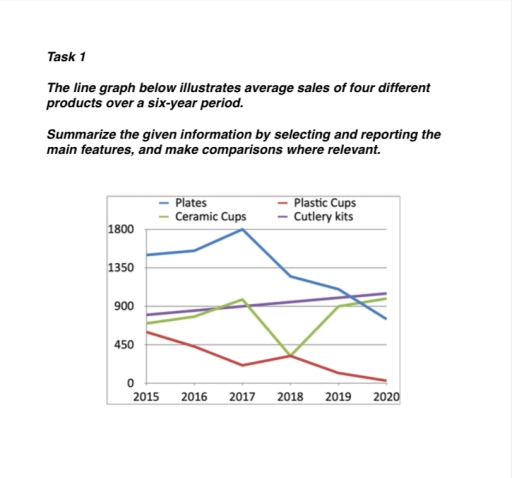
The line graph illustrates changes in the average sales of four different merchandises—cutlery kits, plates, plastic cups, and ceramic cups—in the last six years. Overall, the data show that the average sales of cutlery kits and ceramic cups merchandises increased, while the average sales of plates and plastic cups declined during this time.
Looking at the merchandises that gained popularity, cutlery kits and ceramic cups both began with nearly 850 and 750, respectively, in 2015. These numbers continued to rise steadily until 2017. After that point, the growth in ceramic cups sales decreased, eventually reaching just above 900 by 2020. In contrast, the average sales of cutlery kits increased, achieving at approximately 1000 by 2020.
Regarding the merchandises that saw a decline in popularity, plates and plastic cups started with roughly 1450 and 500, respectively, in 2015. By 2018, both merchandises experienced a sharp decline, dropping to around 1150 and 400 merchandises. After 2018, the numbers decreased at a more gradual pace, with both merchandises reaching at about 800 and 0 merchandises by 2020.
Word Count: 174