🔥 Today Only: Save 30% on Premium — Offer Ends Soon! - Upgrade Now!
Line Graph

Band 5+: The line graph below illustrates average sales of four different products over a six-year period.

Image for topic: The line graph below illustrates average sales of four different products over a six-year period.
Our system will evaluate the answer based on this AI-generated description.
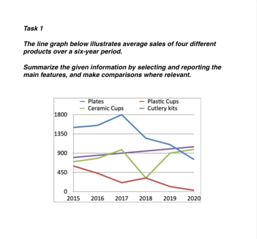
The image shows a line graph detailing average sales of plates, ceramic cups, plastic cups, and cutlery kits from 2015 to 2020. In 2015, sales were plates 1350, ceramic cups 450, plastic cups 450, cutlery kits 900. In 2016, sales for plates remained at 1350, while ceramic cups increased to 900, plastic cups dropped to 225, and cutlery kits slightly rose to 950. In 2017, plates peaked at 1800, ceramic cups slightly decreased to 810, plastic cups remained at 225, and cutlery kits dropped to 900. In 2018, plates fell to 1350, ceramic cups to 675, plastic cups remained at 225, cutlery kits significantly dropped to 450. In 2019, plates decreased further to 900, ceramic cups slightly increase to 720, plastic cups remained at 225, cutlery kits at 450. In 2020, sales showed plates at 900, ceramic cups steady at 720, plastic cups remained at 225, and cutlery kits increased to 675.
Given the complexity of the image, the above description may not be entirely accurate.
Note: Both the topic and the answer were created by one of our users.

The line graph illustrates sell of four different goods between 2015 to 2020.

Between 2015 to 2017, the plates were bought dramaticlly. By 2017, it hit the peak due to selling exactly 1800 products. Unfortunately, from 2018 to 2020, sales figure dropped marginally to became lower than 900.

On the other hand, cutlery kits were fairly stead all the time. The plastic cups were sold approximately 500 peaces in 2015 then decreased slightly up to 2017. However it slowly grow back in 2018, they cut out of the daily usage in 2020.

Althought ceramic cups are flactuate till 2017 from 2015. But it lost almost 60 percent of sales in one year. Luckily, they came back in 2018 and sharply soap at the end of 2020.

Overall, even two products are still in market, another one of two is already discontinued. So if plates’s downward trend contiune, it will be next phased-out item.

Word Count: 153

Answers On The Same Topic:

The line graph below illustrates average sales of four different products over a six-year period.

The line graph displays average sales of four different products, which are plates, ceramic cups, plastic cups, and cutlery kits over six years, from 2015 to 2020. Overall, plates started with the highest number of sales, increased to the peak, and then gradually decrease until the final year. Sales of plastic cups also declined, had […]

The line graph below illustrates average sales of four different products over a six-year period.

The given line graph provide information about the standard sales of multiple kitchen items between 2015 and 2020. Overall, Plates and Plastic cups both declined at the end of the period despite owning several flunctuations throughout the years. In contrast, Culery kits experience a moderate rise while Ceramic cups is account for a slight surge […]

The line graph below illustrates average sales of four different products over a six-year period.

The line graph illustrates changes in the average sales of four different merchandises—cutlery kits, plates, plastic cups, and ceramic cups—over the past six years. Overall, the data show that the average sales of cutlery kits and ceramic cups increased, while the average sales of plates and plastic cups decreased during this time. Looking at the […]

The line graph below illustrates average sales of four different products over a six-year period.

The line graph illustrates changes in the average sales of four different merchandises—cutlery kits, plates, plastic cups, and ceramic cups—in the last six years. Overall, the data show that the average sales of cutlery kits and ceramic cups merchandises increased, while the average sales of plates and plastic cups declined during this time. Looking at […]

See All

Other Topics:

The graph below shows the number of shops that closed and the number of new shops that opened in one country between 2011 and 2018. Summarise the information by selecting and reporting the main features, and make comparisons where relevant. Write at least 150 words.

The line graph illustrates the amount of stores that closed and the amount of new stores that opened in a country around 2011 and 2018. Overall, there was a fluctuation for the opening stores with a decreased trend. On the other hand, there was a remain steady trend with one rocket drop on one year […]

The graph below shows the population of particular coutry by age group starting in 1960 and including a forecast to 2040

The graph depicts the population of a nation in three age groups from 0 up to 65 years old between 1960 and including a forecast to 2040. Overall, the young from 0 to 14 years old a decline among 80 years, while the older groups who are over 65 years old experiencing a significant increased. […]

The graph below shows the results of a survey among online adults on their use of various social media in the USA between 2012 and 201 5.

In today’s fast – paced world, there are many various social medias. This allows them to choose that they really need. This essay is about line graph, that shows us the usage websites in the USA between 2012 and 2015. Overall, the data reveals that users in all social networks generally increased. The Facebook consistently […]

The line graph shows the percentage of spending in a European country from 1960 to 2000. Summarise the information by selecting and reporting the main features, and make comparisons where relevant.

The graph illustrates the proportion of household expenditure on food, leisure, clothing, transport, and energy in a distinct European country from 1960 to 2000. Overall, the figure for energy, clothing, leisure, and food decreased gradually, while that for transport increased consistently. Notably, the gap between several expenditure categories became much smaller by the end of […]

the graph below shows the weekdays volume of passenger activity on the toronto metro system for july 2007.

The line graph illustrates the volume of acitivity of passengers on weekdays on the Toronto Metro system for July 2007. Overall, the graph shows an unstable trend with significant fluctuation. Although the figures reached its two highest points at 8 am and 6 pm, there are considerable decreases in the number right after the rush […]

The graph below illustrates global energy demand, measured in millions of tonnes of oil equivalent, over a six-decade period.

The line graph depicts international energy consumption, expressed in millions of tonnes on an oil-equivalent basis, over 60 years, from 1970 to 2030. Over the period 1970 to 2030, oil consumption has risen considerably across all fuel types, but hydro needs are still levelling off by 2030. The most significant point is that at the […]

See All
We have detected unusual activity on your device.
Please verify your identity to continue.
Note: This verification step won't sign you in. If you have a premium account, please log in to access the service as usual.
Google/Gmail Verification
Or verify using Email/Code
We've sent a verification code to:
youremail@gmail.com (Not your email?)
Enter it below to complete the verification process.
Ensure your email address is correct, your inbox is not full, and you check your spam folder. If no email arrives, consider using an alternative email.
You will need a Premium plan to perform your action!
Note: If you already have a premium account, please log in to access our services as usual.

Plans & Pricing

Our mission is to make quality education accessible for everyone.
However, to keep our hardworking team running and this service alive, we genuinely need your support!
By opting for a premium plan, not only do you sustain us in achieving the mission, but you also unlock advanced features to enrich your learning experience.

Free

For learners who aren't pressed for time

What's included on Free
100+ Cambridge IELTS Tests
Instant IELTS Writing Task 1 & 2 Evaluation (2 times/month)
Instant IELTS Speaking Part 1, 2, & 3 Evaluation (5 times/month)
Instant IELTS Writing Task 1 & 2 Essay Generator (2 times/month)
500+ Dictation & Shadowing Exercises
100+ Pronunciation Exercises
Flashcards
Other Advanced Tools

Premium

For those serious about advancing their English proficiency, and for IELTS candidates aspiring to boost their band score by 1-2 points (especially in writing & speaking) in just 30 days or less

What's included on Premium
Save Your IELTS Test Progress
Unlock All Courses & IELTS Tests
Unlimited AI Conversations
Unlimited AI Writing Enhancement Exercises
Unlimited IELTS Writing Task 1 & 2 Evaluation
Unlimited IELTS Speaking Part 1, 2, & 3 Evaluation
Checked Answers Will Not Be Published
Unlimited IELTS Writing Task 1 & 2 Essay Generator
Unlimited IELTS Speaking Part 1, 2, & 3 Sample Generator
Unlimited Usage Of Advanced Tools
Priority Support within 24h (12-month plan only)

Due to the nature of our service and the provided free trials, payments are non-refundable.
Nếu bạn là người Việt Nam và không có hoặc không muốn trả bằng credit/debit cards, bạn có thể thanh toán bằng phương thức chuyển khoản:


Chọn gói:
419,000₫ 277,000 ₫ cho gói 1 tháng (chỉ 9,233₫/ngày)
1,239,000₫ 597,000 ₫ cho gói 3 tháng (chỉ 6,633₫/ngày)
2,469,000₫ 1,027,000 ₫ cho gói 6 tháng (chỉ 5,706₫/ngày)
4,929,000₫ 1,417,000 ₫ cho gói 12 tháng (chỉ 3,936₫/ngày)


Sau khi chuyển khoản, vui lòng đợi trình duyệt tự động điều hướng bạn trở lại Engnovate và bạn sẽ ngay lập tức nhận được mã kích hoạt tài khoản premium.
Nếu có lỗi xảy ra, bạn có thể liên hệ với team thông qua một trong các phương thức: email đến helloengnovate@gmail.com hoặc nhắn tin qua facebook.com/engnovate.
Vì toàn bộ công cụ trên website đều có thể sử dụng thử miễn phí, Engnovate không hỗ trợ hoàn tiền.