🔥 Today Only: Save 30% on Premium — Offer Ends Soon! - Upgrade Now!
Line Graph

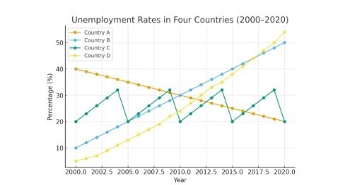
Band 5+: The line graph below shows the unemployment rates in four countries (A, B, C, and D) between 2000 and 2020.

Image for topic: The line graph below shows the unemployment rates in four countries (A, B, C, and D) between 2000 and 2020.
Our system will evaluate the answer based on this AI-generated description.
The image displays a line graph titled 'Unemployment Rates in Four Countries (2000-2020)', with the vertical axis representing 'Percentage (%)' and the horizontal axis representing 'Year'. Data for Country A shows the following unemployment rates (%): 2000(40), 2001(39), 2002(38), 2003(37), 2004(36), 2005(35), 2006(34), 2007(33), 2008(32), 2009(31), 2010(30), 2011(29), 2012(28), 2013(27), 2014(26), 2015(25), 2016(24), 2017(23), 2018(22), 2019(21), and 2020(20). Country B's rates (%) are: 2000(10), 2001(12), 2002(14), 2003(16), 2004(18), 2005(20), 2006(22), 2007(24), 2008(26), 2009(28), 2010(30), 2011(32), 2012(34), 2013(36), 2014(38), 2015(40), 2016(42), 2017(44), 2018(46), 2019(48), and 2020(50). Country C's rates (%) for specific years are: 2000(20), 2002(26), 2004(32), 2005(20), 2007(26), 2009(32), 2010(20), 2012(26), 2014(32), 2015(20), 2017(26), 2019(32), and 2020(20). Country D's rates (%) are approximately: 2000(5), 2001(6.5), 2002(8), 2003(9.5), 2004(11), 2005(13), 2006(15), 2007(17), 2008(19.5), 2009(22), 2010(25), 2011(28), 2012(31), 2013(34), 2014(37), 2015(40), 2016(43), 2017(46), 2018(49), 2019(52), and 2020(55).
Given the complexity of the image, the above description may not be entirely accurate.
Note: Both the topic and the answer were created by one of our users.

The provided line graph illustrates the information about the unemployment ratio in three different nations from 2000 to (2020).

Overall, it is lucid that country A increased in the mid year but it was decreased until the last year. As opposed to, country B decline in middle year but it was inclined in last year. However, country C shows fluctuation.

To commence with, in 2000 unemplyoment rate was 6 % in country A after that it was increased rapidly up to 10 % in the year of 2010. Thereafter, the ratio was decline in 2015 and it was noticed around 7 %. In (2020) unemplyoment rate remains only 5%. Furthermore, in 2000 percentage of people those out of work was 9 % in nation B. Later on, it was decreased gradually in 2010 and it remains 6 % than suddenly it was jumped up to 10% in last year ((2020)).

In the terms of country C, the proportion of the jobless people was 4% in 2000 than it shows variation and lastly it was noticed 8 % in (2020).

Word Count: 179

Answers On The Same Topic:

The line graph below shows the unemployment rates in four countries (A, B, C, and D) between 2000 and 2020.

The line graph compares the unemployment rates in four different countries between 2000 and 2020. Overall, while unemployment rates in country D and country B increased with no fluctuations, country A decreased substantially throughout the period. In contrast, country C stayed stable with variations. As the graph displays, country A’s unemployment rate started at 40% […]

The line graph below shows the unemployment rates in four countries (A, B, C, and D) between 2000 and 2020.

The line graph compares the changing propartions of unemployment individuals in four distinct nations, labled A through D,over the twenty-year preiod starting from 2000. Overall, it is clear that Country B exprienced a dramatic and consistent upward trend, becooming the Country with the hightest rate of unemploymentbt the end of period. Conversely, Country A shown […]

The line graph below shows the unemployment rates in four countries (A, B, C, and D) between 2000 and 2020.

The line graph illustrates the percentages of joblessness in four different countries (A, B, C and D) during 2000 and 2020. Overall, the category B fluctuated throughout the years, while B and D groups both showed an upward trends, despite country A appeared differently. In 2000, group D had the lowest rating at only 3%, […]

The line graph below shows the unemployment rates in four countries (A, B, C, and D) between 2000 and 2020.

The line graph illustrates the joblessness ratio in four countries, over a twenty-year period , between 2000 and 2020. The figures are presented as percentages. Overall, Countries B and C showed an incredible rise while, the figure for Country A had gradually decreased. However Conutry C fluctuated over two decades , from 2000 to 2020. […]

See All

Other Topics:

The line graph below illustrates the proportion of electricity generated from renewable sources in five different countries (USA, Germany, China, Brazil, and India) between 2000 and 2020. Summarize the information by selecting and reporting the main features, and make comparisons where relevant.

The line graph illustrates the percentage of electricity produced from renewable sources in five distinct nations (The United States of America, Germany, China, Brazil, and India) from 2000 through 2020. Overall, Brazil was dominant in the production of eletricity from renewable sources. Followed by Germany which was the second largest electricity produced country. China was […]

The chart below shows the changes in the UK birth rate for women in six different age groups from 1973 to 2008.

The graph protrays the birth rate per 1000 for six unique age groups.Over the years,some age groups have shown an increase in birthrate while other groups haven’t shown similar results either by staying consistent or decreasing in rate. The 40 and over age group birth rates started from 20000 in 1973 , yet it started […]

The graph below shows the number of international tourists visiting three different countries between 2000 and 2010.

The graph below illustrates the number of foreigners visiting various nations from the year 2000 to 2010. Overall, two of the countries has increased since 2010, while The United States of America has a fluctuation. Overall, France experienced the most significant growth and became the most popular destination among the three countries. Meanwhile, the number […]

The chart below shows the percentage of households in one country that owned a car, a computer, and a mobile phone from 1995 to 2015. Summarise the information by selecting and reporting the main features, and make comparisons where relevant. Write at least 150 words.

The provided line graph below demonstrates the household ownership of consumer items such as a vehicle, smartphone and a computer from 1995 to 2015. Overall, the rates of owning the mobile phone had increased dramatically. However, the computer usage did not remain below, it also had an almost straight rapid growth. And the cars ownership […]

The line graph shows usage rates of different operating systems among office workers in a European company from 2000 to 2018. Summarise the information by selecting and reporting the main features, and make comparisons where relevant.

The data illustrates propotion of some operating systems in Europe among office work company from 2000 to 2018. Overall, it is clearly seen that population of systems like MacOS, Linux OS and Smartphone OS became more widely accessed in a European company, while the propotion of users of Windows OS were started experiencing a slight […]

See All
We have detected unusual activity on your device.
Please verify your identity to continue.
Note: This verification step won't sign you in. If you have a premium account, please log in to access the service as usual.
Google/Gmail Verification
Or verify using Email/Code
We've sent a verification code to:
youremail@gmail.com (Not your email?)
Enter it below to complete the verification process.
Ensure your email address is correct, your inbox is not full, and you check your spam folder. If no email arrives, consider using an alternative email.
You will need a Premium plan to perform your action!
Note: If you already have a premium account, please log in to access our services as usual.

Plans & Pricing

Our mission is to make quality education accessible for everyone.
However, to keep our hardworking team running and this service alive, we genuinely need your support!
By opting for a premium plan, not only do you sustain us in achieving the mission, but you also unlock advanced features to enrich your learning experience.

Free

For learners who aren't pressed for time

What's included on Free
100+ Cambridge IELTS Tests
Instant IELTS Writing Task 1 & 2 Evaluation (2 times/month)
Instant IELTS Speaking Part 1, 2, & 3 Evaluation (2 times/month)
Instant IELTS Writing Task 1 & 2 Essay Generator (2 times/month)
500+ Dictation & Shadowing Exercises
100+ Pronunciation Exercises
Flashcards
Other Advanced Tools

Premium

For those serious about advancing their English proficiency, and for IELTS candidates aspiring to boost their band score by 1-2 points (especially in writing & speaking) in just 30 days or less

What's included on Premium
Save Your IELTS Test Progress & Analyze Mistakes By Question Type
Save Your Own Flashcard Sets & Use Them On Any Device
Unlock All Courses, IELTS Tests, Section & Part Practice
Unlimited AI Conversations
Unlimited AI Writing Enhancement Exercises
Unlimited IELTS Writing Task 1 & 2 Evaluation
Unlimited IELTS Speaking Part 1, 2, & 3 Evaluation
Checked Answers Will Not Be Published
Unlimited IELTS Writing Task 1 & 2 Essay Generator
Unlimited IELTS Speaking Part 1, 2, & 3 Sample Generator
Unlimited Usage Of Advanced Tools & AI Features
Priority Support within 24h (12-month plan only)

Due to the nature of our service and the provided free trials, payments are non-refundable.