Our system will evaluate the answer based on this AI-generated description.
The image presents a line graph indicating population growth by age groups in New Zealand from 1950 to 2050; the age groups are 0-14, 25-37, 36-45, and over 65. In 1950, percentages for age groups were as follows: 0-14 at 45%, 25-37 at 25%, 36-45 at 20%, and over 65 at 10%. In 1960, 0-14 rose to 50%, 25-37 dropped to 20%, 36-45 remained at 20%, and over 65 increased to 15%. By 1970, all groups except 36-45 increased by 5% each, but by 1980, 0-14 declined to 40%, 25-37 grew to 30%, 36-45 stayed at 25%, and over 65 reached 20%. By 1990, 0-14 dropped to 35%, 25-37 slightly grew to 35%, 36-45 maintained at 20%, and over 65 rose to 25%. In 2000, 0-14 went down to 30%, 25-37 shrunk to 30%, 36-45 increased to 30%, and over 65 remained at 25%. In 2010, 0-14 further decreased to 25%, 25-37 went up to 40%, 36-45 slightly rose to 35%, and over 65 fell to 20%. The forecast for 2020 anticipates 0-14 at 20%, 25-37 at 45%, 36-45 at 40%, and over 65 at 30%. By 2030, 0-14 is expected to continue at 20%, 25-37 at 55%, and 36-45 at 40%, with over 65 projected to hit 35%. In 2040, predictions suggest 0-14 remaining at 20%, 25-37 peaking at 60%, 36-45 staying at 40%, and over 65 climbing to 45%. Lastly, the 2050 outlook projects 0-14 at 20%, 25-37 reducing to 55%, 36-45 maintaining at 35%, and over 65 surging to 50%.
Given the complexity of the image, the above description may not be entirely accurate.
Skyrocket your IELTS band score by 1-2 points in under a month with our premium plan!
Note: Both the topic and the answer were created by one of our users.
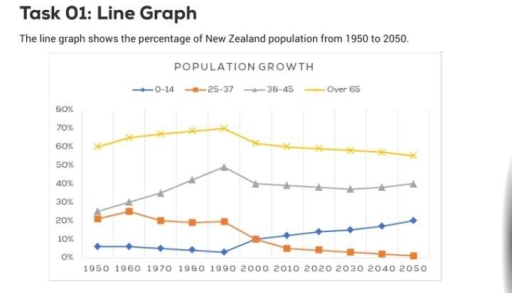
The line chart illustrates the proportions of the population growth in New Zealand between 1950 and 2020 and its prediction thirty years later.
The analysis of data reveals that New Zealand has been facing an aging population with a marked dominance of senior citizens. In addition, the percentage of the early-adult group experienced an upward trend, while the opposite was true for other cohorts.
In terms of the two oldest age groups, senior citizens accounted for approximately two-thirds of the total population in the first years, outnumbering the percentage of middle adults, who took up a quarter. Forty years later, the percentages for both cohorts saw an upward trend, gradually increasing before reaching the peak of 70% and a half respectively. However, there was a slight drop in both figures, and this tendency is forecast to continue, with the data slightly declining by 10% in 2050.
As for the younger cohorts, the proportion of young adults constituted a quarter of the total population, four times higher than that of teenagers under 14 at a tiny proportion in 1950. In the following years, the data on 25-37-year-old participants marginally fell to 10% in 2000 and is anticipated to keep decreasing until hitting the bottom of 0% in the last year. The youngest group’s figure, conversely, despite witnessing a small, started to grow and surpass that of the 25-37-year-old nationals in 2010. Additionally, the proportion of under-14 respondents is projected to significantly increase before climbing to the high of one-fifth afterward.
Word Count: 249
