🔥 Today Only: Save 30% on Premium — Offer Ends Soon! - Upgrade Now!
Pie Chart

Band 8+: The pie chart shows the energy use in Australian homes in 2008

Image for topic: The pie chart shows the energy use in Australian homes in 2008
Our system will evaluate the answer based on this AI-generated description.
The image presents a pie chart titled 'The pie chart shows the energy use in Australian homes in 2008' and an accompanying outline. The chart, subtitled 'Energy use in Australian homes in 2008', shows percentages of energy use for various purposes: Heating & cooling 38%, Water heating 25%, Other appliances 16%, Lighting 7%, Fridges & freezers 7%, Cooking 4%, and Stand-by power 3%. The outline is structured as follows: 1) Intro: energy use = how much electricity was used for different purposes, Australian homes = Australian households. 2) Overview: Heating and cooling accounted for majority of energy use. 3) Body 1 (Heating & cooling, water heating, and other appliances -- three biggest): highest energy consumption = heating & cooling (+data), the figure for water heating = slightly lower (data), Other appliances = at third place (data). 4) Body 2 (Modern methods): Lighting + Fridges & Freezers: similar amount of energy (+data), Cooking + stand-by power: negligible proportion of total energy used (data).
Given the complexity of the image, the above description may not be entirely accurate.
Note: Both the topic and the answer were created by one of our users.

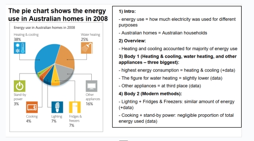
The given pie chart illustrates how much electricity was consumed in Australian households in 2008. Overall, it is clear that heating and cooling accounted for the largest percentage of energy use, while stand-by power used the least.

In 2008, the highest energy consumption was heating and cooling, accounting for 38% of energy use. Following that, the proportion of Australian housing using water heating made up 25%. Moreover, the percentage of electricity used for other appliances contributed 16%, which mainly including small household devices such as machines and other home equipment, which required some energy but not too much.

On the other hand, lighting, fridges and freezers made up 7% of household energy use. After that, cooking represented 4% of energy use, showing that kitchen appliances did not use a lot of energy in most homes. Furthermore, the figure for stand-by power contributed the least, at 3% in 2008.

Word Count: 148

Answers On The Same Topic:

The pie chart shows the energy use in Australian homes in 2008

The pie chart illustrates the percentage of energy use namely (Heating and cooling, Water heating, Other appliances, Lighting and fridges, Freezers, Cooking, and Stand-by power) in Australian households in 2008. Overall, it is clear that heating and cooling showed the largest consumption of using energy. In contrast, stand-by power was the small rate for minority […]

See All

Other Topics:

The charts show the percentage of enrolments on six courses at a local education college in the UK in 2010 and 2012.

The charts below demonstrate the percentage of enrolments on six courses at a local education college in the UK in two different years: 2010 and 2012. Overall, while the highest percentage of enrolments in 2010 can be seen in nursing courses, the greatest number of students was in sports science. In contrast, the least proportion […]

The charts below show degrees granted in different fields at the National University in the years 1990, 2000, and 2010. Summarize the information by selecting and reporting the main features, and make comparisons where relevant.

The pie charts illustrate the difference faculties in degrees granted from the National University between 1990, 2000, and 2010. Overall, it can be clearly seen that the largest percentage was from computer science. Meanwhile, law had the lowest proportion throughout the given period. According to the chart, 30%, 40%, and 45% were from students who […]

The pie charts below show the percentage of household spending in a European country in 1990 and 2020

The pie charts compare the distribution of household expenditure across six categories in a European country in 1990 and 2020. Overall, food and housing accounted for the largest shares of household expenditure in both years, while “other” remained the smallest category. Over the period, spending patterns changed across the categories. There was a significant increase […]

The pie charts below show the percentage of household spending in a European country in 1990 and 2020

The pie charts compare the distribution of household expenditure across six categories in a European country in 1990 and 2020. Overall, food and housing accounted for the largest shares of household expenditure in both years, while “other” remained the smallest category. Over the period, spending patterns changed across the categories. 1-In 1990, food accounted for […]

You should spend 40 minutes on the task The charts below show the main methods of transportation for people traveling to a university for work or study in 2004 and 2009. Summarise the information by selecting and reporting the main features and make comparisons wherever relevant. You should write at least 150 words.

These pie charts illustrate different modes of transport such as bus, bicycle, train, car, walking, people used to commute to university for work or study throughout 2004 and 2009 in the UK. It is apparent, that in both years car and bus accounted for over half of all modes of transports, while other methods were […]

The two pie charts below show psychologists' employment after graduating.

The two pie charts compare the expected and actual employment destinations of psychology graduates after completing their studies. Overall, there was a major difference between graduates’ expectations and reality. While the vast majority expected to work in private clinics, the actual figures show that most graduates found employment in schools and universities. Community agencies also […]

See All
We have detected unusual activity on your device.
Please verify your identity to continue.
Note: This verification step won't sign you in. If you have a premium account, please log in to access the service as usual.
Google/Gmail Verification
Or verify using Email/Code
We've sent a verification code to:
youremail@gmail.com (Not your email?)
Enter it below to complete the verification process.
Ensure your email address is correct, your inbox is not full, and you check your spam folder. If no email arrives, consider using an alternative email.
You will need a Premium plan to perform your action!
Note: If you already have a premium account, please log in to access our services as usual.

Plans & Pricing

Our mission is to make quality education accessible for everyone.
However, to keep our hardworking team running and this service alive, we genuinely need your support!
By opting for a premium plan, not only do you sustain us in achieving the mission, but you also unlock advanced features to enrich your learning experience.

Free

For learners who aren't pressed for time

What's included on Free
100+ Cambridge IELTS Tests
Instant IELTS Writing Task 1 & 2 Evaluation (2 times/month)
Instant IELTS Speaking Part 1, 2, & 3 Evaluation (5 times/month)
Instant IELTS Writing Task 1 & 2 Essay Generator (2 times/month)
500+ Dictation & Shadowing Exercises
100+ Pronunciation Exercises
Flashcards
Other Advanced Tools

Premium

For those serious about advancing their English proficiency, and for IELTS candidates aspiring to boost their band score by 1-2 points (especially in writing & speaking) in just 30 days or less

What's included on Premium
Save Your IELTS Test Progress
Unlock All Courses & IELTS Tests
Unlimited AI Conversations
Unlimited AI Writing Enhancement Exercises
Unlimited IELTS Writing Task 1 & 2 Evaluation
Unlimited IELTS Speaking Part 1, 2, & 3 Evaluation
Checked Answers Will Not Be Published
Unlimited IELTS Writing Task 1 & 2 Essay Generator
Unlimited IELTS Speaking Part 1, 2, & 3 Sample Generator
Unlimited Usage Of Advanced Tools
Priority Support within 24h (12-month plan only)

Due to the nature of our service and the provided free trials, payments are non-refundable.
Nếu bạn là người Việt Nam và không có hoặc không muốn trả bằng credit/debit cards, bạn có thể thanh toán bằng phương thức chuyển khoản:


Chọn gói:
419,000₫ 277,000 ₫ cho gói 1 tháng (chỉ 9,233₫/ngày)
1,239,000₫ 597,000 ₫ cho gói 3 tháng (chỉ 6,633₫/ngày)
2,469,000₫ 1,027,000 ₫ cho gói 6 tháng (chỉ 5,706₫/ngày)
4,929,000₫ 1,417,000 ₫ cho gói 12 tháng (chỉ 3,936₫/ngày)


Sau khi chuyển khoản, vui lòng đợi trình duyệt tự động điều hướng bạn trở lại Engnovate và bạn sẽ ngay lập tức nhận được mã kích hoạt tài khoản premium.
Nếu có lỗi xảy ra, bạn có thể liên hệ với team thông qua một trong các phương thức: email đến helloengnovate@gmail.com hoặc nhắn tin qua facebook.com/engnovate.
Vì toàn bộ công cụ trên website đều có thể sử dụng thử miễn phí, Engnovate không hỗ trợ hoàn tiền.