🔥 Today Only: Save 30% on Premium — Offer Ends Soon! - Upgrade Now!
Line Graph

Band 4+: the proportion of female employees aged 15-64 from 2003 to 2009 in five countries

Image for topic: the proportion of female employees aged 15-64 from 2003 to 2009 in five countries
Our system will evaluate the answer based on this AI-generated description.
The image presents a line graph displaying the percentage of women aged 15-64 in employment from 2003 to 2009 for five different countries, with data points for 2003, 2005, 2007, and 2009. Iceland shows a consistent employment percentage, starting at roughly 80% in 2003, a slight increase to just above 80% in 2005, and maintaining that level in 2007 and 2009. Canada has a small but steady increase, starting at just under 70% in 2003, about 70% in 2005, approximately 72% in 2007, and close to 75% in 2009. Germany starts at around 60% in 2003, increases to about 65% in 2005, then to just above 65% in 2007, and nears 70% in 2009. Chile shows a gradual increase, from just above 40% in 2003 to about 45% in 2005, close to 50% in 2007, and just under 55% in 2009. Turkey starts at just above 20% in 2003, reaches near 25% in 2005, about 30% in 2007, and surpasses 30% slightly in 2009.
Given the complexity of the image, the above description may not be entirely accurate.
Note: Both the topic and the answer were created by one of our users.

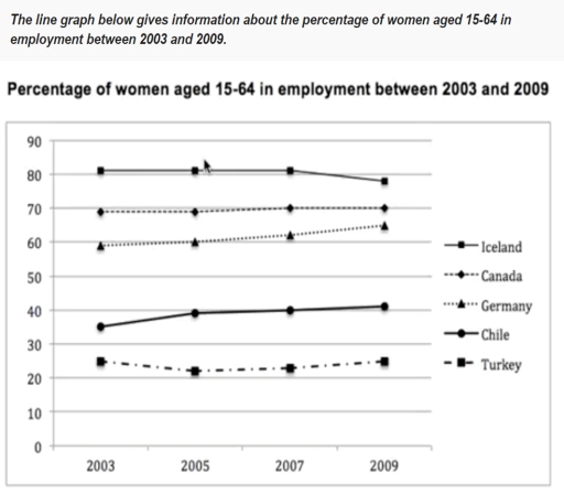
The line graph shows that figures of females aged 15-64 in job employment in 2003 to 2009 between 5 countries.Iceland ,Canada , Germany, Chile ,Turkey

Overall, women from Iceland had the highest percentage throughout the period while , Turkey had the lowest in the given chart .

In the given graph Iceland was stable 80 % until 2008 when it comes to 2009 there was small decline about 1% .Canada was the second highest female workers between 2003 and 2009 with 69% and at the end of the 2009 they reached 70% . Germany has started at 60% and throughout the period it increased by 4%

Lowest 2 countries were Chile and Turkey. Chile has seen the highest increase in the given chart with 5% and stable at 40% until 2009 .Chile female workers were 25 % in 2003 and there was a decline in 2005 and 2007 for about 5 % and they came back to 25% again.

Word Count: 159

Answers On The Same Topic:

the proportion of female employees aged 15-64 from 2003 to 2009 in five countries

The line graph displays data about proportion of females aged 15-64 in employment in different countries from 2003 and 2009. Overall, it is clear that Chile and Germany percentage of women employment increased slightly while Iceland declined minimally throughout the period. Meanwhile,Canada and Turkey remained the same level of work. In detail, in 2003,Chile women […]

the proportion of female employees aged 15-64 from 2003 to 2009 in five countries

The provided line graph depicts the percentage/ratio of women aged between 15 and 64 who were in employment in five different countries, namely Iceland, Canada, Germany, Turkey and Chile, over a six-year period from 2003 to 2009. In 2003, Iceland recorded the highest proportion of employed women at just over 80%, followed by Canada at […]

the proportion of female employees aged 15-64 from 2003 to 2009 in five countries

The chart gives information on the percentage of women aged between 15 and 64 in employment from 2003 to 2009 in five different countries. Overall, the majority of three countries have been above the age of 60, and among them are Iceland, Canada, and Germany. The other two countries, Chile and Turkey, have been below […]

the proportion of female employees aged 15-64 from 2003 to 2009 in five countries

The line chart illustrates the proportion of women aged 15 to 64 in employment across five countries between 2003 and 2009. Overall, female employment levels were consistently higher in the three developed nations, namely Iceland, Canada, and Germany, compared with Chile and Turkey. While employment increased in most countries over the period, Iceland experienced a […]

See All

Other Topics:

The graph below shows the number of visitors to five different types of museums in the UK from 1999 to 2019. Summarise the information by selecting and reporting the main features, and make comparisons where relevant.

The line graph gives information about how many people visited five distinct categories of museums, namely art museums, science museums, culture museums, natural history museums, history museums over the period two-decades from 1999 to 2019. Overall, the figure for all museums underwent stable fluctuations. Most notably, the art museums were always higher than other typers, […]

The line graph below shows the literacy rates of young men and women worldwide between 1975 and 2023. Summarise the information by selecting and reporting the main features and making comparisons where relevant.

The two line graphs illustrate the level of literacy of young males and females in the world from 1975 to 2023. Overall, both graphs demonstrate an upward trend. Throughout the period, the men’s literacy rate remained higher constantly. At the beginning of the period, the literacy rate of young males was just above 80%. The […]

You should spend about 20 minutes on this task. The graph below shows the percentage of money spent on advertising in five types of media in France from 2010 and projected spending to 2040. Summarise the information by selecting and reporting the main features, and make comparisons where relevant. You should write at least 150 words. Writing Task 1

The line graph illustrates the percentage of invested money in promotion across five different media spaces in France over the time period from 2010 to 2040. Overall, the graph shows that internet media has become increasingly popular during this time frame, whereas the other four types of media have declined in their attractiveness for advertising […]

the graph below shows the population of a particular country by age groupd starting

The line graph gives information about the percentage of pupulation in a country by 3 age group, such as 0-14, 15-64 and 65 and over, in a 80-year-period starting from 1960. Overall, the proportion of children and adults declined, exept that of 65+ age group. Additionally, there were a huge gap between 65 and over […]

the line graph shows three different crimes in England and Wales in 1970-2005

The line graph illustrates three different crimes in England and Wales from 1970 to 2005. Overall, car theft and house burglary increased to varying degrees, with car theft consistently recording the highest figures and registering the most pronounced rise. In contrast, street robbery rose slightly throughout the period. In 1970, the number of car theft […]

The graph below shows the number of people taking part in four different kinds of sports in a particular region between 1985 and 2005.

The line graph shows the figures of players in 4 different types of sports in a certain European country from 1985 to 2005. Overall, Range from 1985 to 2005 rugby was the most popular sport in the beginning and had a sensible decline, while tennis has gained a slight popularity increase. However, two other sports […]

See All
We have detected unusual activity on your device.
Please verify your identity to continue.
Note: This verification step won't sign you in. If you have a premium account, please log in to access the service as usual.
Google/Gmail Verification
Or verify using Email/Code
We've sent a verification code to:
youremail@gmail.com (Not your email?)
Enter it below to complete the verification process.
Ensure your email address is correct, your inbox is not full, and you check your spam folder. If no email arrives, consider using an alternative email.
You will need a Premium plan to perform your action!
Note: If you already have a premium account, please log in to access our services as usual.

Plans & Pricing

Our mission is to make quality education accessible for everyone.
However, to keep our hardworking team running and this service alive, we genuinely need your support!
By opting for a premium plan, not only do you sustain us in achieving the mission, but you also unlock advanced features to enrich your learning experience.

Free

For learners who aren't pressed for time

What's included on Free
100+ Cambridge IELTS Tests
Instant IELTS Writing Task 1 & 2 Evaluation (2 times/month)
Instant IELTS Speaking Part 1, 2, & 3 Evaluation (5 times/month)
Instant IELTS Writing Task 1 & 2 Essay Generator (2 times/month)
500+ Dictation & Shadowing Exercises
100+ Pronunciation Exercises
Flashcards
Other Advanced Tools

Premium

For those serious about advancing their English proficiency, and for IELTS candidates aspiring to boost their band score by 1-2 points (especially in writing & speaking) in just 30 days or less

What's included on Premium
Save Your IELTS Test Progress
Unlock All Courses & IELTS Tests
Unlimited AI Conversations
Unlimited AI Writing Enhancement Exercises
Unlimited IELTS Writing Task 1 & 2 Evaluation
Unlimited IELTS Speaking Part 1, 2, & 3 Evaluation
Checked Answers Will Not Be Published
Unlimited IELTS Writing Task 1 & 2 Essay Generator
Unlimited IELTS Speaking Part 1, 2, & 3 Sample Generator
Unlimited Usage Of Advanced Tools
Priority Support within 24h (12-month plan only)

Due to the nature of our service and the provided free trials, payments are non-refundable.
Nếu bạn là người Việt Nam và không có hoặc không muốn trả bằng credit/debit cards, bạn có thể thanh toán bằng phương thức chuyển khoản:


Chọn gói:
419,000₫ 277,000 ₫ cho gói 1 tháng (chỉ 9,233₫/ngày)
1,239,000₫ 597,000 ₫ cho gói 3 tháng (chỉ 6,633₫/ngày)
2,469,000₫ 1,027,000 ₫ cho gói 6 tháng (chỉ 5,706₫/ngày)
4,929,000₫ 1,417,000 ₫ cho gói 12 tháng (chỉ 3,936₫/ngày)


Sau khi chuyển khoản, vui lòng đợi trình duyệt tự động điều hướng bạn trở lại Engnovate và bạn sẽ ngay lập tức nhận được mã kích hoạt tài khoản premium.
Nếu có lỗi xảy ra, bạn có thể liên hệ với team thông qua một trong các phương thức: email đến helloengnovate@gmail.com hoặc nhắn tin qua facebook.com/engnovate.
Vì toàn bộ công cụ trên website đều có thể sử dụng thử miễn phí, Engnovate không hỗ trợ hoàn tiền.