🔥 Today Only: Save 30% on Premium — Offer Ends Soon! - Upgrade Now!
Table

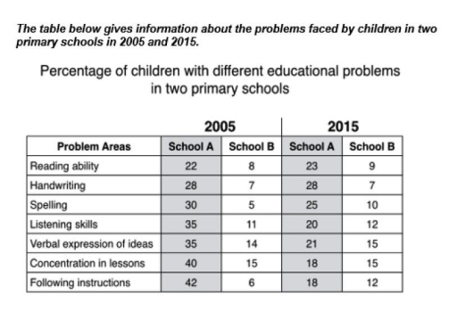
Band 6+: The shown table demonstrates data about difficulties that were confronted by children in two different primary schools in 2005 and 2015.

Image for topic: The shown table demonstrates data about difficulties that were confronted by children in two different primary schools in 2005 and 2015.
Our system will evaluate the answer based on this AI-generated description.
The image contains a table with data from 2005 and 2015 comparing the percentage of children with different educational problems in two primary schools, A and B. Problem areas listed include Reading ability, Handwriting, Spelling, Listening skills, Verbal expression of ideas, Concentration in lessons, and Following instructions. In 2005, School A percentages: Reading ability 22, Handwriting 28, Spelling 30, Listening skills 35, Verbal expression of ideas 35, Concentration in lessons 40, Following instructions 42. School B percentages: Reading ability 8, Handwriting 7, Spelling 5, Listening skills 11, Verbal expression of ideas 14, Concentration in lessons 15, Following instructions 6. In 2015, School A percentages: Reading ability 23, Handwriting 28, Spelling 25, Listening skills 20, Verbal expression of ideas 21, Concentration in lessons 18, Following instructions 18. School B percentages: Reading ability 9, Handwriting 7, Spelling 10, Listening skills 12, Verbal expression of ideas 15, Concentration in lessons 15, Following instructions 12.
Given the complexity of the image, the above description may not be entirely accurate.
Note: Both the topic and the answer were created by one of our users.

The table provide date on the percentage of the children facing various educational challenges in primary school, School A and School B, in years 2005 and 2015.

Overall, School A experienced a decrease in most problem areas, whereas School B saw an increase in the percentage of children facing difficulties.

In 2005, School A reported higher percentages of children compered to School B in all areas. The most significant issues in School A were “Following instructions” with 42 percent and “Concentration In lessons” with 40 percent . By 2015 , this percentages dropped to 18 percent, respectively Similarly, difficulties in “Spelling “, ” Listening Skills “And “Verbal expression of ideas “declined from 30,35 and 35 percent to 20,21 and 25 percent in 2015.

In contrast, School B showed an increase or stay stable in every problem area between 2005 and 2015. For instance, children facing issues with concentration stayed stable from 2005 to 2015 . Moreover, ” handwriting ” faced the same trend with “concentration” . Difficulties in reading ability increased from 8 percent to 9 percent . The area of spelling saw the largest rose , from 5 percent 2005 to 10 percent 2015.

To summarize, while School A managed to reduce education problems dramatically, School B saw a slight but consistent increase in challenges .

Word Count: 217

Answers On The Same Topic:

The shown table demonstrates data about difficulties that were confronted by children in two different primary schools in 2005 and 2015.

The table provides information about seven different educational problems faced by children in two primary schools, labelled School A and School B. The data is given for two separate years, 2005 and 2015, and is shown as percentages of children experiencing each difficulty. Overall, the most noticeable trend is that School A saw a significant […]

The shown table demonstrates data about difficulties that were confronted by children in two different primary schools in 2005 and 2015.

The given table represents the percentage of children with different educational problems in two primary schools in 2005 and 2015. In general, it is apparently seen that the pupils in School A faced more educational issues when compared to School B. In 2005, the most common issues in School A were following instructions (42%) and […]

The shown table demonstrates data about difficulties that were confronted by children in two different primary schools in 2005 and 2015.

In this table there are information about difficult educational problems of two primary school in 2005 and 2015. in 2005 kids of school A had the highest percentage of between following instructions and concentration in classes , the lowest was reading ability having 22 percentage.However at school B the number was lower than the first […]

The shown table demonstrates data about difficulties that were confronted by children in two different primary schools in 2005 and 2015.

The table demonstrates the data of two primary schools about their proportion of students struggling with 7 different learning skills in one decade from 2005 to 2015. Overall, the number of children who had these problems in school A was much more significant than their counterparts in school B. While the percentage of school B […]

The shown table demonstrates data about difficulties that were confronted by children in two different primary schools in 2005 and 2015.

The given table illustrates the proportion of students facing numerous educational problems in two elementary schools between 2005 and 2015. Overall, it is evident that the proportion of children with difficulties in school A shows a downward trend, while a reverse pattern can be seen in school B in 2015. In 2005, the percentage of […]

See All

Other Topics:

The table below shows the results of an airline survey in 2002 of economy class business travellers. The numbers indicate how many male or female passengers in each age group rated a particular feature as their most important in-flight consideration. Summarise the information by choosing and reporting the key features, and make any relevant comparisons.

The table illustrates the results of an airline survey conducted in 2002 of economy class male and female passengers of two different age groups. The aim of survey was to explore which in-flight feature is most important for people of different age groups. In terms of individuals aged between 25 to 45 years, seat or […]

The table below shows the results of an airline survey in 2002 of economy class business travellers. The numbers indicate how many male or female passengers in each age group rated a particular feature as their most important in-flight consideration. Summarise the information by choosing and reporting the key features, and make any relevant comparisons.

The table illustrates the results of an airline survey conducted in 2002 of economy class male and female passengers of two different age groups. The aim of survey was to explore which in-flight feature is most important for people of different age groups. In terms of individuals aged between 25 to 45 years, seat or […]

The table below shows daily oil production in 4 countries from 2000 to 2004. Summarise the information by selecting and reporting the main features, and make comparisons where relevant.

The given table compares how many numbers of barrels were produced per day in four different nation in between 2000 and 2004. It is clear that, the highest number of barrels of oil production country was Congo among this 4 country, while Chad was produce the least number from 2000 to 2004. Beginning with Congo, […]

TASK 1: The table below gives information related to population growth, average birth per women, life expectancy at birth in countries with different income levels in 2000 and 2004.

The following table compares high income countries, middle income countries, and low income countries according to their population growth, average birth per woman, and life expectancy at birth over a 2 year period, from 2002 to 2004. Overall, the numbers didn’t witness a huge change through the 2 year period for all the countries. It’s […]

The table below shows information about spending on health in five different countries in 2002. Summarise the information by selecting and reporting the main features and make comparisons where relevant. Write at least 150 words.

The table illustrates the proportion of expenditure on healthcare in five different nations, namely Japan, Italy, Germany, France, and the USA in 2002. Overall, it is clear that public spending on healthcare was considerably higher than private spending in all five countries. In addition, France recorded the highest proportion of total healthcare expenditure, while Japan […]

The graph below shows the oil production (in barrels) in several African countries from 2000 to 2004. Summarise the information by selecting and reporting the main features, and make comparisons where relevant. Write at least 150 words.

The graph shows the oil production in several African countries like Nigeria, Chad, Congo and Cote d’Ivoire between 2000 and 2004. Overall, it is evident that the highest oil production was in Nigeria. On the other hand, the lowest oil production was in Chad in 2000, then changed to Cote d’Ivoire in 2004 according to […]

See All
We have detected unusual activity on your device.
Please verify your identity to continue.
Note: This verification step won't sign you in. If you have a premium account, please log in to access the service as usual.
Google/Gmail Verification
Or verify using Email/Code
We've sent a verification code to:
youremail@gmail.com (Not your email?)
Enter it below to complete the verification process.
Ensure your email address is correct, your inbox is not full, and you check your spam folder. If no email arrives, consider using an alternative email.
You will need a Premium plan to perform your action!
Note: If you already have a premium account, please log in to access our services as usual.

Plans & Pricing

Our mission is to make quality education accessible for everyone.
However, to keep our hardworking team running and this service alive, we genuinely need your support!
By opting for a premium plan, not only do you sustain us in achieving the mission, but you also unlock advanced features to enrich your learning experience.

Free

For learners who aren't pressed for time

What's included on Free
100+ Cambridge IELTS Tests
Instant IELTS Writing Task 1 & 2 Evaluation (2 times/month)
Instant IELTS Speaking Part 1, 2, & 3 Evaluation (2 times/month)
Instant IELTS Writing Task 1 & 2 Essay Generator (2 times/month)
500+ Dictation & Shadowing Exercises
100+ Pronunciation Exercises
Flashcards
Other Advanced Tools

Premium

For those serious about advancing their English proficiency, and for IELTS candidates aspiring to boost their band score by 1-2 points (especially in writing & speaking) in just 30 days or less

What's included on Premium
Save Your IELTS Test Progress & Analyze Mistakes By Question Type
Save Your Own Flashcard Sets & Use Them On Any Device
Unlock All Courses, IELTS Tests, Section & Part Practice
Unlimited AI Conversations
Unlimited AI Writing Enhancement Exercises
Unlimited IELTS Writing Task 1 & 2 Evaluation
Unlimited IELTS Speaking Part 1, 2, & 3 Evaluation
Checked Answers Will Not Be Published
Unlimited IELTS Writing Task 1 & 2 Essay Generator
Unlimited IELTS Speaking Part 1, 2, & 3 Sample Generator
Unlimited Usage Of Advanced Tools & AI Features
Priority Support within 24h (12-month plan only)

Due to the nature of our service and the provided free trials, payments are non-refundable.